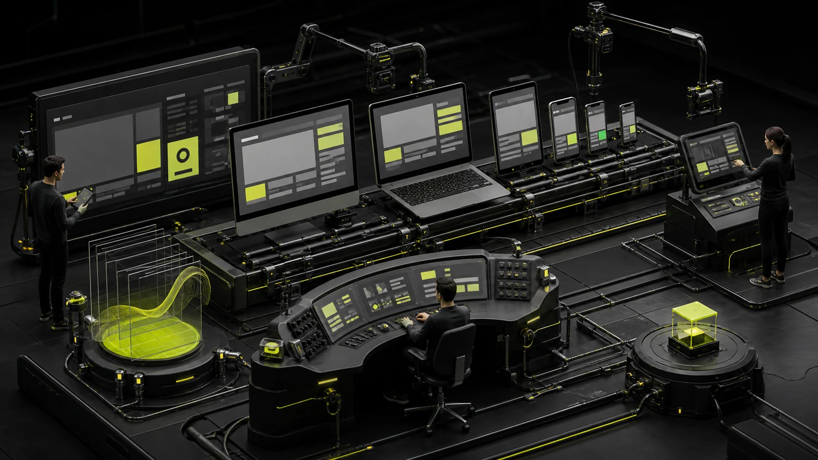
Design files contain a few fixed frames, while browser width is continuous. If frontend teams match each frame pixel by pixel, intermediate sizes depend on patches and CSS becomes harder to maintain.
High-quality responsive development starts by understanding component flexibility, then implementing it with Grid, Flexbox, containers, media queries, and resource strategies.
01 Begin with Semantic Structure
Organize content with clear header, nav, main, section, article, footer, and heading levels before styling the layout.
Semantics support accessibility, SEO, and graceful degradation while reducing meaningless wrappers created only for layout.

02 Use Fluid Layouts Instead of Fixed Widths Everywhere
Let containers, grids, and spacing flex within reasonable ranges, and give components minimum and maximum boundaries.
Fixed pixels work for icons and local dimensions, but should not make the entire page valid only at one frame width.
Responsive Development Checkpoints
| Area | Implementation Priority | Common Problem |
|---|---|---|
| Layout | Grid/Flex, fluid containers, and content breakpoints | Excessive absolute positioning and fixed widths |
| Images | srcset, sizes, suitable formats, and crops | Phones download oversized desktop images |
| Typography | Readable line length, scaling, and font loading | Disabled zoom or overflowing text |
| Navigation | Keyboard, focus, and hierarchical return | Hover-only access or menus that cannot close |
| Tables | Column priority, scrolling, and header association | Scaling until text becomes unreadable |
| Forms | Correct input types, touch, and errors | Keyboard obstruction or missing labels |

03 Make Breakpoints Serve Content, Not Framework Defaults
Framework breakpoints are a starting point. Add or adjust them when components fail. Container queries also require clear internal component rules.
Avoid giving every page its own breakpoint system and making the codebase difficult to maintain.
04 Responsive Resources Determine Real Performance
Serve images by display size and pixel density, lazy-load content below the fold, and preload critical images appropriately.
Reduce unnecessary font weights and character sets, and provide mobile video fallbacks.

05 Support Mouse, Keyboard, and Touch Together
Hover cannot be the only information path. Provide visible focus, adequate touch targets, and keyboard dismissal for overlays and menus.
Mobile means more than narrow screens; it can include landscape, external keyboards, and screen readers.
06 Build a Browser and Device Test Matrix
Use audience data to choose browsers, systems, and devices, then test real content, long copy, localization, slow networks, and exception states.
Automated screenshots find visual regressions; real devices validate touch, keyboards, performance, and system behavior.
Frequently Asked Questions
Can a team test only Chrome?
No. Cover Safari, Edge, other major browsers, and mobile webviews according to the audience.
Does responsive development require Bootstrap or Tailwind?
No. Tools are implementation choices; layout rules and maintainability are what matter.
Is using WebP for every image enough?
No. Images still need appropriate dimensions, quality, crops, and loading timing.
Can mobile use hover effects?
Core tasks cannot depend on hover. Provide equivalent touch and keyboard behavior.
How can future pages avoid breaking responsiveness?
Use components and tokens, content constraints, code checks, and visual regression testing.
| Service | View |
|---|---|
| Related service | View service details |
| Project inquiry | Contact JVDS Design Studio |
| Design and web articles | View all insights |
 Link copied