

Many corporate sites place “Contact Us Now” in every section without explaining what happens after the click. A first-time visitor is still deciding whether the company is a fit, so pushing a high-commitment action too early is easy to ignore.
CTA design should match the user’s stage. Some visitors are ready to submit requirements; others only want to see cases, download materials, or understand pricing.
01 Write Button Copy Around the Action and Outcome
“Submit” and “Learn more” reveal too little. Consider “View product specifications,” “Get a project assessment,” “Book a demo,” or “Download the selection guide.”
Near the button, explain time, cost, registration requirements, and what happens next to reduce uncertainty.
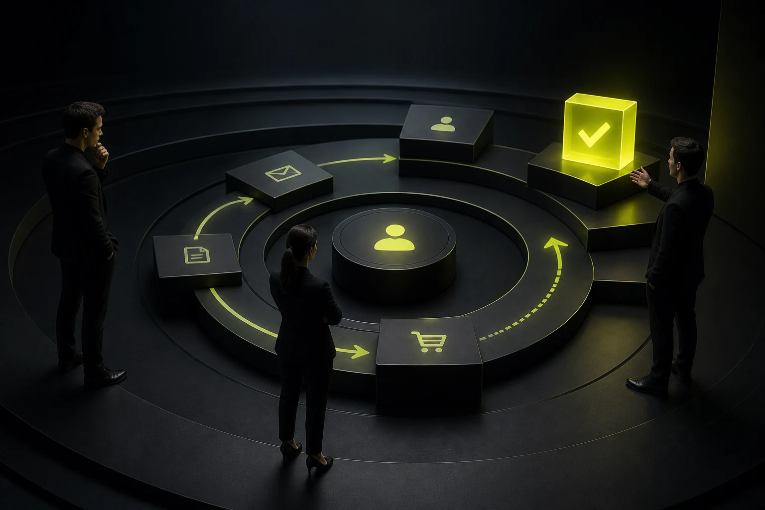
02 Build a Commitment Ladder
High-intent visitors can book a consultation, while lower-intent visitors can review cases, read a guide, or subscribe.
Do not use ten equally prominent buttons. A page needs one primary action and secondary options for people still considering.
CTA Directions by Page Type
| Page | Primary CTA | Secondary CTA |
|---|---|---|
| Home page | Explore core services or submit requirements | View cases or understand the process |
| Service page | Get a tailored assessment | View relevant cases or pricing guidance |
| Product page | Start a trial, book a demo, or request a quote | Download materials or compare models |
| Case-study page | Discuss a similar project | Review the service method |
| Article page | Keep reading or get a checklist | Related service or updates subscription |
| Contact page | Submit information or contact directly | Review response time and privacy details |

03 Let Decision Points Determine Placement
A hero CTA helps visitors with a defined need act quickly. Repeating the action after capabilities, evidence, and pricing supports users whose trust builds gradually.
Do not place a button mechanically in every screen. Repetition becomes noise when the content has not yet answered the visitor’s questions.
04 Match Form Length to the Commitment
A simple inquiry needs only essential contact details and a short requirement summary. A complex project assessment can collect budget, timeline, and scope across steps.
State the expected response time, how contact information will be used, and the privacy terms. After submission, explain the next step clearly.
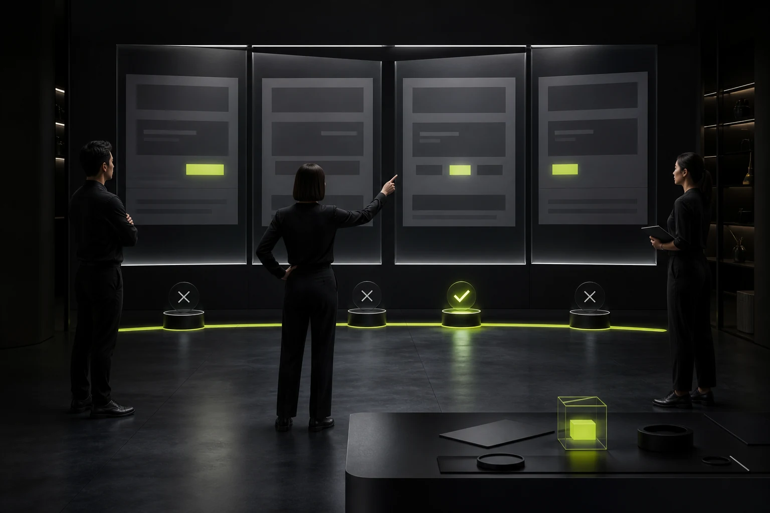
05 Do Not Sacrifice Accessibility for Visual Prominence
Buttons need sufficient contrast, touch area, focus states, and clear labels. Do not rely on color alone to communicate hierarchy or disguise a decorative link as a button.
On mobile, consider thumb reach and whether a fixed bar obscures content.
06 Test Lead Quality, Not Only Click-Through Rate
More aggressive persuasion may increase clicks while creating unqualified forms and misunderstanding. Tests should assess completion, qualified leads, sales, and support questions.
Analyze by source, page, device, and user stage instead of applying one sitewide button conclusion to every context.
Frequently Asked Questions
Must a CTA button use a highly saturated color?
No. It needs to be prominent in the page hierarchy and provide adequate contrast, while fitting the brand and accessibility requirements.
Can a home page have multiple CTAs?
Yes, with a clear primary and secondary hierarchy. Avoid equal emphasis that creates choice overload.
Will “Free Consultation” increase conversion?
It may, but the offer must be real and its scope clear. Overpromising reduces lead quality.
Is a fixed floating CTA useful?
It can work on long pages and high-intent mobile journeys, but must not obscure content or interrupt reading.
Should CTA copy include an SEO keyword?
Prioritize a clear action and value. Do not force an awkward keyword into the label.
| Service | View |
|---|---|
| Related service | View service details |
| Project inquiry | Contact JVDS |
| Design and website articles | View all articles |
 Link copied








