
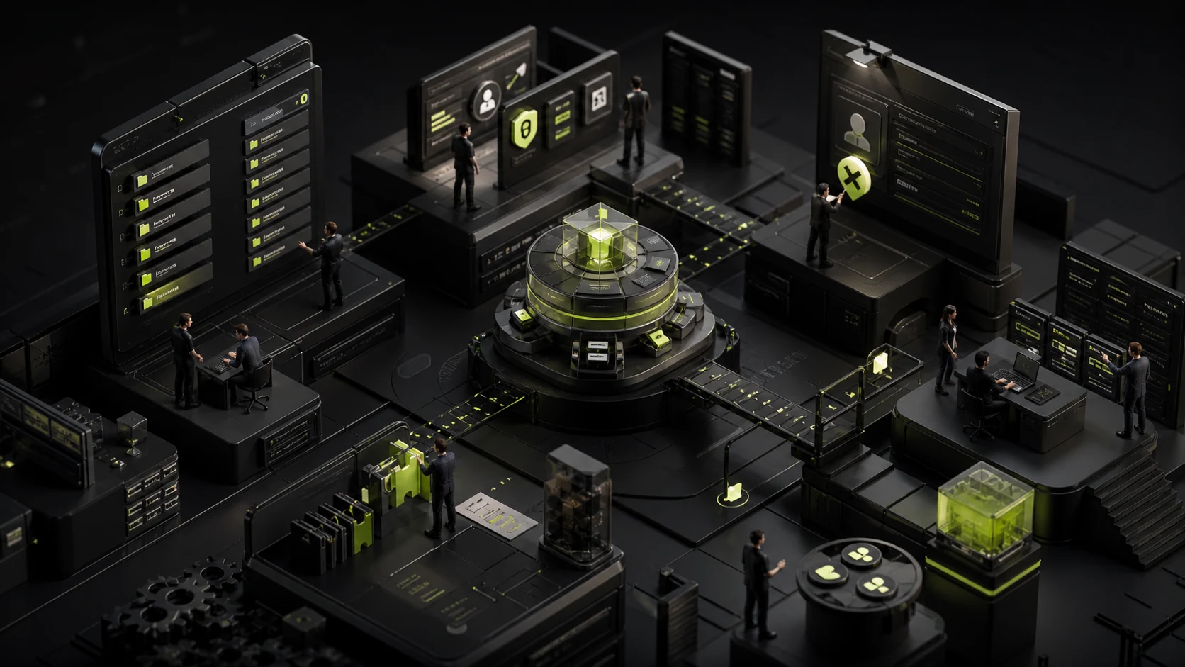
How to Design Navigation for Admin Systems with Many Modules and Roles
A common approach to navigation in admin projects is to turn an organization’s business units, product lines, and database tables directly into a left-side menu. As the business grows, the menu expands from 12 items to 60, and users can complete their work only by relying on memory and browser bookmarks.
Navigation is not a page directory; it is an entry point to tasks. Its design must account for business objects, user roles, frequency of use, and cross-module workflows so users know where they are, where else they can go, and how to return to their work context.
01 Build the Structure Around Tasks and Objects First
Interview different roles and list their frequent tasks, key objects, and natural language. A salesperson may say “follow up with a customer” and finance may say “reconcile a payment,” while the system uses technical table names as menu labels. The language does not align.
Group pages by the objects and tasks in users’ mental models, then map those groups to internal systems. Organizational structure may affect permissions and management, but it should not automatically become the information architecture.
02 Do Not Show Every Role the Same Menu When Their Needs Differ
Administrators, operations staff, salespeople, and finance teams need different modules. Hide unavailable entries according to permissions, and provide role-specific home pages and shortcuts to reduce noise.
However, do not completely change the name and location of the same module for each role, because that makes collaboration and support difficult. Keep core objects stable while adjusting their priority and visibility.
Role | Navigation Priorities | Should Not Be Emphasized by Default |
|---|---|---|
Frontline Operator | Today’s tasks, customers/orders, pending items | System configuration, global reports |
Manager | Team, approvals, exceptions, reports | Infrequent basic configuration |
Operations | Content, rules, campaigns, data quality | Personal task entry points |
Administrator | Users, permissions, integrations, security | Detailed business operations |
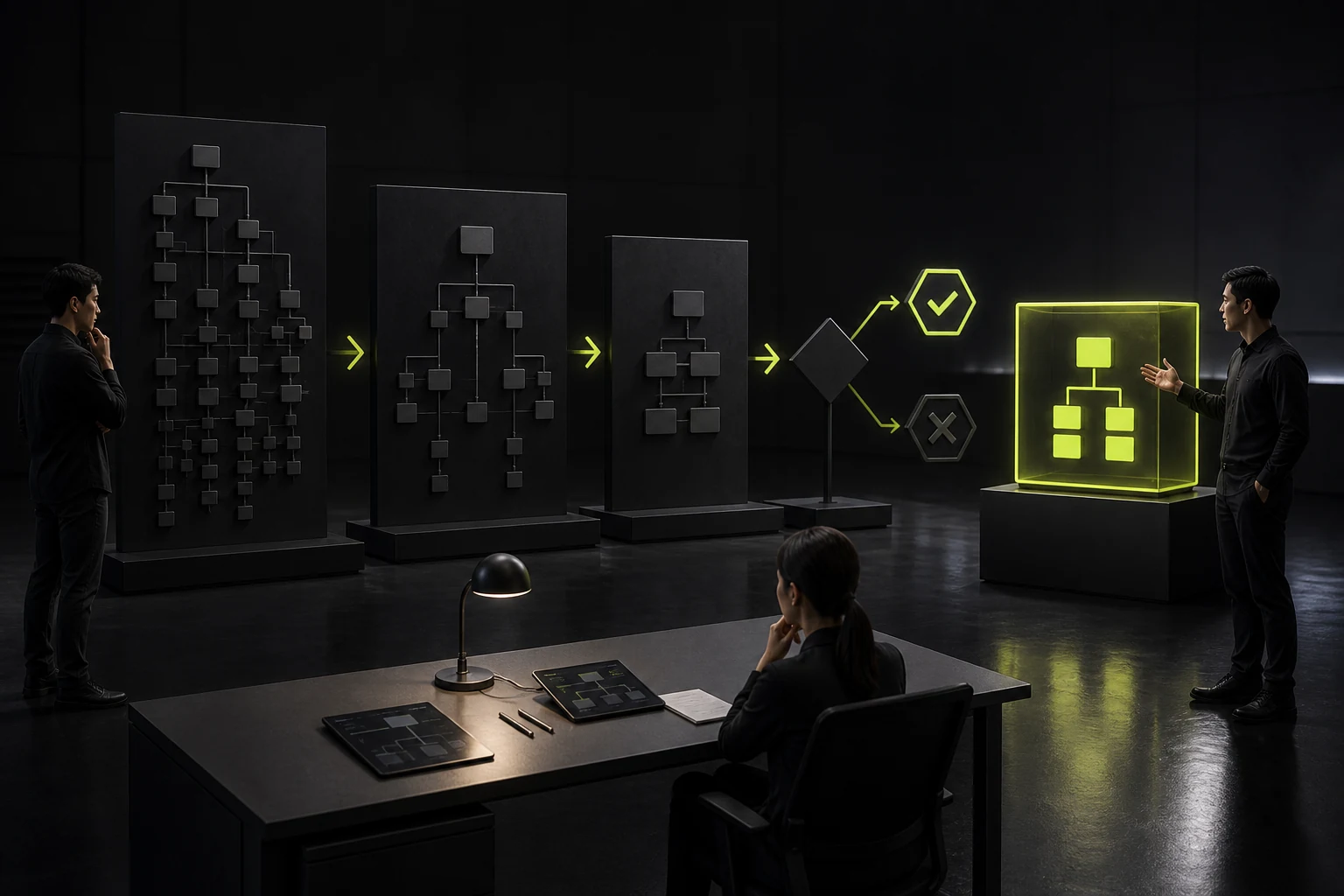
03 Control the Hierarchy Instead of Letting Tree Menus Grow Indefinitely
One or two levels are usually easier to scan. Tabs within pages, object details, and local navigation can handle the third level and beyond. When a left-side menu expands five levels deep, users struggle to maintain a sense of location.
Group labels should carry clear meaning. Do not use buckets such as “Other,” “General,” or “System Management” to absorb every new module. If a group keeps expanding, its boundaries need to be reworked.
04 Separate Global Navigation from Object-Level Navigation
Global navigation switches among primary modules. Overview, activity, contracts, and permissions within an object detail page belong to local navigation. Putting every object subpage into the global menu creates duplicate structure.
After users enter a specific customer or project, preserve that object context so they do not have to return to the list repeatedly when moving across tabs.
05 Search, Commands, and Favorites Supplement Navigation; They Do Not Fix a Poor Structure
Systems with many modules can offer global search, a command palette, recently visited items, and favorites. These features make frequent expert users faster, but new users still need an understandable foundation.
Search results should distinguish customers, orders, pages, and actions while showing the matching scope. Commands must account for permissions, confirmations, and shortcut conflicts.
06 Breadcrumbs and Back Actions Should Preserve Work Context
When users enter a detail page from a list and then move to a related order or approval, returning should preserve filters, pagination, and scroll position. A basic browser back action that loses these conditions forces users to repeat work.
Breadcrumbs are useful for expressing hierarchy, but cross-object tasks also need recent items, contextual tabs, or task queues.
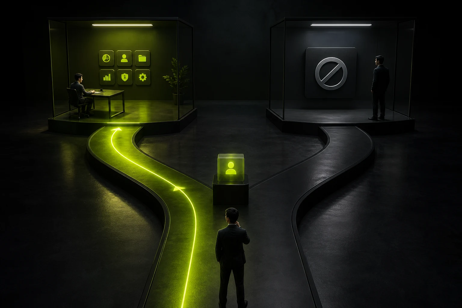
07 Beyond Hiding for Permissions, Explain Why Something Is Unavailable
You can hide modules a user is entirely unauthorized to access. When users know a capability exists but temporarily lack permission, consider showing a disabled entry and a way to request access. If every entry is hidden, users may assume the system lacks the capability.
Navigation should update promptly after permissions change, preventing users from learning about the change only through an error on the destination page. Administrators also need a way to preview the structure seen by different roles.
08 Validate Grouping with Card Sorting and Tree Testing
Ask target users to categorize and name modules or tasks. Then use tree testing to have them find entry points in the structure without visual distractions. Categories created by internal teams often differ from users’ language.
A complex B2B system does not need complete agreement among everyone. Instead, observe whether users can consistently find frequent tasks and whether role-based navigation can resolve differences among roles.
09 Establish Governance Rules for Future Modules
A new module should enter primary navigation only when it meets criteria such as frequency of use, cross-role value, and status as an independent object. Temporary campaigns, infrequent settings, and single functions should not keep occupying the main menu.
Review menu usage, searches, favorites, and unclicked entries each quarter. Merge duplicate groups and remove retired functions. Navigation requires ongoing governance, not a one-time design effort.
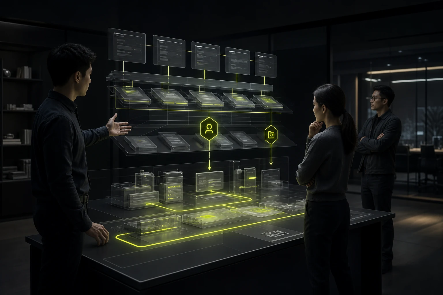
10 A Navigation Redesign Must Account for Links and Personal Workspace Migration
Existing users may have saved browser bookmarks, system shortcuts, favorite views, and common filters. If a navigation change invalidates every URL, experienced users lose the paths they built for their work.
Preserve redirection for key deep links where possible, and create sensible mappings for old paths. Migrate favorites and recent items or explain the change in advance. Paths in training materials, support scripts, and operating manuals also need to be updated.
Navigation is not an isolated interface. It connects many implicit documents and habits across an organization. A migration checklist prevents scattered fixes after launch.
11 Validate Menu Labels Against Real User Language
Internal project names, abbreviations, and organizational terms may mean nothing to new users. Collect the words users employ in training, support tickets, and everyday communication, then compare them with system labels.
Labels should be accurate, concise, and distinguishable from neighboring modules. Provide first-use explanations when necessary, but do not use long labels to compensate for structural issues. When terminology changes, update search aliases so existing users can transition smoothly.
12 Review Navigation Data as the Business Changes
New product lines, organizational changes, and permission updates all affect entry points. Regularly examine unclicked menu items, frequent search terms, return paths, and unauthorized access attempts. Adjust groupings promptly instead of allowing the menu only to grow.
Frequently Asked Questions
How many items can an admin system’s left-side menu contain?
There is no absolute limit, but the menu must remain scannable, clearly grouped, and controlled in depth. For many modules, combine role-based navigation with search and favorites.
Should unauthorized menu items be hidden or disabled?
Hide items that are entirely irrelevant. If users might request access or need to understand a process, show a disabled item and explain the permission requirement.
Should admin navigation be at the top or on the side?
It depends on the number of modules, hierarchy, screen, and tasks. Multi-module B2B systems often use side navigation, while a top bar suits a small number of primary modules or global actions.
Can search replace menus?
Not entirely. Search helps experienced users arrive quickly, while a clear structure still supports learning, discovery, and a sense of location.
How do you validate whether navigation works?
Use task analysis, card sorting, tree testing, usability testing, and real menu click data.
Service | View |
|---|---|
B2B and Admin System UI/UX Design | |
Information Architecture and Navigation Optimization | |
Project Consultation |
 Link copied








