After removing the Focus Outline from the browser, do keyboard users still know where they are? The focus design is interaction, not an "ugly blue box"
Mouse users have a cursor to tell them where to click, while keyboard users rely on the focus indicator to achieve the same positioning. Removing the default outline without an alternative is equivalent to hiding the cursor. The vision of Focus doesn't necessarily have to be the blue box of the browser, but it must be continuous, clear and predictable.
01 WCAG 2.2 requires that the focus be visible during keyboard operations
The W3C Focus Visible success standard requires that any keyboard-operable interface has visible indications in the keyboard-focused state.
"outline: none" itself is not absolutely wrong, provided that you provide an alternative focus style that is the same or clearer. In reality, many projects only complete the first half of the sentence.
02 Focus and Hover cannot be used to be exactly the same
Hover only appears when the mouse passes over it, while Focus may come from tabs, shortcuts or program navigation.
The two can be visually related, but the Focus must be stable and distinct enough not to disappear when the mouse moves away.

03 The Tab order should be consistent with the visual and task order
Using CSS visual rearrangement while keeping the DOM in a completely different order will cause the keyboard focus to jump around on the page.
Avoid abusing positive tabindex. A better approach is to organize the DOM itself in the order of reading and then express the visual through the layout system.
04 When opening the Modal, bring the focus in and avoid going to the background page
When a keyboard user opens a dialog box and continues to Tab to enter the covered page content, they will lose the context. The common practice is to Focus Trap and return the focus to the trigger button after closing.
This requires development and implementation, but the design draft should specify the initial focus position, closing method and keyboard behavior.
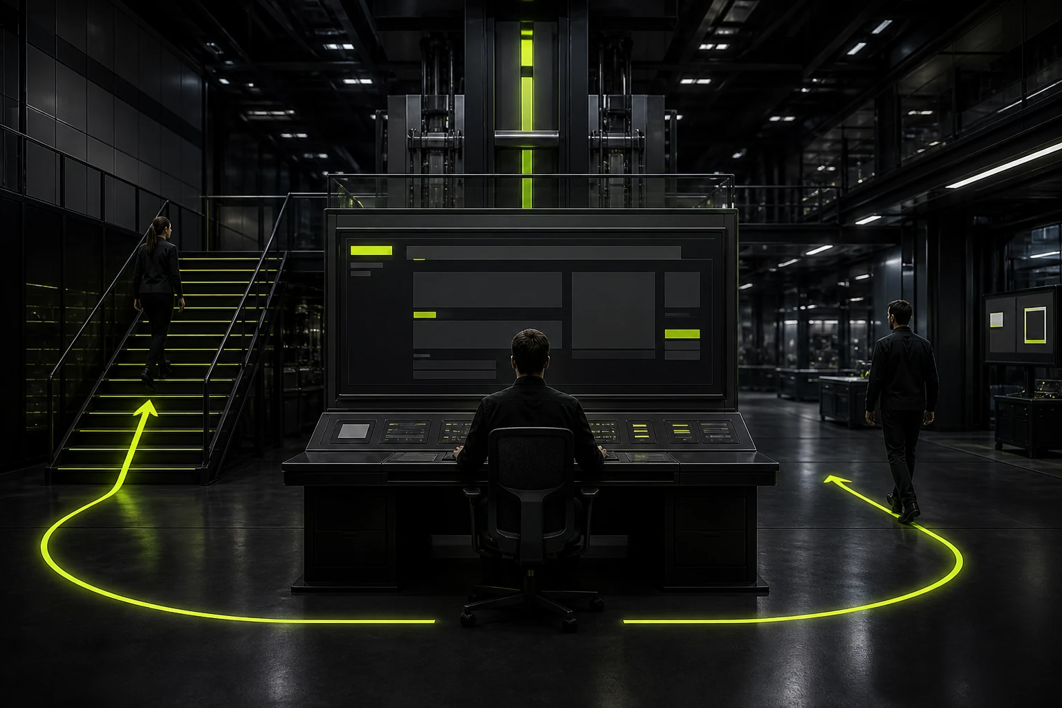
05 Long pages require a Skip Link to help skip repetitive navigation
Each time a keyboard user opens a new page, they have to Tab 20 times to bypass the Header, which is a clear burden.
"Skip to main content" can be displayed when the focus is gained, allowing users to directly enter the main text. It usually does not interfere with mouse vision.
06 :focus-visible can prevent unnecessary focus styles from appearing after mouse clicks
Modern browsers support the focus-visible pseudo-class to display the focus more intelligently based on the input method.
This way, both design aesthetics and keyboard usability can be met simultaneously, and there is no need to use "mouse users don't like the blue box" as a reason to remove the focus.
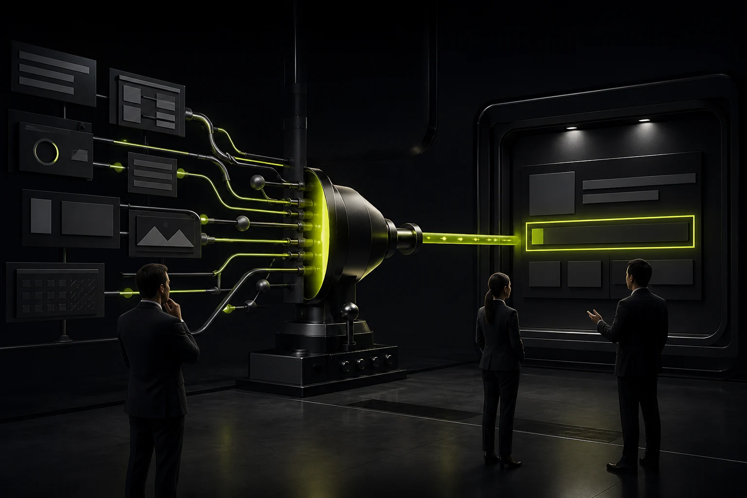
07 SPA routing and dynamic content require active management focus
Traditional page jumps will reload. For single-page applications, even after changing the content, the focus may still remain on the buttons that have disappeared.
Key view switches should determine where the focus goes, such as moving to a new page title or the main container, and provide a clear context for screen readers.
08 The simplest QA method: Put down the mouse and complete the task with just the keyboard
From login, navigation, filtering, opening the Modal, submitting the form to closing the prompt, the entire process only uses Tab, Shift+Tab, Enter, Space, and Esc.
If the designer himself doesn't know where the focus is now, of course the user won't know either. Keyboard testing should be included in the regular design acceptance process.
09 The focus style should be the component state, rather than the final unified CSS completion during development
The Focus appearance of Button, Link, Input, Tab, and Menu Item needs to match the shape and background of the component. A uniform external glow for the entire site may be clear on light-colored buttons, but it is completely invisible on brand-colored cards.
The design system can define the width, spacing, color and high-contrast alternatives of the Focus Ring, allowing developers not to temporarily guess for each control.
10 The keyboard experience also includes closing, returning, and focus recovery after an error
If only red text appears at the top of the page after the form submission fails, keyboard users may not know what has happened. After closing the pop-up window, if the focus jumps back to the beginning of the page, it will also interrupt the task.
Therefore, Focus management should be designed together with status feedback: locate the error summary or the first problem field when an error occurs, and return to the original trigger position after completing the temporary task.
Frequently Asked Questions
Can the default blue Outline in the browser be removed?
Sure, but a clearly visible alternative Focus style must be provided.
Can "Focus" and "Hover" be the same?
Similar visuals are possible, but Focus must remain visible throughout keyboard operations and should not rely on the mouse.
Can Tabindex=1, 2, 3 control the order?
Technically, it is possible, but it is generally not recommended to rely on positive tabindex. Prioritize making the DOM order itself reasonable.
Why does Modal need Focus Trap?
Prevent the keyboard focus from entering the occluded background content and maintain the context of the dialogue task.
Will Skip Link affect vision?
It can be hidden by default and displayed when the keyboard gains focus, thus not significantly interfering with the normal visual layout.
| Related Service | Learn More |
|---|---|
| UI/UX Design Services | View Service Details |
| Project Consultation | Contact JVDS Design Studio |
| Design and Website Development Articles | Read More Related Articles |
 Link copied