How to design the parameter table of an enterprise's corporate website on a mobile phone? Responsive and accessible processing methods for complex tables
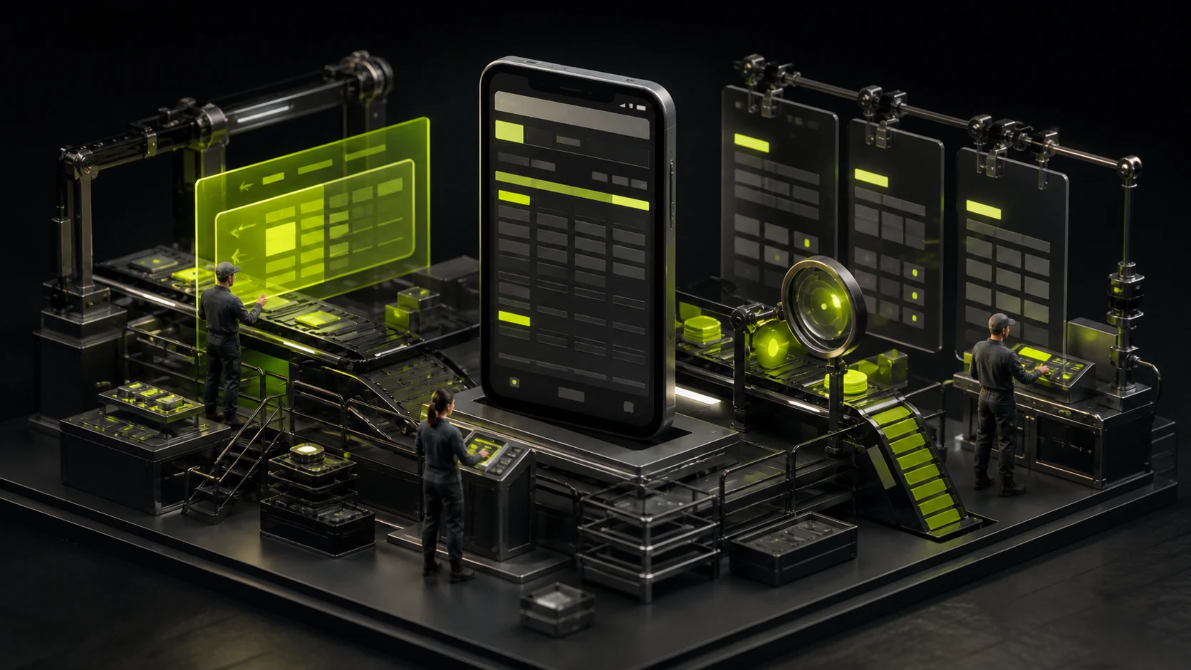
When the 8-column specification table on the desktop is shrunk to the mobile phone screen, the most common result is that the text is squeezed into several lines, the font size becomes smaller, and users do not know which table header each value corresponds to. Responsive tables are not about "letting it fit", but rather redefining how users compare and read on small screens.
01 First, confirm whether this set of content is "true table data"
The W3C's Table Accessibility tutorial emphasizes that tables should be used for data with row-column relationships rather than for page layout. Enterprise product pages often incorporate "product features, ICONS, and descriptions" into tables as well. In fact, these are more suitable for lists or cards.
A table is correctly expressed only when users need to cross-understand data through rows and columns, such as model × parameter, year × indicator.
02 On the desktop, horizontal comparison is possible, while on mobile devices, one usually has to choose between "maintaining the relationship" and "reducing information"
It's natural to view 6 to 10 columns of complex specification tables at once on the desktop, but mobile phones cannot offer the same view. Common solutions include horizontal scrolling, carding, group folding, and two-column comparison.
No single solution is suitable for all scenarios. When users need strong comparisons, horizontal scrolling can better preserve column relationships. When users mainly read individual models, it is easier to make them card-based.
03 When scrolling horizontally, let the user know "You can still scroll here."
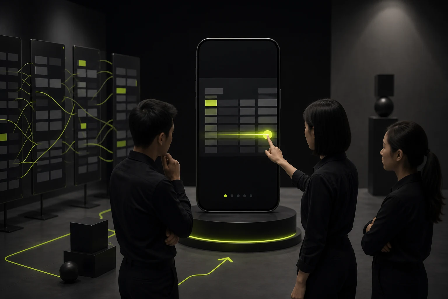
If the content on the right side is completely cropped without any visual cues, many users will not realize that the table can scroll horizontally. You can expose a part of the next column, add a fade-out edge or a brief prompt.
At the same time, consider fixing the first column or the key model name; otherwise, when the user slides to the right, they won't know what the current row represents. The fixed area should not be too wide to avoid the remaining visible area being too small.
04 Carding is not simply piling each cell into a "label: value"
When converting a line of parameters into a card, it is necessary to redetermine which fields are the most important. Repeating 20 labels on each card will make the page extremely long.
5 to 8 key indicators can be displayed first, and then the complete specifications can be provided. If users need to compare multiple models, the card mode should add "Add Comparison" instead of allowing users to switch by memory.
05 The key to accessibility lies in the programmatic association between table headers and data
Visually bolding the first row does not mean that there is a header technically. The W3C recommends using correct structures such as th and scope to enable screen readers to determine which row or column header a certain piece of data corresponds to.
Complex multi-level headers require joint definition by development and design. Don't split it into multiple unrelated Divs just for visual effects, and eventually cause the assistive technology to lose its row-column relationship.

06 Do not trade extremely small font size for "look complete"
Some mobile tables shrink 14px characters to 10px just to maintain the same number of columns. This is equivalent to shifting the responsive problem onto the user.
It is better to allow horizontal scrolling or hide low-priority fields than to make the core specifications difficult to read. The numerical units, negative signs and decimal points should be kept particularly clear.
07 Important specifications should provide download or copy capabilities
B2B customers often need to send parameters to purchasers, engineers or enter them into their own comparison tables. Providing PDF data sheets, Excel, copying model numbers or downloading specification sheets can prevent web pages from undertaking all the in-depth work.
However, the downloaded file itself should also be kept updated. It is not allowed that the web page has changed its parameters while the PDF is still the version from two years ago.
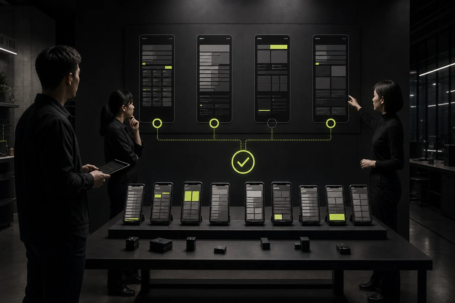
08 Design acceptance should use real extreme data rather than neat examples
Test for extra-long models, null values, negative numbers, maximum values, different units, mixed Chinese and English, and 320px small screens. Only real boundary data can expose column width, line break and overflow issues.
The quality of complex table design rarely depends on the border color, but rather on whether users can still accurately understand "who this value belongs to, what it represents, and how to compare it next" on different devices.
09 Number alignment and unit consistency will directly affect comparison efficiency
It is best to keep the numbers in the parameter table uniform in decimal places and units, and consider right-aligned or equal-width numbers to make it easier for users to make vertical comparisons. Do not mix mm, cm and m in the same column unless the conversion relationship is clearly defined.
If some parameters contain ranges, such as 10-40°C, dashes, minus signs and units should be checked in different fonts and languages to avoid looking like typesetting symbols rather than data.
10 The printing and copying scenarios also fall under the category of professional website experiences
Engineering and procurement users often copy a line of specifications to emails or documents. If a table relies on a large number of visual ICONS, floating prompts or colors, its semantics will be lost once it is copied.
Therefore, key values should exist in text form as much as possible, with ICONS serving as an auxiliary. The print style can also hide navigation and irrelevant marketing modules, keeping the specification sheet readable on paper or in PDF.
Frequently Asked Questions
Must the mobile parameter table be changed to a card?
Not necessarily. When horizontal comparison is needed, it might be better to keep the table and allow scrolling. Cards are more suitable when single-item reading is the main focus.
Can some columns be hidden?
Sure, but it should be based on priority and provide a way to view the complete specifications to avoid hiding key fields that affect decision-making.
Will the experience be very bad if the table scrolls horizontally?
If the user clearly knows that it is scrollable, the key headers remain visible, and the column width is reasonable, horizontal scrolling can be the most reliable solution.
Does the table have to use HTML table?
Semantic tables are usually the most appropriate when the content has a real row-column relationship. Complex custom components should also retain equivalent accessibility semantics.
Does the specification sheet need to be provided in PDF format?
It is of great value for B2B and professional procurement, especially when users need offline review, internal circulation or printing.
| Related Service | Learn More |
|---|---|
| UI/UX Design Services | View Service Details |
| Project Consultation | Contact JVDS Design Studio |
| Design and Website Development Articles | Read More Related Articles |
 Link copied