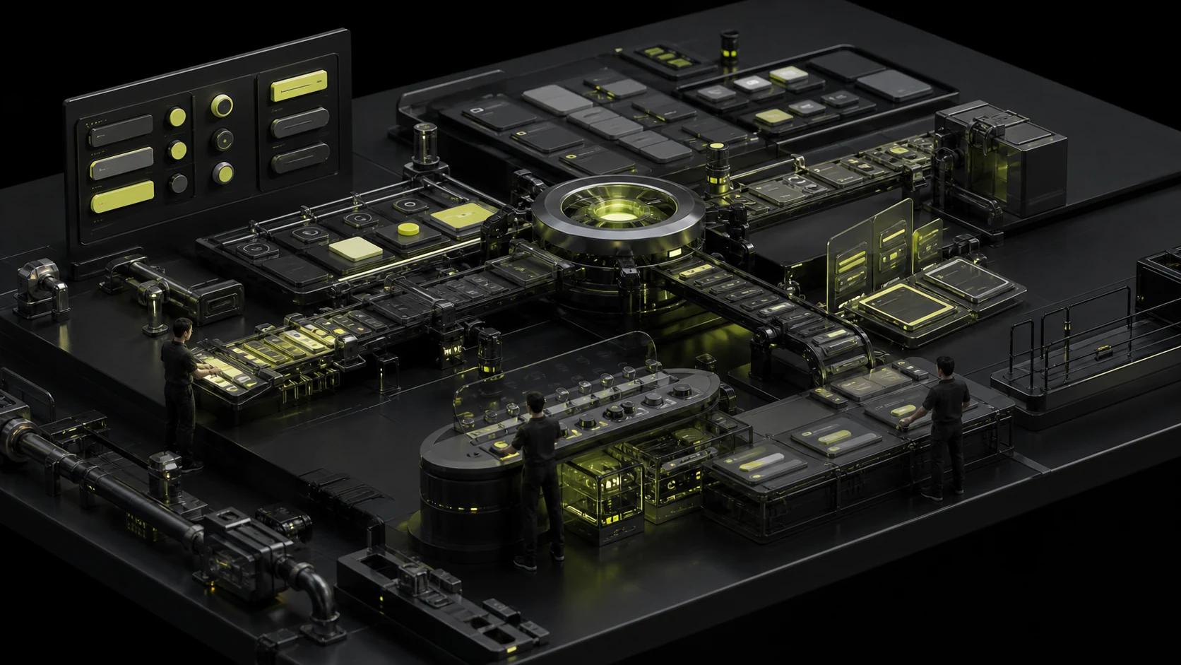
Why is the component status always patched during the development stage? Buttons, input boxes and cards should at least have all these states designed completely
In the page draft, the buttons are always in the default state and the input boxes always have beautiful sample text. After the actual launch, Hover, Focus, Loading, Disabled and Error will all be temporarily added by the developers. Ultimately, the "poor fidelity" is merely a superficial phenomenon. The root cause is that the design has never described what would happen to the components in real interactions.
01 The default state only accounts for a small part of the actual usage by users
A button in a real product may be hover over with the mouse, focused on with the keyboard, pressed, wait for requests, or become unoperable. An input box will be empty, focused, filled in, incorrect, disabled, or read-only.
If the component library only provides Default, developers can only complete the remaining states based on experience. Different developers will produce different implementations, and the larger the product, the more obvious the differences will be.
02 The interaction state and business state should be defined separately
Hover, Focus, and Pressed belong to interactive states. Success, Error, and Warning often express business semantics. "Selected" and "Expanded" express the state of the component itself. If you cram all of them into a Variant attribute, it's easy to have dozens of combinations.
When designing a system, one should first understand the state dimensions and then decide which ones need to be combined and which ones are mutually exclusive. It's not the case that the more variants there are, the more complete it is.
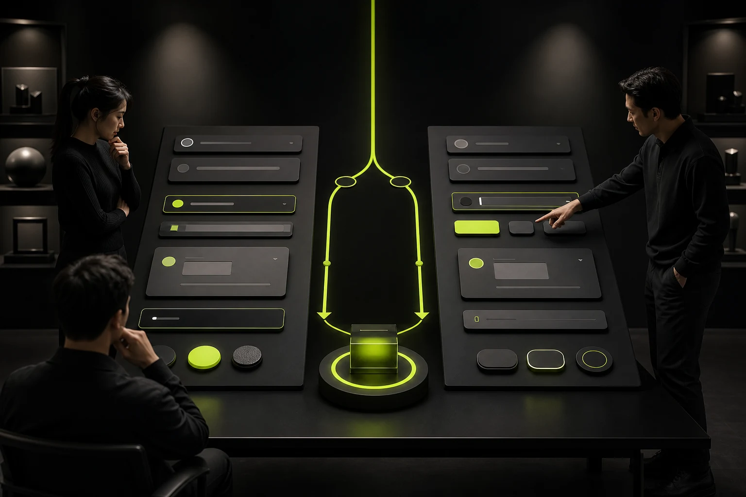
03 Focus cannot be equated with Hover
Mouse Hover indicates the pointer passing by, while Focus may come from keyboard tabs, scripts, or other input methods. The user demands of the two are different.
If the design only focuses on Hover, keyboard users may not be able to see the current position at all. The Focus style should be clear, stable, and meet the requirements of barrier-free contrast and visibility, rather than being removed for visual simplicity.
04 Disabled should not be an excuse for being "too gray to see"
Disabling a control requires expressing that it is currently not operable. However, if the text and ICONS overly reduce the contrast, users may not even understand what the original function was.
More importantly, explain "why it is not available". For instance, when the submit button is Disabled, if the user is unaware of which field is still missing, "Disabled" merely blocks it. In many scenarios, buttons can be retained to be clickable and provide clear verification after operation, rather than being grayed out forever.
05 In the Loading state, it is necessary to prevent repetitive operations and maintain layout stability
After the request is submitted, if the button text disappears or the width suddenly narrates, the page will jump. Loading should usually maintain the button size, clearly indicate that it is being processed, and prevent users from repeatedly submitting continuously.
Tasks that take a long time also require timeouts, cancellations, or background operation plans. A Spinner that is always rotating is not in a complete state.

06 The Error state should contain information, not just the border turning red
The red border only indicates "There is a problem here", but does not tell the user what the problem is. The error status should include specific copy and, if necessary, explain how to correct it.
At the same time, don't rely solely on color. ICONS, text and programmable error associations can help more users understand. Form errors should be placed close to the corresponding fields rather than all concentrated at the top of the page without being located.
07 The component documentation should specify the state trigger conditions
Drawing a row of states in the design draft is only the first step. Development needs to know when to enter Loading, when the condition is Disabled, and when to use Warning instead of Error.
These rules can be written in component descriptions, Figma annotations, or Storybooks. The clearer the state definition is, the more consistent the implementation across teams will be.
08 Use the actual process acceptance status combination instead of just looking at the component display page
Individual Button Stories all seem correct, but when placed in forms, pop-ups, or tables, they may experience loss of focus, Loading occlusion, or become Disabled and unclear.
Therefore, when designing system QA, it is necessary not only to test the components themselves but also to check the state changes in real tasks. Components are languages, and the ultimate experience occurs within sentences.

09 The words "Selected", "Checked", and "Active" need to have a unified semantic meaning within the team
In design documents, it is common for the same state to be called "Selected", "Active", or "On" by different people, while developers use "Checked". Confusing names can make it difficult for component APIs and design attributes to correspond.
The team can create a state dictionary: Toggle with on/off, Checkbox with checked/unchecked, Tab with selected, and navigation items with current. Semantic consistency will directly reduce delivery communication.
10 The visual differences between states should match their importance
Hover only needs slight changes, Focus must be visible enough, and Error needs to be clearly warned. If all states use strong brand colors, users will be unable to determine which one is more important.
Hierarchy can be established from multiple dimensions such as background, border, text, shadow and icon, rather than only changing the transparency of each state.
11 Only by writing the status into the test case can it be truly implemented
The design acceptance list can clearly state: whether the keyboard tabs have Focus, whether Loading is displayed when the network is slow, whether the buttons are restored after a failed request, and whether they are still readable when Disabled.
Once the status enters QA, it changes from "designer suggestions" to product quality standards, and cross-platform consistency is also easier to maintain.
Frequently Asked Questions
What are the minimum states that a button needs to be in?
Common ones include default, Hover, Focus, Pressed, Disabled, and Loading. Whether more is needed depends on the platform and the business.
Does the mobile device need Hover?
Touch screens do not have traditional Hover, but the same component may be shared on the desktop and mobile, so the state system should take platform differences into account.
Must the transparency of the "Disabled" button be reduced?
Not necessary. The goal is to express inoperability while maintaining understandability.
Must the error be in red?
Red is a common semantic color, but it cannot be relied solely on the color; text or ICONS should also be provided simultaneously.
Should all component states be made into Figma Variant?
Not necessarily. It is determined based on the dimension, the number of combinations and the frequency of use to avoid Variant explosion.
| Related Service | Learn More |
|---|---|
| UI/UX Design Services | View Service Details |
| Project Consultation | Contact JVDS Design Studio |
| Design and Website Development Articles | Read More Related Articles |
 Link copied