An article cover looks attractive but unrelated: how should website images address the reader's question?
When an attractive cover seems unrelated to an article, the image task is often undefined. Image planning should first ask what problem the reader is solving, which relationship the image helps explain, and where it belongs. Unify colors and style after defining these tasks.
Corporate website images may identify a topic, explain steps, present evidence, or support comparisons. Four images of "businesspeople looking at screens" satisfy a count but may help less than one clear diagram.
Turn the article question into a relationship that can be pictured
Before choosing images, summarize the core task in one sentence: "Turn vague requirements into a verifiable checklist," "Compare product suitability," or "Distinguish completed work from unconfirmed outcomes." This guides imagery better than "technological" or "premium."
Then find objects and relationships in the text: who operates on what, which information belongs together, and which conditions determine the next step. Beyond typical objects associated with a topic, depict the differences this article actually explains. Publication scope may center on selected and unselected objects, rather than a generic website screen.
For an article explaining bilingual readiness, distinguish complete translations, missing materials, and confirmed content. A world map signals internationalization but does not show the readiness decision at issue. A map may be useful, provided its task is defined.
Temporarily remove an image and read the nearby text. If nothing is lost, it may mainly decorate; if relationships become hard to imagine, there is explanatory potential. Define its role before visual emphasis without presenting every image as indispensable evidence.
For each important image, write a brief: main objects, their relationships, the decision readers should understand, and facts it must not imply. Then choose photography, conceptual illustration, or a real interface. Avoid acquiring imagery first and forcing the article's explanation to fit afterward.
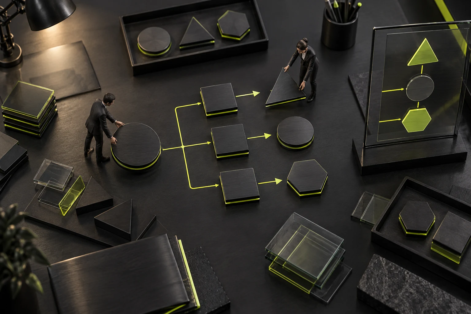
Covers summarize the topic; body images explain different questions
Covers appear in lists and shares and usually need quick topic recognition. They can summarize the main objects and tension, without relying on tiny text, complex screenshots, or dozens of symbols. A clear subject at thumbnail size suits this location.
Body images can be more specific because nearby text provides context. Explain scope, process, and result checking separately rather than redraw every cover element three times. Distinct tasks provide new information as readers continue.
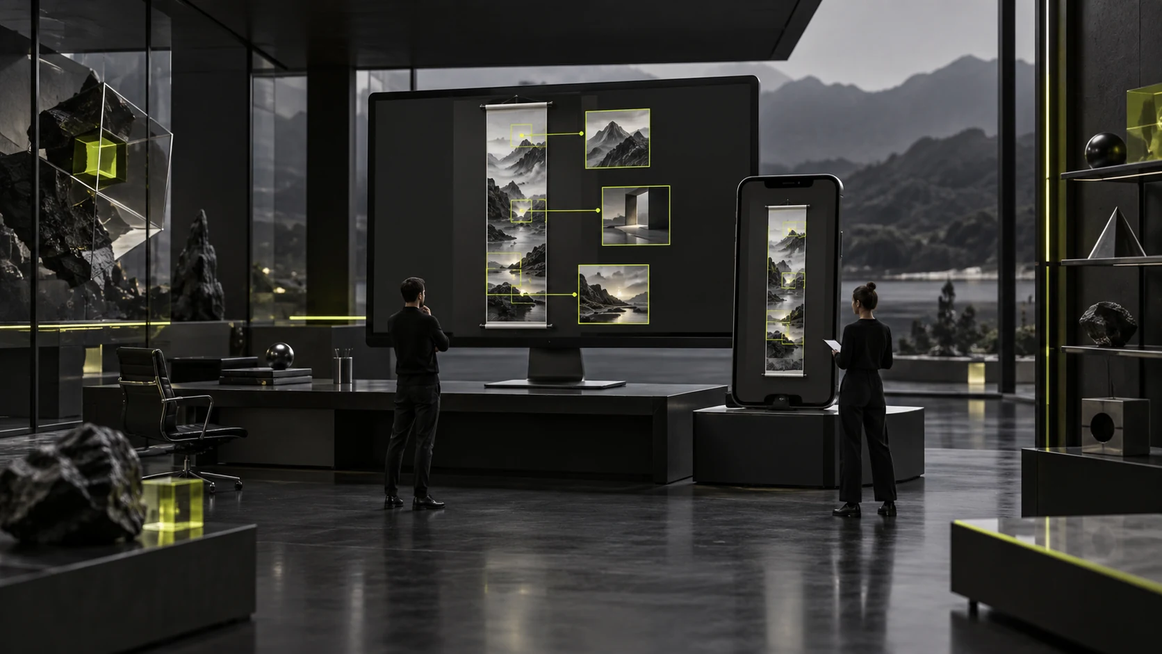
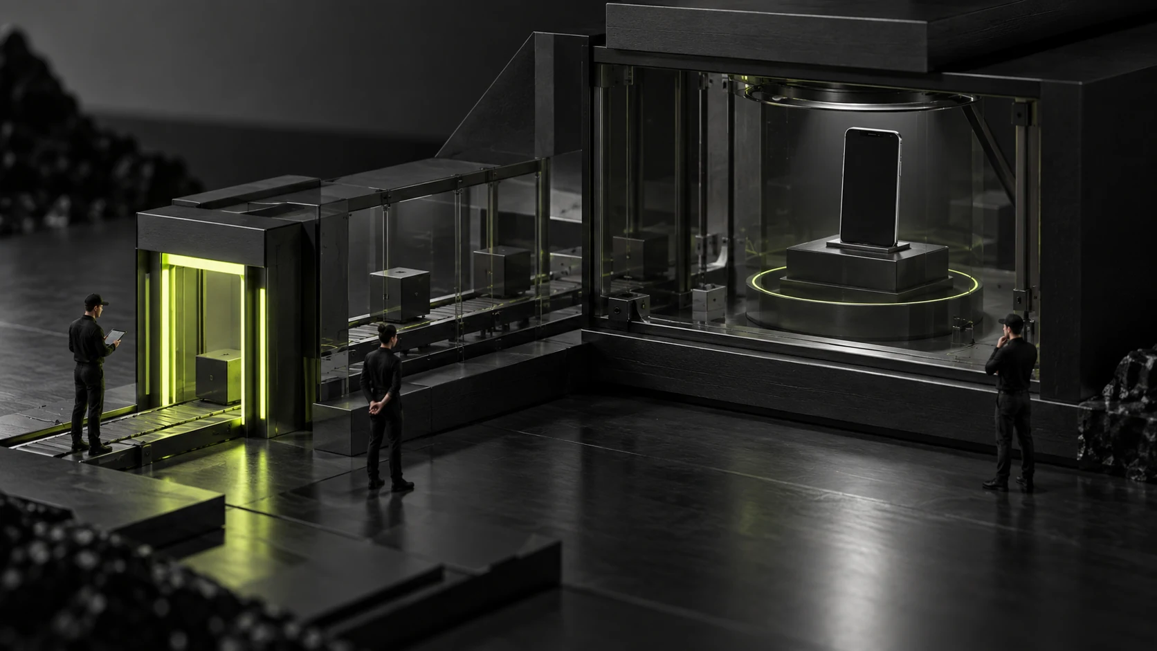
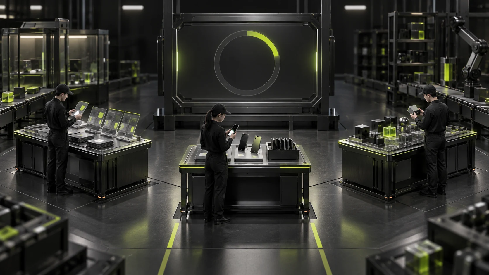
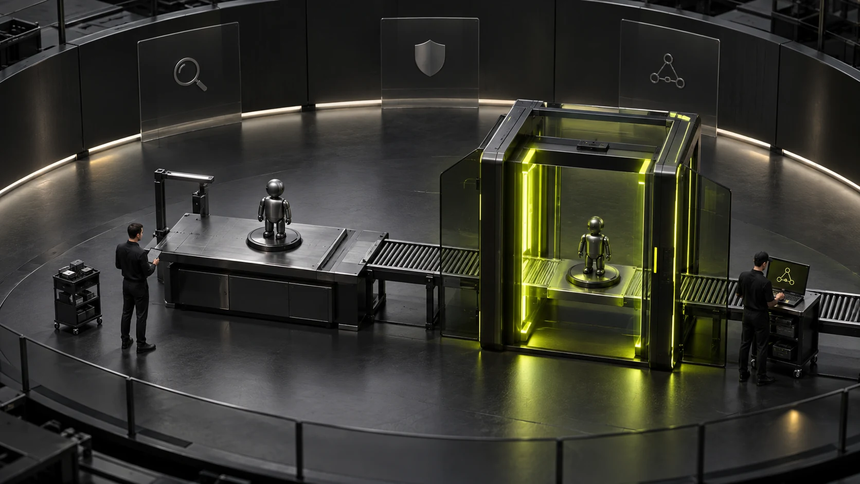
For a hypothetical redesign-requirements article, the cover might show scattered content becoming structured. The first body image shows tasks and boundaries, the second specific operation scope, and the third acceptance checking. This is one division of roles, not a compulsory process for every article.
Image count depends on content needs and editorial standards together. If three body images are required, find three aspects needing explanation. A changed angle on the same image does not constitute three explanations. Leave unnecessary visual detail to text and focus images on key relationships.
Place an image near its relevant passage: introduce the question before it, then continue with decisions or actions afterward. Putting every image at the opening makes readers return there when they reach the relevant sections.
Conceptual illustrations explain relationships; real screenshots provide evidence
Conceptual illustrations make abstract processes tangible, but demonstrate a representation rather than actual company use of a system. A beautiful generated CMS model cannot substantiate a claim that its features are implemented in the real CMS.
Screenshots demonstrating operation results should come from the actual checked page, with version, time, and displayed scope confirmed. They establish visible status but may not prove completion of the whole process. The article still needs to explain what was checked.
For hypothetical processes, captions can explicitly say "Conceptual illustration" or "Example workflow." Avoid realistic customer names, order values, or growth curves that may suggest real performance evidence even without a textual promise. See Should Website Content or Design Come First? for related checks.
Different assets must not impersonate one another. A stock meeting room is not your team's workplace; an imported demonstration template is not commissioned client work; simulated charts must not imply actual business results. Show conditions and tradeoffs to demonstrate professional judgment without invented persuasive numbers.
Check private information and authorized disclosure in real screenshots too. Handle undisclosable parts according to project agreements. A local image file is not automatically suitable for public publication.
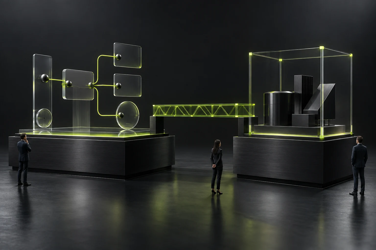
Unify visual language while retaining each article's own image task
Similar materials, colors, viewpoints, and figure scales help readers identify a series. But if every article shows people around a glowing cube, topics remain indistinguishable. Consistent style does not replace accurate planning.
Vary subjects, spatial relationships, and camera views. Organizing information uses groups and correspondence; selecting scope uses inclusion and exclusion; acceptance uses operations matched to results. Let relationships follow the article while materials and colors remain consistent, creating both a series and distinct content.
Review a group of images together and compare subjects and actions. If only filenames distinguish different articles, return to their topic relationships. If four images in one article show the same action, reduce repetition. Consistent materials and colors with different information structures preserve category recognition better than random color changes.
Specify constraints too. Conceptual illustrations may not need readable text, client logos, or fake code; screens can use simple geometric blocks. Explain critical conditions in the article so pseudo-text in generated images does not conflict with real terminology.
Figures should support the explanation, with clear positions and actions. Do not add many characters merely for activity, obscuring main objects. The brightest area should correspond to the image's focus rather than unrelated background decoration.
When using generation tools, prompts must still contain the specific article task. Reusing style text and replacing a keyword often produces consistent-looking images explaining the same generic idea. Check relationship accuracy when selecting results, beyond refinement.
Alt text, captions, and articles should serve distinct reading needs
Alt text accurately describes an image according to its role on this page. Informative images need their key objects or relationships described. Purely decorative assets should use appropriate empty alternatives under the page implementation, avoiding repeated descriptions with no information. See How to optimize the images on the corporate website? It's not the case that the smaller the pressure, the better: clarity, loading speed, SEO and accessibility should all be addressed simultaneously for related checks.
A grouping diagram can say "Pending content divided into complete, untranslated, and awaiting-confirmation groups." This is clearer than a pile of "multilingual website, web development, SEO." Do not add conclusions absent from the picture, such as "efficiency doubled" or "customer satisfaction increased significantly."
Captions can explain source, scope, and illustrative status. The article provides full explanation. Alt text need not contain the entire workflow, and one passage should not be copied into both alt text and caption. Maintain a clear reading path without repeating the full article at every image.
On small screens, check that cropping preserves key relationships. Cover crop rules may differ from body images; a complete editor view does not guarantee the list thumbnail retains the subject. Important relationships should not depend on tiny edge objects or extremely thin lines.
For steps and exact numbers, use clear text or suitable charts rather than hide detail in conceptual imagery. Images help understanding, while the article should still let readers complete the main task.
Check correspondence between text and images before launch
Place the article and images on the actual page and ask for each: which passage does it explain, what can readers understand, does it repeat the previous image, and does it imply unoccurred facts? If the only answer is "beautification," reassess its placement or content.
Then check files and sequence, whether the cover is duplicated in the body, saved alt text, and thumbnail and mobile display. If text changes a key decision, recheck images instead of retaining an earlier workflow diagram automatically.
Keep brief asset records: article, purpose, related passage, original source, uploaded version, and confirmer. Later updates can then identify replacements and avoid same-name files leaving old public images in use.
Completion means the cover identifies the topic, body images add understanding individually, and conceptual imagery and evidence are clearly distinguished. Images need not all be complex, but each should have a known reason for appearing.

Frequently asked questions
Must the cover show the article keyword as text?
Not necessarily. Objects and relationships can express the topic while the page title supplies text. Words in small images are often unreadable and should not be the sole basis of recognition.
Can one image serve as both cover and body illustration?
Assess its purposes, but duplication may add no value. For a specific body explanation, a separate scene is preferable. If reusing the cover, define its purpose in that location.
Can polished generated images be uploaded immediately?
Also check object relationships, complete figures, pseudo-text, misleading implications, and text-image placement. Visual quality and informational accuracy are separate checks; refinement cannot replace accuracy.
Does every image need long alt text?
No. Describe key content for its current purpose; explain complex relationships in the article. Do not copy keyword lists or whole paragraphs, or force lengthy descriptions onto decorative material.
Should images change when the article changes?
Recheck when processes, objects, conditions, or result relationships change. Wording-only changes may retain suitable images, but captions, alt text, and relevant passages must still agree.
 Link copied