

How to Design a B2B Solution Page: A Complete Structure from Customer Problems to Sales Leads
The purpose of a solution page is not to prove that a company has "many features." It is to help a particular customer quickly confirm: you understand my problem, you can solve it, you have evidence, and I know how to evaluate the next step.
B2B websites often fall into one of two extremes. One is a product catalog that merely lists features and specifications. The other is brand promotion filled with words such as "empowerment," "leadership," and "innovation" but no specifics. A solution page exists to translate product capabilities into customer situations. It connects marketing with sales conversations, allowing visitors to complete an initial assessment without a salesperson beside them.
01 The Bottom Line
• Write about the customer's task and business constraints before describing your own product modules. That order matters.
• A solution page must support a multi-person B2B decision: users, technical evaluators, procurement, and management need different evidence.
• Success does not mean that visitors "read to the end." It means helping them compare, download material, share internally, or begin a consultation.
02 1. Distinguish a Product Page from a Solution Page
A product page answers "What is this and what can it do?" A solution page answers "How do these capabilities work together to solve a problem in a particular industry or business context?" A product page for a data platform, for example, may introduce data ingestion, permissions, dashboards, and APIs. A manufacturing solution page should explain how equipment data is connected, which roles use it, how anomalies are detected, and how the platform works with the existing MES or ERP.
When the two are mixed, visitors must translate the information themselves. Technical specialists may be able to infer applicability from a feature list, but procurement, business owners, and executives rarely have the patience. The page should perform the first mapping for them: how do your capabilities relate to my situation?

03 2. Use the Hero to Prove "This Is for Me" Before Introducing the Company
The most important elements in a solution-page hero are not the company's history but the audience, problem, and outcome. An effective headline often identifies both whom the solution serves and what they need to accomplish. "Help cross-border ecommerce teams manage multi-warehouse inventory and order exceptions in one place" creates a clearer match than "Intelligent Supply Chain Solution." The subheading can add scope, deployment options, or a core differentiator.
For visitors arriving directly from search, advertising, or a sales link, the hero also needs enough context: which company offers this, who it is for, what it solves, and what the next step is. Do not assume they have read the homepage. The solution page is a landing page in its own right.
04 3. Organize Content Around a Chain of Problems, Not the Company Org Chart
Companies often organize material around product lines, departments, and technical modules, while customers think in business problems. The middle of the page can follow a current state–obstacle–solution–outcome sequence: where the process is slow, where risk appears, why the existing method falls short, how your solution intervenes, and what observable change follows implementation.
The outcome does not have to be an exaggerated number. If there is no reliable measurement, do not invent a "300% efficiency gain." Describe verifiable changes instead: replacing manual consolidation across systems with one dashboard, moving approvals from email into a traceable workflow, or expanding a local deployment into multiregion access control. Specific and honest claims build more trust than hollow large numbers.

05 4. Present Product Capabilities After the Scenario and Explain Why They Work Together
Capabilities are easier to absorb once visitors understand the problem. Do not simply arrange six feature cards side by side. Explain the relationships between modules: where data comes from, how it is processed, who sees what, and what happens after an exception. Flowcharts, architecture diagrams, and before-and-after comparisons work well for complex solutions, but every visual needs a written explanation rather than leaving users to guess what the arrows mean.
For technical B2B offers, essential specifications and integration details must not be hidden behind a sales inquiry. Nielsen Norman Group's long-running B2B research emphasizes that business users compare products, build shortlists, and share information with colleagues. Interfaces, compatibility, deployment, certification, and security information that can be disclosed should be available on the page or in downloadable material.
06 5. Prepare Different Evidence for Different Decision-Makers
A B2B purchase is rarely made by one person. Users care about usability, IT about integration and security, procurement about cost and contracts, and management about risk and business value. The page need not answer every detail at once, but it must offer clear routes deeper. Case studies, white papers, technical documentation, certifications, implementation steps, and service scope each serve a different role.
This is also why a trust section matters more than a row of customer logos. Logos show only that some relationship may have existed; a case study explains what was done. If customer names cannot be disclosed, publish an anonymous but specific industry case that describes the context, constraints, implementation, and result rather than removing evidence entirely.
07 6. Design for Internal Sharing: The Page Is Not Only for the Current Visitor
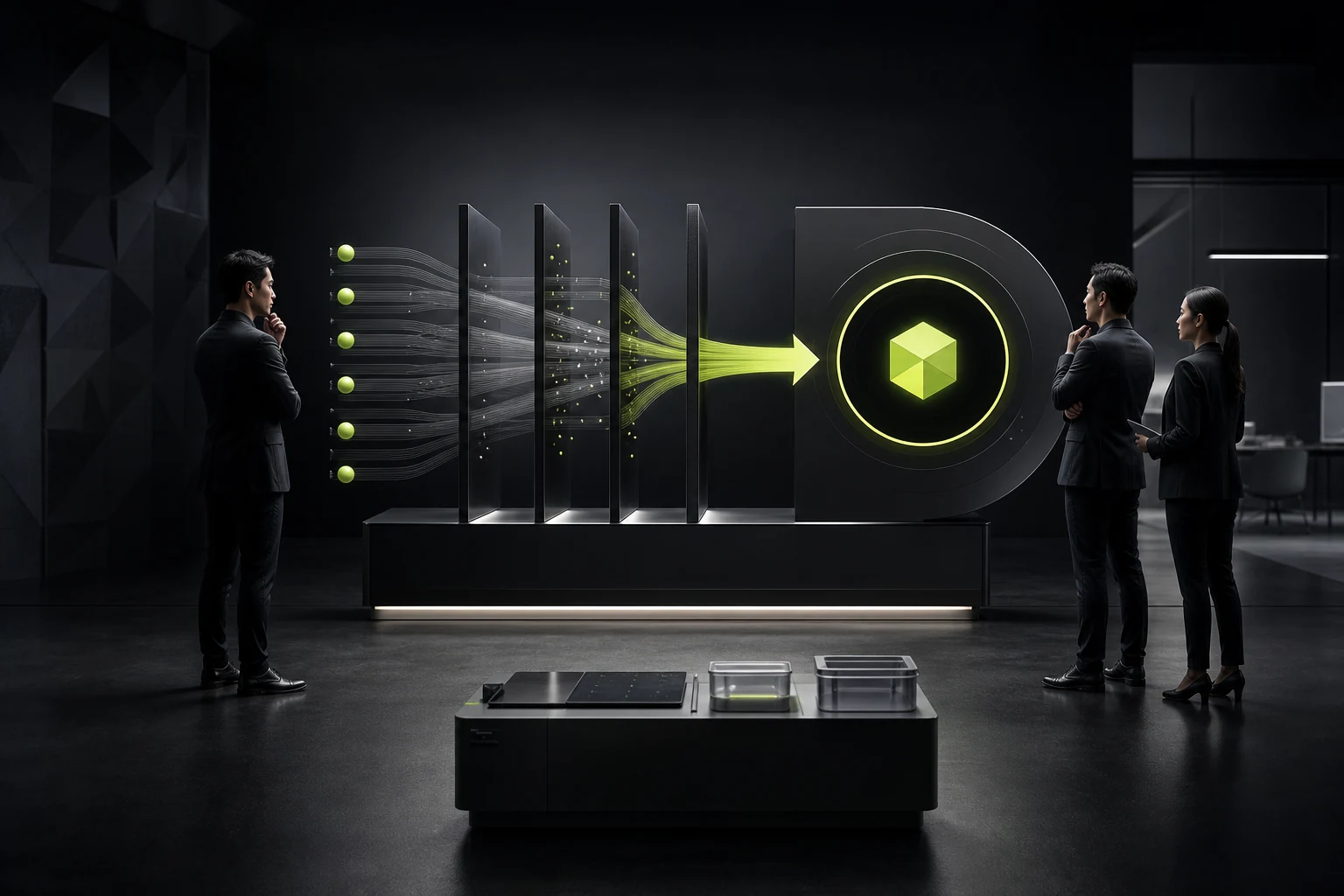
Many B2B visitors are researchers rather than final decision-makers. NN/g's B2B research notes that business purchases often require users to share shortlisted options with colleagues, executives, or committees. The page should therefore be easy to capture, print, share, and download, with a hierarchy that lets someone who missed the earlier research understand it quickly.
Offer a one-page solution overview, a technical PDF, or a concise summary of use cases, core capabilities, typical outcomes, and deployment options. Downloads should not exist solely to force lead capture. If every basic document requires a ten-field form, serious evaluators may leave instead.
08 7. Offer More Than One "Contact Us" CTA
Visitors at different levels of readiness need different next steps. Someone just beginning research may want a case study or technical brief; someone building a shortlist may need a demo; only a visitor with a defined project may be ready to submit requirements. Sending everyone to the same "Contact Us" action creates too much friction.
Use one primary CTA and one or two lower-commitment supporting actions. The primary action might be "Schedule a Solution Consultation," supported by "View a Similar Case Study" and "Download the Technical Overview." CTA copy should describe what the user receives instead of relying on an abstract "Get Started."
09 8. SEO Creates the Entrance, but the Page Must Help People Decide
Google's current people-first content guidance emphasizes original information, complete explanations, and genuine value rather than mass-produced thin pages designed for search traffic. For solution pages, this means not cloning the same template for every keyword and changing only the industry name. Each industry page needs real differences in process, terminology, regulation, cases, integrations, and decision criteria.
If "Healthcare Solutions" and "Manufacturing Solutions" have nearly identical bodies beneath different titles, they neither help customers nor create lasting search value. The strongest SEO for a solution page comes from answering a specific customer problem in depth.
Frequently Asked Questions
Do solution pages and product pages both need to exist?
Usually. Product pages explain the capability itself, while solution pages map capabilities to industries, roles, or business problems. They serve different search intents and decision tasks.
Should a solution page show pricing?
It depends on the business model. A standardized SaaS product can show prices or pricing logic. A complex project should at least explain pricing dimensions, implementation scope, or the factors that affect a quote so visitors are not left without expectations.
What if no customer case studies can be published?
Create anonymous cases that retain the industry, problem, implementation, and outcome. Process demonstrations, technical validation, certifications, and sample data can add evidence as well. Never invent customers or results.
How long should the page be?
There is no fixed word count. Judge it by whether users can make an informed assessment. A complex solution page may be long, but it needs clear navigation, summaries, and hierarchy rather than uninterrupted walls of text.
What is the most important metric for a solution page?
Look beyond pageviews to clicks on key resources, case-study readership, demo bookings, qualified inquiries, and sales feedback. These reveal whether the page truly enters the customer's evaluation process.
| Related Service | Learn More |
|---|---|
| Corporate Website Design Services | View Service Details |
| Project Consultation | Contact JVDS Design Studio |
| Design and Website Development Articles | Read More Related Articles |
 Link copied








