
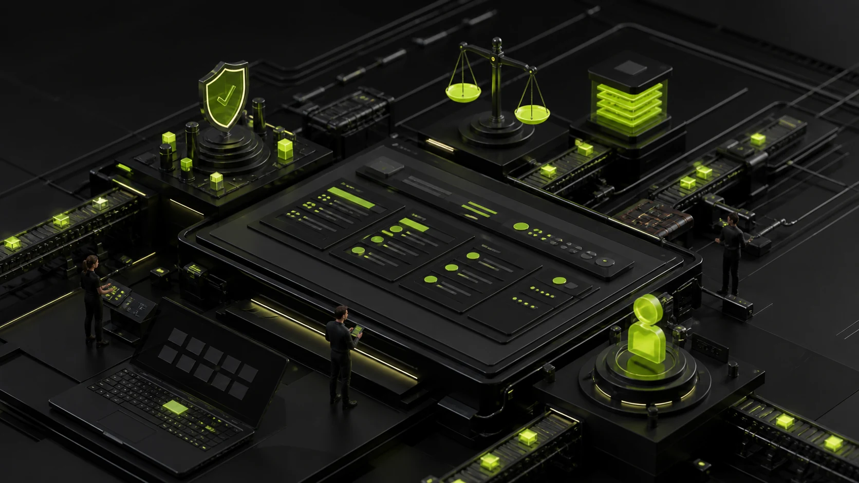
How to design a corporate website Footer? The footer is not "a place for copyright information", but the last layer of navigation and trust entry
When users scroll to the bottom of the page, they usually haven't found the answer yet or are deciding whether to continue learning. A mature Footer should be responsible for supplementary navigation, building trust, providing contact entry points and fulfilling legal information disclosure, rather than casually stuffing all remaining links at the bottom of the page.
01 The real task of Footer is to catch users who have "rolled to the end but haven't left yet"
The footer is often regarded as the final area after the page design is completed: first place the copyright, then pile in the filing, privacy policy, social media and links to several columns. This approach is formally complete, but it fails to answer a crucial question: Why do users scroll here? Many people keep going until the end because the main text doesn't directly address their next steps, or they want to confirm whether the company is genuine, if it has contact information, and where else they can go to learn more.
The U.S. government Design System (USWDS) gives a straightforward description of Footer: it serves visitors who "have reached the bottom of the page but still haven't found the content they want." This judgment also applies to corporate corporate websites. Footer should be regarded as the second-layer information architecture of the website, rather than a clutter area.
02 Do not mechanically copy the Header. The footer should be reorganized with high-value entries
Some websites, in order to "maintain consistency", copy the top navigation completely to the footer. The problem is that the usage scenarios at the top and bottom are different. The top navigation addresses the direction selection when entering for the first time. Footer is more suitable for providing supplementary entry points that users may still need after reading the page, such as product categories, industry solutions, cases, support, material downloads, and contact us.
The current USWDS guidelines also clearly state that footers do not need to mirror headers but should be filtered. Enterprises can decide which links are worth retaining for the long term based on search, visit and sales feedback. A website with dozens of product categories doesn't need to lay all the columns flat on Footer. It is actually more effective to put out the most frequently used entry points that can best answer the remaining questions.

03 The Footer of the B2B corporate website needs to bear part of the "proof of authenticity"
For customers who enter the website for the first time through search or business email, Footer is often the place where they confirm the company information. The full name of the company, the general business email, the customer service phone number, the city where it is located, the privacy policy, the Cookie policy, the terms of service, etc., all seem to be low-key information, but together they form the clues for judging whether the enterprise is genuine and whether it has been operating for a long time.
Contact information does not need to include the mobile phone numbers of all salespeople in the footer. A more reasonable approach would be to provide a stable enterprise-level entry point and then place the detailed address, map, and department contact information on the contact page. This way, not only can the Footer be kept concise, but also long-term invalid information can be avoided after personnel changes.
04 The CTA in Footer should be "Natural Next Step", not another homepage AD
Many corporate websites place a huge gradient module at the bottom of the page: "Contact us now and create the future together." If the same set of strong promotional copy is repeated on every page, users are likely to experience advertising fatigue. The conversion design of Footer should be combined with page tasks: the product page can guide inquiries about products, the case page can guide viewing services, and the article page can guide subscriptions or reading related content.
A true full-site Footer can retain a low-interference general CTA, such as "Submit Project Requirements" or "Contact Business Team". Its function is not to steal the attention of the main text, but to provide a stable exit when the user has completed the reading.
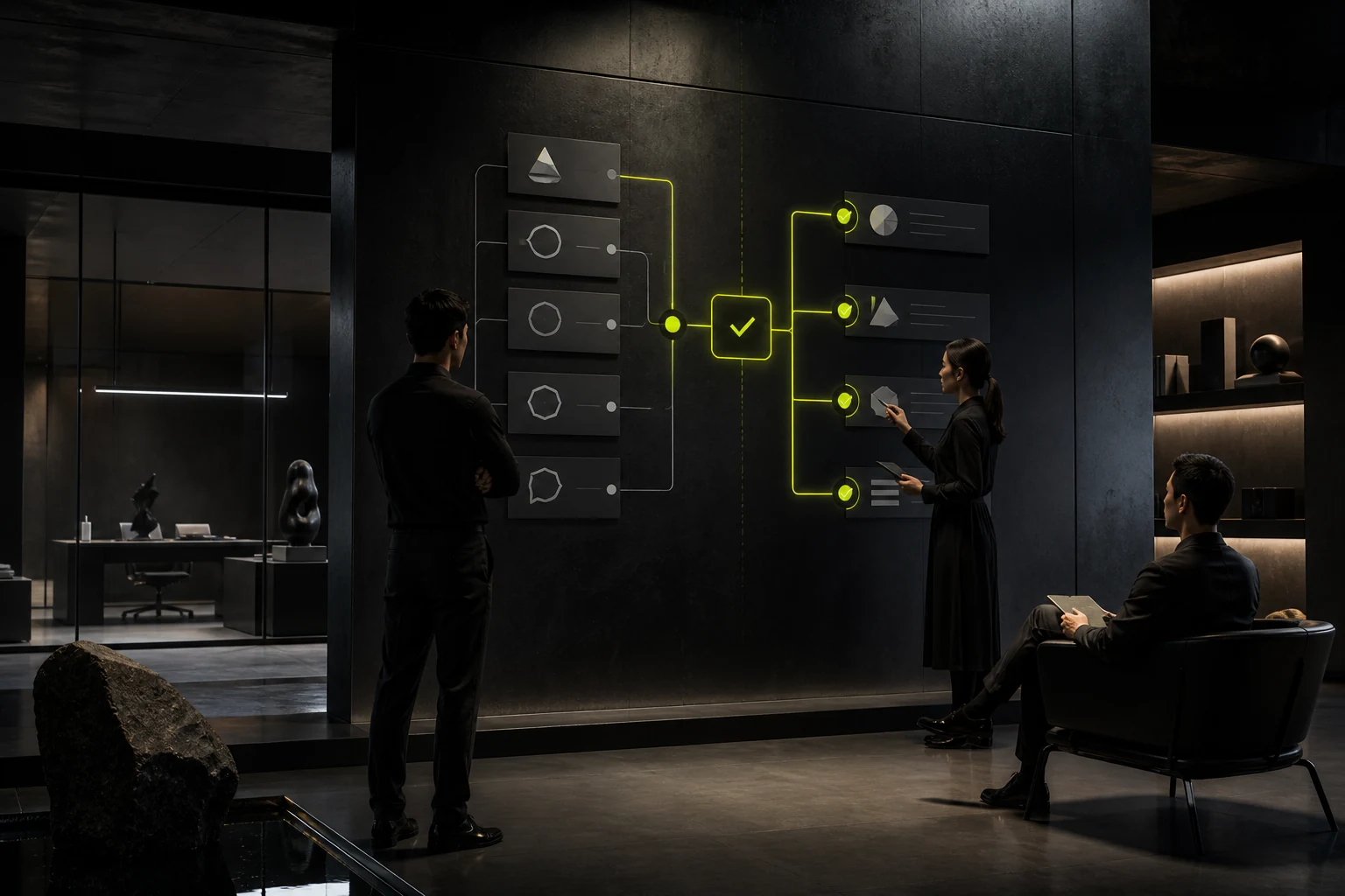
05 Legal and policy information should be complete, but there should be no "disclaimer inflation".
The common privacy policies, Cookie policies, terms of use, copyright and filing information on corporate corporate websites are indeed suitable to be placed on Footer, as users need to be able to access them on any page of the entire site. But "being able to fit" doesn't mean "spreading everything flat". If there are many legal links, they can be grouped into one group and clearly named to help users understand.
The USWDS usability guidelines particularly remind people to avoid disclaimer bloats in footers, which are dominated by a large number of disclaimers. For enterprise websites, the bottom of the page should still be the navigation and contact area. Legal texts should be accessible, but they should not overwhelm the main information.
06 The mobile Footer should not merely force the four columns on the desktop into one
When four to five columns of links on the desktop are directly expanded vertically on a mobile phone, they often turn into a very long tail. Users may have to swipe several screens to reach the copyright information. A more reasonable approach would be to group by theme and use an accessible folding structure on mobile devices, allowing users to actively expand the sections they need.
Folding does not mean hiding all the information. The enterprise name, core contact information, policy entry points and key CTAs can remain visible. A large number of secondary links are folded again. This way, it not only controls the length but also retains the most important information certainty.
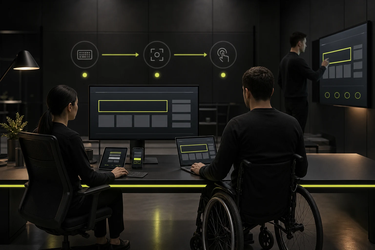
07 The footer also requires keyboard, focus and touch tests
The number of Footer links is usually large, so the keyboard navigation sequence, focus visibility, and mobile touch area are prone to problems. If Accordion is used, it is also necessary to ensure that the expand button is a truly operable control, rather than a visual text that only works when clicked with a mouse.
The USWDS Footer Accessibility guidelines clearly require that the focus can still be normally moved through tabs in the folded navigation. When enterprises implement components on their own, they should also check whether the link text is clear, whether the contact number can be directly dialed, whether the email address is clickable, and whether the social ICONS have understandable names.
08 To determine whether Footer needs a revamp, you can directly look at these questions
When checking Footer, it might be a good idea to temporarily ignore the visual style and just ask: Can users quickly find the next step after reading the page? Is the identity and contact information of the enterprise clear? Do you have any expired social media accounts? Have there been a large number of low-value links piled up? Is the mobile too long? Is the legal and privacy entry easy to find?
If there are three or four obvious problems in the answers, Footer is no longer just a matter of "beautifying", but rather needs to reorganize the information architecture. A good footer rarely becomes the visual star, but it can still make users feel that the website is complete, trustworthy and worth exploring in the final step.
Frequently Asked Questions
How many links are generally appropriate to put in a Footer?
There is no uniform figure. Screening should be based on the scale of the website and the tasks of users. When there are many links, they should be grouped to avoid stuffing the sitemap into the Footer as it is.
Does the full company address need to be placed in the footer?
Not necessarily. High-value information such as the city, phone number and email address can be retained, and the detailed address will be placed on the contact page. If the offline visit is for important business, it can be directly displayed.
Does the Footer need to be exactly the same as the Header?
No need. The top is responsible for the first-round navigation, while the footer is responsible for supplementary navigation and the final decision-making step. Different groups can be used for the two.
Can a mobile Footer be fully folded?
A large number of links can be folded, but key information such as the enterprise name, core contact entry, and policy links should be kept easily discoverable.
Is it true that the more social media ICONS there are, the better?
No. Only retain the accounts that the enterprise continuously maintains and are truly valuable to customers. Accounts that have been inactive for a long time will actually lose credibility.
| Related Service | Learn More |
|---|---|
| Corporate Website Design Services | View Service Details |
| Project Consultation | Contact JVDS Design Studio |
| Design and Website Development Articles | Read More Related Articles |
 Link copied








