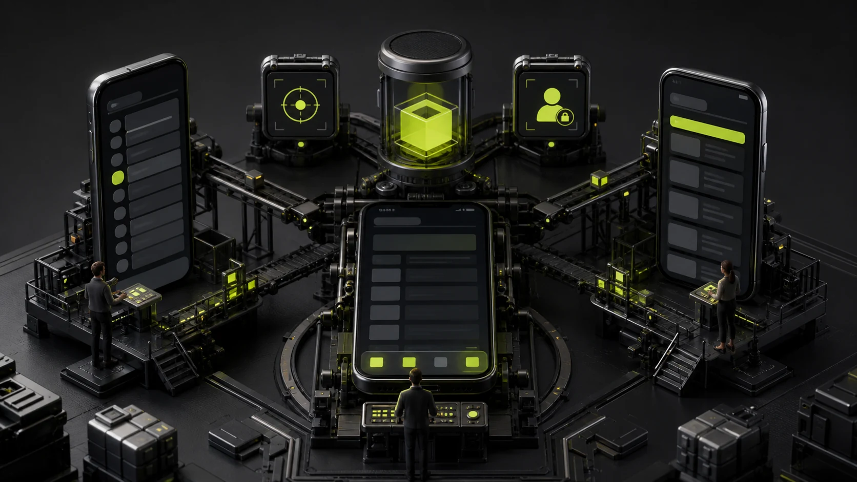
Navigation is often treated as visual styling: how many icons go at the bottom, whether the top needs Back, and where the menu hides. In reality, it determines whether users understand the product structure and can return to frequent tasks.
Map information architecture and core tasks before choosing. A competitor's bottom Tabs do not make them right for your product.
01 Bottom Tabs Suit a Few Frequent Primary Destinations
When a product has three to five frequently switched, relatively equal core areas, bottom Tabs remain visible and thumb-accessible.
Do not place low-frequency settings beside frequent tasks or dynamically reorder Tabs; users lose their sense of location.

02 Top Navigation Handles the Current Level and Page Actions
Titles, Back, search, filters, and primary page actions often sit at the top. It is less suitable for many primary destinations, especially on large phones.
Back behavior should follow platform conventions, without confusing Close, Back, and Cancel.
03 Side Menus Fit Infrequent or Complex Destinations but Hide Them
A drawer holds more items and can suit accounts, administration, and low-frequency tools. Its disadvantage is weaker discovery and an extra step per switch.
Do not hide a business-critical feature only in a hamburger menu.
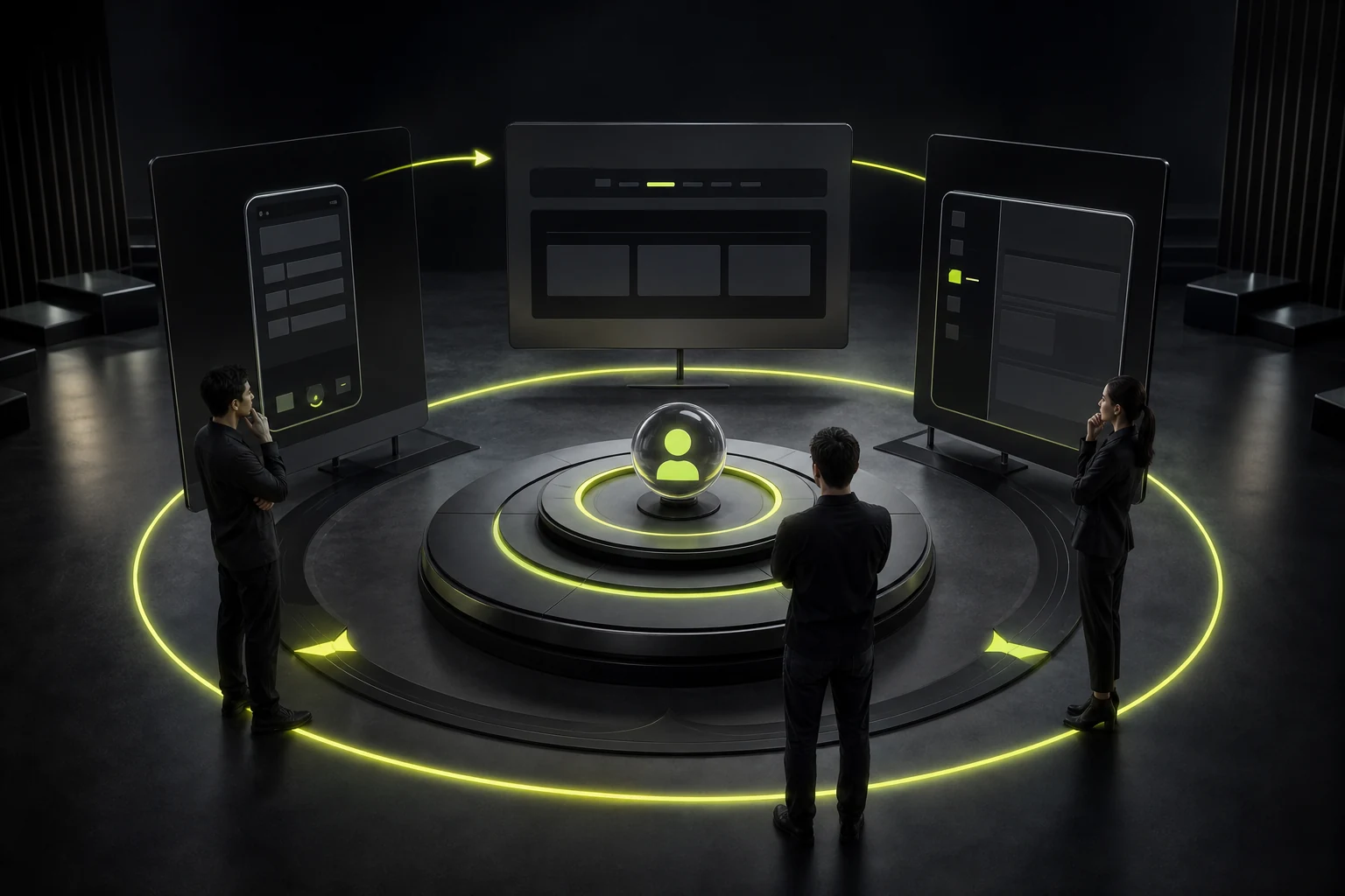
Navigation Pattern Guide
| Condition | Better Pattern | Risk |
|---|---|---|
| Three to Five Frequent Peer Modules | Bottom Tabs | Crowding and unclear labels with too many entries |
| Deep Tasks and Back Paths | Top navigation stack | Weak discovery of primary destinations |
| Many Infrequent Admin Destinations | Side menu or More page | Lower use after hiding |
| Many Content Categories | Top categories, segmented controls, or search | Horizontal scrolling is difficult to discover |
| Immersive Single Task | Simplified navigation and contextual actions | Exit and recovery paths must be clear |
04 Organize by Task Frequency, Not Departments
Users do not care that the company has sales, operations, finance, and support. Navigation labels should reflect tasks and objects.
Cards, shortcuts, and recents can support frequent tasks but cannot replace stable information architecture.

05 Account for State and Permission Changes
Logged-out users, membership levels, roles, no-data states, and restricted regions may see different destinations. Explain changes so items do not disappear mysteriously.
For restricted permissions, retain an entry with instructions or hide a meaningless function according to the business.
06 Validate with Task Testing, Not Preference Questions
Ask users to complete cross-module tasks and observe discovery time, mistakes, Back behavior, and repeated switching.
After launch, review clicks, searches, return paths, and ignored features. Iterate without frequent structural upheaval.
Frequently Asked Questions
Must Bottom Tabs Stay Under Five?
It is not a law, but too many become crowded and unreadable. Put extras under More or restructure.
Can Tabs Use Icons Without Text?
Sometimes for universally understood frequent icons, but most business icons need labels.
Is the Hamburger Menu Obsolete?
No. It still suits infrequent and complex destinations, but should not hide core tasks.
Can Top and Bottom Tabs Be Used Together?
Yes, for primary and secondary levels, with unmistakable hierarchy and selection.
Do B2B Mobile APPs Suit Bottom Tabs?
It depends on frontline tasks. Frequent workspaces may fit; complex administration may rely more on search, dashboards, and contextual navigation.
| Service | View |
|---|---|
| Related Services | View Service Details |
| Project Inquiry | Contact JVDS Design Studio |
| Design and Website Development Articles | View Service Details |
 Link copied