Data visualization primarily uses graphical methods to communicate information. Yet as expectations rise, a trend has emerged in large-screen visualization: designs become extremely complex in pursuit of colorful visual impact and fail to communicate the data effectively. What, then, is genuine large-screen data visualization? What should designers consider when creating one? This article explores the subject from a professional UI perspective.
What Is Large-Screen Data Visualization?
Before answering that question, it is worth restating the concept of “data visualization.” Data visualization is a set of methods for describing data through information graphics and presenting it in a form people can understand more easily. Its purpose is to express the information and patterns within data more vividly and support the communication and application of that information.
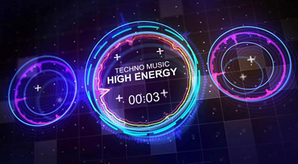
Large-screen data visualization is data visualization design presented primarily on a large-format display. Key data is shown across an oversized LED screen. Typical characteristics include a large visual area, striking motion, and rich color. A large display can make a powerful visual impression, create a distinctive atmosphere, and build a sense of occasion. Because it can show a great deal of information and share key insights with a team, it is also frequently used for data analysis and monitoring.
One point must remain clear: the main purpose of large-screen data visualization is to analyze and communicate data. Design should add visual appeal while shortening the path to understanding. It is not simply the conversion of data into an attractive image, but a way of viewing the world through data. In plain terms, visualization lets the data speak and uses information graphics to tell its story. It is a method of expressing data and an abstraction of the real world.
Key Elements of Digital Narrative Design
A strong large-screen experience begins by identifying the relationship between the data and what it represents. Designing around a “digital narrative” is essential both to comprehensive analysis and to deeper understanding. In large-screen UIdesign, the following considerations help aesthetic form and function advance together:
1. Font Usage
Use the system's default fonts whenever possible. When embedding a typeface, consider its legibility, fit with the current visual style, and licensing for commercial use.
2. Typeface Selection
Choose typefaces whose letterforms are easy to distinguish and unlikely to create ambiguity.
1. Prioritize legibility: letters should be easy to identify, without unusual or confusing forms.
2. For font size, follow web-design practice and do not go below 12 px. That size can be used for chart labels; data information should generally use 14 px or larger, and type on large displays may be increased further.
3. Letter spacing should remain tighter than word spacing, while spacing between Chinese characters should be comfortably open.
4. When Chinese and Western text are mixed, leave appropriate spacing between the two scripts. This helps users scan the content more quickly.
3. Background Color
Color is a powerful tool, but poor use distracts the reader. Background choice depends on the visualization device and may be dark, light, or colorful.
Small displays support a broad range of backgrounds; light, colorful, and dark options can all work well. Light backgrounds are better suited to presenting large amounts of data because charts are easier to recognize against them. Dark and colorful backgrounds are more appropriate for simple datasets and atmosphere.
Large-screen devices commonly use dark backgrounds to reduce motion trailing and visual glare. Every chart palette should be developed for the dark background, with enough variation in hue and brightness to keep the visualization clearly legible.
Dark backgrounds also reduce discomfort caused by visible panel seams. Because the background covers a large area, darker colors can minimize the overall impact of color differences between screens. They focus attention, highlight content, and support effects such as flowing light and particles.
4. Color Combinations
Use palettes with clear differences in brightness and saturation, and avoid relying on adjacent colors. Colors that are too similar, such as light gray and a still lighter gray, are difficult to distinguish. At the same time, avoid harsh opposing combinations such as red and green or blue and yellow.
5. Use One Color for the Same Type of Data
Charts generally use regular increments such as 0, 5, 10, and 15 rather than uneven intervals such as 0, 3, 5, and 16. Ordering should feel consistent and should not create visual disorder.
6. Comparison
Visualization can make data comparisons more intuitive, but placing two charts side by side does not automatically achieve that goal and may make the information more confusing. Imagine trying to compare 32 different pie charts at once.
7. Choose the Most Efficient Visualization
To maintain visual consistency and enable instant recognition, you may need a stacked column chart, grouped bar chart, or line chart. Whatever the format, do not force readers to compare too many things at once.
After all that theory, the ideas may still feel abstract. Examples created with Esensoft BI Cool Screen may make them easier to understand visually.
Follow these visualization UI design considerations to create a better user experience.
Need design or website development services?
JVDS Design Studio is a professional design studio focused on digital product experiences and brand identity. We work with businesses in China and overseas that want to strengthen their brand image, improve user experience and grow their business, providing clear, usable UI/UX design, high-quality website design and development, app and mini-program development, and cohesive, distinctive brand identity design.
Working on a B2B system or an app? Share your current screens and key user tasks so we can discuss the design scope.
 Link copied