Aesthetics can strengthen a brand, build trust, and make a product enjoyable. But excessive whitespace, low-contrast text, hidden navigation, complex motion, and unfamiliar controls can also increase the cost of learning.
Mature design makes visual expression support the task while preserving a distinctive character. It does not treat usability as a compromise.
01 Identify the Exact Task That Feels Difficult
Record the user's goal, steps, errors, pauses, and requests for help. Do not attribute every problem to visual style, and do not dismiss the value of aesthetics based on personal preference.
The same interface may affect new and experienced users differently.
02 Align Visual Hierarchy with Information Priority
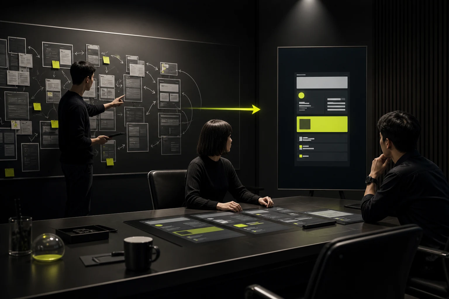
Type size, color, placement, and motion should help users notice what matters most. Tasks slow down when decoration attracts more attention than the primary action or every card is emphasized equally.
Reduce meaningless competition rather than merely making the interface more plain.
03 Give Hidden Actions Enough Clues
Icons, gestures, hover behavior, and swipes without sufficient discoverability cause users to miss features. Frequent or high-risk actions should use familiar patterns and clear labels.
Novel interactions need feedback and a learnable path.
04 Prioritize Content Readability over Visual Purity
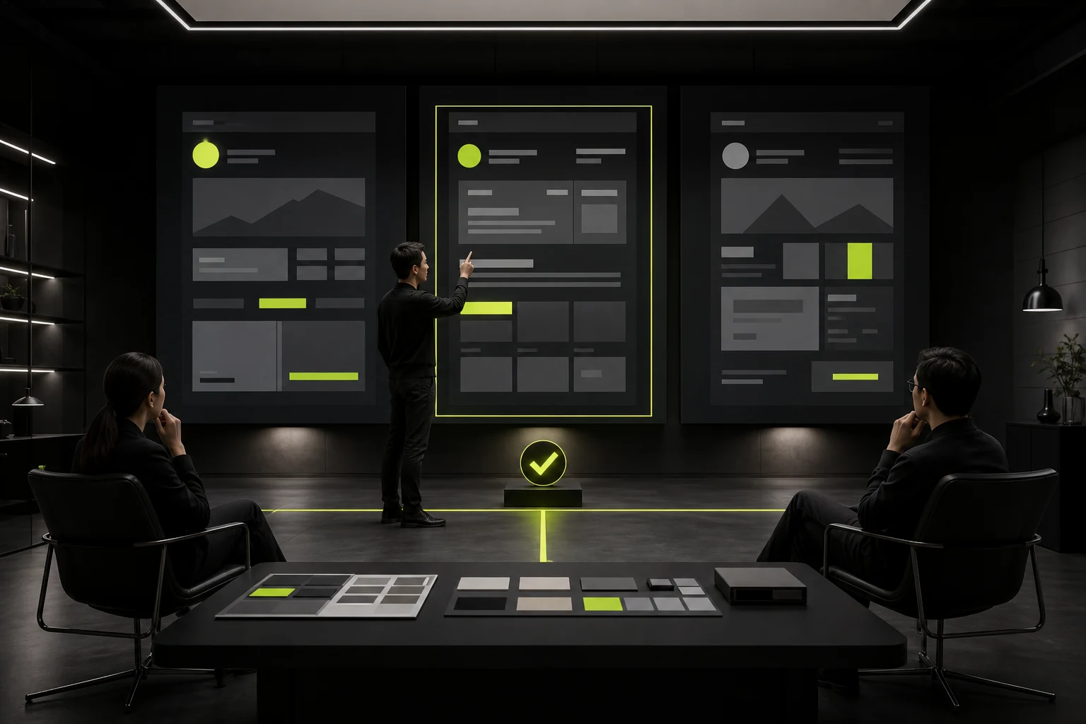
Low contrast, ultra-thin type, overly long lines, and text placed on images all reduce readability. Information-dense products need grouping and scannability, not indiscriminate whitespace.
Brand colors also need combinations that remain readable.
05 Do Not Let Motion and Immersion Block Control
Transitions should explain relationships and states, not force users to wait, trigger motion discomfort, or make them lose their place. Provide skip controls, reduced-motion options, and static alternatives.
Important controls should not remain disabled until an animation finishes.

06 Use Testing to Find a Balanced Solution
Compare task completion, errors, and comprehension while also observing brand perception. Local changes to hierarchy, labels, and feedback often solve the issue without abandoning the entire visual direction.
Continue monitoring behavior and qualitative feedback after launch.
Common Conflicts and Adjustments
Visual Approach | Potential Problem | Balanced Adjustment |
|---|---|---|
Extensive whitespace | Information is pushed too far apart | Keep rhythm but tighten task areas |
Low-contrast palette | Difficult reading | Build an accessible color scale |
Icons without labels | Meaning is hard to infer | Add text labels to frequent actions |
Complex transitions | Waiting and disorientation | Shorten, allow skipping, explain relationships |
Hidden navigation | Features are not discoverable | Keep a clear entry point |
Extreme information density | High cognitive load | Group, filter, and disclose progressively |
Frequently Asked Questions
Does usability make an interface look generic?
No. Branding, typography, imagery, and motion can remain distinctive as long as critical tasks are clear.
Should every user complaint be implemented directly?
Ask about the specific context and validate the problem rather than treating feedback as the solution itself.
Do standard interactions limit innovation?
Standards reduce learning costs. Innovation should appear where it creates clear value and includes adequate feedback.
How can you tell whether the visuals are excessive?
Check whether they delay, obstruct, or misdirect critical tasks, then test with real users and devices.
What should take priority when aesthetics and conversion conflict?
Start with business and user goals. Hierarchy and pacing often provide a balanced solution without sacrificing either side.
Service | View |
|---|---|
Related services | |
Related reading | View article |
Design work | |
Project inquiry |
 Link copied