

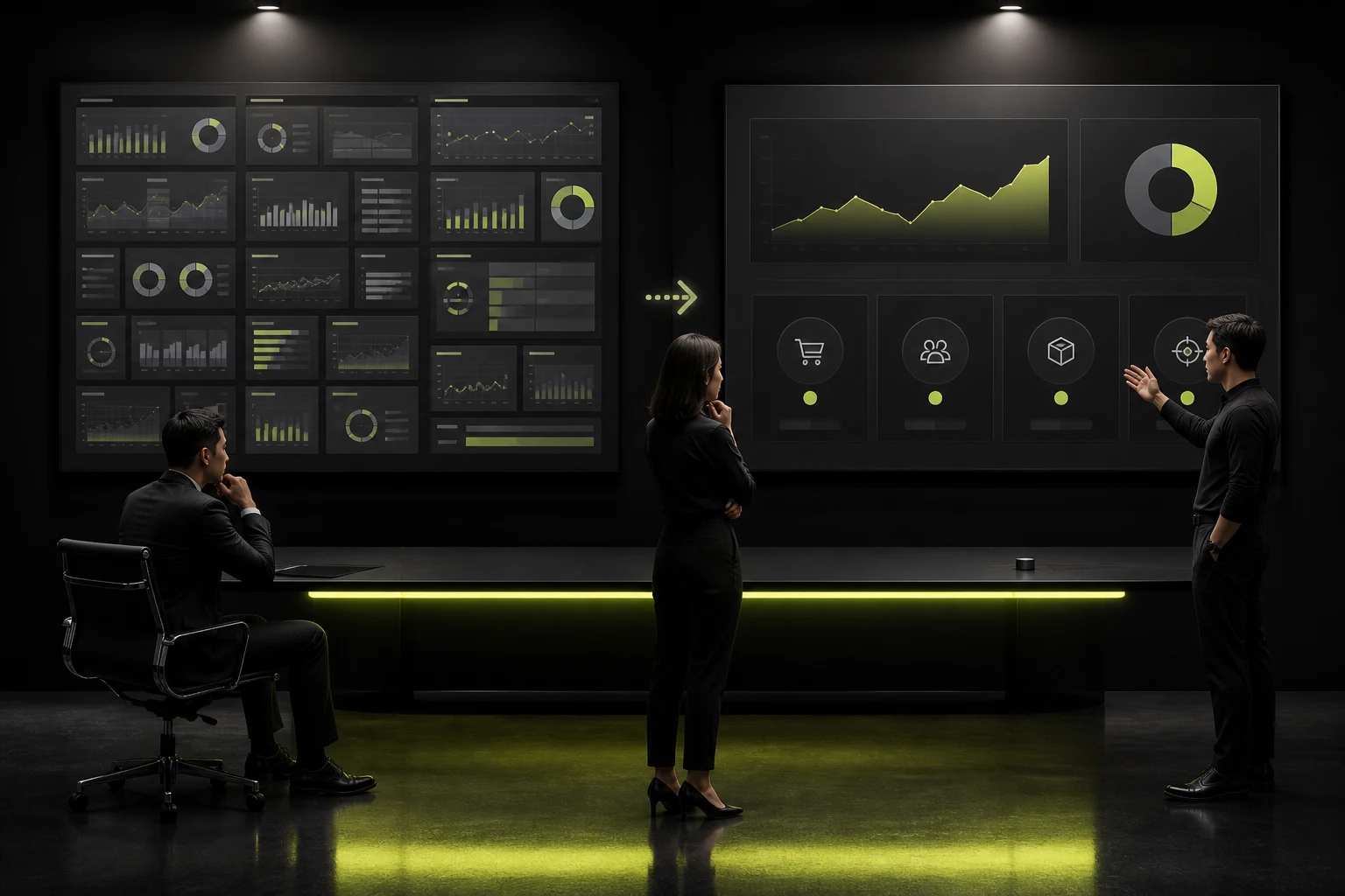
Many management-dashboard projects begin by debating how many charts to show and what kind of big-screen effect to use. The result looks busy, yet meetings still return to Excel to investigate causes. The real issue is usually not too few charts, but failure to define who is looking, when they look, and what they should do afterward.
A useful dashboard home page should answer four questions without opening detail: What is happening now? How far are we from the target? Where is the exception? Who needs to act? A metric that cannot answer these questions is decoration, however attractive it looks.
01 Define the Decision Task the Home Page Serves
Executives, operations leaders, and frontline managers expect different things from a “home page.” Executives focus on growth, cash flow, and major risk; operations leaders on funnels and resource allocation; frontline managers on pending work and exception details. Combining all three on one screen often serves none of them.
Before designing, write one task statement, such as “Help the sales director assess regional target gaps in the weekly meeting and allocate resources.” This constrains metrics and interactions more effectively than “Build a management cockpit.”
02 Keep Only Metrics That Can Change Action
Ask a simple question to judge importance: if this number changes, who will take what action? If the answer is “We will look into it,” the metric belongs on a secondary analysis page, not in prime home-page space.
There is no universal number of core metrics, but they should remain readable at a glance. Layer total results, target completion, period comparisons, exception counts, and pending actions instead of presenting a dozen numbers at equal weight.
Example Home-Page Information Hierarchy
| Level | Question | Suitable Content | Unsuitable Content |
|---|---|---|---|
| Level 1: Outcome | Is the business healthy overall? | Revenue, cost, target completion, key risks | Dozens of departmental details |
| Level 2: Change | Why did it improve or decline? | Trends, period comparisons, key drivers | Isolated numbers without a baseline |
| Level 3: Exception | What needs attention? | Alerts, thresholds, missing data, overdue work | Red color without an explanation |
| Level 4: Action | What happens next? | Owner, action link, deadline, drill-down | Charts with no action path |
03 Give Every Metric a Definition and Comparison Baseline
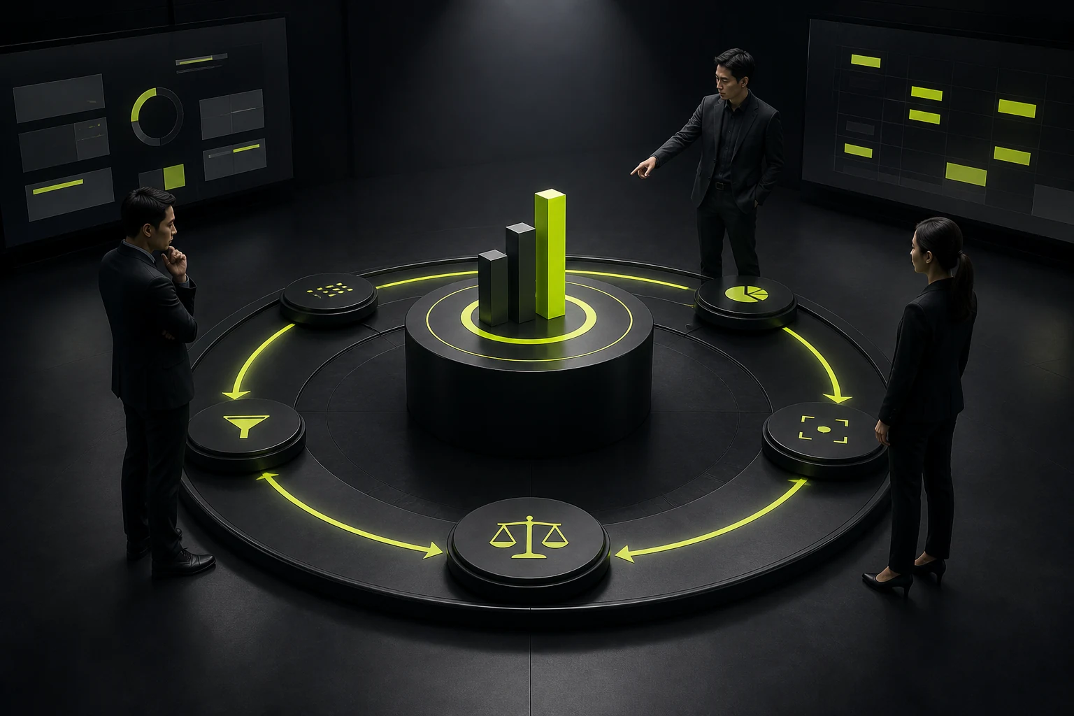
“Active customer,” “qualified lead,” and “revenue” may mean different things across teams. If the dashboard omits the time range, definition, and update time, greater numerical precision can create more disagreement.
At minimum, a metric card should show the reporting period, target, comparison baseline, and last update. Explain complex definitions in a tooltip rather than forcing users to guess.
04 Choose Charts for the Question, Not Visual Preference
Use lines for trends, bars or stacks for composition, progress or bullet charts for target gaps, and maps only for geographic distribution. Pie charts, gauges, and 3D graphics are not inherently wrong, but often reduce efficiency when categories are numerous, differences are small, or precise comparison matters.
A page should not use too many chart forms. Every new encoding forces users to learn again. A small set of stable rules suits frequent management tasks better than making every module different.

05 Explain the Cause and Action Path for Exceptions
A red number says only that something is wrong. A better design shows where the exception occurred, when it began, how much it affects, and which detail page supports further action.
For common exceptions, expose the owner, ticket status, or action button. For complex causes, provide drill-down and filters. A dashboard shortens the distance from discovery to action.
06 Measure Whether It Is Used, Not Merely Opened
Page views show that someone entered, not that the dashboard improved a decision. Look at filter and drill-down usage, whether exceptions are resolved, whether meetings require fewer ad hoc exports, and whether disputes over metric definitions decline.
If a module receives no interaction over time, do not begin by changing its color. Ask whether the metric affects the task; move it to a secondary page if needed and reserve home-page space for information with greater action value.
Frequently Asked Questions
How many metrics should a dashboard home page show?
There is no fixed number. The screen should distinguish core results, trends, exceptions, and actions, and every metric should influence a decision. Extensive scrolling usually means the home page has too many tasks.
Does a management cockpit need a dark big-screen style?
No. Dark themes suit presentation screens and low-light environments, while light interfaces often work better for office use, long reading, and table analysis. Style should follow device, viewing distance, and duration.
What if the business says no metrics can be removed?
Segment by role, then separate the home and analysis pages. Keep shared core metrics on the home page and expose departmental detail through permissions, tabs, or drill-downs.
How frequently should data update?
Match the decision frequency. Monthly business metrics do not need minute-by-minute refreshes, while inventory, risk, or service alerts may need much higher frequency.
Should a dashboard support export?
Many enterprise workflows still require it, but export should not replace online analysis. Define the purpose, field permissions, time range, and watermark to prevent sensitive-data loss.
| Service | View |
|---|---|
| Related service | View service details |
| Project inquiry | Contact JVDS |
| Design and website articles | View all articles |
 Link copied








