

Is it necessary to pop up a second confirmation before deleting? The design of hazardous operations should be determined based on whether they can be revoked or not
If every time a user deletes a draft, they have to pop up "Are you sure?" Are you really sure?" Unconscious click confirmation will soon form. However, if only a 3-second Undo is given to delete the entire organization, it may cause unacceptable losses. The core of the design for hazardous operations lies in the consequences, reversibility and scope of impact.
01 First, determine whether the consequence is reversible, and then decide whether to interrupt
If the deletion is merely moved to the Recycle Bin, users can restore it within 30 days. Providing Undo after the operation is often smoother than popping Modal before the operation.
If the action will permanently delete data, affect other members or incur fees, it is more appropriate to confirm before taking action. Confirmation is not a ritual but a last chance for users to understand the consequences.
02 Do not train users to "mindlessly click OK" with repeated confirmations for frequent low-risk operations.
When a user deletes dozens of drafts every day and the same dialog box pops up each time, he will soon automatically click the main button on the right. When truly high-risk operations occur, confirmation also loses its protective effect.
Low-risk operations can be directly executed and revoked. High risk increases friction. The design friction should be proportional to the loss.

03 Confirm that the copy should cover the specific target audience and consequences
"Are you sure to delete it?" " The information is very weak. The statement "After deleting project Apollo, 12 members will be unable to access it and related automation will cease" better supports the judgment.
The button should not be written as "OK/Cancel", but as "Delete Item/Keep Item". Users can quickly tell at a glance which action is dangerous.
04 Enter name confirmation is only suitable for extremely high-risk and low-frequency operations
Requiring the input of organization name, project name or DELETE can effectively reduce accidental touches, but it is a high-friction method. It is suitable for actions with serious consequences such as deleting organizational and production environment databases.
Do not generalize input confirmation to each deletion; otherwise, users will copy and paste and continue mindless operations.
05 Batch operations must display the affected quantity and range
"Delete Selected" is extremely risky if a user forgets that they have selected 438 pieces of data across pages. The confirmation area should display the quantity and, if necessary, specify cross-filtering or cross-page selection.
After batch operations are completed, if recovery is supported, a clear recovery entry should be retained instead of only showing "Operation successful".
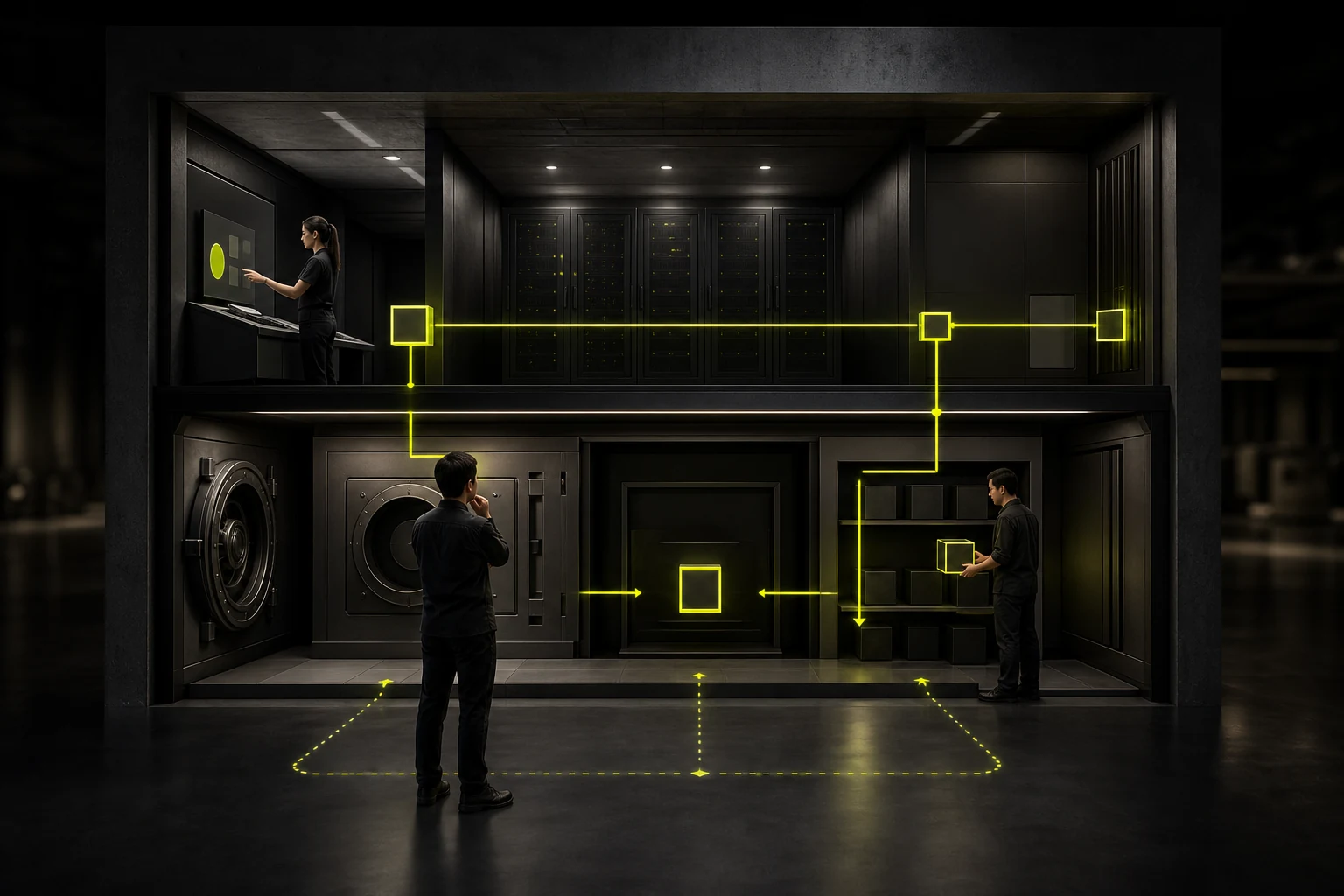
06 Soft deletion and recovery periods are product strategies, not just for UX components
Many deletions can first enter Trash and be truly cleaned up after a certain period of time. This way, the user experience is safer and the cost for customer service to recover data is also reduced.
However, when it comes to privacy and compliance, the recovery period, the actual deletion time and the backup strategy must be confirmed with the legal and security teams and cannot be determined by the designer based on their personal experience preferences.
07 Permissions and authentication can serve as additional protective layers
Deleting the entire workspace may require administrator privileges; Modifying the payment account may require re-identity verification.
This type of protection is more effective than popping up another visual Modal because it restricts who can execute it instead of merely asking the executor, "Are you sure?"
08 After the operation, provide the user with a clear result instead of suddenly reducing one line from the list
After successful execution, it indicates that the object has been deleted, whether it can be restored, and where the recovery entry is. Explain the reasons when you fail.
The complete experience of dangerous operations consists of three stages: prevention, execution and recovery. Designing just a red button and a confirmation box is far from enough.
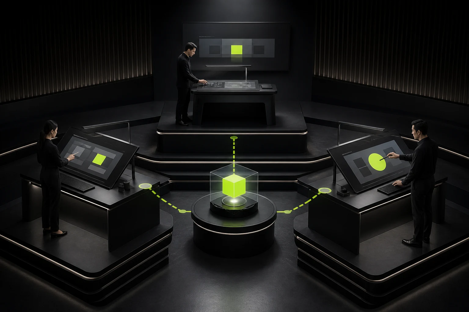
09 The default button position should avoid being too similar to Confirm and cancel
In the danger confirmation box, the destructive button should have a clear label and visual semantics. If it is removed, the normal style should be maintained. Don't make both buttons equally highlighted and only distinguish them by their left and right positions.
Different platforms have different habits for the position of the main button. The design system should unify the rules to prevent users from accidentally touching it when relying on muscle memory.
10 Continuous hazardous operations require throttling and permission control
Deleting payments in batches and then immediately deleting them again or continuously modifying payment Settings within a short period of time may be due to misoperation or account risks. The product can provide additional protection through rate limiting, re-certification or delayed effectiveness.
These fall under security and product strategies, but UX needs to express the limitations and reasons in advance.
11 The recovery entry must be truly discoverable
If the Undo is only provided in the 5-second Toast after deletion, and the user misses it and can no longer find the Trash, it may seem revocable in form, but in reality, it is still close to being irreversible.
Important resources can provide independent recycling stations, recovery period explanations and searches, making recovery capabilities a reliable mechanism.
Frequently Asked Questions
Must the deletion operation be confirmed a second time?
Not necessarily. Low-risk deletions that can be easily undone can be directly executed and provide Undo, while high-risk irreversible operations are more suitable for confirmation.
How many seconds is appropriate for Undo to display?
It depends on the task and recovery mechanism. If it is truly possible to recover from the Recycle Bin, there is no need to limit the sole chance of recovery to just a few seconds.
When is it required to confirm the input of the object name?
It is suitable for eliminating extremely high-risk and low-frequency behaviors in organizations, production environments, etc.
Is a red button enough to indicate danger?
Not enough. There should also be clear copy, consequence explanations and accessible semantics, and it cannot rely solely on color.
What is the most important display for batch deletion?
At least clearly define the number, scope and recoverability of the objects to prevent users from mistakenly believing that only the current screen is deleted.
| Related Service | Learn More |
|---|---|
| UI/UX Design Services | View Service Details |
| Project Consultation | Contact JVDS Design Studio |
| Design and Website Development Articles | Read More Related Articles |
 Link copied








