
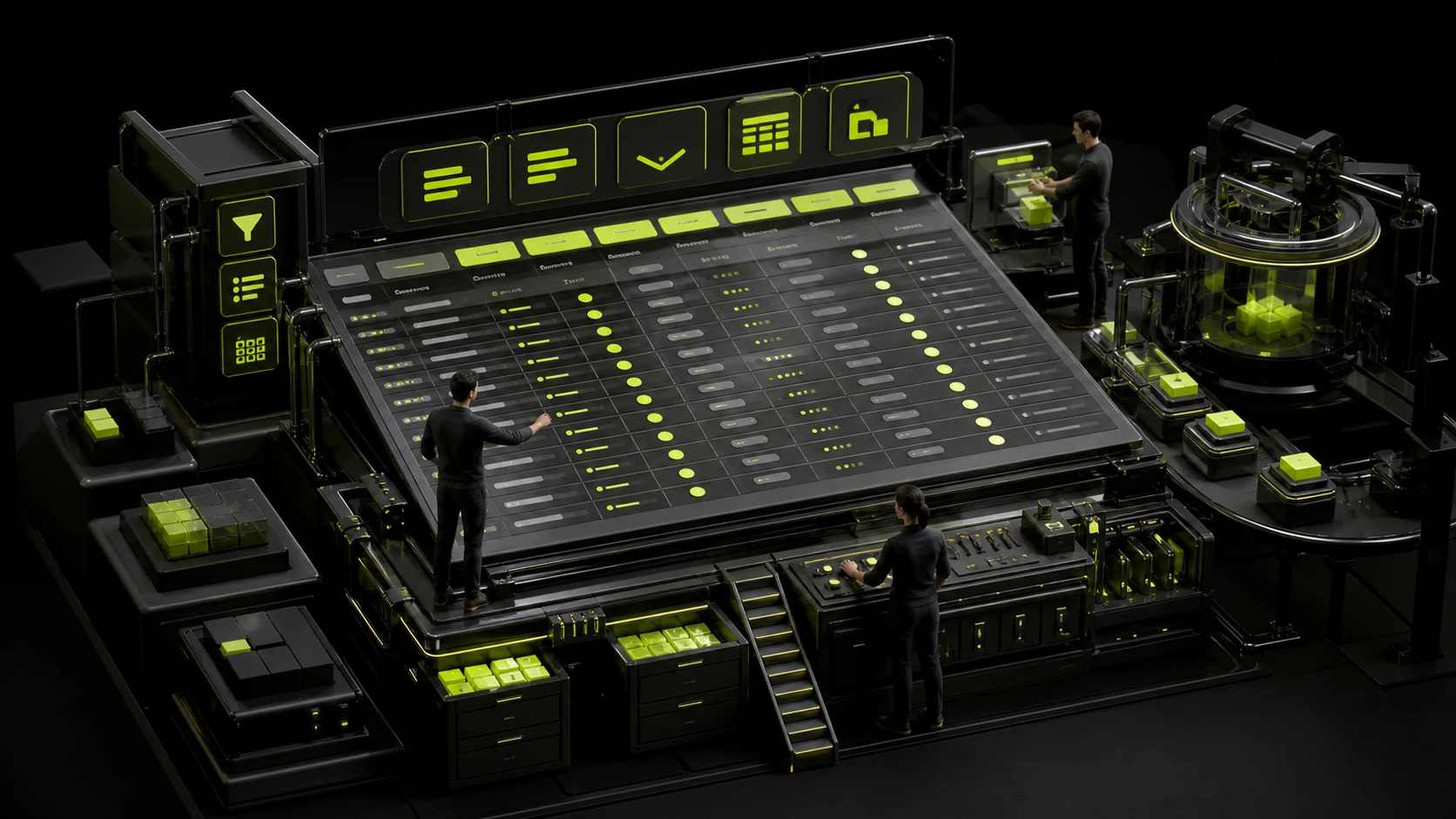
Why are SaaS backend tables getting more and more difficult to use as they are made? The real problem with the data table is not "too much information", but that the tasks have no priority
The background table is most likely to become the place where "all departments want to add a column". The last screen has 18 columns, 6 buttons per row, and the status tags are in various colors. Users still need to export to Excel. What really needs to be addressed first is: When users come to this table, what tasks do they most frequently complete?
01 First define the task, and then determine whether this is a Table
The current Data Table guidelines of IBM Carbon clearly state that tables are suitable for organizing and displaying data and helping users locate specific resources, but should not be regarded as a substitute for spreadsheet applications.
If users need free formulas, complex cell editing and large-scale modeling, the product may really need to offer Excel export or a dedicated editor instead of forcing all the capabilities into web tables.
02 Columns are not "displayed whenever there is data", but should be prioritized based on tasks
The order object may have 50 fields, but the customer service only needs the order number, customer, status, amount, time and reason for the abnormality every day. The remaining information can be viewed in the details or the expansion area.
The more columns there are, the slower the horizontal scan will be. Column Settings can be supported, but the default view should be a set of designed working views rather than leaving all the selection costs to the user.
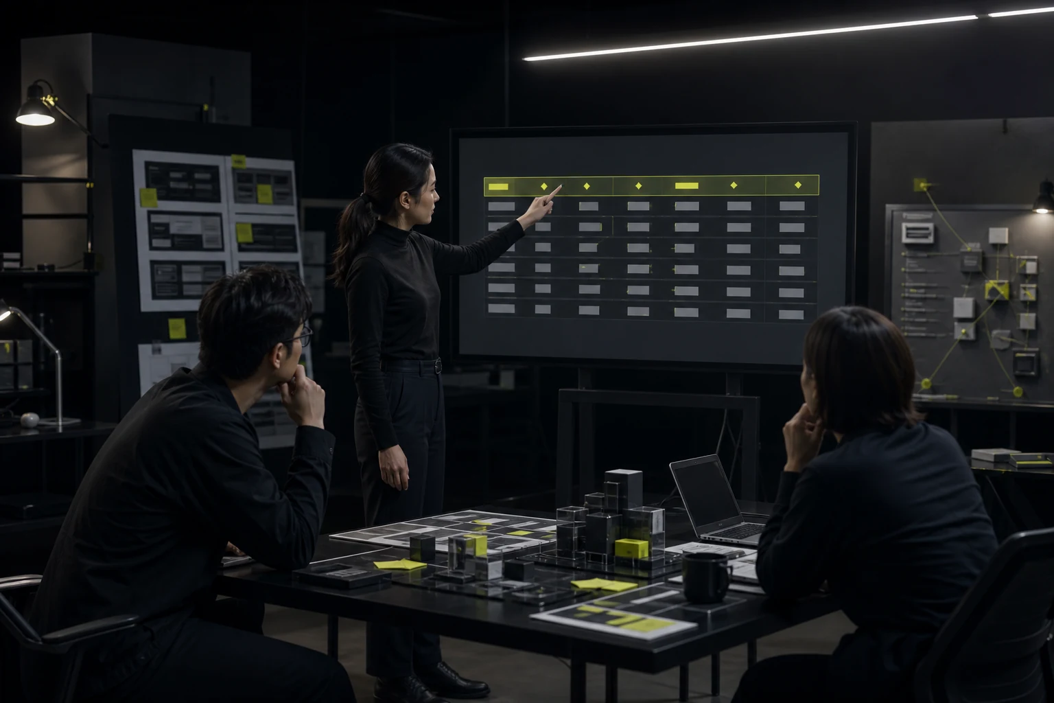
03 The header should be short and stable, and inform the user which columns can be sorted
Carbon suggests that column headings be kept at one or two words, and no more than two lines if necessary. A title that is too long often indicates that the field naming itself needs optimization.
If sorting is supported, there must be clear Hover/Focus and sorted indications. The accessibility implementation of Carbon will sort the status through aria-sort association. The design end should also indicate which columns can be sorted and not let the developers guess.
04 Line Hover can help users scan horizontally even if it cannot be clicked
In the long table, users need to match the names on the left with the values on the right. Slight line highlighting can keep the line of sight on the same line. The current user guide of Carbon also recommends always keeping Row Hover to assist in scanning.
However, if the entire line is clickable and there are links, switches, and menus within it, the interaction priority should be clearly defined to prevent users from not knowing what will happen if they click on the blank area.
05 Do not mix single-line operations and batch operations into a button forest
High-frequency main operations can be displayed directly, while low-frequency operations are included in the Overflow Menu. After the user selects multiple lines, the Batch Action area will appear again, which can reduce duplicate buttons on each line.
Dangerous operations should be separated from ordinary operations and a decision on whether to confirm them should be made before execution based on the degree of revocability. Don't stuff five or six ICONS in each line just because it has many functions.
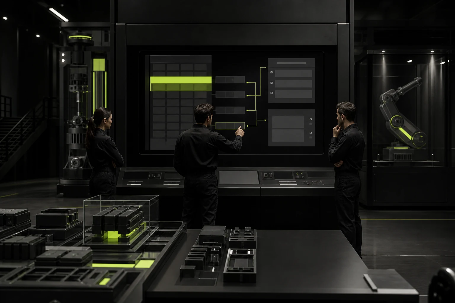
06 The expansion line is suitable for supplementing context but not for filling a full detail page
Carbon supports the expandable data table, which is used to progressively disclose more information in a limited space. Suitable for displaying notes, additional attributes, and brief histories.
If complex Tabs, forms, or over a dozen operations appear after expansion, it indicates that the user has entered an independent task. Jumping to the detail page is usually clearer.
07 Pagination, infinite scrolling, and virtual lists should be selected based on the task
For enterprise backends that require remembering locations, batch operations, and precise page jumping, traditional Pagination is often more stable. Log streams or continuously loaded content are more suitable for infinite scrolling.
When the data volume is very large, server-side filtering and virtual rendering also need to be considered. Designers do not have to decide on technical details, but they must understand that "displaying 100,000 lines" is not a purely visual issue.
08 Table density should support work efficiency rather than pursuing "looking high-end"
Professional users may prefer to see more lines on one screen, while low-frequency users need a looser line height. Density options such as Compact/Default can be provided, but do not sacrifice the click area and readability.
The sign of a mature table design is not how exquisite the borders are, but that users can quickly locate, compare and operate, and rarely need to leave the product to manually organize the same data.

09 Be cautious when combining frozen columns with horizontal scrolling
When there are many columns, fixing the first column can help users maintain the object context, but freezing three or four columns will take up a large amount of visual width. Especially on 13-inch laptops, the remaining data area may only be visible in one or two columns.
What should be fixed are the identifiers that users need most to determine "who this line is", such as the name or order number, rather than locking all the fields on the left just because they are all important.
10 The table state needs to override Loading, Empty, Error, and permission differences
Real data tables do not always contain content. The first use is empty, it is empty after filtering, the interface loading failed, there is no permission, and some fields are not visible. Different feedback is required respectively.
If "No data available" is uniformly displayed, users cannot determine whether the company has no records, the filtering conditions are too narrow, or there is a system error.
11 Column Settings and save views are suitable for professional high-frequency users
When different roles do indeed require different fields, it is allowed to show/hide columns, adjust the order and save the View. For example, the finance department saves the "Collection View", and the operations department saves the "Delivery View".
However, the product should still provide excellent default views. Customization capabilities should enhance efficiency rather than remedy a default table that is difficult for everyone to use.
Frequently Asked Questions
How many columns should the background table display by default?
There is no fixed quantity. Prioritize the display of fields required to complete the main tasks, and the rest can be provided through details, expansion, or column Settings.
Can the entire line be clicked?
Sure, but avoid conflicts with in-line controls and express them clearly with Hover, cursor, and keyboard behavior.
When should the expandable line be used?
Suitable for supplementing a small amount of context; If the content is complex, you should go to an independent detail page.
Must the table be paginated?
Not necessarily. Pagination, infinite scrolling, and virtual lists should be selected based on the volume of data and tasks.
Do I need to provide the export to Excel?
If users have cross-system analysis, reporting or complex editing requirements, exporting is often a reasonable capability rather than a design failure.
| Related Service | Learn More |
|---|---|
| UI/UX Design Services | View Service Details |
| Project Consultation | Contact JVDS Design Studio |
| Design and Website Development Articles | Read More Related Articles |
 Link copied








