
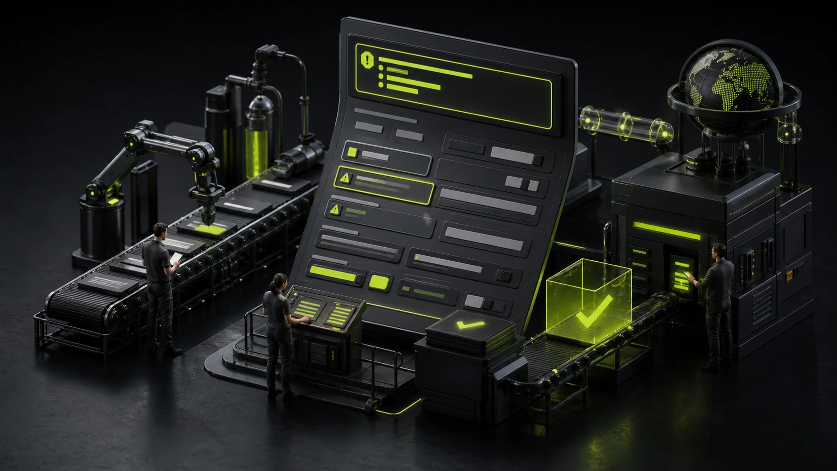
How can form error prompts be written so as not to drive users crazy? "Format error" is not a qualified solution
If a user fills in the wrong information, it is not an exception but a normal path of the form. A page that only shows "There are 3 errors" after submission leaves all the costs for location and correction to the user. Good verification will clearly indicate the fields, reasons and correction methods, and enable users to smoothly return to the task after correction.
01 The error prompt should answer at least three questions: where, what the problem is, and how to correct it
"Format error" and "invalid input" only answer half of the questions. More specific prompts such as "The mobile phone number should be an 11-digit number without Spaces" can directly guide the correction.
If the rules are complex, they can be explained before input, such as password requirements, instead of being suddenly announced after the user submits.
02 Do not check the timing too early, nor wait until the very end
When a user just enters a letter in the email box and a red message "Email format error" appears, it will create unnecessary pressure because he hasn't finished entering it yet.
A common strategy is to verify the format after the fields are out of focus and uniformly check the mandatory and cross-field rules when submitting. The fields that have already displayed errors can be promptly and successfully fed back after correction.
03 Field-level errors should be close to the input box and establish a program association with the control
Visually placing the red text below the input box is the first step. The W3C Form tutorial also emphasizes clear labels, descriptions, and error associations to enable screen reader users to understand as well.
Don't just turn the border of the input box red, nor rely on placeholders as labels, because the prompt will disappear after input.
04 Long forms can simultaneously provide a summary of top errors
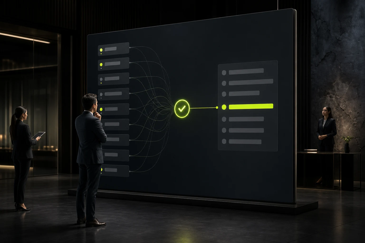
After submitting a 30-item business application form, there are 6 errors. Only by the red text beside the fields, users may not be aware that there are still problems below. The top can display the number of errors and a clickable list to help with quick jumps.
Summaries cannot replace field-level prompts. It is best for both to exist simultaneously: the top is responsible for positioning, and the area near the field is responsible for correction.
05 Don't blame users for incorrect copy
"You entered the wrong address" can be changed to "Please enter a valid email address." The product only needs to describe what is needed and does not need to assess the user's capabilities.
System errors and user input errors should also be distinguished. "Server temporarily unable to submit" cannot be written as "Please check the input", otherwise users will repeatedly modify the correct data.
06 The technical error returned by the server needs to be translated into the user's language
The API returns 422, duplicate_key, and permission_denied, which are meaningful for development but not for users. The interface should be mapped to actionable information such as "This email address has been registered" and "You do not have the permission to modify this item".
At the same time, keep the error tracking ID or log for customer service and engineering to investigate, but do not let technical codes become the main copy.

07 After correction, do not allow users to re-fill in the content that is already correct
After the form submission fails, the entire page refreshes and all fields are cleared, which is a very serious recovery issue. Except for passwords or security-sensitive fields, the content already entered by the user should be retained as much as possible.
If an error occurs during the upload of a file, it is also necessary to clearly state whether a re-upload is required to prevent users from thinking that the file still exists.
08 The form QA must proactively create error scenarios
It is far from enough to test "all filled in correctly and submitted successfully" just once. To test for blank fields, format errors, duplicate values, network failures, timeout, permission changes, server anomalies, and keyboard movements.
The quality of a form experience is often not perceived when things go smoothly, but rather whether users still know how to complete the process after an error occurs.

09 The error status also needs to take into account internationalization and format differences
The formats of dates, mobile phone numbers, postal codes and names vary significantly among different countries. Copying the rules of Chinese mobile phone numbers to overseas sites or forcing names to contain two characters will result in the rejection of legal input.
The form rules should be determined by the target market and the actual business needs. The incorrect copy also needs to be localized instead of just translating "Invalid format".
10 Do not automatically correct until the user is unaware of what is happening
The system can remove Spaces from mobile phone numbers and convert email addresses to lowercase for low-risk standardization, but if it automatically modifies the meanings of addresses, amounts or dates, users should be made aware of the changes.
The goal of input assistance is to reduce errors, not to quietly make important decisions for users.
11 Complex errors can provide a manual recovery path for retained data
When the enterprise long form submission encounters server failure, a draft can be generated, temporarily saved or a customer service number can be provided to prevent users from having to fill it out again for half an hour.
The error recovery capability of high-cost tasks often has a greater impact on users' judgment of system reliability than "how beautiful the success page is".
Frequently Asked Questions
Should the form be verified in real time?
Some rules are suitable for real-time or out-of-focus verification, but do not report errors too early before the user has completed the input.
Should the error prompt be placed at the top or below the field?
For short forms, field level is sufficient. For long forms, a top summary can be added while retaining specific prompts near the fields.
Can a Placeholder replace a Label?
Not recommended. The Placeholder disappears after input and is not suitable as a stable accessible tag either.
Must the error be in red?
Semantic colors can be used, but not solely based on color. They should be combined with text and other visual cues.
How do I prompt a server error?
Indicate that the system is temporarily unable to be completed and the next steps the user can take. Do not directly display the technical status code as the main information.
| Related Service | Learn More |
|---|---|
| UI/UX Design Services | View Service Details |
| Project Consultation | Contact JVDS Design Studio |
| Design and Website Development Articles | Read More Related Articles |
 Link copied








