
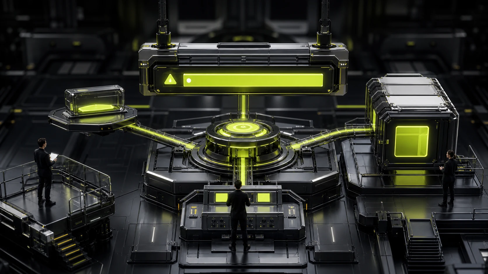
How to choose between Toast, Banner and in-site message? Notification design is not about "informing users", but about managing attention
"Save successful" can disappear after a few seconds, but "Account will be deactivated in 3 days" cannot just appear as a 2-second Toast. The selection of notification components should be determined by the importance of the information, whether action is needed, and whether history is to be retained, rather than which component is the most convenient to develop.
01 The first step is to grade the message instead of selecting components first
Notifications can be immediate feedback, system status, reminders of action needs, risk warnings, and operational messages. Their demands for users' attention are completely different.
If the team does not categorize messages, eventually all business personnel will consider themselves the most important, and three banners, five red dots and constantly popping up toasts will appear simultaneously on the homepage.
02 Toast is suitable for low-risk, brief feedback that does not require a review
For example, "Copied link" and "Saved successfully". The user has just taken an action. The feedback is merely to confirm that the system has received it and does not need to be retained for a long time.
If a Toast contains an error detail and two buttons that disappear before the user can read them, it indicates that the message level has exceeded its carrying capacity.

03 Banners are suitable for influencing the ongoing state of the current page or the entire system
For example, service maintenance, account risks, and the need to update payment methods. The Banner can persist until the issue is resolved or the user explicitly closes it.
However, the global Banner position is extremely precious. Promotions, feature updates and satisfaction surveys all competing for this area will make truly urgent information lose its distinction.
04 Modal is only used in high-priority situations where a decision must be made immediately
Modal can interrupt tasks, so it is not suitable as a regular notification. Only matters that must be handled first, such as deletion confirmation, session expiration, and key permission changes, are worth blocking.
Popping up a Modal every time a new feature is launched is essentially using users' attention to repay operational KPIs.
05 Important messages need a history record instead of relying on just one pop-up
Enterprise users may handle it during meetings, when switching pages, or several days later. Bill alerts, security incidents, approval results, etc. are suitable for entering the Notification Center or Inbox, allowing for re-viewing.
Historical messages also need to be read, unread, time, source and operation status, rather than just an infinitely growing list.
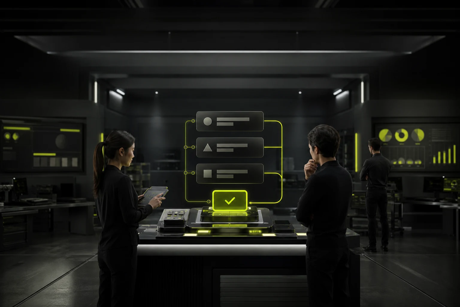
06 Should the notification copy tell the user what happened and what to do next
The "Operation failed" information is insufficient. It should be clearly stated that "File upload failed: Format not supported", and then provide "View Supported formats" or reselect.
If the user does not need to take action, do not manually add the "Got it" button. If it must be handled, the CTA should be directly related to the status.
07 Allow users to control low-priority notifications, but do not leave system security entirely to the switch
Email marketing, collaborative reminders, daily reports, etc. are suitable for providing preference Settings. Users can choose the channels and frequencies.
High-risk security notifications, payment failures, etc. require the minimum necessary reach. Even if certain channels are allowed to be closed, it is necessary to ensure that the critical status is visible within the product.
08 The notification system requires global governance; otherwise, each business will create its own red dot
The design system can define message levels, component mappings, colors, ICONS, durations, and whether to enter the message center.
A truly mature notification design is not about having five types of banners in the component library, but rather about the product having a common standard of "what is worth interrupting the user".
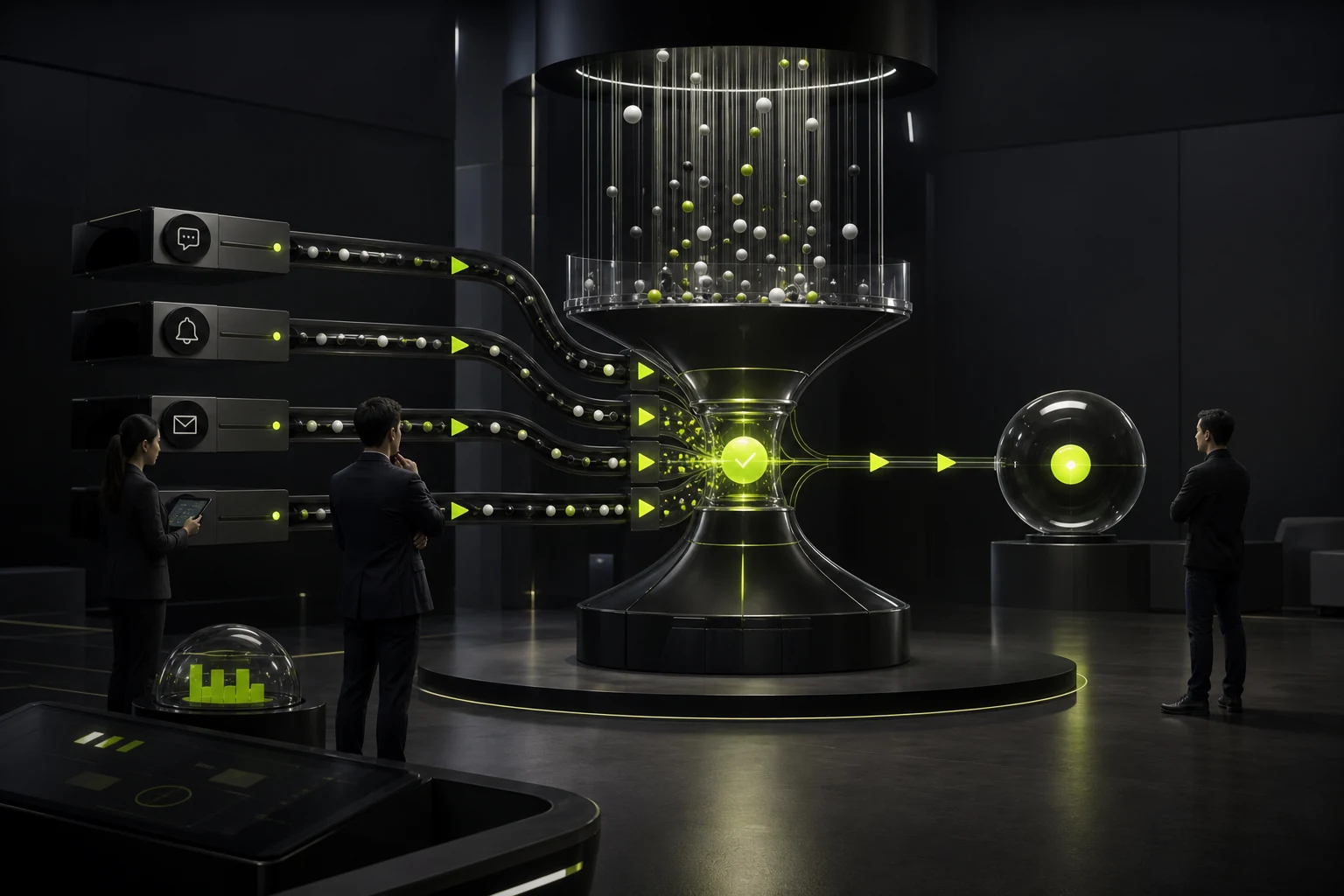
09 When the same event spans multiple channels, avoid repeated bombardment
Sending in-site messages, emails, text messages, and Push notifications simultaneously after approval is not necessarily more reliable; it might just be four interruptions. The upgrade channel can be determined based on urgency, user preferences and whether it has been read.
For instance, first add in-site and email, and then upgrade high-priority events that have not been handled for a long time, rather than sending them to all channels simultaneously.
10 Notifications need to take into account time zones and work rhythms
Global SaaS will be rolled out in batches at 10 a.m. Beijing time, but for US users, it might be late at night. Non-urgent notifications should respect the user's time zone and quiet time.
Summary notifications can allow for daily and weekly frequencies, reducing a large number of fragmented reminders.
11 "Read" does not equal "processed"
The payment failed and the pending approval was marked as "read" upon opening it once, but the problem still exists. The notification center can distinguish between read and action status, or directly link to to-do.
For information that requires actions to be completed, what truly matters is the resolution status, not the disappearance of the red dot.
Frequently Asked Questions
How long should Toast be displayed?
There is no uniform number of seconds. It should be determined based on the length and importance of the message. Information that requires careful reading or operation should not rely on brief toasts.
Can Toast be used for errors?
Minor and easily recoverable errors are acceptable; Errors for complex or blocking tasks should be placed close to the problem location or use continuously visible prompts.
Do all notifications have to go to the message center?
No need. Only information that needs to be reviewed, tracked or processed across sessions is necessary to be retained.
Can the Banner be closed by users?
Low-risk information is acceptable; If the critical status remains unresolved, there should be other discoverable entry points or re-reminder mechanisms after the closure.
Is it true that the more eye-catching the red dot is, the better?
No. Overuse of red dots can quickly lose their meaning and should be reserved for unread or to-do items that truly require attention.
| Related Service | Learn More |
|---|---|
| UI/UX Design Services | View Service Details |
| Project Consultation | Contact JVDS Design Studio |
| Design and Website Development Articles | Read More Related Articles |
 Link copied








