

Corporate home pages often resemble internal directories: a company slogan in the first screen, an introduction in the second, leadership messages in the third, and products and solutions much later. Yet first-time visitors care most about what problem you solve, who you serve, and why they should trust you.
The home page does not need to introduce the entire company. Its job is to help users choose a path. Products, solutions, case studies, technical resources, and contact options should form a scannable decision sequence.
01 State the Audience, Value, and Action in the Hero
The hero should at least explain who you serve, what you offer, what it solves, and what the visitor can do next. A slogan can remain, but it cannot replace business information.
The primary CTA should fit the decision stage. A complex B2B project may call for “View solutions,” “Get technical materials,” or “Submit requirements” rather than “Buy now.”
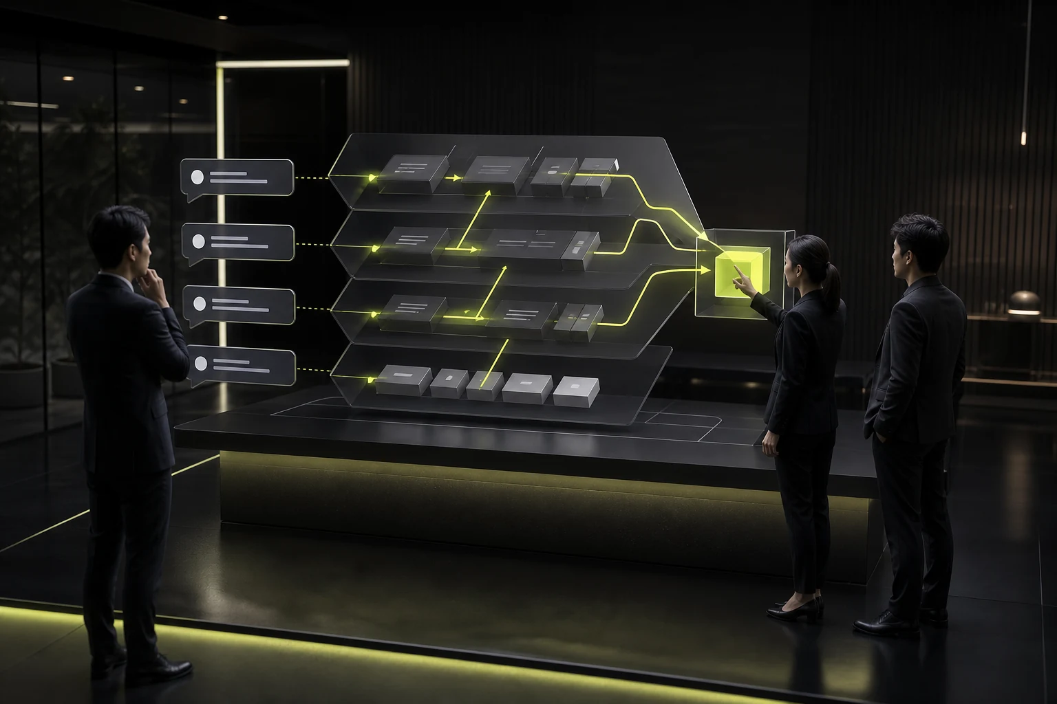
02 Organize Solutions Around Customer Problems
Do not present only the company’s internal product lines. Start with common customer scenarios or business goals, then lead visitors to the relevant products and solutions.
If product models are well defined, also provide direct product entry points so every visitor is not forced through the same marketing journey.
03 Prove Capability Instead of Rating Yourself
“Professional team,” “leading technology,” and “excellent service” need support from cases, data, qualifications, product demonstrations, and methods. Place evidence close to the claim it supports.
Keep summaries on the home page and move detail to case-study, technical, or qualification pages.
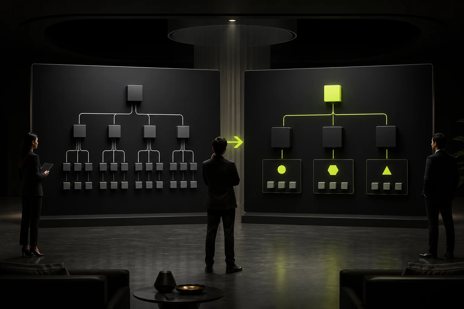
04 Show How Products and Services Relate
Customers need to know whether you sell a standalone product, a combined solution, a platform capability, or an ongoing service. Product cards should explain differences and fit, not just show a name and image.
Complex portfolios can offer comparison, filters, or industry entry points to reduce guesswork.
05 Help Different Stakeholders Find the Next Step
Executives may look for business value, technical teams for architecture and integrations, and procurement for delivery and qualifications. Layered content and entry points can support these different roles.
Do not compress every detail onto the home page. Clear routing matters more than endlessly increasing page length.

06 End by Reducing Inquiry Friction, Not Repeating the Slogan
Explain how collaboration begins, what materials are needed, when the team responds, and whether an initial assessment is available. The contact area can also show the team, process, or privacy commitment.
For visitors not ready to inquire, offer lower-commitment actions such as case studies, white papers, or product materials.
Recommended B2B Home Page Structure
| Order | Module | Question Answered |
|---|---|---|
| 1 | Hero value and CTA | Is this relevant to me? |
| 2 | Business scenarios or core solutions | What problem do you solve? |
| 3 | Product and capability entry points | Which category should I explore? |
| 4 | Cases, data, and qualifications | Why should I trust you? |
| 5 | Process, team, and service | How is collaboration risk controlled? |
| 6 | Resources and final CTA | What should I do next? |
Frequently Asked Questions
How long should a B2B home page be?
It depends on business complexity and available evidence. A long page is not a problem when the structure is clear and each module has a job; repetition and irrelevance are the problems.
Should the company introduction appear near the top?
Usually not. Explain customer value and solutions first, then use company capabilities to build trust.
Should the home page show pricing?
Standardized services can show ranges or packages. Complex projects can explain pricing factors and provide an estimate request.
How many customer cases should appear?
Feature a small set that is most relevant to the target customer, with a link to view more.
Should the home page have only one CTA?
It can have one primary CTA and a few secondary ones, but their labels and promises need a clear hierarchy. Avoid repeating the same button on every screen.
| Service | View |
|---|---|
| Related service | View service details |
| Related article | Read the article |
| Design work | View design work |
| Project inquiry | Contact JVDS |
 Link copied








