
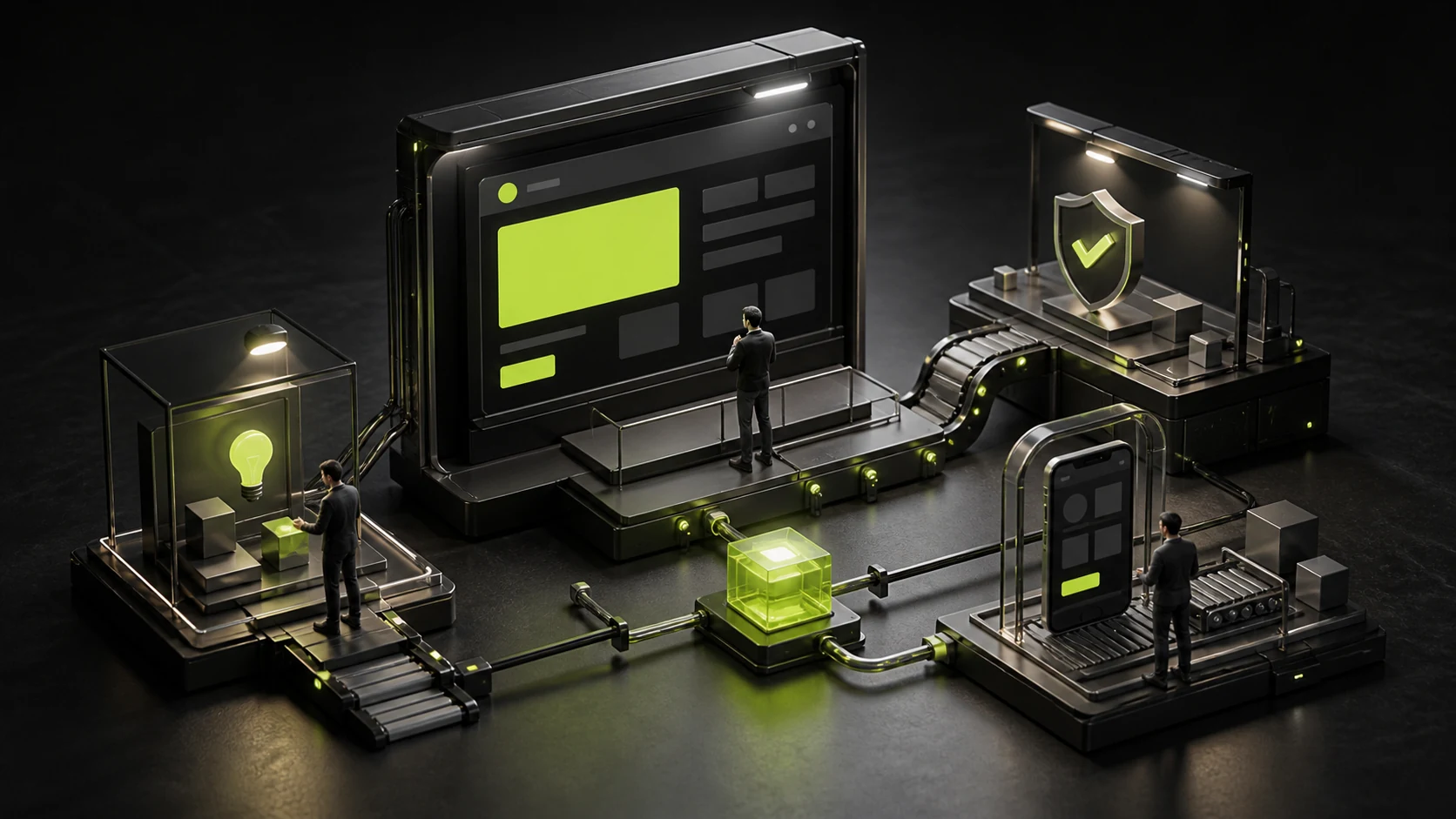
Many website heroes look beautiful, yet visitors must scroll through two or three screens before understanding what the company actually offers. A large headline says “Redefining the Future,” a dramatic video plays behind it, and the buyer is left guessing whether the company sells software, consulting, or industrial products.
The hero should reduce comprehension cost first. Brand character and visual impact can strengthen information, but they cannot replace it.
01 Make the H1 Explain the Business, Not Just an Attitude
The main heading can carry brand voice, but it should include at least one of the following: the intended audience, product category, or core outcome. An abstract slogan can support the message, but should not be the only information.
If the business is complex, use a subtitle to clarify scope and differentiation.
02 Give a Clear Reason to Choose You
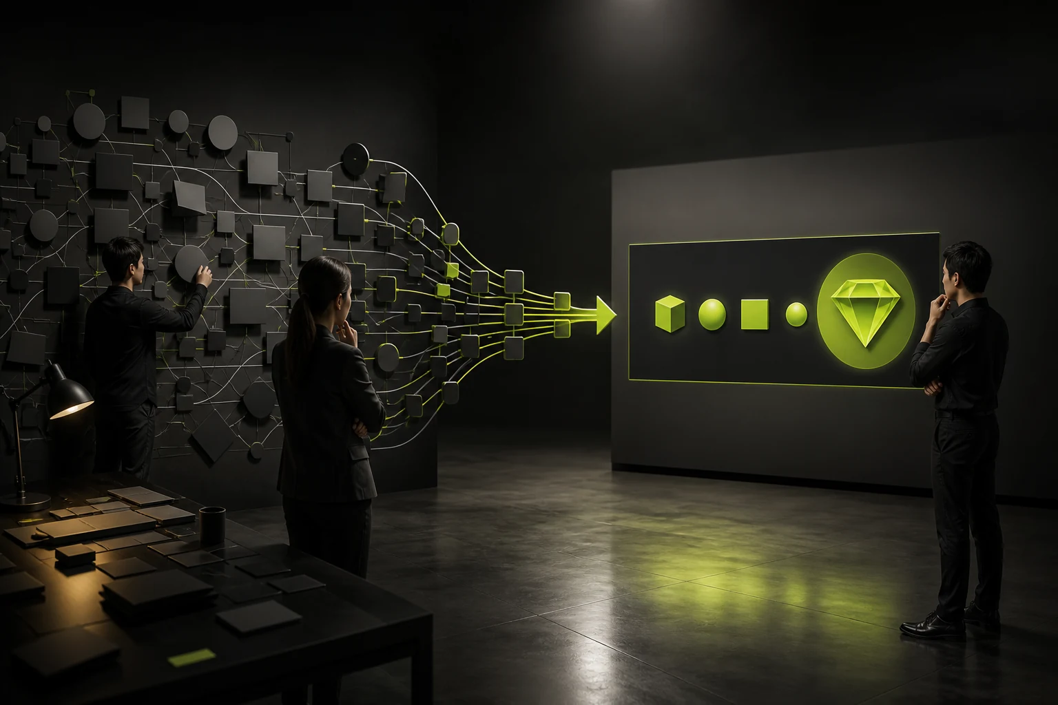
Once visitors know that you design websites, they will ask how you differ from other firms. Industry focus, integrated design and development, complex-product experience, or a distinctive delivery method can provide one credible difference.
Do not list five differentiators. Keep only the one or two most relevant to the immediate decision.
03 Make the CTA State Its Promise
“Learn more” provides too little information. Viewing cases, requesting a quote, booking a call, and downloading product materials represent different intentions.
The primary button should support the highest-value action, while a secondary button serves people not yet ready to make contact. Too many choices dilute the decision.
04 Use Visuals to Explain, Not Merely Decorate
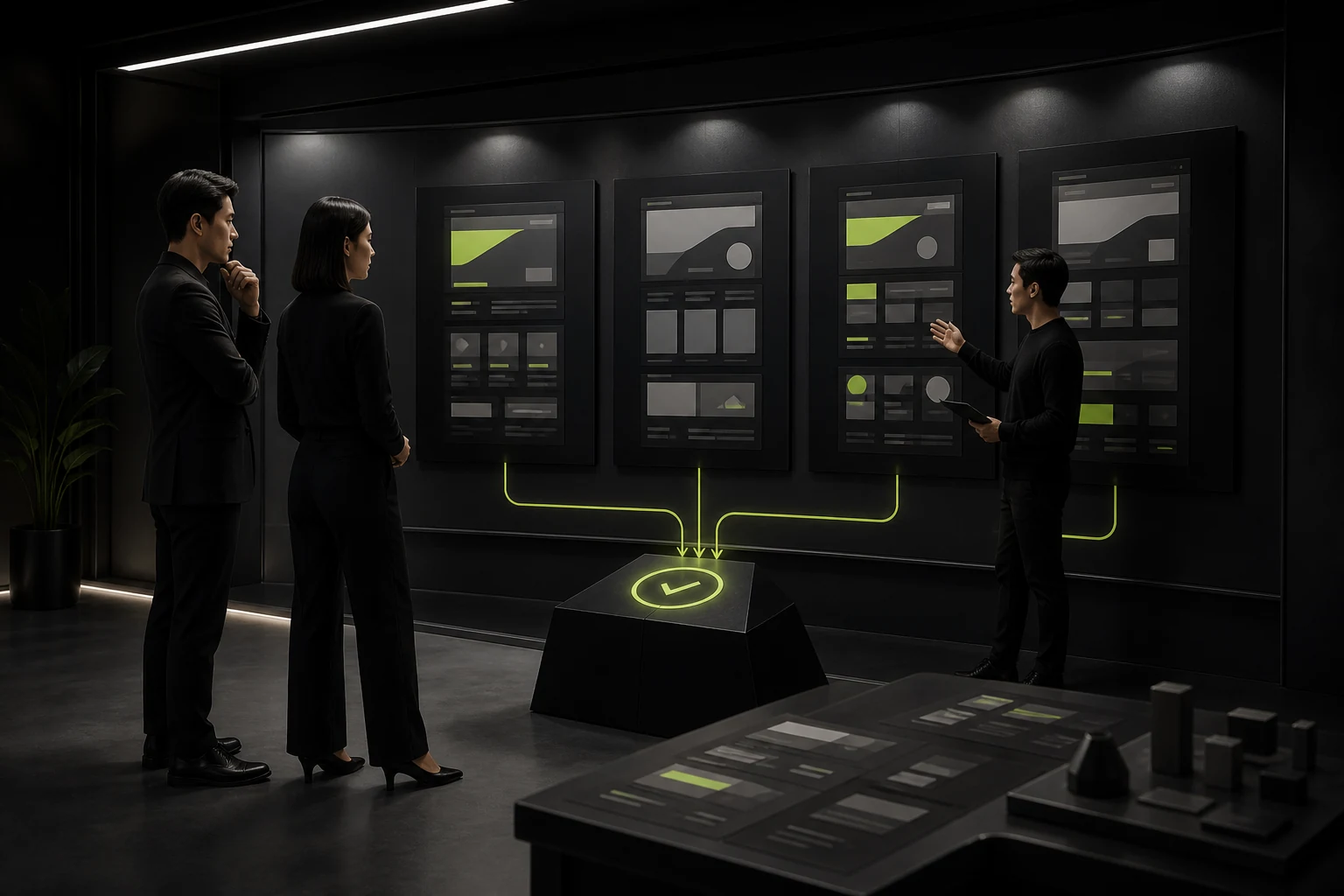
Product screenshots, service outcomes, factory environments, or real people can communicate the business directly. Abstract 3D and motion graphics can establish character, but they need to work with the copy.
Control hero asset size so visual effects do not delay the core content.
05 Put Trust Cues Where They Matter Most
A relevant customer type, key qualification, project count, or flagship case can reduce the perceived risk of continuing. Evidence must be accurate and clearly defined.
Do not compress dozens of logos into an unreadable strip or use brands without permission.
06 Validate on Mobile and Through Real Entry Paths
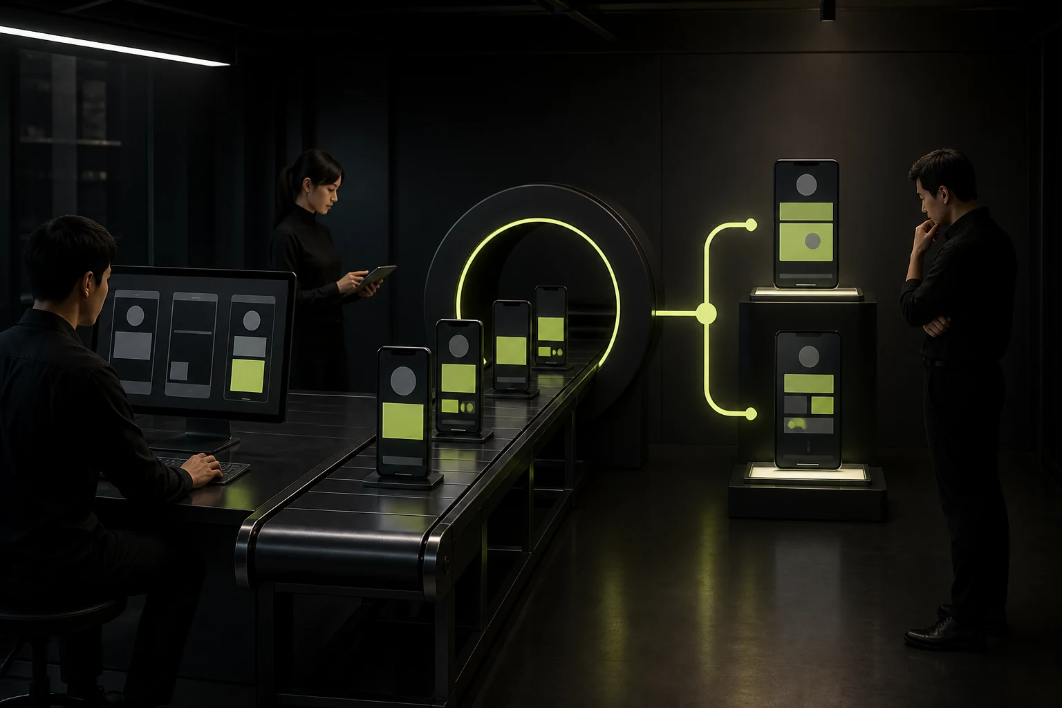
On a phone, the hero may be reduced to a heading and button while the background is cropped. Also test entries from ads, search, and shared links to confirm the heading matches visitor expectations.
Do not evaluate the hero only by team vote. Use comprehension tests, click behavior, and inquiry quality.
The Five-Second Hero Check
| Question | Successful Outcome | Failure |
|---|---|---|
| Who are you? | The product or service category is recognizable | Only an abstract slogan appears |
| Who do you serve? | The target customer or scenario is clear | It appears suitable for every company |
| What is the value? | A concrete outcome or capability is stated | Only “leading” or “innovative” claims appear |
| Why are you credible? | Relevant evidence or a difference is visible | Only self-assessment appears |
| What is next? | The button promise is clear | Only “Learn more” appears |
Frequently Asked Questions
Should the hero heading include a keyword?
It should describe the page topic naturally without keyword stuffing. The heading should help users understand and remain consistent with the page content.
Can the hero use full-screen video?
Yes, with a static fallback, controlled file size, and readable copy. It must not compromise loading, legibility, or the mobile experience.
Should customer logos appear in the hero?
If they are authorized and directly strengthen relevant trust, show a small selection. Otherwise use qualifications, cases, or specific capabilities.
What is the best primary-button label?
Match the user stage with labels such as “View solutions,” “Request a quote,” “Book a call,” or “Start a trial.” Avoid vague wording.
How can we test whether the hero is clear?
Show it to someone unfamiliar with the business for five seconds, then ask them to explain what the company does, who it serves, and what to do next. If they cannot, revise it.
| Service | View |
|---|---|
| Related service | View service details |
| Related article | Read the article |
| Design work | View design work |
| Project inquiry | Contact JVDS |
 Link copied








