
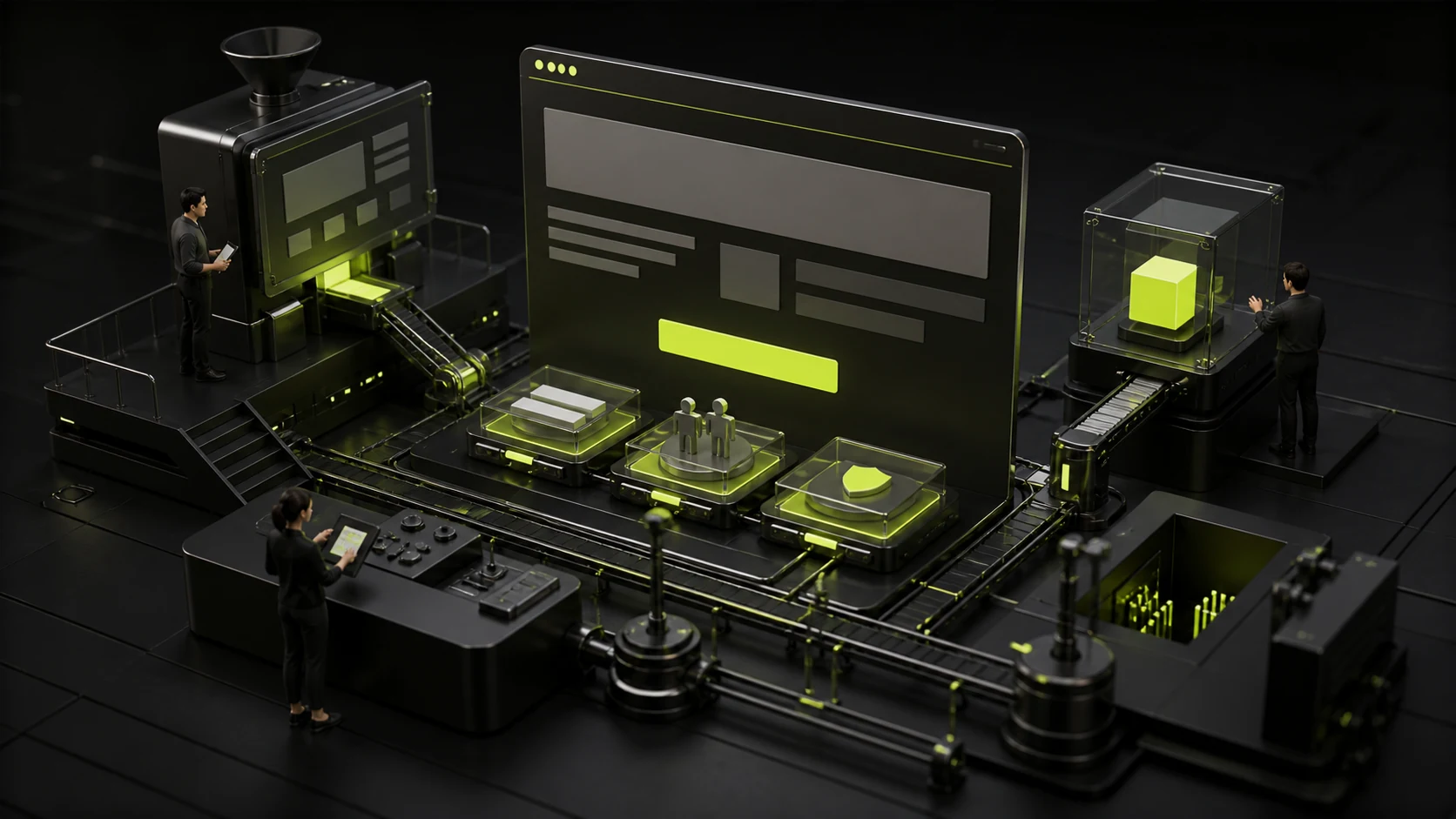
How should the first screen of a corporate website homepage be designed? The first thing users need to know is not the "vision", but what exactly you are doing
The first screen on the home page is not a grand slogan plus a large image. For unfamiliar visitors, it first needs to answer within a very short time: who you are, what you do, who you serve, and why it's worth continuing to watch.
01 The most important task on the first screen is to establish the basic context
The most common mistake on the first screen of a corporate website is to place brand expression before business understanding. The title reads "Connecting the Future", "Redefining Possibilities", and "Making the World a Better Place", accompanied by a full-screen video. The visual experience is very complete, but visitors still have no idea what the company sells after watching it.
Nielsen Norman Group has long emphasized in its research on enterprise websites that for unfamiliar companies, users first want to know "what exactly does this company do?" Its corporate and investor website research even suggests that the homepage should use one or two lines of straightforward text to describe the company's business, rather than forcing users to enter About Us first to understand the basic background. This is especially true for B2B enterprises, as a lot of traffic comes from search, exhibitions, LinkedIn or sales sharing, and visitors have no brand awareness.
02 The title should first clearly state "value", not just "vision".
The title on the first screen is not necessarily the shorter the more advanced. A good title should at least make the target customers confirm that "this is related to me." For instance, "Providing an automated customer service platform for cross-border e-commerce teams" may not be as emotionally charged as "Reimagining customer relationships", but it has a higher information density.
If the brand itself enjoys high popularity, it can be more abstract. For most growth-oriented enterprises, a more stable structure is "business category + target object/scenario + core value". The title is responsible for establishing the direction, while the subtitle supplements the differences, scope of ability or applicable scenarios. A vision is not something that cannot be realized; rather, it should emerge only after users already know what you are doing.
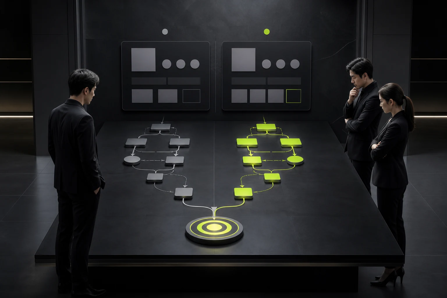
03 The subtitle should not repeat the title but complete the decision information
Many subtitles on the first screen are just rephrases of the title. For instance, the title should be written as "New Future of Intelligent Manufacturing", and the subtitle should be "Driving the Future of Intelligent Manufacturing with Innovative Technologies". There are two lines of text visually, but there is still only one sentence in terms of information.
The subtitle is more suitable for supplementing the content that users need but the title cannot cover: which industries are served, which regions are supported, how the product is deployed, and what the core advantages are. For complex B2B businesses, you can combine "what to do" and "why it is trustworthy" in 1-2 sentences, allowing visitors to make basic judgments without scrolling.
04 How many CTAs are needed for the first screen? The key lies in priority
The homepage of an enterprise often features five buttons simultaneously: "Consult Now", "View Products", "Download Materials", "Watch Videos", and "Learn More". Every department hopes that its entrance is more obvious, but the result is that there are no real major actions.
The first screen of the homepage usually requires a main CTA, followed by a low-weight secondary CTA. The main CTA corresponds to the most important business paths, such as "Book a product demonstration", "Submit project requirements", and "View products". This CTA can serve those who are not yet ready to consult, such as "View Cases" or "Understand Solutions". The more buttons there are, the easier it is to convert. On the contrary, the more choices there are, the higher the cost of judgment will be.
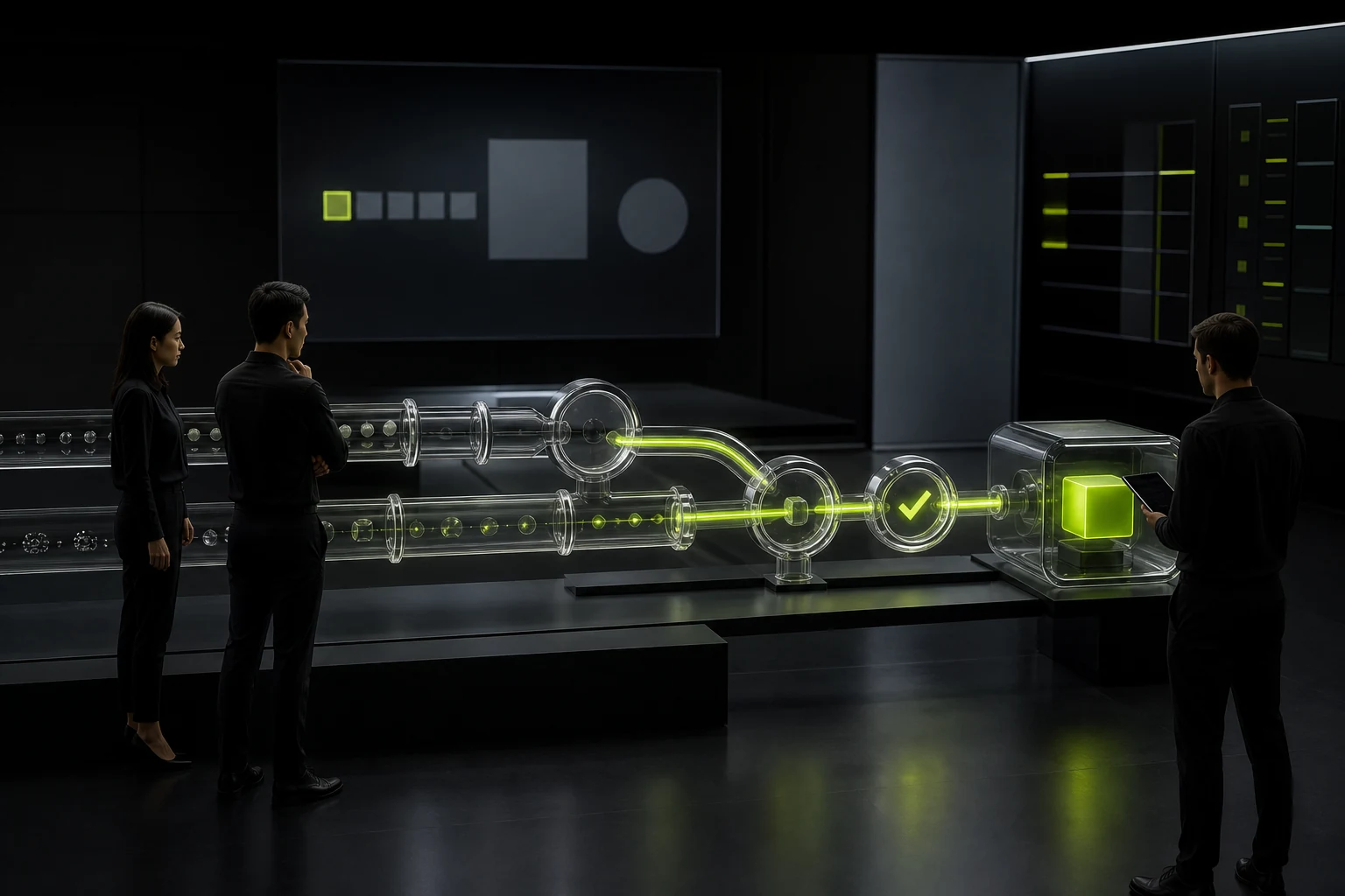
05 Should the CTA copy let users know what will happen after they click
In the CTA method released by NN/g in 2026, three very practical principles are presented: starting with an action verb, establishing expectations, and explaining the value of the action. Compared with the general "learn more", for instance, "View industrial camera products", "Schedule a 30-minute demonstration", and "Get project quotations" are all more specific.
Especially for high-value B2B projects, users' uncertainty about the next step will affect clicks. When writing "Contact Us", he might be worried about being followed up by a sales call immediately. It is more predictable to write "Submit requirements and get a reply within one working day". Minor changes in the copywriting are essentially aimed at reducing the sense of risk.
06 The first-screen visuals should help understand the business rather than steal information
Full-screen videos, 3D, and abstract animations can all build a brand sense, but the prerequisite is that they do not make the core information difficult to read and do not cause the page performance to get out of control. For equipment, manufacturing, medical care, space, and consumer brands, real product or scene pictures can often quickly explain the business. For pure software, it can be assisted by product interfaces, result demonstrations, or abstract but meaningful dynamic graphics.
What needs to be guarded against are "beautiful but irrelevant" materials. An AI SaaS homepage features an aerial view of a city, with a very cinematic visual effect, but it cannot help users understand the product. The first screen material should at least undertake one function: explaining the product, presenting the scene, establishing credibility, or strengthening brand recognition.

07 Place the trust evidence at the position where the user has doubts
After B2B users see the value proposition, the next step is often to judge "Is it really reliable?" Therefore, on the first screen or adjacent to it, a small amount of high-quality evidence can be placed: real customer logos, certifications, covered markets, key data or product capabilities.
But don't cram all the awards, clients and statistics onto the first screen. The first screen only needs to address the most critical questions. Detailed evidence can be elaborated in the subsequent cases, capabilities, and About Us modules. For unknown enterprises, clear facts are more convincing than unverifiable adjectives like "globally leading" and "industry top".
08 Conclusion: The homepage is not a brand poster but the interpreter of the entire website's entry point
The criterion for judging an excellent first screen is not "whether the screenshot looks good when posted on Moments", but whether unfamiliar users can quickly answer four questions: What does this company do? Is it serving me? What's worth continuing to watch? What can be done next?
Brand sense, visual impact and dynamic effects can add memorable points on this basis, but they cannot replace business expression. For most corporate websites, let users understand first and then experience. Establishing the context first and then unfolding the story is often more effective than making a beautiful poster first.
Frequently Asked Questions
Is it true that the shorter the title on the homepage of a corporate website, the better?
Not necessarily. As long as the business and value can be quickly clarified, a slightly longer title is completely acceptable. Don't sacrifice understanding for a sense of "sophistication".
Must the company name appear on the first screen?
Usually, the Logo already serves to identify the brand, so it is not necessary to repeat the company name in the title. The title should be given priority to illustrate the business value.
Should the first screen display a video or a static image?
It depends on the content value and performance cost. Videos are only worth using when they can explain the product, scene or brand, and the loading on the first screen should be controlled.
How many buttons are appropriate to place on the first screen of the home page?
Usually, one primary CTA plus one secondary CTA is sufficient. Complex business can add text links, but a clear priority should be maintained.
Is "Consult Now" the best CTA?
Not necessarily. For B2B users, more specific and predictable copy is usually better, such as "Get Project Quotations", "Schedule product demonstrations", and "Submit Requirements".
| Related Service | Learn More |
|---|---|
| Corporate Website Design Services | View Service Details |
| Project Consultation | Contact JVDS Design Studio |
| Design and Website Development Articles | Read More Related Articles |
 Link copied








