How to design the navigation for a corporate website? What truly affects whether users can find content or not is the information architecture rather than the menu style
The real issue that an enterprise's corporate website navigation needs to address is whether users can predict what they will see when they click in. The menu style is only the surface. It is the classification logic, tag language and hierarchy that determine whether something can be found or not.
01 For navigation design, don't discuss "horizontal or hamburger menu" for now.
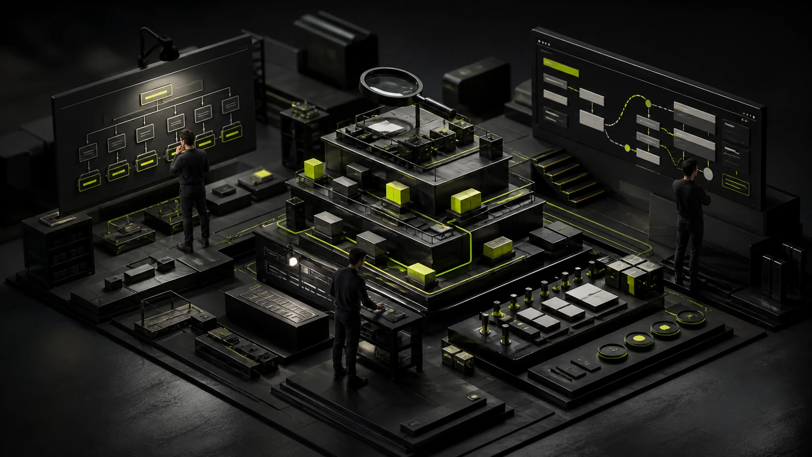
When a corporate website is being revamped, navigation is often regarded as a visual issue: how many first-level menus should be placed, whether to create a Mega Menu, whether the drop-down menu should be in two or three columns, and whether to use drawers or full screen on mobile devices. But these are only the final forms of presentation. What truly determines whether a navigation system is user-friendly or not is the website's information architecture: how the content is classified, how users understand these classifications, and whether each column name enables people to predict in advance what is inside.
The Nielsen Norman Group summarizes information architecture as the structuring, organizing and naming of website content. Its research also repeatedly emphasizes "information scent", that is, when users see a link or tag, whether they can infer from the name whether the next step is closer to the target. For a corporate website, if the navigation reads "Empowerment Center", "Innovation Ecosystem", or "More", internal employees might understand the meaning, but first-time visitors usually can only guess.
02 First principle: Navigation tags should be in the customer's language rather than the internal language of the enterprise
Within enterprises, business is often managed according to an organizational structure: Division One, Digital Center, Innovation Platform, and Solution BU. However, when customers enter the corporate website, they are not aware of these departments and do not care about the internal division of labor. He is more likely to look for "products", "industry solutions", "technical support", "cases" and "contact us".
For the menu design of NN/g, it is recommended to emphasize the use of clear, specific and familiar words, and avoid creative naming in the navigation. Navigation is not the location of brand slogans. A very practical way to judge is: take a separate screenshot of the menu label and do not show the user the page. If the other party can still roughly say what they will see after clicking, then this label can be considered to have sufficient information flavor.
03 Second principle: Don't blindly believe that "content must be found with three clicks"
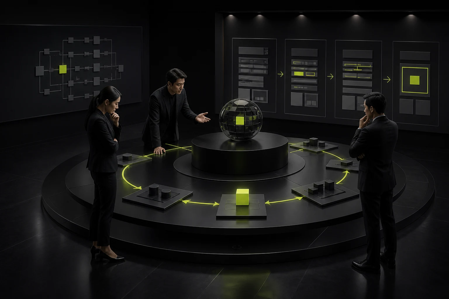
Many website planners require that "any content be reached within three clicks". NN/g clearly states that the 3-Click Rule is not a reliable availability rule. What users usually care about is not the number of clicks themselves, but whether they know where they are at each step, where they should go next, and whether they need to repeatedly judge among a large number of ambiguous options.
Rather than pushing all the content into two layers, making the menu extremely crowded, it is better to maintain a clear hierarchy and provide sufficient path hints. For manufacturing, SaaS or group enterprises with complex product systems, a three-tier or even four-tier structure is not inherently wrong. The mistake is that the classification boundaries of each layer are ambiguous, or users have to rely on trial and error to understand.
04 When is Mega Menu suitable for large-scale corporate websites
When there are multiple clear subcategories under a first-level column and users often need to cross two or three levels to search for specific content, Mega Menu is easier to scan than multi-level cascading pull-down. The menu guide of NN/g also suggests that large websites expand through multiple layers of information in submenus, avoiding multi-level cascading menus that require precise mouse movement.
But Mega Menu is not "the more content, the more professional". It should have clear groupings, distinct column titles and a stable sequence. If products, industries, resources and support are all mixed in one huge panel, users still need to reclassify them. ICONS and pictures can assist in recognition, but they cannot replace clear text labels.
05 Breadcrumbs are not decoration; they serve a positioning function within deep pages
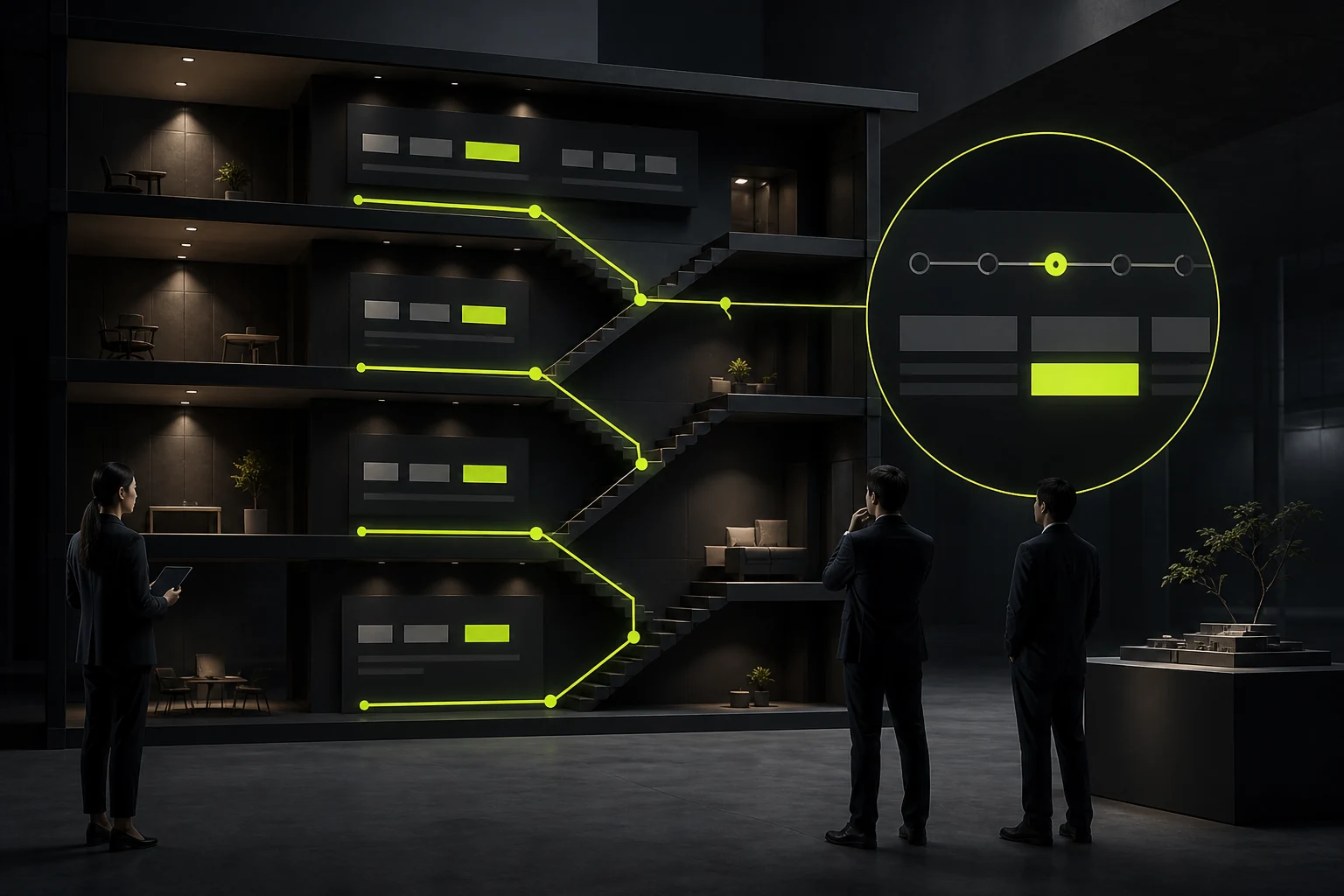
For deep pages such as product details, industry solutions, and knowledge articles, users often do not enter from the homepage but directly land through search results. At this point, the breadcrumbs can inform the user which layer the current page is at and provide a path to return to the upper-level category. W3C WCAG 2.2 also requires websites to provide multiple ways to position pages and that the purpose of links be understandable.
For corporate websites, breadcrumbs are particularly suitable for structures like "Product Center > Product Series > Specific Model" and "Resource Center > White Paper > A Certain Report". It can also work in conjunction with Breadcrumb structured data to help search engines understand the position of a page within the site hierarchy.
06 Mobile navigation is not about shrinking the desktop menu
The desktop version can expand dozens of options at once, but the mobile phone screen cannot. On mobile devices, sequential browsing is usually required: first enter "Products", then select the product category, and finally enter the specific series. The menu research of NN/g indicates that on mobile devices, sequential navigation can support a deeper information architecture while avoiding piling up multiple layers of accordions on small screens.
When designing, attention should also be paid to the touch control target. The Target Size (Minimum) AA success criterion of WCAG 2.2 requires that the pointer target be at least 24×24 CSS pixels, or meet the corresponding pitch exception. In fact, the corporate website can be made more relaxed, especially in terms of menus, close buttons and language switching. Do not make the click area too small just for the sake of visual refinement.
07 How to test the navigation before it goes live instead of relying on meeting votes
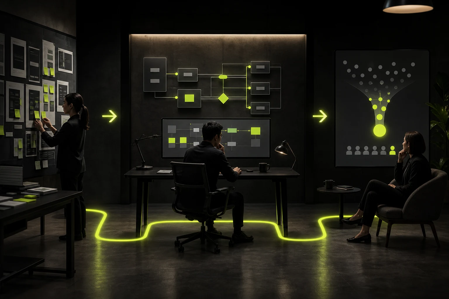
The statement "I think this classification is more reasonable" does not prove that users understand it this way. For important corporate websites, Card Sorting can be used to understand how users categorize content, and Tree Testing can be used to verify whether they can find their targets along the proposed hierarchy. NN/g directly uses Tree Testing to evaluate menu labels and classification hierarchies.
Even without a complete research budget, small-scale task tests can be conducted: Have several people who are not familiar with the internal structure of the enterprise respectively find "a certain product specification", "a certain industry case", "after-sales support", and "contact sales", and observe where they click first and at which step they hesitate. This process is usually more likely to expose real problems than conducting three rounds of internal navigation reviews.
08 Conclusion: Good navigation makes users guess less rather than click less
To determine whether the navigation of an enterprise's corporate website is mature, three questions can be considered: whether users understand the names of each column; After entering the deep page, do you know where you are? Is there a clear and stable path when looking for important content?
Visual form is of course important, but it is merely a load-bearing structure. The true value of navigation lies in translating a company's complex products, services and content into paths that customers can understand. Users can smoothly find products, cases, materials and contact information without having to learn your organizational structure or guess what "innovation ecosystem" means. This is when the navigation design has accomplished its task.
Frequently Asked Questions
How many levels of navigation should be placed on a corporate website?
There is no fixed number. More importantly, it is about whether the classifications are mutually exclusive, whether the labels are clear, and whether the most important tasks can be quickly discovered. Don't force different contents together just to make up "five" or "seven".
Is Mega Menu definitely better than the ordinary drop-down menu?
No. When there is less content, a regular dropdown is more direct. Mega Menu is more valuable only when there are many subcategories and users need to search across multiple categories.
Can "Learn More" be used as a navigation name?
It is not suitable to be used as the main navigation tag. Its information smell is very weak, and users cannot predict the destination. The secondary links in the main text should also be written as specifically as possible.
Does a corporate website need breadcrumbs?
If the website has a deep hierarchy and a large number of products and contents, it is recommended to use it. Single-page or extremely shallow websites may not be necessary.
How to determine if the navigation is better after the revision?
It can be judged by combining Tree Testing, usability testing, site search terms, menu click data and the reach rate of key pages together, rather than only looking at visual feedback.
| Related Service | Learn More |
|---|---|
| Corporate Website Design Services | View Service Details |
| Project Consultation | Contact JVDS Design Studio |
| Design and Website Development Articles | Read More Related Articles |
 Link copied