

Does a Corporate Website Need Dark Mode? Use Cases, Accessibility, and Implementation Boundaries
Dark Mode is not a matter of replacing white with black. Whether it is worthwhile depends on the viewing environment, brand expression, content type, and maintenance capacity. The real cost lies in validating two sets of colors, imagery, states, and accessibility.
Corporate websites in technology, AI, gaming, automotive, and creative industries increasingly favor dark visuals, so redesign projects often ask, "Can we add a Dark Mode switch?" In a mockup, this looks like one extra color palette. In implementation, it affects brand colors, logos, imagery, charts, forms, shadows, code components, and content operations. Before committing, clarify whether dark is the brand direction or a user-switchable feature.
01 The Bottom Line
• "A website with an overall dark visual style" and "a website supporting Light and Dark themes" have completely different scopes.
• A dual-theme system should respect the operating-system preference and use semantic colors and replaceable assets instead of manual page-by-page recoloring.
• A dark theme must still meet WCAG contrast requirements: generally at least 4.5:1 for body text and 3:1 for essential non-text UI cues.
02 1. Distinguish a Dark Brand Style from Actual Dark Mode
If a brand's website is inherently dark—perhaps for immersive film, AI infrastructure, or premium automotive—it may not need a light mode at all. It is simply a website with a dark visual identity. Actual Dark Mode means that the same content supports two or more appearances and switches according to user preference or a manual choice.
This distinction directly determines the workload. A dark brand site needs one complete theme. Dual themes require every component, state, chart, image, and piece of third-party content to work on both backgrounds. That is a design-system capability, not merely a page-level visual effect.

03 2. Corporate Websites Do Not Have to Provide Theme Switching
Apple's Human Interface Guidelines recommends that applications respect the system appearance and notes that a separate app-level setting adds something else for users to manage. The web does not have exactly the same rules, but the principle remains useful: without a genuine need, do not add a rarely used feature that the team must maintain indefinitely merely to follow a trend.
To judge whether it is worthwhile, consider session length, viewing conditions, brand character, and the existing product ecosystem. Developer tools and back-office products used for long sessions are more likely to benefit. For a corporate website visited for two minutes, the value of dual themes may be limited.
04 3. Dark Mode Cannot Simply Swap #FFFFFF and #000000
Pure white body text on pure black has very high contrast, but it can feel harsh during long reading, and brand colors acquire completely different visual intensity on a dark background. A dark theme usually needs new layers for backgrounds, text, borders, surfaces, and status colors rather than a simple inversion.
A more robust design system uses semantic tokens such as background-primary, text-primary, border-subtle, and surface-elevated, then maps each meaning to a different value by theme. Component logic stays consistent while theme changes remain concentrated in the token layer.
05 4. WCAG Contrast Requirements Still Apply in a Dark Theme
At WCAG 2.2 AA, normal text generally needs a minimum 4.5:1 contrast ratio against its background and large text 3:1. Essential non-text visual information used to identify UI components and states needs at least 3:1 against adjacent colors. Dark does not automatically mean high contrast.
A common problem is "gray on gray." In pursuit of a premium, desaturated look, teams make secondary text, input boundaries, disabled states, and table dividers too faint. The result looks restrained but is difficult to perceive. Design review must verify ratios with contrast tools rather than trust how a monitor looks.

06 5. Brand Colors Usually Need Recalibration on Dark Backgrounds
A blue that feels calm on white may glow like neon on black. Highly saturated reds, greens, and purples can behave similarly. "The brand color cannot change" is not a reason to copy the light-theme value unchanged. Preserve hue relationships and brand recognition while adjusting lightness and saturation.
Test status colors as a system too. Success, warning, and error should not rely on color alone; include an icon, label, or shape. This supports accessibility and prevents state differences from becoming difficult to distinguish in a dark environment.
07 6. Logos, Product Images, and Photography Are the Most Frequently Overlooked Assets
A logo designed for white may need a reversed version on black. Product images with transparent shadows may develop dirty edges on a dark background, and a pale product photographed for a white page may lose its outline. Theme switching that changes only CSS regularly exposes asset problems.
The CMS therefore needs theme-specific assets, or the design needs an asset standard that works on both backgrounds. Content editors also need instructions about formats, transparency, and required variants. Otherwise, new content will gradually break theme consistency after launch.
08 7. Follow the System First, Then Offer a Stable Manual Choice
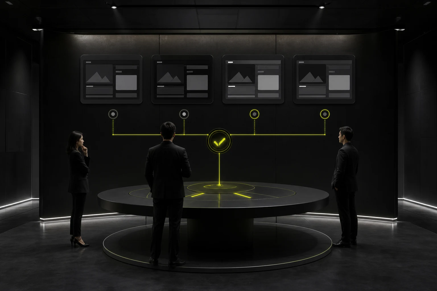
A website can read the operating system's light or dark preference with prefers-color-scheme. A common strategy is to default to "System" while allowing a manual Light or Dark selection and remembering it so users do not have to set it again on every visit.
If a user explicitly selects Dark, do not overwrite that decision the next time because the system switches to Light during the day. System preference is the default; an explicit user choice has higher priority.
09 8. Launch QA Must Cover Every State, Not Only the Homepage
Frequently missed areas include form focus, error messages, cookie dialogs, third-party embeds, search results, tables, code blocks, the download center, maps, and image placeholders. These modules may come from different components or external services and will not automatically follow the theme.
Dual themes nearly double the QA workload. If the company lacks a stable design system and a long-term maintenance team, complete one theme well instead of delivering a "Dark Mode" whose homepage looks finished while inner pages leak white everywhere.
10 9. Ask Four Questions Before Committing to Dual Themes
First, will users spend long periods on the site, or is low-light use clearly important? Second, can the brand and content remain coherent in both themes? Third, can the design system and CMS maintain theme-specific assets? Fourth, will the team accept the ongoing testing cost? If most answers are no, one theme is usually the better investment.
"Our competitors have it" is not evidence of Dark Mode's value. On a corporate website, clear content, stable performance, authentic case studies, and mobile usability usually influence decisions more than a theme switch.
Frequently Asked Questions
Does every corporate website need Dark Mode?
No. Dual-theme support depends on user scenarios and maintenance capacity. For many brands, one high-quality theme is the more sensible choice.
Should a dark theme use pure black?
Not necessarily. Pure black is not inherently wrong, but dark gray often makes hierarchy easier to establish. Contrast, brand expression, and long-form reading comfort are what matter.
Are body-text contrast requirements lower in Dark Mode?
No. WCAG contrast requirements apply equally to dark themes, and normal text at AA generally still needs at least 4.5:1.
Should the theme switch automatically with the system?
When dual themes are supported, following the system by default is usually natural. The site should also respect and remember an explicit manual choice.
Why are dual themes expensive?
The work covers more than colors: component states, images, logos, charts, third-party content, CMS assets, and complete QA in both themes.
| Related Service | Learn More |
|---|---|
| Corporate Website Design Services | View Service Details |
| Project Consultation | Contact JVDS Design Studio |
| Design and Website Development Articles | Read More Related Articles |
 Link copied








