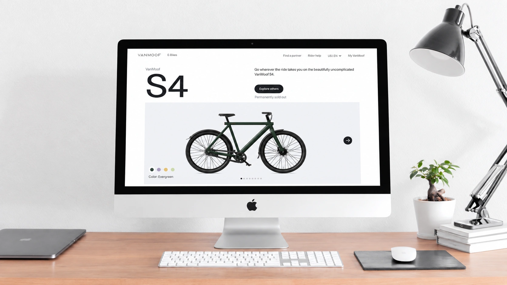
We often discuss the visual experience of web design because it is critical and is one of the first things users notice when opening a website. Few people will enjoy a site whose color palette looks poorly executed, even when its underlying content is excellent. If color matching is so important, what should designers consider? Today, a Beijing website development company discusses the question.
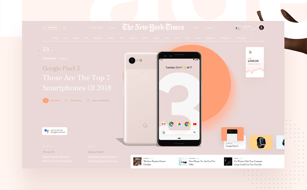
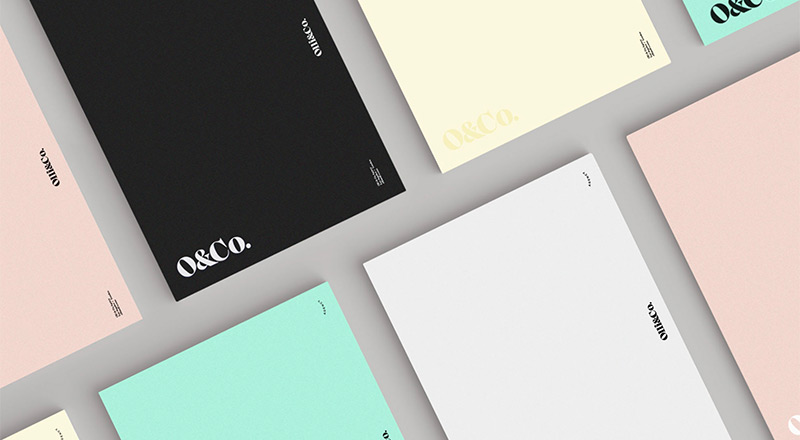
Website color matching should first be systematic, both in the palette itself and in how colors vary. A web page rarely relies on a single flat tone, which can feel visually limited. Small variations in transparency and the use of gradients can make the palette more dynamic. Users generally want a clean, bright page. As a rule of thumb stated in the source, a page should use no more than three colors, with one established as the primary color. White is a relatively safe background choice. Certain sites, such as food websites, can appropriately use warm primary colors such as orange, red, and yellow, supported by complementary shades.
Color can also appear through special effects suited to particular contexts or pages. Shadows, lines, and highlights may make images look more refined. Effects are generally not recommended for the page background, however, because they can compete with the content and distract users.
Color is an important part of everyday perception; without it, life would feel monotonous. Website development should respond to this preference and shape a site that users enjoy. Respecting their expectations is fundamental to good web design. If you are unsure how to build a website palette, a professional web-design company such as “Beijing Website Development Company” can provide one-to-one custom website design.
Need design or website development services?
JVDS Design Studio is a professional design studio focused on digital product experiences and brand identity. We work with businesses in China and overseas that want to strengthen their brand image, improve user experience and grow their business, providing clear, usable UI/UX design, high-quality website design and development, app and mini-program development, and cohesive, distinctive brand identity design.
Planning a corporate website, a multilingual site or a redesign? Tell us about your audience, existing website and the work you need.
 Link copied