

How should the "Contact Us" page on a corporate website be designed? Don't force high-intent customers into a form without feedback
When users voluntarily enter "Contact Us", they are usually closer to consulting than ordinary visitors. At this point, the most important thing is not to show off your skills visually, but to reduce contact costs, provide clear channels, avoid meaningless fields, and let users confirm whether the submission is successful.
01 The contact page is not "the last page of the website", but a key conversion node
Many corporate websites focus a great deal of effort on their homepages and case studies, but the Contact us page is left with only a map, an address and a default form. The problem is that those who actually enter here often have already completed the previous understanding and are looking for a low-risk next step. Once this page becomes confusing, it will directly result in the loss of high-intent leads.
The core tasks of the contact page are only a few: informing users of the ways they can get in touch, allowing them to choose the channel that suits them, collecting the minimum information needed to complete the next step, and clearly stating what will happen after submission. Any decoration that does not serve these goals should be placed at the back.
02 First provide the contact information, and then decide whether the form is the sole entry point
Communication habits vary among different businesses and regions. B2B enterprises can provide methods such as phone calls, email addresses, forms, instant messaging, and meeting reservations based on the actual habits of customers. It's not necessary to include all of them, but it's also not recommended to force everyone into the same form.
For instance, purchasers might prefer to send technical materials directly to email, overseas customers might be accustomed to scheduling meetings, and emergency after-sales service is more suitable for phone calls. It is more helpful to clearly state the channels and uses than just listing a few ICONS. When necessary, they can be diverted by types such as "business cooperation, after-sales support, media and recruitment" to reduce internal forwarding.
03 The form fields should be inferred from "sales needs" rather than the more complete they are
In the Forms Tutorial updated by W3C in 2026, it is explicitly recommended that users only input the information truly necessary to complete a transaction or process. Irrelevant or excessive data will increase the risk of giving up. This principle is highly suitable for B2B inquiry forms.
The company name, contact person, contact information, type of requirement and brief description are usually sufficient to support the first communication. Whether fields such as budget, detailed address, staff size, and procurement cycle are mandatory depends on whether the sales department will actually use them in the first step. There is no need to put all the information that can be communicated later on the first submission.

04 Do not replace labels with placeholders
Some minimalist forms, for the sake of being "clean", only put placeholders in the input boxes, such as "Name" and "Email". As soon as the user starts to input, the prompt disappears, and it is very difficult to confirm the meaning of each field when checking back. The W3C form guidelines clearly state that placeholders cannot replace labels and emphasize that input controls should have clear and associated labels.
Visually, labels can be made restrained, but understandability and accessibility should not be sacrificed for the sake of minimalism. Especially for multilingual websites, complex fields or mobile devices, stable and visible tags are even more important.
05 The error prompt should inform the user "where it is wrong and how to correct it"
"Submission failed" and "Format error" are merely system states, not executable guidelines. Better error prompts will target specific fields and explain the correct format, such as "Please enter a valid business email address" or "The phone number can include the country code".
The W3C also recommends providing input validation and accessible notifications in forms to help users avoid and correct errors. The error status cannot be expressed merely by a red border; it also needs to be accompanied by text or other perceptible prompts.

06 The status of success must be clear, especially for high-value consultations
After a user clicks "Submit", if the button briefly spins around and then returns to its original state, he will doubt whether it was successful and may even resubmit. A clear success page or success status should inform users that the request has been received, approximately when it will be replied to, whether it will be contacted by phone or email, and what alternative channels are available.
If an enterprise promises to "reply within one working day", it should ensure that the sales process can truly achieve this. Rather than writing an unfulfilled promise of immediate response, it is better to give a true expectation. Certainty itself is part of the experience.
07 Addresses and maps should serve real visits, not to make them look like "big companies".
When there is a need to visit an offline office, exhibition hall or factory, the address module can include business hours, transportation methods, parking, entrance instructions and maps. Multi-location enterprises should clearly distinguish the differences between the headquarters, sales offices, factories and after-sales centers.
If the business is fully online, there is no need to stuff a huge map to make the page full. A more concise description of the company's registered address, service area and remote collaboration can be used to avoid the map occupying the main visual space without practical use.
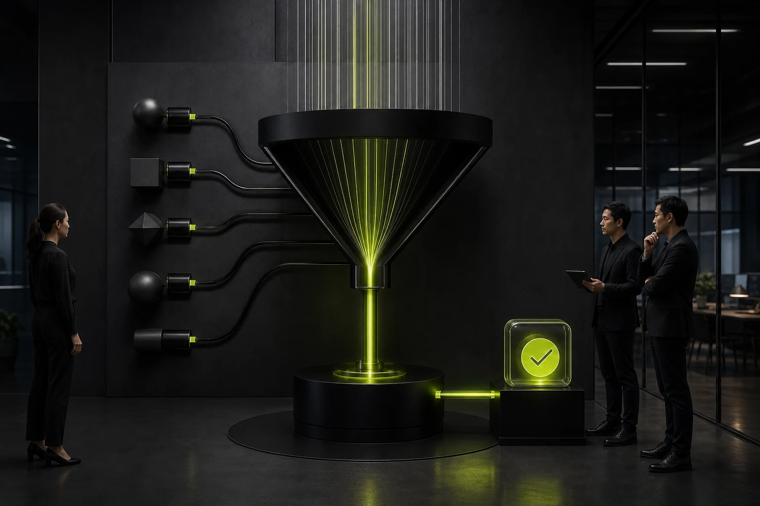
08 Privacy and anti-spam measures should not undermine the normal user experience
Contact forms usually collect name, email, phone number and company information, and should provide a clear description of the purpose and an entry to the privacy policy. Anti-spam measures also need to be balanced. Overly complex verification codes will increase the burden on normal users.
For enterprises, a better strategy is to combine backend rate limiting, hidden fields, risk assessment or more friendly verification mechanisms, rather than shifting all security costs onto users.
09 Conclusion: The goal of optimizing the contact page is to "enable those who truly want to contact to get in touch smoothly."
The contact page doesn't need to be complicated. It can even be one of the simplest pages on the entire site. But simplicity does not mean lack of information: contact details, form fields, labels, errors, success feedback and next steps all need to be complete.
When evaluating the page, you can walk through it yourself on your mobile phone: Can first-time visitors find the appropriate way, complete the submission and confirm the result within tens of seconds? If the answer is negative, the problem is usually not the color of the button but the process itself.
Frequently Asked Questions
Must there be a form on the Contact Us page?
Not necessarily. If the business is more suitable for phone calls, emails or appointments, these channels can also be used as the main entry points. The key is to conform to the real communication habits of the customers.
Is it true that the fewer fields in a B2B form, the better?
Not absolute. The information that is truly needed for the first follow-up should be retained, and the fields that are not temporarily needed should be deleted to strike a balance between the conversion rate and the quality of leads.
Can a Placeholder replace field labels?
Not recommended. The W3C clearly states that placeholders are not substitutes for labels, and labels should stably describe the purpose of input boxes.
What should be displayed after a successful submission?
At least clearly state "Received", and specify the expected reply time, contact information or the next step. High-value projects can provide access to scheduled meetings or supplementary materials.
Does the privacy policy need to be placed on the contact page?
If personal information is collected, it is recommended to state the purpose near the form and provide a privacy policy entry. The specific compliance requirements still need to be determined based on the business region and applicable laws.
| Related Service | Learn More |
|---|---|
| Corporate Website Design Services | View Service Details |
| Project Consultation | Contact JVDS Design Studio |
| Design and Website Development Articles | Read More Related Articles |
 Link copied








