

Navigation often begins with the organization chart: Products, Solutions, Technology Center, and Partnerships. Employees find it obvious, but external visitors do not know which option serves their needs.
The goal of navigation is to help different roles quickly confirm that the site contains what they need and return to a higher level after exploring.
01 Organize Content Around Visitor Tasks First
Customers may want to understand products, solve a problem, validate the company, download resources, review cases, or contact sales. Map these tasks to content before defining navigation.
Internal departments can own content without becoming public navigation categories.
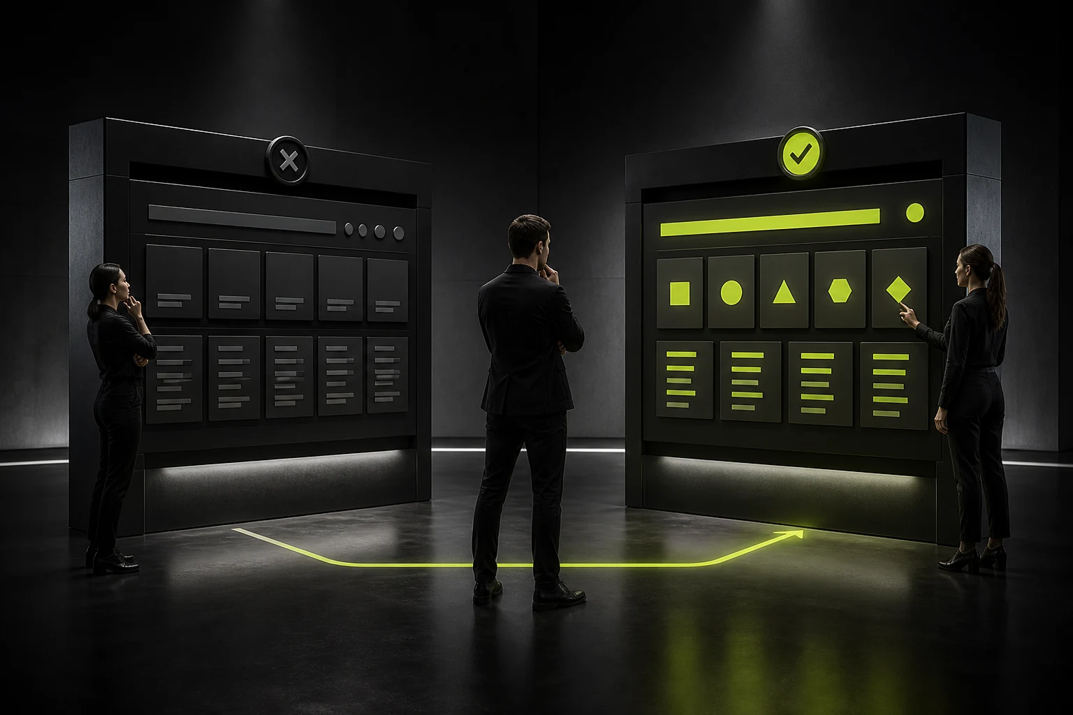
02 Use Labels Users Can Predict
Terms such as “Capability Center,” “Value Enablement,” or “Ecosystem Matrix” may feel branded but make content difficult to predict. Products, Solutions, Case Studies, Resources, and About are usually clearer.
Use page titles and copy for distinctive brand language; navigation should establish orientation first.
Recommended Corporate Navigation Hierarchy
| Level | Suitable Content | Design Priority |
|---|---|---|
| Primary navigation | Frequent, stable content categories | Restrained quantity and clear labels |
| Secondary menu | Product families, industry solutions, and resource types | Grouping, short descriptions, and priority entries |
| Third level and deeper | Complex catalogs or documentation | Use sidebars, breadcrumbs, and search |
| Utility navigation | Login, language, search, and contact | Distinguish visually from primary navigation |
| In-page navigation | Long-page sections and anchors | Scroll state and accessibility |

03 Give Mega Menus an Information Structure
Mega menus suit companies with many products or solutions, but should not place every link in one large box. Group by user problem or product family and control density.
Add short descriptions for important pages so users are not forced to understand internal product names. Reorganize for mobile instead of shrinking the desktop menu.
04 Retain Core Entries in Mobile Navigation
The menu should be easy to close, support hierarchical back navigation, and work with keyboards and screen readers. High-frequency actions such as contact, search, and login can remain visible.
Avoid expanding every nested accordion at once and making users lose their position.

05 Support Deep Browsing with Breadcrumbs and Search
Large, deep sites need breadcrumbs for orientation. Internal search should cover product names, model numbers, industries, and common synonyms.
Search is not an excuse for chaotic navigation; the two should work together.
06 Validate with Tree Testing and Data
Before visual design, use a text-only tree test to see whether users can find typical tasks. After launch, review navigation clicks, internal searches, and return paths.
Do not delete a category only because it receives few clicks. The cause may be an unclear label, weak position, or low demand; judge it in context of the task.
Frequently Asked Questions
How many primary navigation items should a corporate site have?
There is no fixed number, but the list should remain restrained and scannable. Use grouping and secondary menus for larger structures.
Should the homepage logo link to the homepage?
Usually yes. It matches user expectations and should include an accessible name.
Should Products and Solutions be separate?
They can be when users search both by product and by problem or industry, with cross-links between them.
Can navigation use creative labels?
They can supplement the brand, but core categories should prioritize clarity and predictability.
Must mobile navigation use a hamburger menu?
No. Choose a bottom bar, collapsed menu, or combination based on entry count while preserving discoverability.
| Service | View |
|---|---|
| Related service | View service details |
| Project inquiry | Contact JVDS Design Studio |
| Design and web articles | View all insights |
 Link copied








