
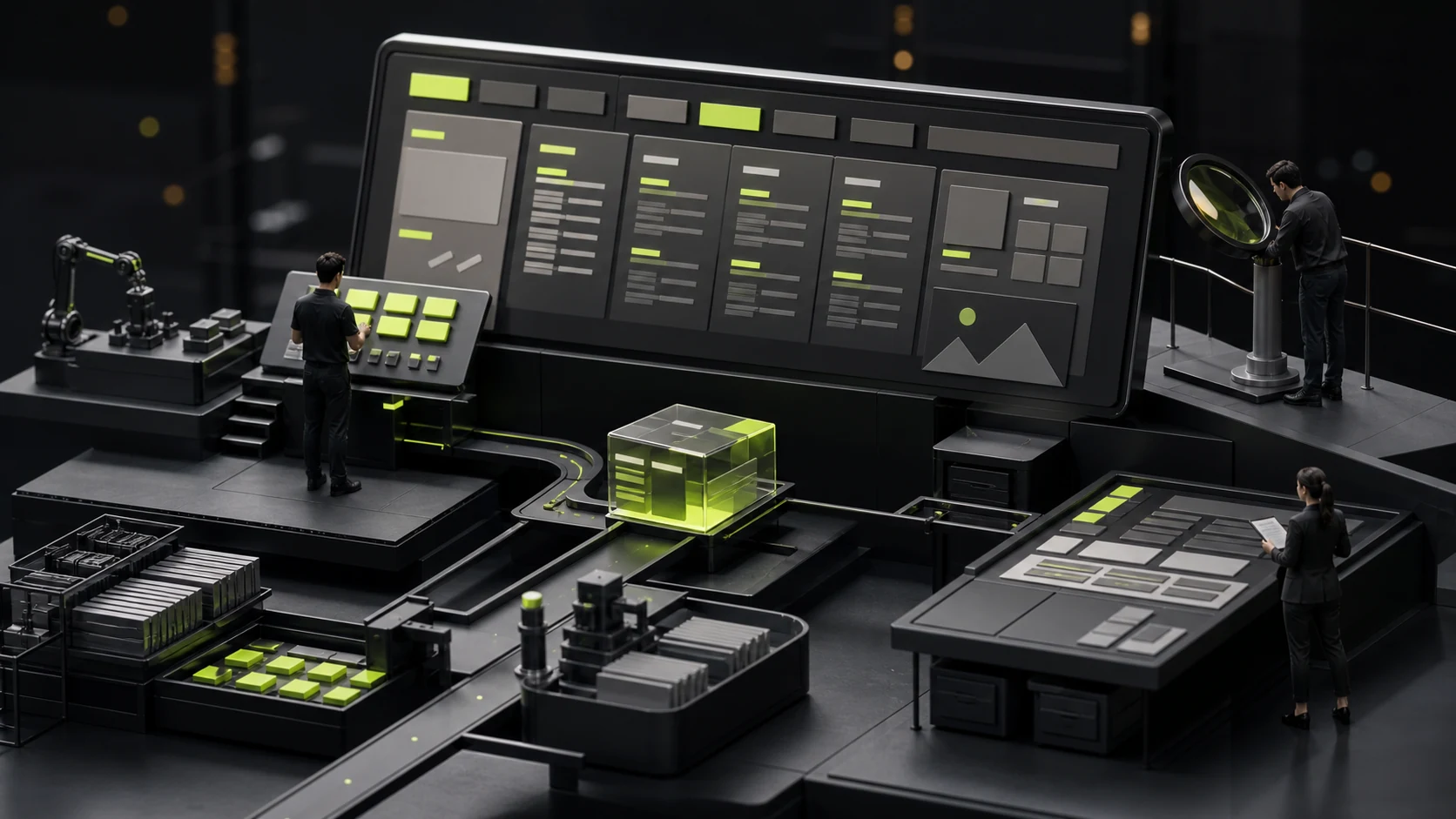
When does a corporate website need Mega Menu? Don't treat the mega menu as a decoration for scale
Some corporate websites have only six or seven sections, but they cover the entire navigation screen, hoping to make it seem like they have a lot of business. The result is often the opposite: users see dozens of entry points and don't know which one to click first. Mega Menu is not a scale decoration. It is only valuable when ordinary drop-down menus can no longer help users quickly locate the content.
01 Here's the conclusion first: Having many columns is just one of the necessary conditions
A website that is truly suitable for Mega Menu usually has three characteristics at the same time: the content is indeed abundant, the goals of users when they enter the website are significantly different, and these contents can be stably grouped. There are only "many pages" but the grouping is chaotic. Making it into a mega menu merely lays out the chaos all at once.
| Judgment problem | Under what circumstances is it worth considering | Signals that are not needed temporarily |
|---|---|---|
| Can the user state which type of content they are looking for? | Some people search by product, while others search by industry, role or task | Most visitors only need to know about the company, services and contact information |
| Are there multiple stable subcategories under the first-level column for a long time? | There are more than five sustainably maintained pages or resources under each main class | The sub-columns were just temporarily pieced together to fill up the menu |
| Is it already difficult to scan with a regular two-level dropdown? | Users need to repeatedly open and close the menu to compare the entry | The number of primary navigation items is within 6 to 8, and their names are also clear |
| Are there multiple product lines or combinations of solutions? | Products, solutions, industries and resources need to be viewed side by side | The company has only one core service |
| Can the team maintain the menu in the long term? | There are clear content managers and new entry rules | After the website was launched, few people maintained it |
| Is there an independent solution for the mobile? | It can be changed to a hierarchical list, search or task entry | I'm going to retract the desktop panel directly into the drawer |
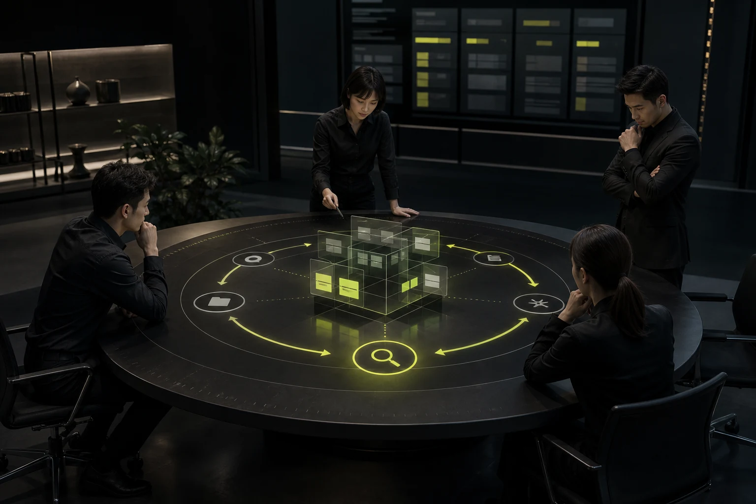
02 Mega Menu addresses "discovery efficiency", not content deficiency
The mega menu is most suitable for helping users compare adjacent options. For instance, if a manufacturing enterprise has multiple product lines at the same time, the purchaser needs to switch quickly among materials, specifications and application industries. SaaS companies serve financial, operational and technical roles simultaneously, and visitors need to enter from different tasks. At this point, placing the key entry points in the same field of vision can indeed reduce back-and-forth trial and error.
However, if the corporate website lacks real product pages, cases and materials, Mega Menu will not make the content richer. It will only enlarge empty pages, repeat categories and "Learn More". First, fill in the content, and then decide on the navigation format.
03 Don't simply copy the company's organizational structure when grouping
Internal practices are managed by business divisions, regions and departments, while external users are more likely to seek answers by questions, products, industries or usage stages. If the navigation replicates the organizational structure, it will require visitors to first understand your company and then find the content they need.
| Internal statement | Grouping that is easier for users to understand | Rewriting principle |
|---|---|---|
| Intelligent Division/Digital Division | Products and platforms/industry solutions | Change the department name to the task that the user needs to complete |
| Technical Support Center | Documents, downloads, after-sales service and frequently asked questions | Break it down by content type and usage stage |
| North China Region/East China Region | Contact the sales/service outlets/delivery areas | The area only appears when it truly affects the service |
| Ecological business | Partners/Integration capabilities/APIs | Replace internal concepts with specific cooperation methods |
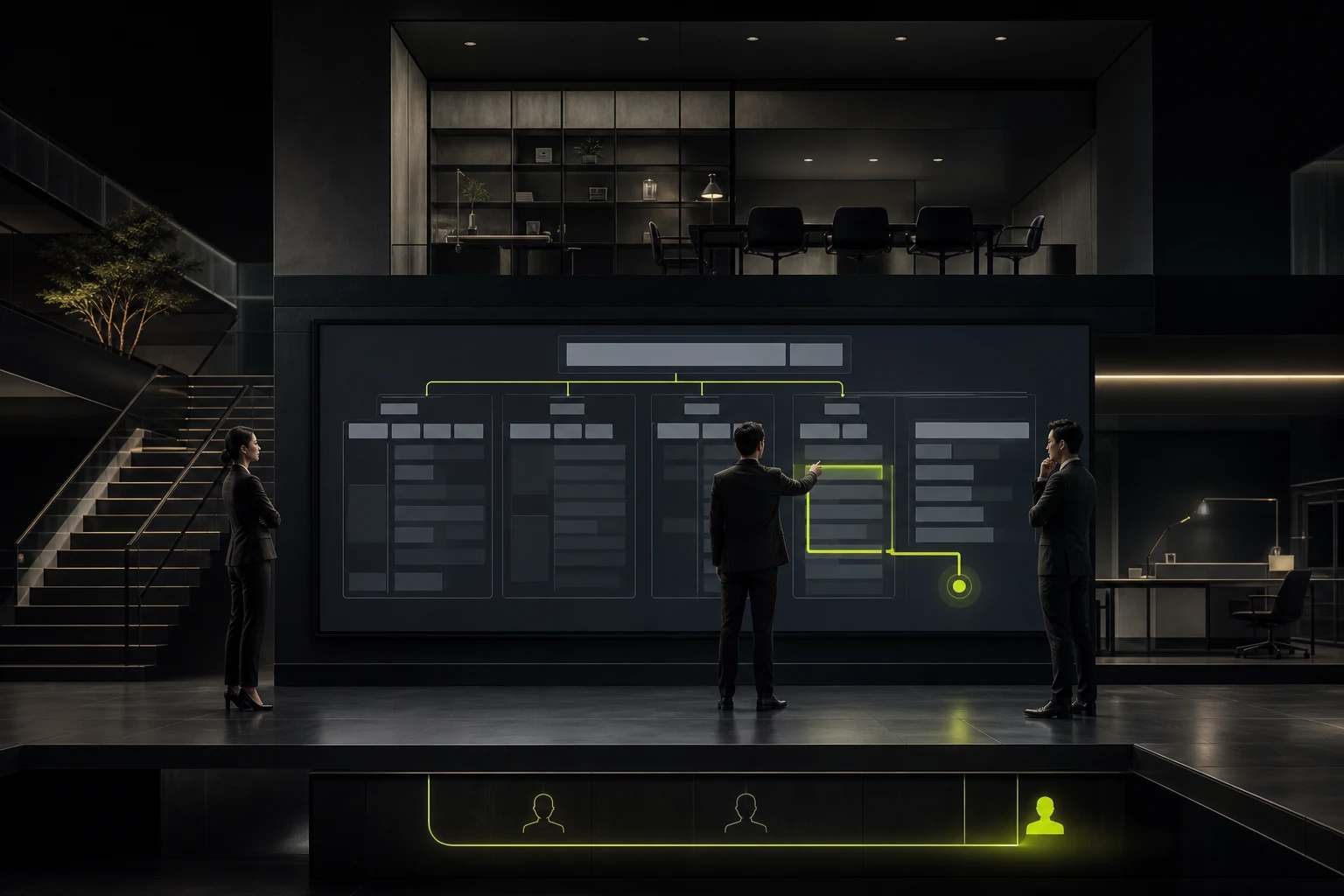
04 The large panel on the desktop must make the hierarchy clear at a glance
An available Mega Menu usually has only a few clear group titles, with short links placed in each group and a description explaining the differences in one sentence when necessary. Key entry points can have a light emphasis, but do not have ICONS, tags, and marketing copy for each link. The more lively the visual effect, the slower the scanning.
Interaction should also be stable: the trigger area should not be overly sensitive. The mouse should not be suddenly closed when moving from the first-level entry to the panel. There should be consistent rules for clicking, hovering and keyboard operations; The current column and expansion status need to be clearly identified. The HTML structure of the menu should remain semantically clear and provide keyboard-operable expand, close, and focus sequences.
05 The mobile is not about stuffing the desktop Mega Menu into a drawer
The mobile phone screen does not have the advantage of "comparing the entire panel at a glance". A more common approach is to retain a small number of top-level tasks and use step-by-step expansion, grouped landing pages, site search or "hot entry points" to help locate them. The desktop can be compared horizontally, while the mobile is more suitable for step-by-step comparison.
| Scene | Desktop suggestions | Suggestions for mobile devices |
|---|---|---|
| Multi-product catalogue | The group panels display product families and key models side by side | Product family list + filtering + search |
| Multi-industry solutions | Dual entry points for industry and ability to avoid duplicate links | First select the industry, and then present the relevant solutions |
| Resource Center | Group by document, case, activity and download | Search + Type filtering + Recent Update |
| Multilingual corporate website | Only the corresponding valid entry is displayed in the current language | Language switching and navigation status are saved independently |
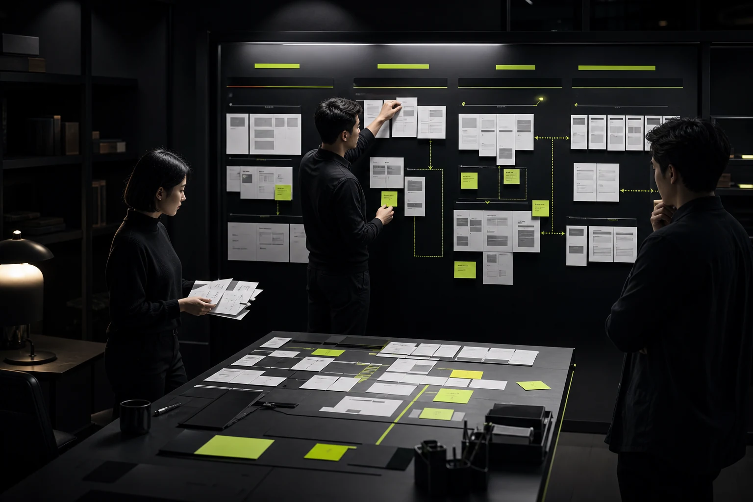
06 Before starting the design, complete a paper practice with real content first
- Put the existing URLs, planned new pages and main user tasks in the same table instead of just looking at the current navigation.
- Invite sales, customer service and product teams to group the content in user language respectively, and then compare the differences.
- Test the menu with real long titles, discontinued products, empty categories, and multilingual content instead of just using neat placeholders.
- Ask those who did not participate in the project to complete three search tasks, and record the first click, the position of hesitation and the number of fallbacks.
If users must first understand your organizational structure before they can understand the navigation, the problem does not lie in the menu size but in the information architecture.
07 After going live, don't just look at the number of menu clicks
It is necessary to simultaneously observe whether users can reach the product page more quickly, whether backtracking is reduced, whether search terms decline, whether mobile devices frequently close menus, and whether new content is continuously placed in the correct groups. A high number of clicks does not necessarily mean success; it may also indicate that the user is repeatedly trying and making mistakes.
Frequently Asked Questions
How many items in the first-level navigation are needed for the Mega Menu?
There is no uniform figure. The six first-level columns may also require large panels because the content under each column is complex. The ten columns might also only need to be renamed and merged. It should be judged based on the user's task, group stability and the scanning cost of ordinary pull-down.
Will Mega Menu affect SEO?
The menu itself does not automatically improve rankings, but clear and crawlable internal links can help search engines discover important pages. Don't cram all pages into the full-site navigation, nor hide key links with scripts or inaccessible interactions.
Is it suitable to put pictures in Mega Menu?
It can be used in small amounts for key products or activities, but pictures cannot replace clear link text. If each entry has a large image, the menu will be more like an advertising space, and the loading and maintenance costs will also increase.
If the corporate website of a small business may expand in the future, is it necessary to prepare a Mega Menu in advance?
It is not recommended to increase the complexity in advance for future imagination. First, establish scalable column rules and components. Upgrade the navigation when the content volume and user path truly reach the threshold.
| Related Service | Learn More |
|---|---|
| Corporate Website Design Services | View Service Details |
| Project Consultation | Contact JVDS Design Studio |
| Design and Website Development Articles | Read More Related Articles |
 Link copied








