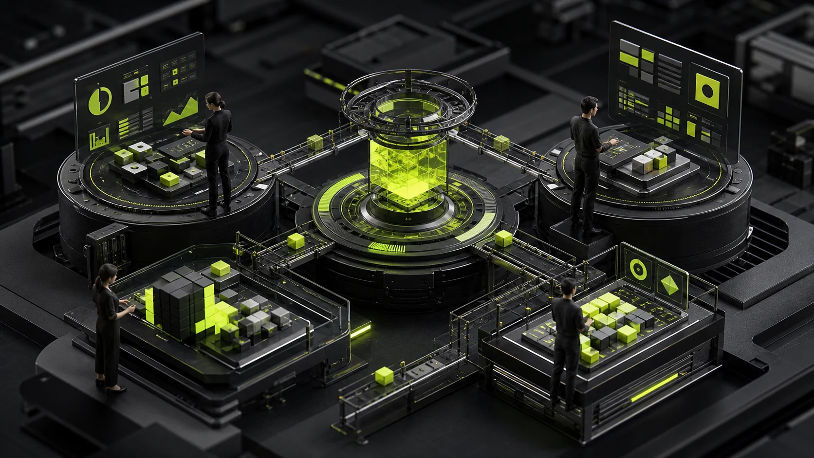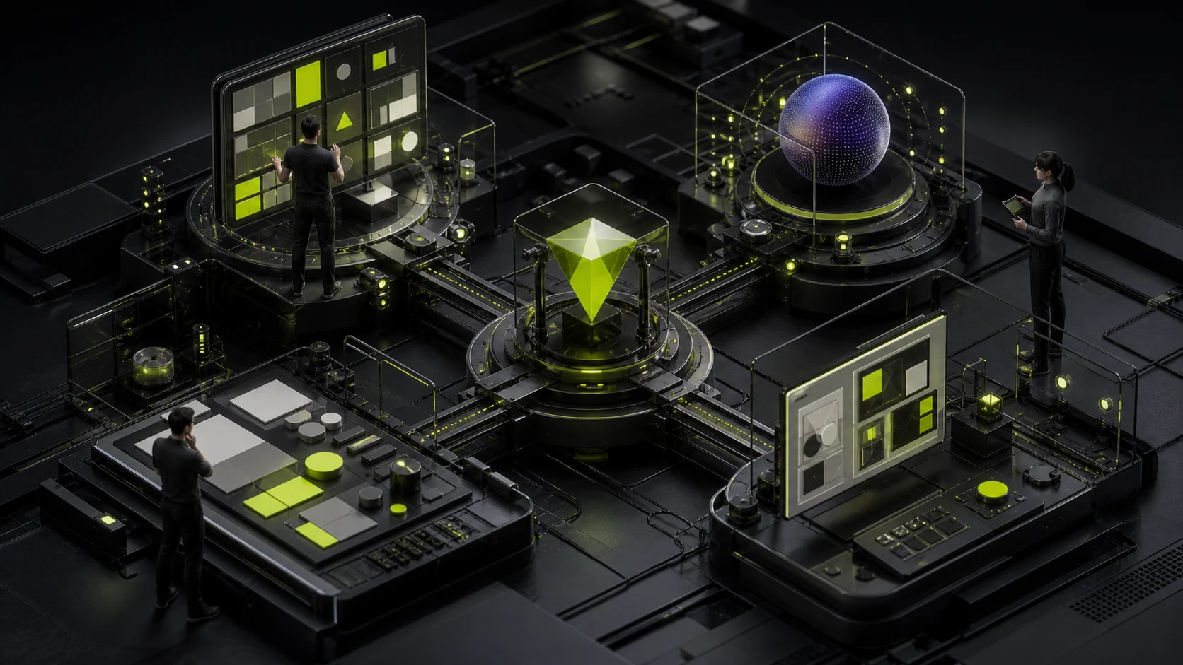
Place a logo inside a blue-purple gradient sphere, add grids and particles, and people can tell it is “an AI company.” That is exactly the problem: they recognize the category but cannot remember the brand. AI is a technology category, not a personality. Real differentiation grows from the problem the product solves, why users trust it, and how the company defines the relationship between automation and people.
Place a logo inside a blue-purple gradient sphere, add grids and particles, and people can tell it is “an AI company.” That is exactly the problem: they recognize the category but cannot remember the brand. AI is a technology category, not a personality. Real differentiation grows from the problem the product solves, why users trust it, and how the company defines the relationship between automation and people.
01 Start with a Competitive Wall Test
Collect the homepages, logos, product screenshots, and social avatars of 20 direct and indirect competitors. Normalize their size, hide the names, and display them together. If most use dark backgrounds, blue-purple gradients, glowing spheres, dot matrices, grids, and abstract letters, repeating those elements will only make the brand look like the category average.
A competitive wall is not an excuse to appear deliberately “anti-tech.” It identifies which visual conventions have lost distinctiveness. Common elements can still work, but they must combine with a brand’s own structure, language, rhythm, and application rules.
02 Why AI’s “Tech Look” Becomes Homogeneous
| Common Element | What It Signals | Why It Fails | Better Question |
|---|---|---|---|
| Blue-purple gradient | Future, digital, and computing power | Most AI, Web3, and SaaS companies use it | Does the brand need to feel calm, approachable, or authoritative? |
| Glowing sphere | Model or intelligent core | It has no unique meaning outside the product | What object or transformation defines the product? |
| Neural-network nodes | Connection and learning | The metaphor is too literal and dated | What value do users actually perceive? |
| Pixels and grids | Technology, systems, and data | Visual grammar converges | Is the company’s order rigorous, open, or flexible? |
| Neon on black | Performance and frontier technology | It may weaken readability and enterprise trust | What do buyers fear most? |
| Robot or brain | Artificial intelligence | It reduces a complex service to a dated symbol | Should the brand feel like a tool, partner, or infrastructure? |

03 Start Brand Direction with Four Questions, Not a Mood Board
1. Which Work Outcome Does the Product Change?
“We use large models to improve efficiency” is too broad. Be specific: does the product help support agents resolve issues faster, help R&D teams interpret complex documents, or provide auditable decision support to financial teams? Derive visuals from the object, rhythm, and outcome of the changed work—not from “intelligence” alone.
2. What Risk Does the User Entrust to the Product?
An AI creation tool may risk loss of expressive control. An enterprise knowledge assistant may risk data leakage. Medical AI may risk misjudgment, while a foundation-model service raises stability and cost concerns. A brand that talks only about the future without answering real risks struggles to build trust.
3. What Is the Relationship Between People and the System?
Does the product replace, assist, review, or provide infrastructure for people? That relationship shapes copy, graphic structure, motion speed, and product UI. A brand centered on “human in the loop” should not portray people as tiny nodes swallowed by a giant machine.
4. Is the Brand Honest About Technical Boundaries?
Mature AI brands do not describe every function as “fully automated.” They clarify capability limits, human confirmation, data sources, and failure handling. Brand expression aligned with actual product boundaries earns more long-term credibility than exaggerated future narratives.
04 Four Types of AI Companies Should Not Share One Visual Language
| Business Type | Users Care About First | Suitable Brand Direction | Avoid |
|---|---|---|---|
| Models and infrastructure | Performance, stability, and developer experience | Precise, open, systematic; built around modules and scale | Consumer-style cute robots |
| Enterprise AI workflows | Security, control, and implementation cost | Restrained, credible, process-transparent, and collaborative | Overly mysterious black-box visuals |
| Consumer creative tools | Freedom of expression, speed to value, and output quality | Energetic, personal, playful, and more colorful | Talking only about specifications and compute |
| High-risk AI in healthcare or finance | Accuracy, responsibility, auditability, and privacy | Stable, clear, evidence-led, and centered on human review | Harsh neon, exaggerated claims, and rapid motion |
05 A Logo Does Not Need to “Look Like AI”; It Needs to Be Memorable
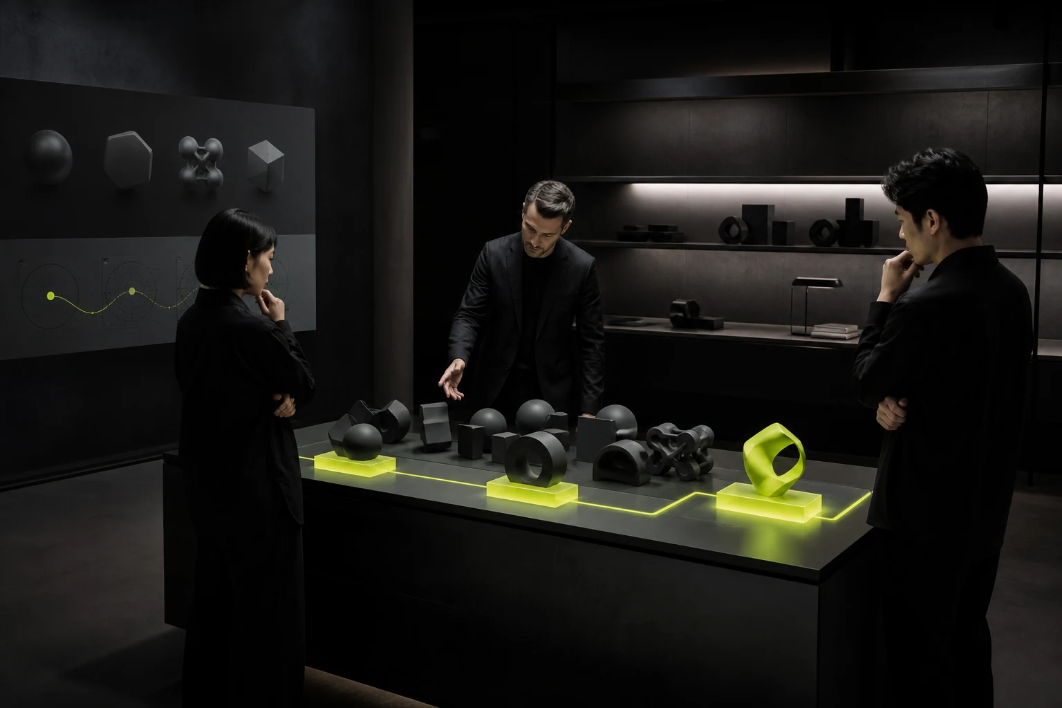
An AI company logo can emerge from the brand name, product action, core object, or a distinctive structure. It does not need to explain the entire technology. A mark that remains clear at 16 pixels in an app icon, browser tab, model selector, and developer documentation is more useful than a complex neural-network illustration.
- Scale test: does it remain recognizable at 16px, 24px, and 32px?
- Monochrome test: after removing gradients, is anything left beyond a generic geometric shape?
- Masked-name test: can its structure be recognized beside competitors without the name?
- Motion test: does motion add meaning while the static mark still works?
- Product test: does it fit a sidebar, button, data table, and documentation?
06 Typography and Language Build More Character Than “Tech Illustrations”
AI brands contain extensive product copy, model names, parameters, code, states, and explanatory text. The type system must support Chinese, English, numbers, and code, while the voice stays professional without becoming obscure and confident without exaggeration.
If the website uses experimental condensed type to feel futuristic while the product uses an unrelated default font, the brand breaks as soon as users enter the product. Define roles for display, body, numeric, and code typefaces, and confirm licensing and multilingual coverage early.
07 Product UI Is the Most Frequent AI Brand Touchpoint
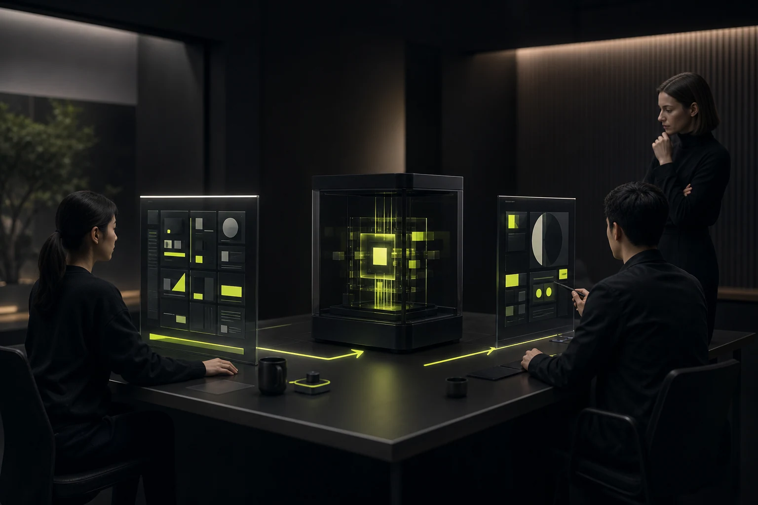
SaaS and AI users do not see a campaign poster every day. They see input fields, model states, generated results, citations, failure messages, and permission settings. Brand design must enter these concrete components.
| Product Touchpoint | What the Brand Must Express | Design Focus |
|---|---|---|
| Input and prompts | What the system can do and how users stay in control | Examples, boundaries, privacy, and undo |
| Generation process | What the system is doing | Real states rather than meaningless loading animation that conceals waiting |
| Results and citations | Why the output is trustworthy | Sources, confidence, time, and verifiable information |
| Errors and refusals | The system remains trustworthy after failure | Explain causes and provide alternatives and human support |
| Permissions and data | How the organization controls risk | Clear scope, logs, deletion, and administrator rules |
08 Use a “Remove the Effects” Test to Judge Real Differentiation
- Remove gradients, shadows, 3D, and animated backgrounds, leaving only structure, type, and words.
- Reduce the logo and homepage to grayscale thumbnails and place them on the competitive wall.
- Ask someone outside the project to describe the brand after five seconds and recall it ten minutes later.
- Apply the brand to product empty states, error pages, technical documentation, and recruiting pages.
- Check whether every page expresses one value and voice instead of a different “AI style” each time.
If the brand immediately loses recognition without effects, its differentiation comes mainly from rendering style rather than a system. Rendering trends change; structure, language, and behavioral rules last longer.
09 Example: Avoiding an “All-Powerful AI” Narrative for an Enterprise Knowledge Assistant
Imagine a product that helps employees search internal policies, contracts, and project materials. If the brand only promises “limitless intelligence,” users will immediately fear data leakage and wrong answers. A more credible direction can center on sourced answers, knowledge within permissions, and a path back to original documents.
The visual language does not need a giant glowing orb. Translate sources, paths, and boundaries into clear hierarchy lines, citation marks, and modular structures. Replace “It does everything for you” with “Find the evidence faster and make a judgment.” This differentiation comes from the product’s real mechanism, not artificial weirdness.
Frequently Asked Questions
Must an AI company put “AI” in its brand?
No. If AI is the primary reason users choose the product, express it clearly. If it is only the implementation, lead with user value. Putting AI in the name or tagline improves category recognition but may constrain future expansion.
Should AI brands completely avoid blue and purple?
No. The issue is not the colors themselves but whether the whole identity consists only of category clichés. Even with blue and purple, distinctive proportions, combinations, typography, graphics, and application rules can build recognition.
Do AI brands need 3D and motion?
Invest only when motion explains a product process, improves memory, or supports interaction. Resource-heavy animation added merely to “look advanced” can slow the website and weaken information.
Should the same team design the brand and product UI?
Not necessarily, but teams must share brand principles, component standards, and decision mechanisms. The most frequent AI brand experience happens inside the product, so complete separation creates an obvious break.
| Service | View |
|---|---|
| Brand identity design | View service details |
| Project inquiry | Contact JVDS Design Studio |
| Design and web articles | Read more articles |
 Link copied