When teams build a component library for the first time, they often list dozens of items—buttons, inputs, dialogs, tables—and design them all at once. Months later, only a few are used frequently; the rest have incomplete states, no code equivalent, and higher maintenance cost.
A component library should grow from the real product rather than copying the catalog of an open-source system. Solve recurring, inconsistent, and expensive scenarios first, then expand gradually.
01 Audit the Product Before Auditing Component Websites
Break existing pages into business scenarios: data entry, search, review, configuration, monitoring, collaboration, and exception handling. Identify patterns that repeat and places where the same problem has several solutions.
If the product is very early, at least map the workflows scheduled for the next three months. A component library is not a one-time build; early teams should avoid designing large amounts of unused capability for the sake of “completeness.”

02 Prioritize by Frequency, Inconsistency, Cost, and Risk
Frequently used components with substantial variation should be standardized first, including buttons, forms, tables, filters, dialogs, and status feedback. Low-frequency but high-risk components—permission confirmation, bulk actions, and destructive actions—also deserve early definition.
Assess usage frequency, current inconsistency, duplicated development cost, and error risk. If all four are high, the component belongs in the first release.
Suggested Component-Library Phases
| Phase | Priority Content | Definition of Done | Do Not Pursue Yet |
|---|---|---|---|
| Foundation | Color, typography, spacing, radius, shadow, icons | Tokens are usable in design and code | Finalizing every brand expression at once |
| High-frequency components | Buttons, inputs, selection, forms, feedback | Complete states, shared naming, composition | A custom version for every workflow |
| Business patterns | Complex tables, filters, approval, bulk actions | Scenario, data boundaries, and interaction rules | Static visuals without behavior |
| Governance | Versions, ownership, contribution, deprecation | Changes are traceable and migration is documented | Maintaining through verbal notices |
03 Complete States Matter More Than Visual Polish
An input has more than default and typing states; it may need hover, focus, disabled, read-only, error, success, loading, and help states. Tables need empty, loading, failure, selection, fixed-column, overflow, and permission variants.
If the design file shows only the ideal state, engineering still makes many decisions ad hoc and the library does not reduce communication. The first release can be small, but its states and behaviors must be clear.
04 Give Design and Front-End Components a Shared Language
Names, properties, and variants should correspond where practical. Design properties such as size, status, and disabled should align with code so a “secondary small button” is not called “secondary compact” elsewhere.
Not every design variation needs to become a code API, but every difference must be explainable. Before adding a variant, decide whether it is a reusable rule or a one-off business exception.
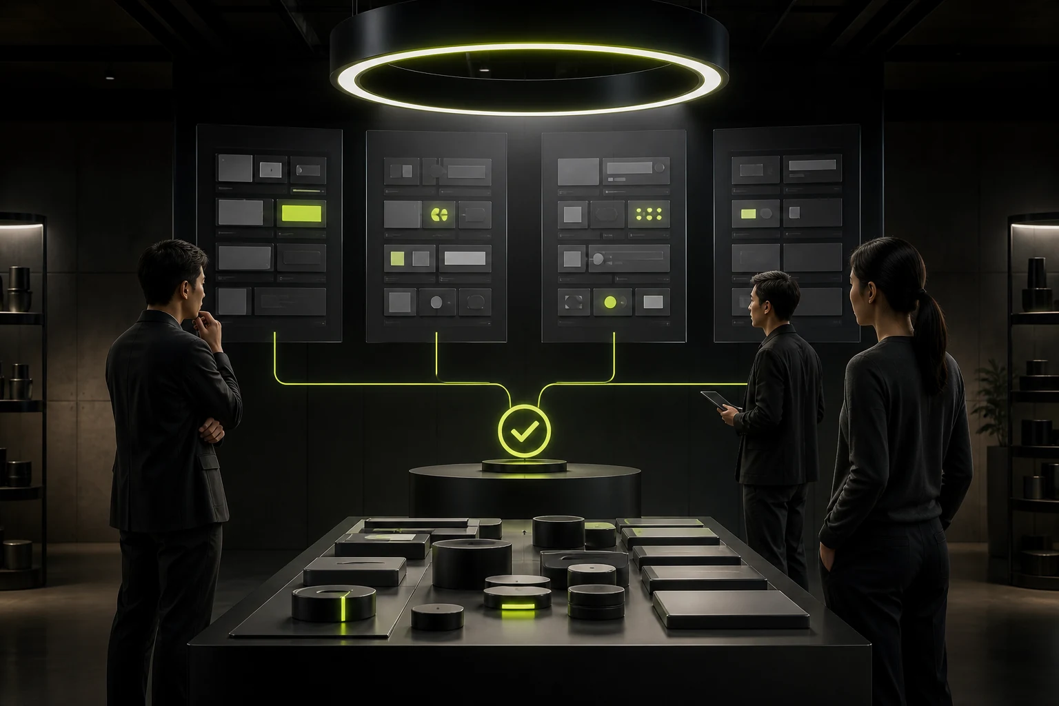
05 Do Not Abstract Business Components Too Early
Approval cards, quotations, and equipment-status panels carry business semantics. They should become business components only after repeating consistently across several workflows. Premature abstraction freezes rules that have not matured.
Record them first as patterns or templates, observe two or three versions, then decide whether they belong in the formal library.
06 Measure the Reduction in Waste
Track duplicated design time, engineering reuse, visual defects, delivery-review issues, component coverage, and migration cost. Higher coverage is not always better; forcing every page into components can damage business efficiency.
Review the library quarterly: Which components are unused? Which workflows now repeat? Which variants are becoming uncontrolled? A healthy library removes and consolidates, not only adds.
Frequently Asked Questions
Are a component library and a design system the same?
No. A component library is part of a design system, which also includes principles, tokens, content guidance, patterns, governance, and engineering implementation.
Does an early product need a component library?
It needs foundations and high-frequency components, but not the full set at once. Prioritize consistency and reuse in current core workflows.
Can we use Ant Design directly?
It can provide a front-end foundation, but you still need rules for workflows, brand, information density, and accessibility. Changing colors is not enough.
Does design or front-end own components?
They share ownership. Design defines experience and visual rules, front-end defines feasibility, APIs, and quality, and product and business teams provide scenarios.
What happens to old pages after a component changes?
Use versioning and migration strategy. Major changes need an impact scope, replacement, and migration priority rather than allowing old pages to drift silently.
| Service | View |
|---|---|
| Related service | View service details |
| Project inquiry | Contact JVDS |
| Design and website articles | View all articles |
 Link copied