

Data visualization is not "turning data into graphs": The 7 most common mistakes in backend chart design
Data visualization truly addresses "how to make faster judgments", not "how to place more graphs". The type of chart, axis, color, comparison base and subsequent actions all directly affect whether users will draw the correct conclusion.
01 The most dangerous state of Dashboard is "It seems to have a lot of information, but in fact, it cannot make a decision."
With four indicator cards, two line graphs, a circular chart, a map, and several sets of rankings, the page can easily appear to have "strong data capabilities". But when users actually open the background, what they care about is: what happened, whether it was abnormal, why, and what should be handled next.
The data visualization guidelines of the Office for National Statistics (ONS) in the UK have a very practical principle: First, determine the data relationships and main conclusions that you want users to understand, and then select the most appropriate chart. If a complex graph undertakes too many relationships at the same time, two simple graphs are often clearer than one complex graph. Enterprise dashboards should also start from problems rather than from "what chart components do we have?"
02 Error 1: Placing all metrics on the home page
The most common problem on the homepage is that each department hopes its own data will be the focus. As a result, the management saw 20 figures but had no idea which three needed attention today.
A more reasonable approach is to define roles and tasks first. The sales director may be concerned about the target completion rate, key business opportunities and risky customers. The operations manager may be concerned about new, active, retained and abnormal channels. Whether an indicator is important or not does not depend on whether there is data or not, but on whether it will change the user's next decision.

03 Error 2: Only absolute values, no comparison benchmark
"An income of 8.63 million yuan this month" in itself does not indicate good or bad. Only by adding "a target of 10 million yuan, 86.3% completed, and a 12% increase compared to last month" can users have a basis for judgment.
ONS also emphasizes that comparison is at the core of chart understanding and can be made with last year, goals, average levels, other regions, or the highest and lowest values. When designing a Dashboard, one should proactively ask: What reference does this number need to have for users to know if it is worth paying attention to?
04 Error 3: Choosing a more complex diagram for a sense of sophistication
Bar charts and line charts may seem ordinary, but they are often the easiest to read. ONS suggests that line charts be used to show trends over time, and horizontal bar charts are suitable for most category comparisons. Pie charts are only suitable for the overall composition of a small number of categories with obvious differences. Ideally, there should be three or four categories. When there are many categories or the differences are small, bar charts are usually easier to compare.
Charts are not visual decorations. If users need to first learn "how to look" before understanding the data, it has already increased their cognitive cost. Sankey charts, bubble charts, radar charts, etc. are not unusable, but it must be confirmed that they indeed express the target relationship more accurately than simple schemes.
05 Error Four: The coordinate axes have created a wrong impression
The most typical problem with a bar chart is that the vertical axis does not start from 0. The difference between 100 and 105 was originally only 5%. If the coordinates start from 99, the two columns will seem to have doubled. The current guidelines of ONS explicitly require that charts such as bar charts and area charts, which represent "length/area values", start from 0. If it is necessary to highlight minor changes, point plots or other expressions should be considered instead of cutting off the bar chart coordinates.
In addition, if multiple side-by-side images use different scales, they may also be misleading. For the same business indicators, try to keep comparable axes as much as possible. When it comes to double Y-axes, extreme caution should be exercised, as overlapping two scales can easily make the correlation appear stronger than it actually is.

06 Error 5: Colors undertake too many semantics at the same time
Blue sometimes represents "normal" and sometimes "brand main color", green indicates both growth and completion, and red indicates both decline and deletion. This will make users relearn each image.
Color should establish stable semantics while not serving as the sole information channel. ONS emphasizes that colors should have sufficient contrast and take into account color vision differences. The W3C also requires that key information should not be conveyed solely by color. Trends can be represented by arrows, plus or minus signs, and text simultaneously. Risk status can be assisted by ICONS, labels and shapes. This not only makes it more barrier-free but also more conducive to quick scanning and reading.
07 Error 6: No null values, outliers, or true boundaries were designed
The data in the design draft is usually just right: the numbers are of uniform length, the curves are smooth, and the category names are not long. However, in real systems, zeros, negative numbers, extreme peaks, extremely long enterprise names, missing data, unit switching, and abnormal time spans may occur.
Data product design should proactively prepare boundary datasets to test maximum values, minimum values, null values, missing points and outliers. When a time series is missing, do not randomly connect the breakpoints to create the illusion of "continuous data". If outliers are indeed important, they should be explained through comments instead of being directly cut out to make the graph look better.
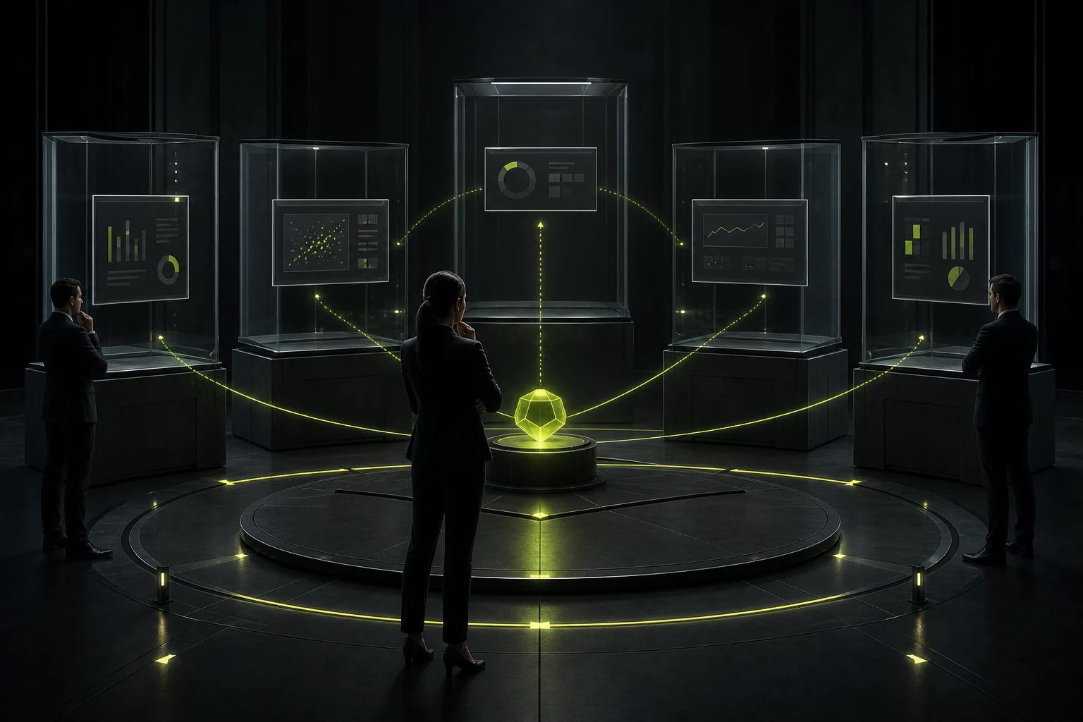
08 Error 7: Seeing the problem but unable to proceed with the processing
Many kanban boards can only be "viewed". The user saw "127 overdue orders", but was unable to click to enter the corresponding order. When seeing a decline in conversion in a certain area, it is also impossible to check the composition channels. In the end, I still opened another module to re-filter.
The true value of a Dashboard lies in connecting "discovery" with "action". Key indicators can jump to the details, abnormal trends can be viewed for composition, and the risk list can directly enter the processing tasks. The data dashboard should not merely be the web version of the daily report, but should serve as the entry point for the business workflow.
09 Don't forget that the chart itself also needs accessibility design
In the complex image guidelines updated by W3C in 2026, charts, flowcharts and maps are clearly classified as complex images and require the provision of text alternatives that can convey core information. Complex data should also be accompanied by more complete textual explanations or tables.
For enterprise backends, this means that even if the charts are rendered on Canvas or SVG, keyboard access, data table substitution, readable tags, screen reader descriptions, and high-contrast Settings should be taken into consideration. Accessibility does not mean simply adding an alt to a chart and calling it a day; rather, it ensures that people who do not need to look at colors and visual shapes can still obtain key data relationships.
10 Conclusion: Write a sentence first, "What should the user know after reading it?" before starting to draw the diagram
Before designing the Dashboard, the team can be forced to write a sentence for each core chart: "What should users know after looking at this chart?" If this sentence cannot be written, it usually indicates that the purpose of the chart is still unclear.
The maturity of data visualization does not lie in the number of charts, but in whether they are accurate, fast, comparable, accessible, and can lead users to the next step of action. By doing all these, a backend with only three pictures might be more valuable than a large screen with just over a dozen pictures.
Frequently Asked Questions
Must the coordinate axes of a bar chart start from 0?
When the column length represents a large value, it should start from 0; otherwise, the visual proportion will be exaggerated. If you need to observe very small changes, you can consider more appropriate expressions such as line charts and dot plots.
How many classes can be placed at most in a pie chart?
There is no absolute upper limit, but ONS suggests that pie charts are suitable for a small number of categories, ideally 3-4 categories. Exceeding 6 categories usually significantly reduces readability.
Is it true that the more colors a Dashboard has, the better?
No. Colors should have clear and stable meanings. Too many colors will increase the cost of recognition and may cause color vision problems.
Do charts need to be accompanied by textual explanations?
It is especially necessary for complex charts. At least the core trends and conclusions should be stated. When it comes to accessible use, equivalent data or a long description should also be provided.
Must the management kanban support drilling down?
Not every diagram needs to be included, but key anomalies and business indicators are best included in the details or subsequent actions; otherwise, users will still have to search repeatedly.
| Related Service | Learn More |
|---|---|
| UI/UX Design Services | View Service Details |
| Project Consultation | Contact JVDS Design Studio |
| Design and Website Development Articles | Read More Related Articles |
 Link copied








