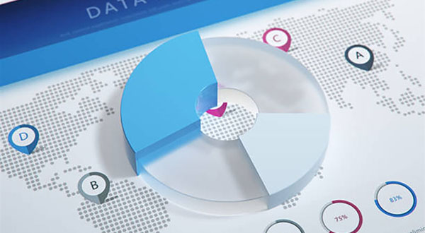
Data visualization comes naturally to people. We are physiologically inclined to read graphical information and can understand it more quickly. In an age of information overload, people increasingly value information that is efficient, engaging, and easy to understand. In the data field, visual infographics turn complex data into graphical forms. Achieving a high standard of visual presentation is also a fundamental skill for product managers.
1. The Purpose of Data Visualization Design
Before doing anything, we consider its purpose. The same applies when undertaking Data Visualization Design. For example, the goal may be to persuade an audience, call them to action, draw attention to an issue, or broaden their perspective. Different objectives naturally call for different stories. A storytelling approach can therefore help shape how data is visualized.
2. Forms of Data Visualization
Different objectives require different forms of data presentation. Common types include trends, proportions, relationships, comparisons, distributions, and geographic views. The right type depends on the specific situation, so they are not discussed individually here.
3. The Audience for Data Visualization
Data visualization must also consider its audience. A general audience and specialists in a particular field expect different levels and amounts of information from a chart.
4. The Communication Context for Data Visualization
The environment in which a data product is presented also matters. Designers need to consider the final setting. In a dim space, chart colors may need to be brighter. In a noisy or cluttered setting, the data may need to be presented as simply as possible to create contrast and capture attention.
Need design or website development services?
JVDS Design Studio is a professional design studio focused on digital product experiences and brand identity. We work with businesses in China and overseas that want to strengthen their brand image, improve user experience and grow their business, providing clear, usable UI/UX design, high-quality website design and development, app and mini-program development, and cohesive, distinctive brand identity design.
Working on a B2B system or an app? Share your current screens and key user tasks so we can discuss the design scope.
 Link copied