
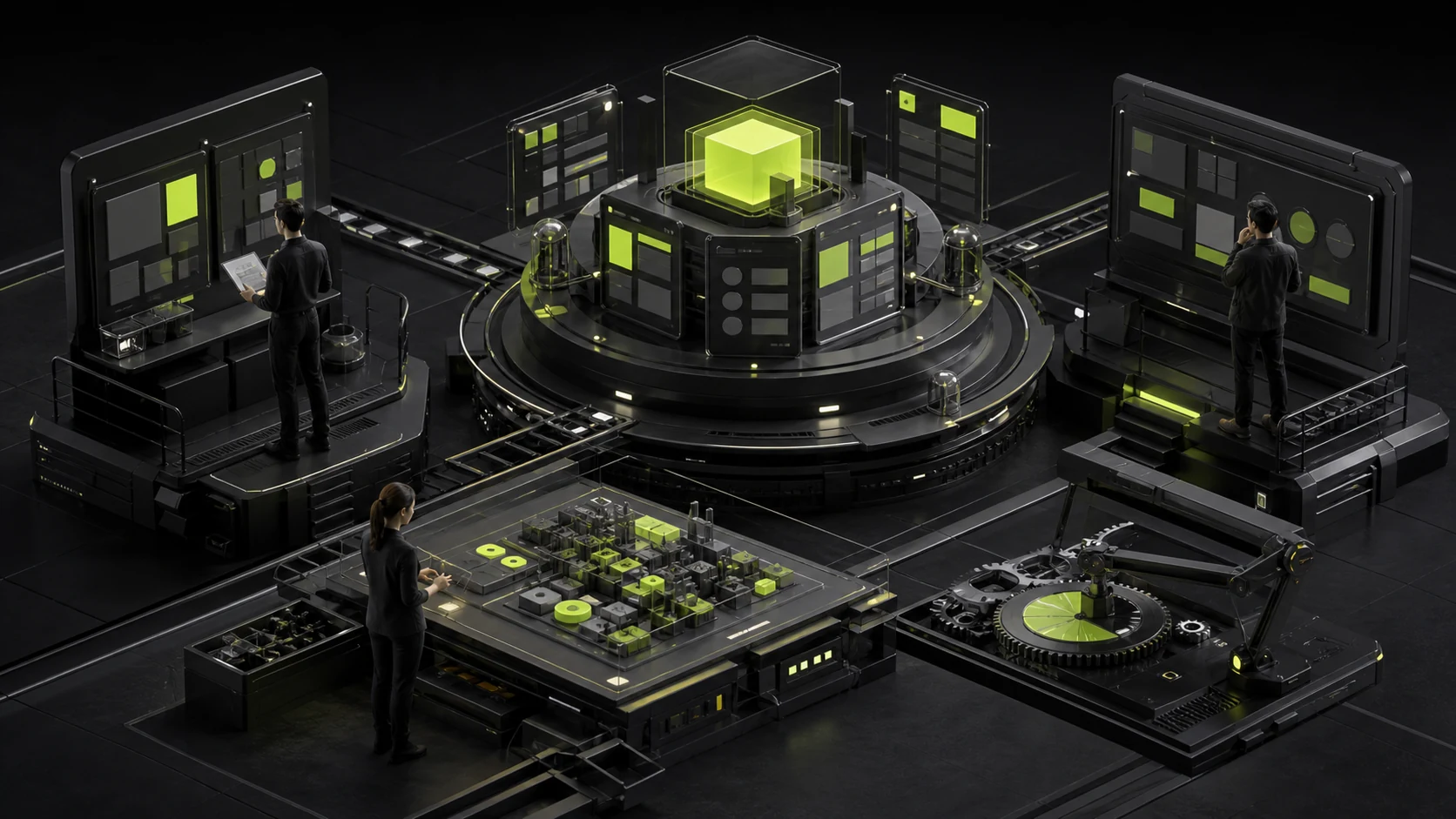
A proposal meeting can easily become a color vote: A feels more premium, B feels more energetic, and C looks more like a competitor. Without agreed review criteria, the team often selects the most immediately appealing direction rather than the one best suited to the business.
A mature review first confirms what the design must solve, then assesses whether information, interaction, visuals, brand, and development form a coherent logic.
01 Return to the Project Goals First
Does the concept help users complete tasks faster, understand the product, build trust, or reduce errors? If the goal is efficiency in a complex B2B product, simply adding more white space may be inappropriate.
Put the objectives and priorities on the first page of the review deck.

02 Evaluate Information Hierarchy, Not Style Alone
What do users see first, what comes next, and are critical actions prominent? A beautiful page with a confused hierarchy will quickly fail when real content enters it.
Review the design with realistic data and copy.
03 Check Critical Workflows and States
A proposal should not show only the home page or ideal state. Validate the direction with at least a core task, a complex module, mobile, and an error state.
A direction that looks strong on a hero page may not extend to tables, forms, and admin interfaces.
04 Look for a Basis Behind the Brand Expression
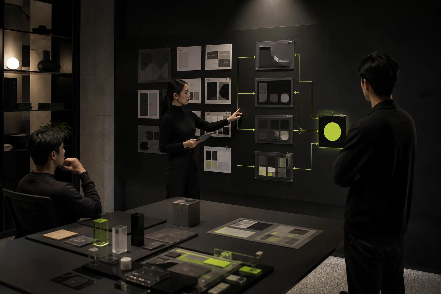
Color, typography, graphics, and motion should relate to the brand direction and user context—not merely current trends. Designers should explain both the selected direction and the alternatives they rejected.
The explanation should not be forced or rely only on words such as "young," "technology," and "premium."
05 Evaluate the System and Its Ability to Scale
Can components, grids, spacing, and page templates support future modules? Can the design adapt to multiple languages and platforms?
The more a concept depends on unusual layouts and large images, the more rigorously it should be tested against changing content.
06 Include Developers in Feasibility Evaluation
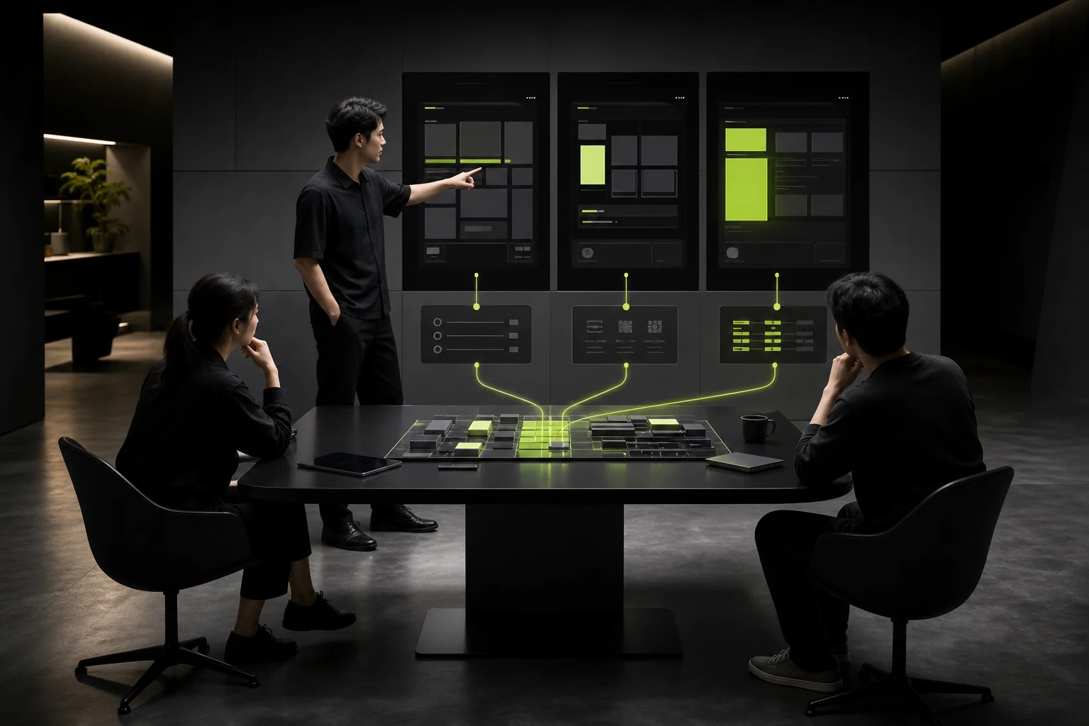
Complex motion, charts, 3D, and responsive behavior can affect performance and cost. Developers should explain implementation risks, but "difficult to build" should not dismiss every design idea.
When needed, validate critical technology through a prototype.
100-Point UI Proposal Review
Dimension | Weight | Review Question |
|---|---|---|
Goals and User Tasks | 20 | Does it solve the core problem? |
Information and Interaction | 20 | Are hierarchy, workflows, and states clear? |
Visuals and Brand | 20 | Is it relevant, distinctive, and consistent? |
System and Scale | 15 | Can it support multiple pages and platforms? |
Content and Data Adaptation | 10 | Does it remain stable with real content? |
Technology and Cost | 10 | Is it feasible with manageable risk? |
Evidence and Communication | 5 | Is the design rationale sufficient? |
Frequently Asked Questions
How Many Concepts Should a Proposal Include?
Two or three genuinely different directions are usually enough. The contract should define the number.
Can a Client Select a Concept Based Only on Preference?
Preferences can be expressed, but important decisions should return to goals, users, the brand, and actual contexts of use.
Should Users Participate in Selecting the Proposal?
Users are well suited to validating comprehension and usability, but they should not directly vote on the brand direction.
What If Developers Say It Is Difficult to Build?
Clarify performance, timing, and cost risks, then evaluate alternatives or conduct technical validation rather than merely debating.
Can the Design Change Substantially After Proposal Approval?
Details can be refined within agreed rounds. Reversing the overall direction is generally a scope change.
Service | View |
|---|---|
Related Services | |
Further Reading | View Service Details |
Design Case Studies | |
Project Inquiry |
 Link copied








