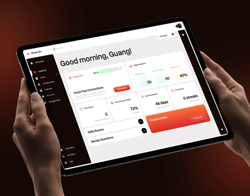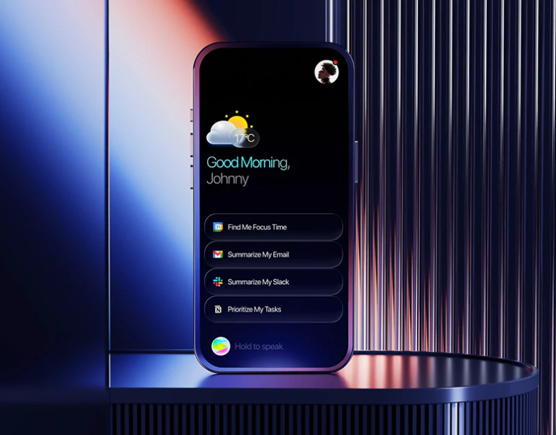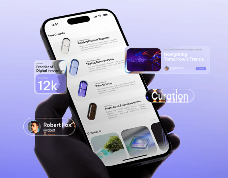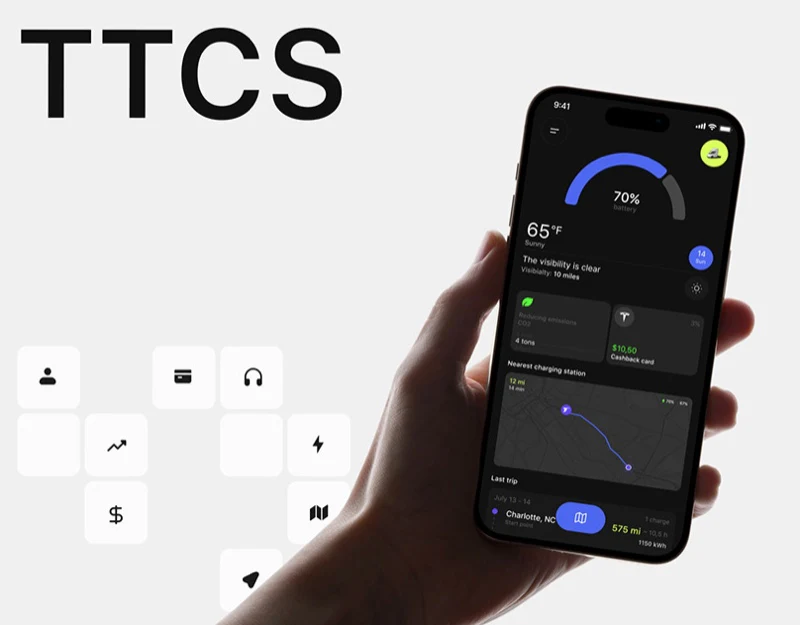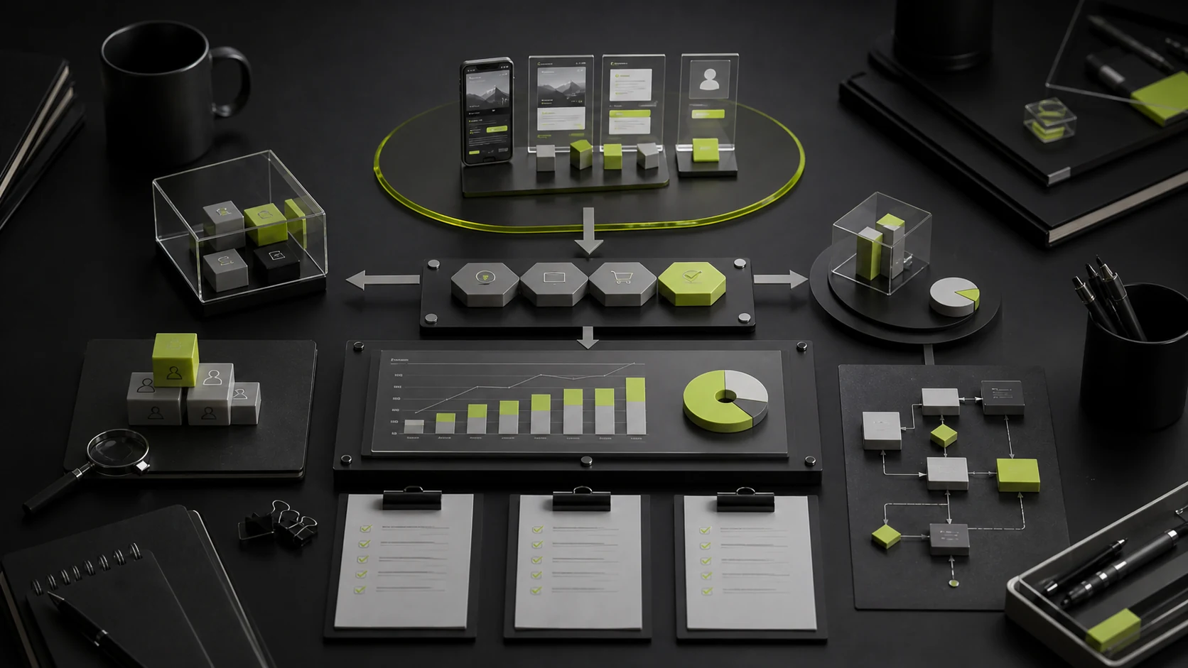
Conversion gains after a UI/UX redesign are often reduced to "the page looks better." In reality, design primarily affects conversion by reducing behavioral friction: users understand faster, complete tasks in fewer steps, feel more certain about outcomes, recover from errors, and gain sufficient trust at critical moments.
Design also has limits. Wrong traffic, an uncompetitive product, unacceptable pricing, and slow sales do not disappear when a button changes color. Rigorous UX conversion optimization first defines the business goal, user task, and controllable variables, then designs and validates.
01 Five Common Types of Behavioral Friction
Friction Type | User Experience | Design Symptoms |
|---|---|---|
Cognitive Friction | Cannot understand, sees too much information, or cannot identify differences | Unclear terminology, hierarchy, choices, and next steps |
Operational Friction | Too many steps, difficult input, or error-prone actions | Long forms, repeated input, small touch targets, and interrupted journeys |
Uncertainty Friction | Does not know what will happen and fears mistakes | Opaque pricing, progress, permissions, outcomes, and reversibility |
Trust Friction | Worries about risk, data, quality, or support | Weak entity information, evidence, security, privacy, and support |
Technical Friction | Slow loading, freezes, exceptions, or poor compatibility | Performance, weak-network, error, and device-adaptation problems |
02 Define Conversion Through the Critical Journey
Conversion is not always payment. On a B2B website it may be submitting qualified requirements; for SaaS it may be completing the first critical task; in a financial APP it may be completing verification and the first transaction. Break the journey into observable steps and define entry, success, failure, and exit for each.
Journey Stage | Behavior to Observe | Possible UX Problem |
|---|---|---|
Understand | Whether users continue reading and enter the relevant solution | Unclear value, wrong information order, or excessive terminology |
Compare | Whether users review cases, pricing, features, and evidence | Unclear differentiation, weak evidence, or hard-to-find content |
Begin Action | Whether users click a CTA and start a form or registration | Excessive commitment, ambiguous button, or unknown prerequisites |
Complete Task | Whether users successfully submit, pay, create, or activate | Too many steps, poor errors, performance, or permission issues |
Subsequent Value | Whether users return, continue, share, or upgrade | Broken first-use experience, unclear states, or insufficient support |
03 Information Architecture Reduces Cognitive Friction
When users must guess among several sections, conversion loss has already begun. Organize information by user goals and decision logic, not internal departments, database fields, or history. Use familiar labels, place important content logically, and help users narrow choices through search and filters.
04 Interface Hierarchy Shows Users What Matters Now
Visual hierarchy does more than create a designed appearance. It controls reading order, emphasizes the primary task, differentiates primary and secondary actions, and reduces competition. Five strong buttons, three accent colors, and several overlays on one page increase choice cost.
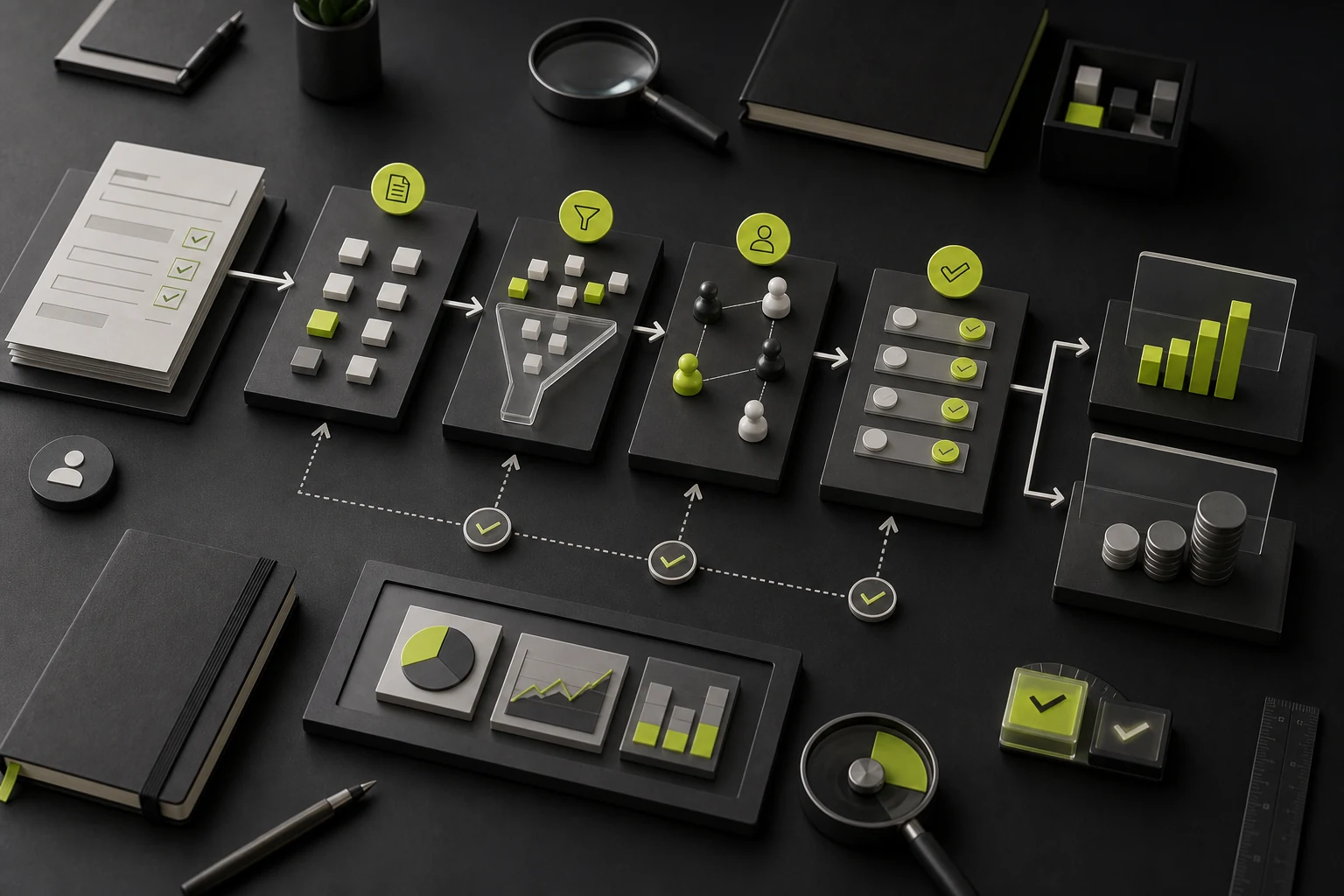
- Give each page one primary task and reduce the visual weight of supporting actions;
- Use headings to express outcomes or problems before conditions and details;
- Group related information with spacing and hierarchy rather than numerous borders;
- Show progress, completed content, and recovery after exit in long journeys;
- Do not hide critical numbers, fees, risks, or limitations in fine print.
05 Form and Journey Optimization Reduces Operational Cost
Common Problem | Optimization Direction |
|---|---|
Requests Too Much Information at Once | Collect in stages and prioritize fields needed for the current task |
Field Format Is Unclear | Provide examples, formats, units, and real-time validation |
All Data Clears After an Error | Preserve input, locate the error, and explain how to fix it |
Registration Is Required Too Early | Request an account after users understand the value and provide a reasonable guest flow |
Existing Data Must Be Entered Again | Use defaults, autofill, and information reuse |
Mobile Keyboard / Control Mismatch | Select correct input types, touch sizes, and scan/upload capabilities |
06 State Visibility Reduces Uncertainty
After payment, submission, review, upload, or synchronization, users need to know whether the system received the action, its current state, what happens next, and how to get help. Missing feedback causes repeated submissions, support inquiries, and abandonment.
- □ Show processing during submission to prevent repeated actions;
- □ Explain the result, reference number, next-step timing, and available actions on success pages;
- □ On failure, explain cause, impact, and recovery instead of only an error code;
- □ Provide states, notifications, and history for asynchronous review and processing;
- □ Give high-risk actions confirmation, undo, or a cooling-off period;
- □ Provide a status page and alternative channels during maintenance and outages.
07 Trust Design Requires Evidence, Not Decoration
Lock icons, five stars, and "100% secure" cannot replace real trust. Depending on risk, provide corporate identity, privacy, pricing, refunds, cases, customers, qualifications, security, support, and contact details. Place evidence where questions arise instead of collecting it all in the footer.
08 Error Recovery Is Part of Conversion
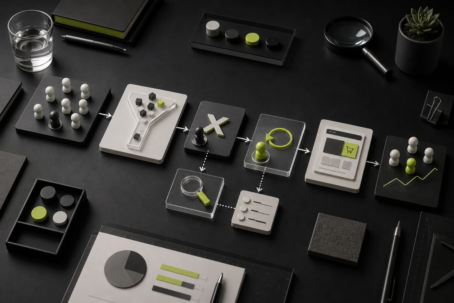
Many journeys design only the success path, but real users enter incorrect data, lose their network, lack permissions, have insufficient balances, exceed file limits, or repeat actions. Preserving progress, explaining causes, offering alternatives, and connecting support often determines whether they continue.
09 Accessibility Reduces Friction for a Wider Audience
Contrast, keyboard operation, focus, labels, error explanations, touch targets, and motion preferences help not only people with disabilities, but also users in bright light, weak networks, temporary injury, older age, and complex work environments. Accessibility should enter components and the design system rather than appear as one prelaunch check.
10 Metrics for Validating UX Impact
Metric | Description | Question It Answers |
|---|---|---|
Completion Rate | Share of entrants who complete the task successfully | Can the journey be completed? |
Abandonment Rate | The step where users exit or pause for a long time | Where is friction concentrated? |
Error Rate | Error counts, types, and recovery | Are forms, rules, and guidance effective? |
Completion Time | Time from starting to success | Is the operation too long or waiting too high? |
Task Success Rate | Whether users achieve the goal without assistance | Is the overall experience usable? |
Lead / Order Quality | Whether converted users match business goals | Are only low-quality conversions increasing? |
Support Cost | Changes in tickets, service contacts, and repeated questions | Does design reduce uncertainty and errors? |
11 How to Design a Reliable Experiment
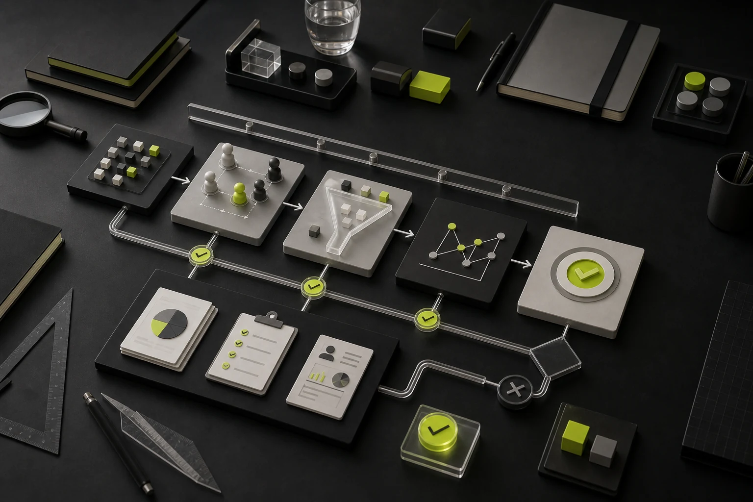
Begin with a clear hypothesis from data and research, such as: "Users do not know what happens after an inquiry, reducing form starts." Address the cause by explaining process and response time near the CTA, instead of changing page structure, copy, colors, and forms simultaneously. Before the experiment, define a primary metric, guardrail metrics, sample requirements, and lead-quality observation.
12 Priorities for a UX Conversion Project
- Fix tasks that cannot be completed, data errors, and severe performance problems;
- Fix value and traffic mismatches and missing critical information;
- Add pricing, risk, case, and trust evidence;
- Reduce critical-journey steps, repeated input, and error costs;
- Improve states, recovery, mobile, and accessibility;
- After stabilizing the baseline, validate local copy and visual details.
Frequently Asked Questions
Does a more attractive UI improve conversion?
Not necessarily. Visuals can improve attention and trust, but only when value, information, and workflow problems are solved can they affect conversion reliably.
Does a high conversion rate prove a good experience?
No. Coercion, deception, and preselected options may temporarily raise one metric. Also review complaints, refunds, cancellations, lead quality, and long-term usage.
Does UX optimization require A/B testing?
Not every issue does. Fix clear usability defects directly. Hypotheses involving copy, order, and strategy can be tested when traffic is sufficient.
How can a low-traffic B2B website validate changes?
Combine user interviews, usability testing, sales feedback, session recordings, task completion, and lead quality instead of relying only on large-sample experiments.
Can a design system affect conversion?
It reduces experience defects through consistent components, states, accessibility, and development quality, but cannot replace page-specific user research and value communication.
Service | View |
|---|---|
UI/UX Design Services | |
Corporate Website Design and Website Development | |
Project Inquiry |
Need design or website development services?
JVDS Design Studio is a professional design studio focused on digital product experiences and brand identity. We work with businesses in China and overseas that want to strengthen their brand image, improve user experience and grow their business, providing clear, usable UI/UX design, high-quality website design and development, app and mini-program development, and cohesive, distinctive brand identity design.
Working on a B2B system or an app? Share your current screens and key user tasks so we can discuss the design scope.
 Link copied