Is it true that the more blank space a corporate website has, the more advanced it is? When the page is left empty, it is no longer restraint
When a high-end corporate website is being revamped, the most frequently heard phrase is "Leave a little more blank space." So the title became larger, the modules were pulled away, and the main text was deleted to just one slogan. The page is indeed quieter, but it doesn't necessarily mean it's more sophisticated. The value of leaving blank space lies in establishing relationships and rhythm. When it makes users unable to find information, unable to notice the differences, and have to scroll for a long time before making a decision, it has transformed from a design tool into content waste.
01 Blank space does not mean blankness; rather, it represents the relationship between information
At a distance of 80 pixels, placing it between the title and the main text may help with layering, while placing it between the price and the purchase button may weaken the association. To determine whether the blank space is reasonable, one should not merely look at the numerical value but also consider whether it is for grouping, emphasizing, breathing, or breaking down originally related content.
| Blank space type | What problem does it solve | Common misuses |
|---|---|---|
| Macro blank space | Divide into major modules such as the first screen, services, and cases | Each module fills up the entire screen, resulting in low scrolling efficiency |
| Microscopic blank space | Improve the readability of text, forms and components | Uniformly increase the spacing to disrupt the information connection |
| Semantic blank space | Express grouping, hierarchy and logical relationships | Just use blank Spaces, without titles or boundaries |
| Interactive white space | Ensure click, touch and focus space | For the sake of being "high-end", the buttons were made too small and too faint |
02 First, determine whether the page has "too much information" or "unclear hierarchy".
Many pages look crowded not because there is really too much content, but because the title, body text, data, buttons and decorations are all competing for the same level. At this point, continuing to delete information will result in less evidence for decision-making. A more effective approach is to reorder: first answer the questions that users care about most, and then place the secondary details in the folded, inner pages or downloaded materials.
| Page symptoms | A more likely reason | Prioritize adjusting the movements |
|---|---|---|
| At a glance, it's all words | The font size, width, line spacing and title hierarchy are not distinguished | Redo the layout hierarchy and don't rush to delete the content |
| The page is very empty but I can't find the key points | All modules have the same spacing and lack visual anchor points | Establish primary and secondary as well as key evidence areas |
| It takes a long time to scroll to see the product | The first screen and brand description take up too much space | Move the product entry forward and shorten the pure atmosphere zone |
| There are many cards and many borders | Information is overly componentized | Merge similar content and reduce containers |
| It is especially loose on the mobile phone | The desktop spacing is directly inherited proportionally | Establish independent spacing rules for mobile devices |
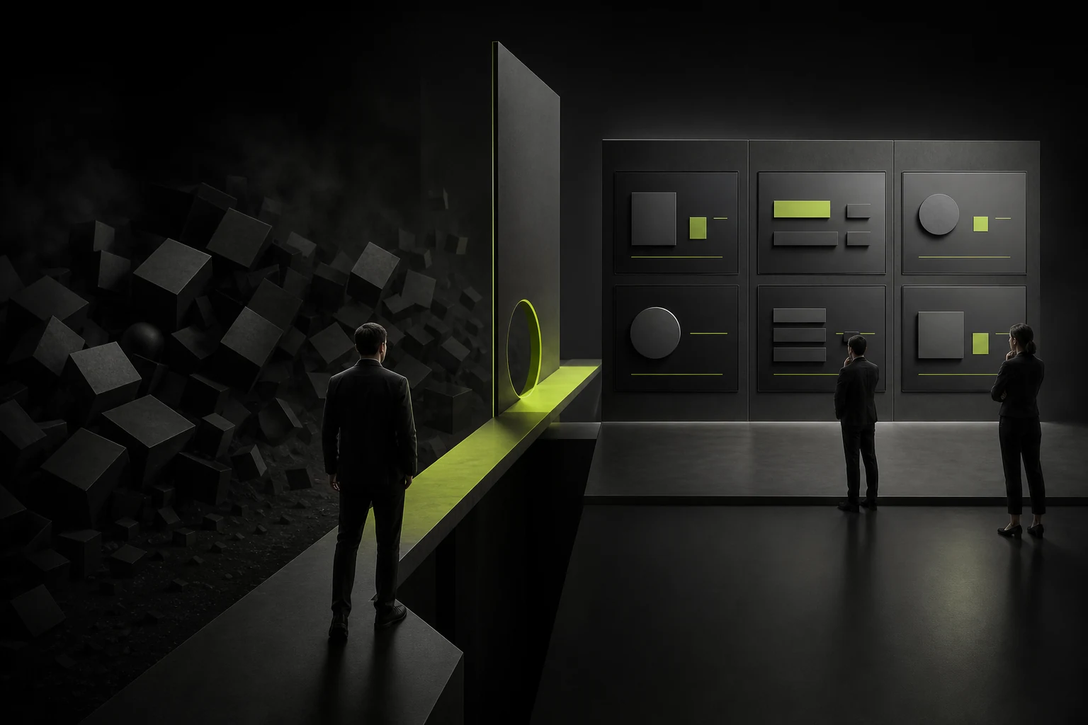
03 The "high-end feel" of an enterprise's corporate website comes from choices, not from a lack of information
A truly mature page will proactively remove repetitive, vague and valueless content, while retaining product differences, cases, data, delivery methods and risk boundaries. Customers are willing to pay for professional services often because the information is clearer rather than the page is more empty.
Restraint does not mean saying less, but only saying what is useful for decision-making and making it easy for these words to be seen.
04 Organize a page with three layers of density
| Hierarchy | Content features | Design strategy |
|---|---|---|
| Decision-making level | Value proposition, product differentiation, key data, main CTA | High contrast, short text, fast scanning |
| Understanding layer | Process, function, case, applicable scenarios, common questions | Reasonable grouping, combination of text and images, and comparability |
| Evidence layer | Technical details, downloadable materials, complete specifications, policies and terms | It can be expanded, downloaded or entered into inner pages |
A page does not need all areas to maintain the same density. The first screen can be restrained, the product comparison area can be compact, the case area can establish a rhythm through large images, and the FAQ needs to be read efficiently. The change in density itself is narrative.
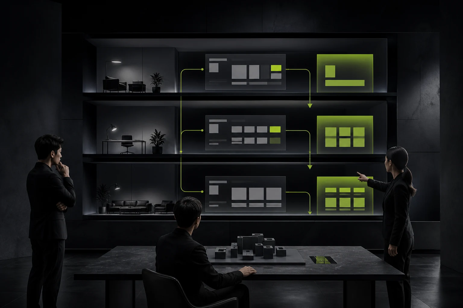
05 Different pages require different density strategies
| Page type | What do users care about the most | A more suitable density |
|---|---|---|
| Brand homepage | Quickly understand positioning, temperament and core entry points | The first screen is restricted, but key products and evidence cannot be postponed |
| Product or service page | Functional differences, applicable scenarios, prices and next steps | Medium to high density, allowing for comparison and continuous reading |
| Case Page | Problems, processes, results and credible evidence | The rhythm of the text and images changes, the key points are magnified, and the process is compact |
| Documents and Resources Page | Quick location, scanning and downloading | High information density, relying on filtering, titles and metadata to maintain order |
| Contact and form page | Determine whether it is worth submitting and fill in the cost | The content is small but closely related, so there's no need to leave large blank Spaces to break down the fields |
The same brand can have different densities without having to make each page look like the same poster. True consistency comes from fonts, grids, components and information priorities, rather than all modules using the same blank space.
06 Responsive design does not reduce all spacing together
The cost of vertical scrolling on mobile phones is more obvious, and the large blank space on the desktop often needs to be shortened. However, the line spacing of text, touch area and module grouping cannot be compressed at will. Container margins, module spacings, component spacings, and text spacings should be defined separately instead of solving all screens with a global scale.

07 During the review, don't just focus on the design draft. Use the real content for stress testing
- Put the longest product name, real customer cases and the most complex parameters on the page.
- Check the reading path on a 1366px desktop, a regular mobile phone, and 200% zoom.
- Enable first-time visitors to find product differences, cases and contact information within 30 seconds.
- Record where users repeatedly scroll, roll back or mistakenly think the page has ended.
08 A simple blank audit table
| Inspection items | Qualified performance | Signals that need to be adjusted |
|---|---|---|
| "Relevance" | The title, description and button visually belong to the same group | The user doesn't know which section of content the button corresponds to |
| Rhythm | There are pauses in the key areas, and the reading in the information areas is continuous | Each module is like an independent poster |
| Density variation | Different tasks use different densities | All the modules on the entire site are equally loose or equally crowded |
| Complete content | The key evidence is visible in a reasonable position | Delete the price, case or boundary to leave blank space |
| Mobile adaptation | The scrolling length of the mobile phone is controllable and there is sufficient touch space | Move the blank desktop to the phone exactly as it was |
Frequently Asked Questions
Should the corporate websites of high-end brands use as little text as possible?
Not necessarily. Luxury goods display pages can rely on visual emotions, while B2B, technology and professional services require more decision-making evidence. The amount of text should be determined by the user's task and brand positioning.
How to determine if there is too much white space on a page?
When the relevant content is separated by distance, the first screen fails to explain the business, users frequently scroll to find the entry point, or there is only one sentence on the mobile screen, it is necessary to recheck.
Can cards help solve the problem of information density?
Cards are suitable for expressing independent objects or comparable information, but not for putting every piece of text into a container. Too many cards will increase boundaries and visual noise.
Is it necessary to stipulate blank space in the design system?
Necessary. At least define the page margins, module spacing, component spacing, text spacing and responsive changes, and explain when exceptions are allowed.
| Related Service | Learn More |
|---|---|
| Corporate Website Design Services | View Service Details |
| Project Consultation | Contact JVDS Design Studio |
| Design and Website Development Articles | Read More Related Articles |
 Link copied