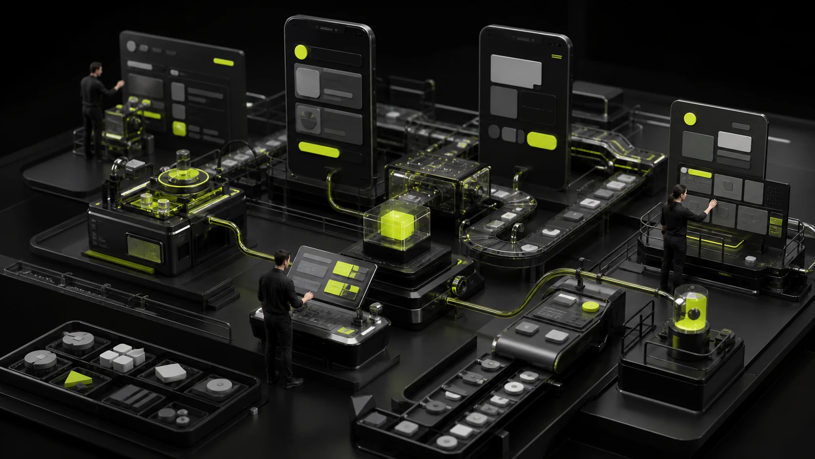
After a brand team completes a visual system, product teams often face two problems: ignore it completely and the product resembles a generic template; use it everywhere and buttons, states, and data all compete in the brand color, making interaction confusing.
Product UI must translate brand assets into a functional system rather than copy a marketing poster directly.
01 Distinguish Brand Colors from Semantic Colors
Brand colors support recognition, while semantic colors communicate success, warning, error, information, and interaction states. They can be related, but one color should not simultaneously represent both the brand and an error.
Manage color through semantic tokens to keep light and dark modes, accessibility, and states consistent.
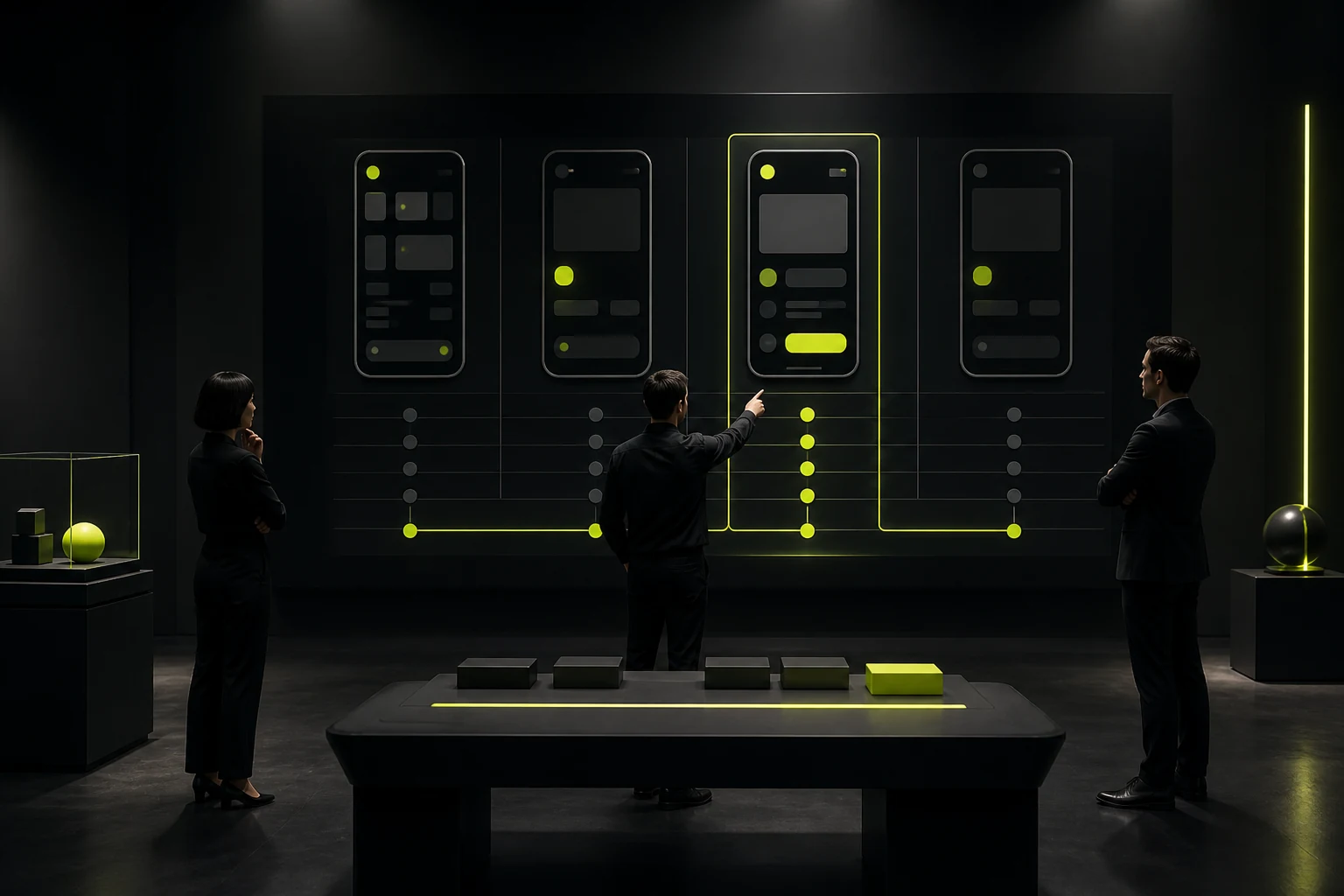
02 Place Brand Expression in Memorable, Low-Interference Moments
Launch, login, empty states, important success moments, welcomes, and branded content pages can support stronger expression. Dense tables, long forms, and risk confirmations should prioritize clarity.
Brand presence does not require a logo in every corner. Consistent typography, icons, radii, spacing, and voice last longer.
Ways Brand Assets Enter Product UI
| Asset | Good Uses | Avoid |
|---|---|---|
| Color | Primary CTAs, navigation recognition, illustration, key states | Using one primary color for every button and chart |
| Typography | Headings, numbers, brand content, with readable body copy | Using display type for long text |
| Graphic system | Empty states, onboarding, backgrounds, data stories | Decoration covering controls and data |
| Imagery/illustration | Welcomes, education, content, emotional moments | Large images consuming space on every screen |
| Motion | Feedback, transitions, signature brand moments | Delaying tasks or using effects that cannot be disabled |
| Voice | Buttons, guidance, errors, help | Marketing slogans in risk warnings |

03 Balance Branded Typography and Icons with System Efficiency
If the brand typeface lacks characters, loads slowly, or has limited licensing, use it for headings and marketing touchpoints and choose a highly readable system or product typeface for body text.
Keep icons on a consistent grid with familiar meanings. Branding should not make common actions unfamiliar.
04 Critical States Express Brand Personality Better Than the Homepage
When something fails, does the product coldly say “Operation failed,” or clearly explain the problem and help users recover? When something succeeds, is the feedback restrained, and does it offer the next step? These are all parts of the brand experience.
Content and visual designers should define the voice together rather than leaving developers to improvise copy.

05 Share Foundations Across Marketing and Product, but Allow Different Density
A marketing website can use bolder layouts and motion, while a product interface needs frequency, stability, and information density. Connect them through color, typography, graphics, and voice without forcing an identical structure.
Build cross-touchpoint tokens and an asset library so each team does not create its own “brand version.”
06 Use Usability Testing to Detect Excessive Branding
Observe whether users can quickly identify the primary action, status, and risk, and whether decoration, color, or motion distracts them.
Testing can also compare recognition in screenshots without logos. If people still sense the same brand, the system is genuinely established.
Frequently Asked Questions
Must the primary brand color be the product's button color?
No. Buttons must meet hierarchy, state, and contrast needs. Use a functional variant when the primary color is unsuitable.
Must the website and app use the same component library?
They do not need to share every component, but they can share tokens, brand assets, and content principles. Platforms and task density differ.
Do brand illustrations belong in an admin system?
They can support empty states, onboarding, and important guidance, but should not occupy frequent workspace.
Can product text use the logo typeface?
Usually not. Logo lettering may be custom or unsuitable for long text. Choose a readable product typeface with clear licensing.
How can brand recognition inside a product be measured?
Use logo-free recognition tests and interviews about brand attributes while also checking task efficiency and error rates, not preference alone.
| Service | View |
|---|---|
| Related services | View service details |
| Project inquiry | Contact JVDS |
| Design and web articles | View articles |
 Link copied