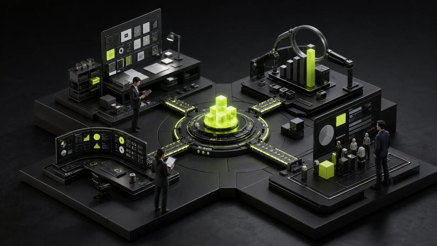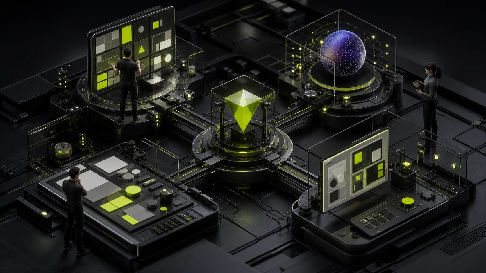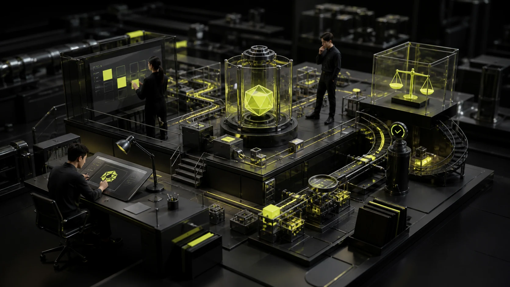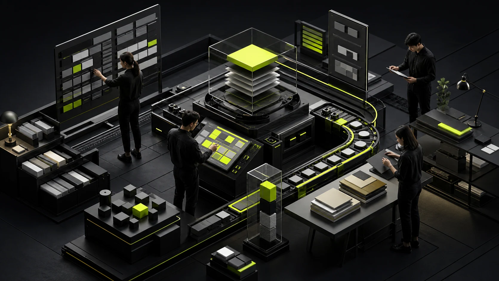
After replacing the company name, many technology websites look almost identical: dark backgrounds, glowing spheres, flowing lines, and oversized English type. The style looks advanced but does not help customers remember what the company actually does.
Technology is not one fixed set of visuals. It can express clarity, precision, experimentation, speed, connection, or trust. The identity should emphasize the personality that best fits the business instead of stacking every trend.
01 Begin with Technology Value, Not Technical Terms
Customers care about what the technology solves, why it is better, and how it works in practice. Build the brand around tasks, relationships, and outcomes rather than terms such as models, cloud, or blockchain.
Technology evolves, but the brand core cannot be rebuilt with every product release.
02 Define the Technology Personality You Want to Express
Research software may emphasize rigor and exploration, fintech may emphasize trust and control, and developer tools may emphasize efficiency and openness. Each personality leads to different typography, color, graphics, and motion.
“Futuristic” is too broad to guide design decisions.
03 Avoid Using an Industry Visual Kit Directly
Gradients, grids, particles, and glass effects can work, but they need brand-specific generation rules and content meaning. Trend assets with only a new color will age quickly.
Audit competitor visuals first and identify the shared symbols to avoid.
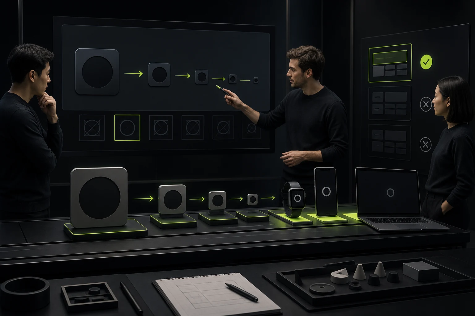
04 Make the Logo Work as a Product Icon and at Small Sizes
Technology brands often appear on websites, apps, dashboards, GitHub, documentation, and social profiles. The logo needs clear icon, wordmark, light-mode, and dark-mode versions.
Complex glow effects need stable static and single-color versions.
05 Build Systems for Data, Graphics, and Motion
Technology companies need to explain processes, architecture, metrics, and product screens. Charts, icons, code, screenshot frames, and motion should follow shared rules.
If the brand system defines only the logo and colors, the website will soon become generic again.
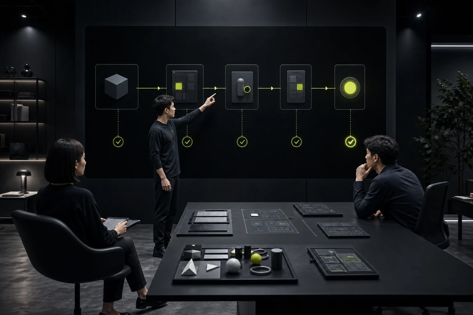
06 Align Visual Identity with the Product Experience
A website that promises simplicity while the product dashboard remains chaotic damages the brand. Core colors, voice, components, and feedback can coordinate across marketing and product without being identical.
Brand and product design teams should validate the system together.
Technology Brand Differentiation Check
| Question | What to Answer | Generic Approach |
|---|---|---|
| What does the technology deliver? | Specific tasks and outcomes | Writing only about innovation and the future |
| What is the brand personality? | Prioritized traits such as precision, openness, and stability | Using every technology adjective |
| What are the visual rules? | A generative, scalable system | Buying a set of abstract assets |
| Does it work in digital products? | Icons, dark mode, motion, and product interfaces | Reviewing only large presentation screens |
| Is it memorable? | Clear distinction from competitors | Blue-purple gradients and a geometric logo |
Frequently Asked Questions
Does every technology company need a dark website?
No. Dark mode is a visual choice that should reflect the content, readability, brand, and product context.
Can a technology brand still use blue?
Yes. The problem is not the color itself, but a lack of distinctive proportions, combinations, and rules.
Does an abstract logo make the company harder to understand?
It does not need to depict the product literally, but it should be recognizable, express the right character, and follow an explainable design logic.
How closely should brand and product design match?
Core identity and voice should align, while specific components can be optimized separately for marketing and work contexts.
How can the identity avoid becoming dated?
Reduce dependence on one visual trend and establish a stable core with supporting layers that can evolve.
| Service | View |
|---|---|
| Related service | View service details |
| Related reading | Read the article |
| Design work | View selected work |
| Project inquiry | Contact JVDS Design Studio |
 Link copied