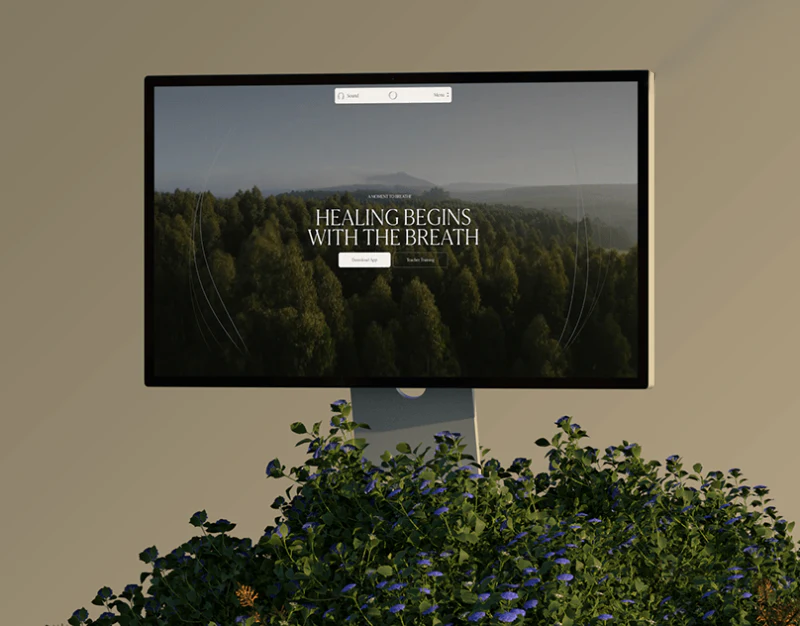
Aurum’s financial product website design creates a distinct style through blue, white cards, and dimensional marks. Account actions, platform entries, and business services share the visuals. Though the entries look similar, they answer different questions and need words to retain task distinctions.
Key takeaways
- Shared blue-white buttons support different tasks; copy should distinguish account actions and platform entries.
- Business cards have clear visual priority; large benefit figures need nearby audience and condition explanations.
Account actions and platform entry are different levels
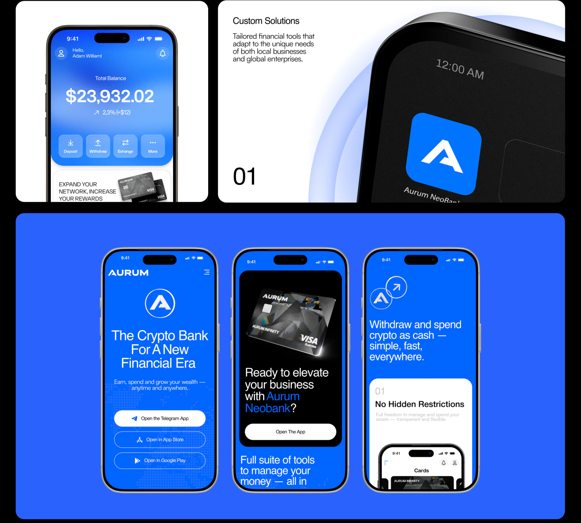
The account example centers a large balance above Deposit, Withdraw, Exchange, and More. The amount provides an overview before named actions suggest next steps. Pale buttons stand out on blue without being overwhelmed by the number.
Other phones list Telegram, App Store, and Google Play with one filled and several outlined buttons. They identify platforms, not account deposits, withdrawals, or exchanges. Shared button styles identify the brand, while copy needs to distinguish starting use from entering an existing account.
JVDS values a brief explanation of purpose before an entry. Open The App on the business page is broad; readers still learning about a solution need to know what task follows. Account and change figures are display content, not real balances or returns.
A wide photograph card gives custom solutions priority
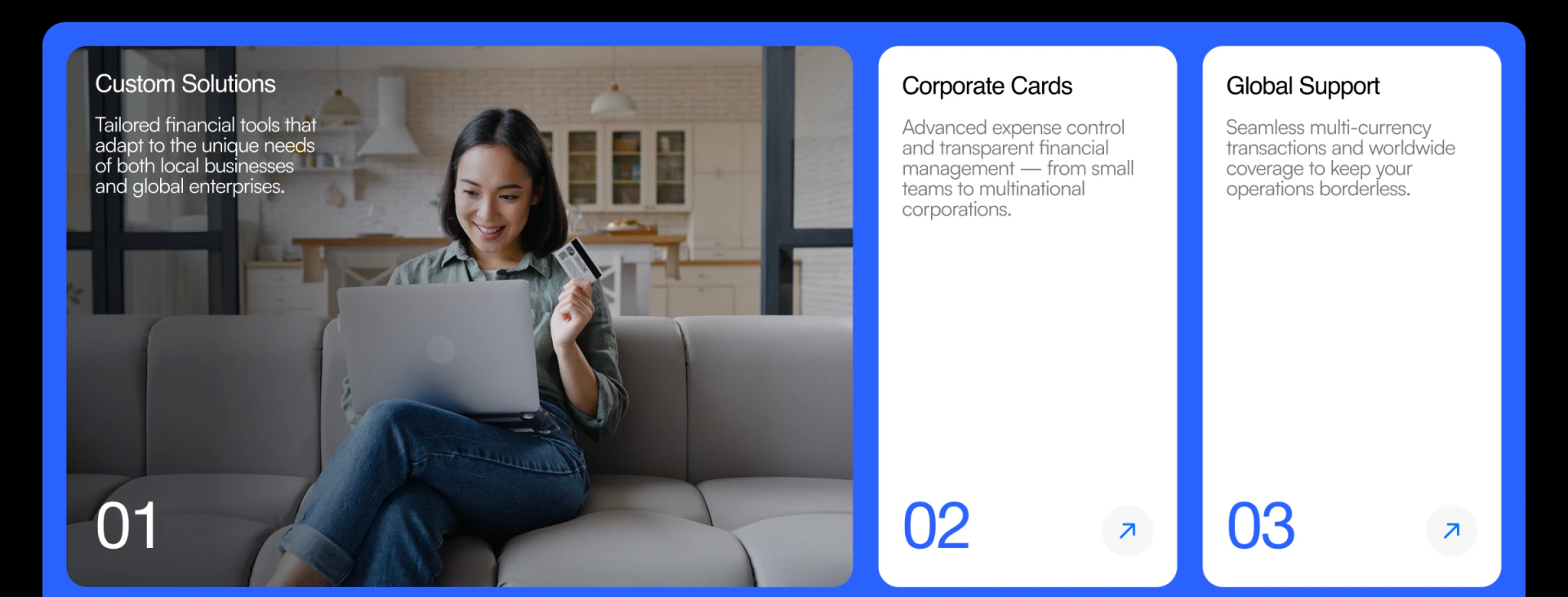
Custom Solutions occupies a wide portrait card on the left, with narrower white Corporate Cards and Global Support cards right. Numbers and arrows share positions, while different visual weights highlight customization first.
This suits content emphasizing one main business service. Photography supplies atmosphere and text cards preserve reading space. Customization, card products, and support scope still belong to different levels, so each description should identify its audience and next step.
A comparable site can ask the same questions for every card: which need, what scope, and what follows a click? A person photograph is not evidence of customer experience, and numbering does not establish comparable services. JVDS prefers retaining these content differences within a stable card structure.
Large cashback claims need nearby conditions
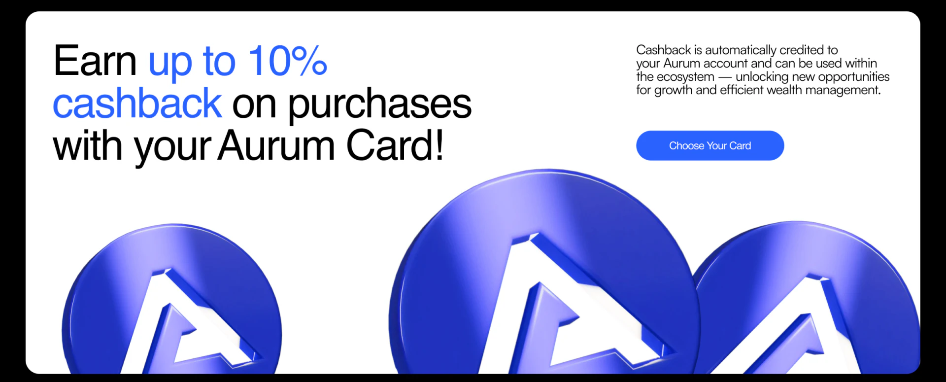
The benefits section uses blue up to 10% and cashback within a large left heading. Smaller explanation and Choose Your Card sit right, with three dimensional marks below. The emphasized number makes the claim easy to recognize.
A maximum rate should remain connected to applicable audiences and conditions. Spending scope, limits, and settlement explanations need to be findable before card selection. This discusses numeric presentation, not the rate as a verified benefit.
Personal accounts, business solutions, and card conditions can share visuals while following distinct content paths. JVDS would check whether readers can name the service they are choosing and what comes next, rather than repeating one opening button throughout.
Frequently asked questions
Can every product website button say Open the App?
It depends on reader purpose. Learning business solutions, choosing cards, and operating accounts need different explanations; generic action names can lose context.
Design review checklist
- Read every button and explain the task after entry.
- Keep benefit limitations near promotional numbers.
Organize financial product introductions and choices
If a product website presents personal, business, and card solutions together, bring its audiences and entry list to discuss page routes.
JVDS Design Studio provides UI/UX design, website design, and development services, helping organize page content, interface structure, and implementation needs.
 Link copied