GenLayer’s pointed symbol, transparent materials and purple-blue light form a distinct relationship, but this technical brand visual design does more than repeat one abstract graphic. The mark supplies stable identity, posters change themes, and the website turns content into participation routes for different roles. Their division is more useful than a single technology atmosphere.
Geometry forms a repeated recognition anchor
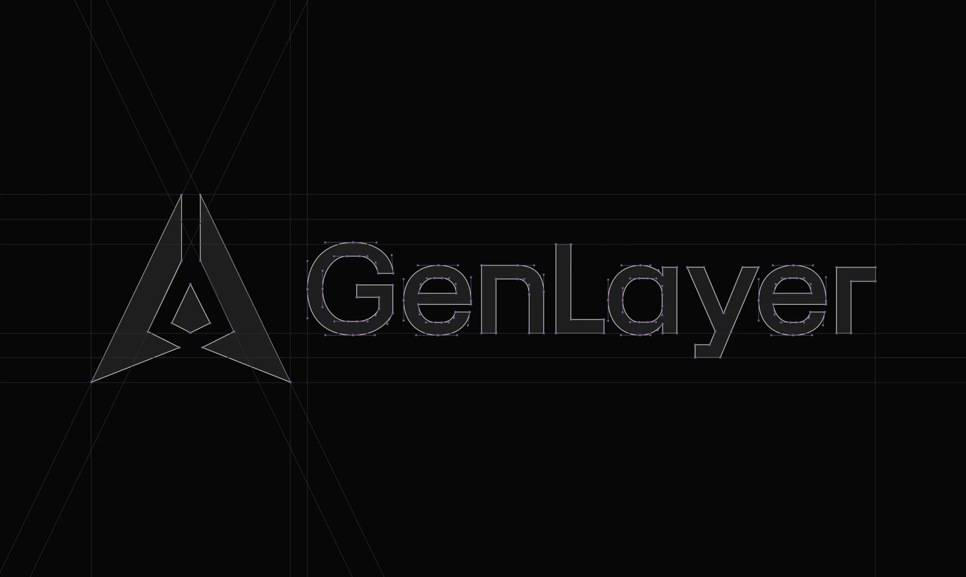
The construction image shows outward-pointing corners and central negative space, with outline and control points retained on the GenLayer wordmark. A strong directional exterior surrounds an empty center, giving the symbol memorable internal structure beyond its solid area.
Symbol and wordmark share explicit proportions, with the full name appearing atop subsequent posters. This relatively fixed combination anchors changing visuals. Construction lines show shape organization without establishing legibility at every size; icons, small wordmarks and posters need scale-specific checks.
JVDS considers fine tips and central openings important features that are also vulnerable when reduced. Small-size applications should allow detail adjustments, prioritizing recognizable form over mechanically retaining every identical point.
Shared lighting lets different themes remain distinct
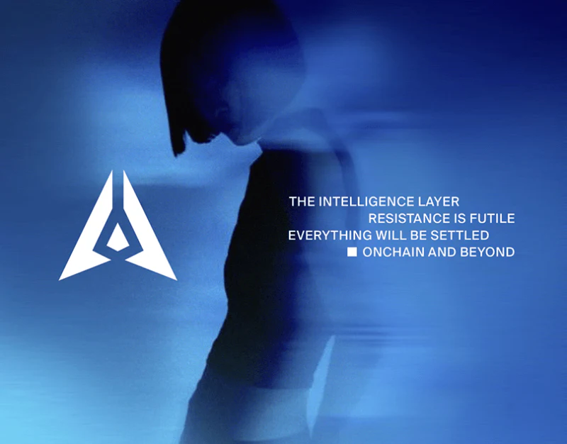
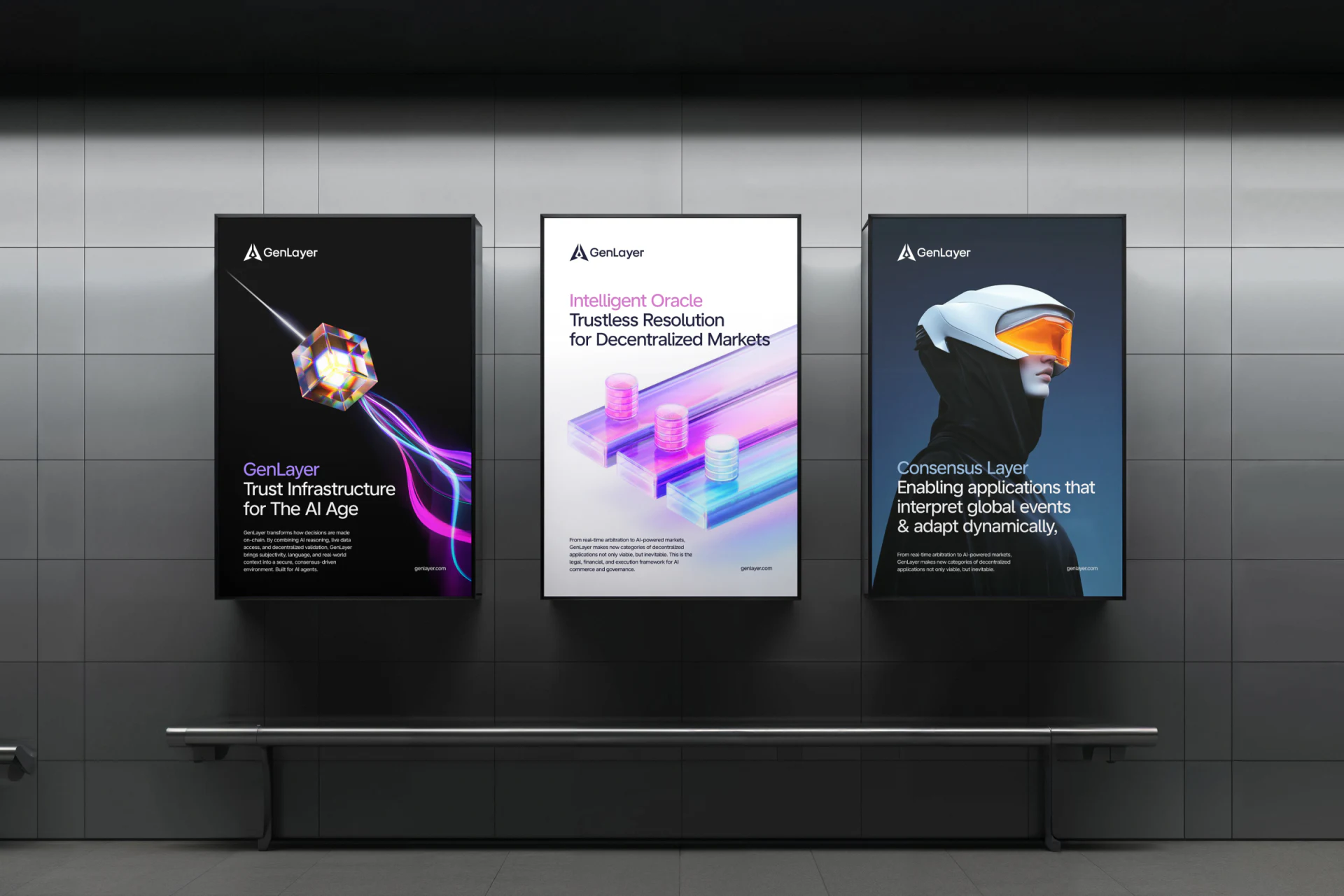
Three posters use a prism and beam, cylinders on transparent tracks, and a helmeted person respectively. Related purple-blue and orange light makes a series while subjects differ: convergence and dispersion, parallel tracks, then a person. The third adds another viewing subject beyond abstract geometry.
Titles name the brand theme, Intelligent Oracle and Consensus Layer. Images invite imagination and words identify topics without replacing each other. Variation can distinguish technical chapters, but mechanisms still need explanation; prisms and helmets cannot substitute for system principles.
Wordmarks occupy similar positions while bodies and subjects adapt to background brightness. White posters use dark type, dark ones light type. The system can keep material relationships while changing textual roles, improving readability over identical gradient type everywhere.
Ecosystem content moves from brand tone to role choices
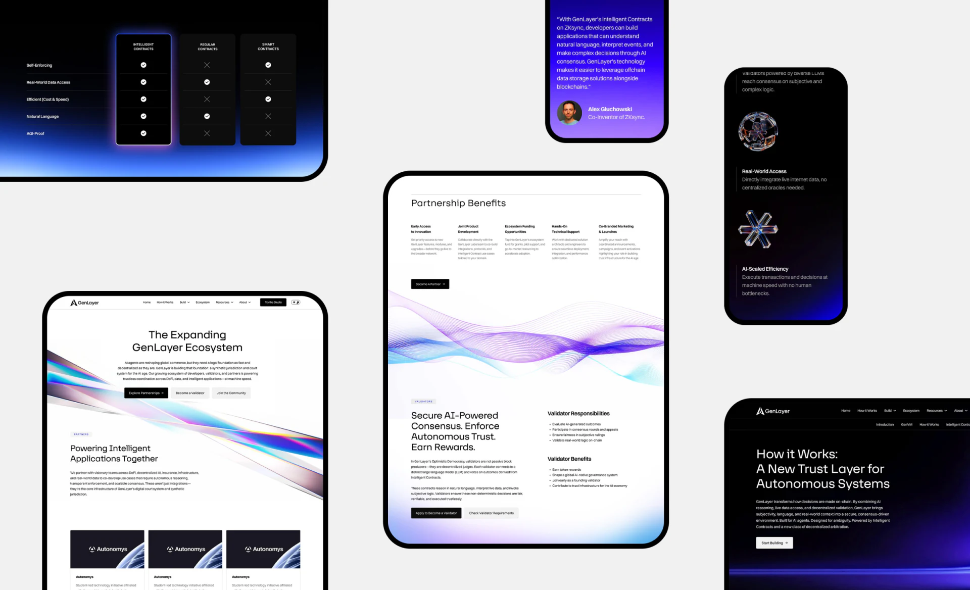
The ecosystem hero offers partnership, validator and community entries. Partnership Benefits expand below; validators separate Responsibilities and Benefits, with application and requirements actions. Roles divide before details, avoiding one Join entry through which everyone must guess their next step.
Purple-blue lines and transparent materials remain, but content has white reading areas, while dark technical pages use the same lighting. Continuity comes from stable materials and color relationships rather than filling every screen with abstract hero imagery.
A comparison matrix emphasizes one column through checks, crosses and a glowing border for easy scanning, but row definitions and applicable conditions still need explanation. Repeated partner names are layout examples, not grounds for counting real partners. GenLayer’s useful approach gives visuals recognition and roles and conditions judgment, establishing a stable place for technical explanations.
Connect brand recognition and technical content
AI platforms, developer services and technical businesses can plan brand graphics, themed series and role entries separately, maintaining clear responsibilities for promotion and specific explanations.
JVDS provides UI/UX design and website design and development, helping plan technical brand sites, ecosystem navigation and product explanation interfaces.
 Link copied