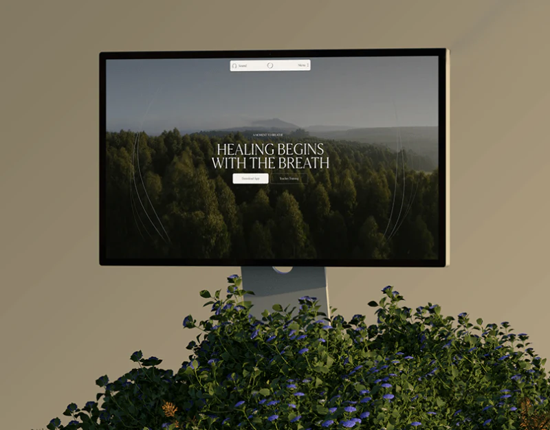
Frequency organizes brand, courses, and articles with plant photography, beige backgrounds, and serif type. Breathwork course website design can create a calm viewing rhythm before placing training levels and arrangements clearly. After atmosphere, readers need to compare what they will join and in which format.
Natural imagery leads into stable text areas
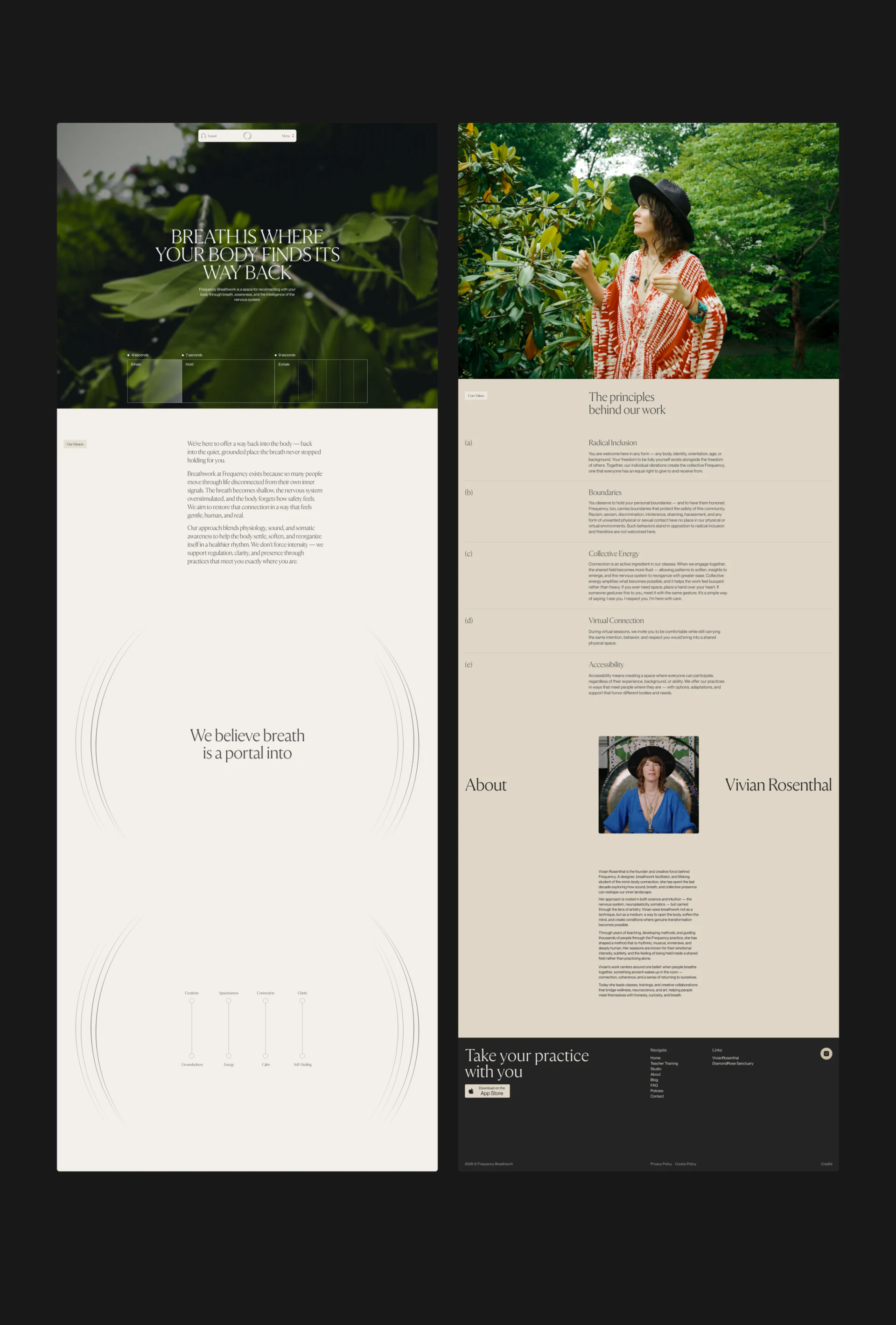
Two long-page columns begin with leaves and portraits, with Sound and Menu compressed into narrow navigation. Beige text and principle lists follow. Large photos, paragraphs, and fine lines unfold slowly, giving brand philosophy its own space.
Sound should state its current setting, and returning from the menu should preserve the paragraph position. Readers still need discoverable course entries so brand narrative is not the only route. Principles about boundaries and accessibility explain service organization; training fields answer what participation includes. Each serves a different purpose.
Level summaries need correct meanings before details
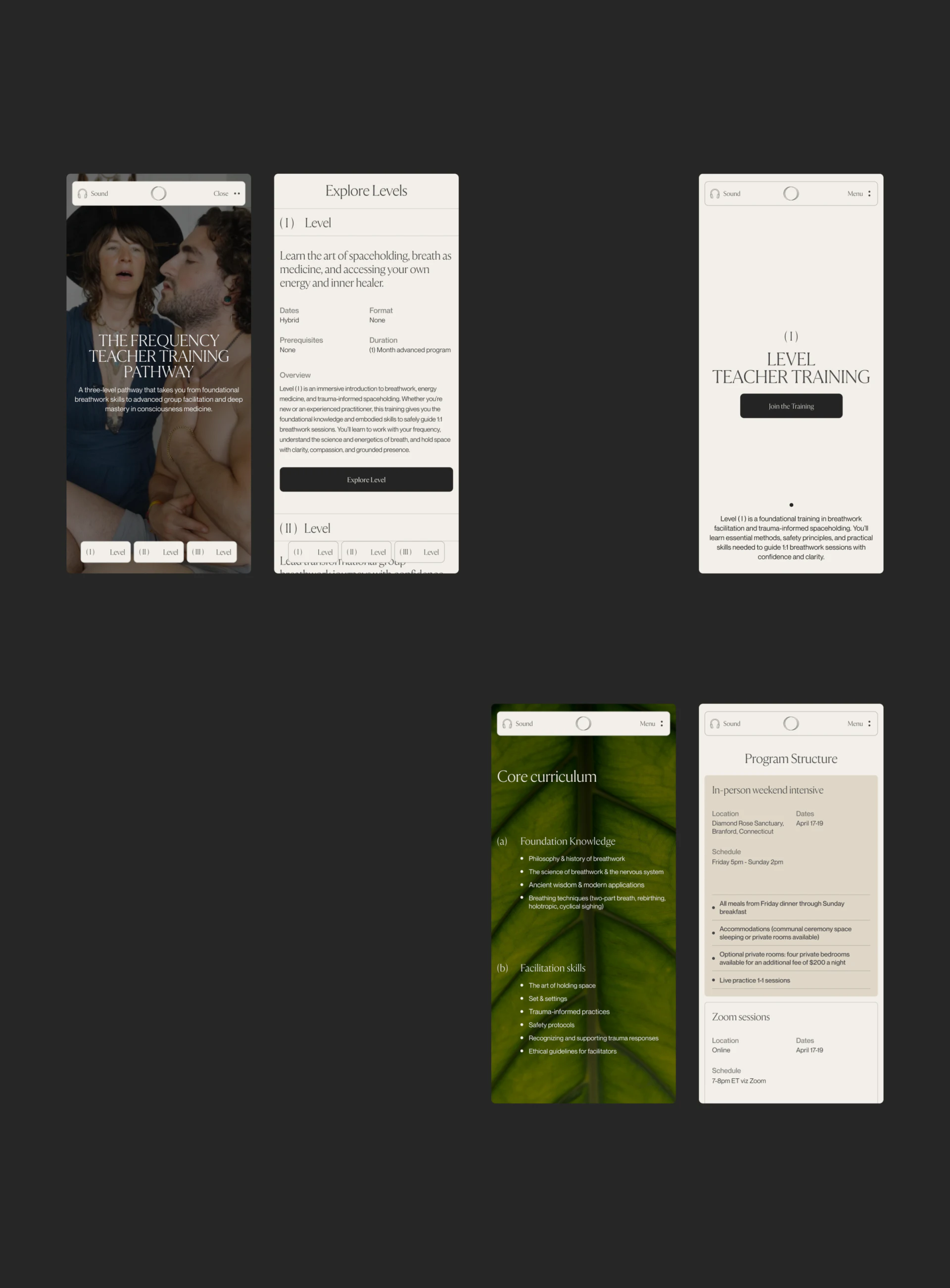
Three Levels stay fixed below on mobile. Explore Levels presents introduction, dates, format, prerequisites, and duration before Explore Level. Persistent entries and summaries support initial comparison, while details increase depth through core content and arrangements.
Level one currently places Hybrid under Dates and None under Format, requiring label-value alignment first. No prerequisite, unpublished, and not applicable should remain distinct rather than all becoming None. JVDS prefers participants, entry conditions, and format visible at one comparison level instead of relying on Roman numeral order.
In-person and Zoom cards list locations, dates, and times, with ET online. Final content should explain whether these are components or independent choices, retaining time zones and inclusions. Enrollment should continue the selected level and arrangements so Join the Training corresponds to a defined choice.
Article categories give further reading different routes
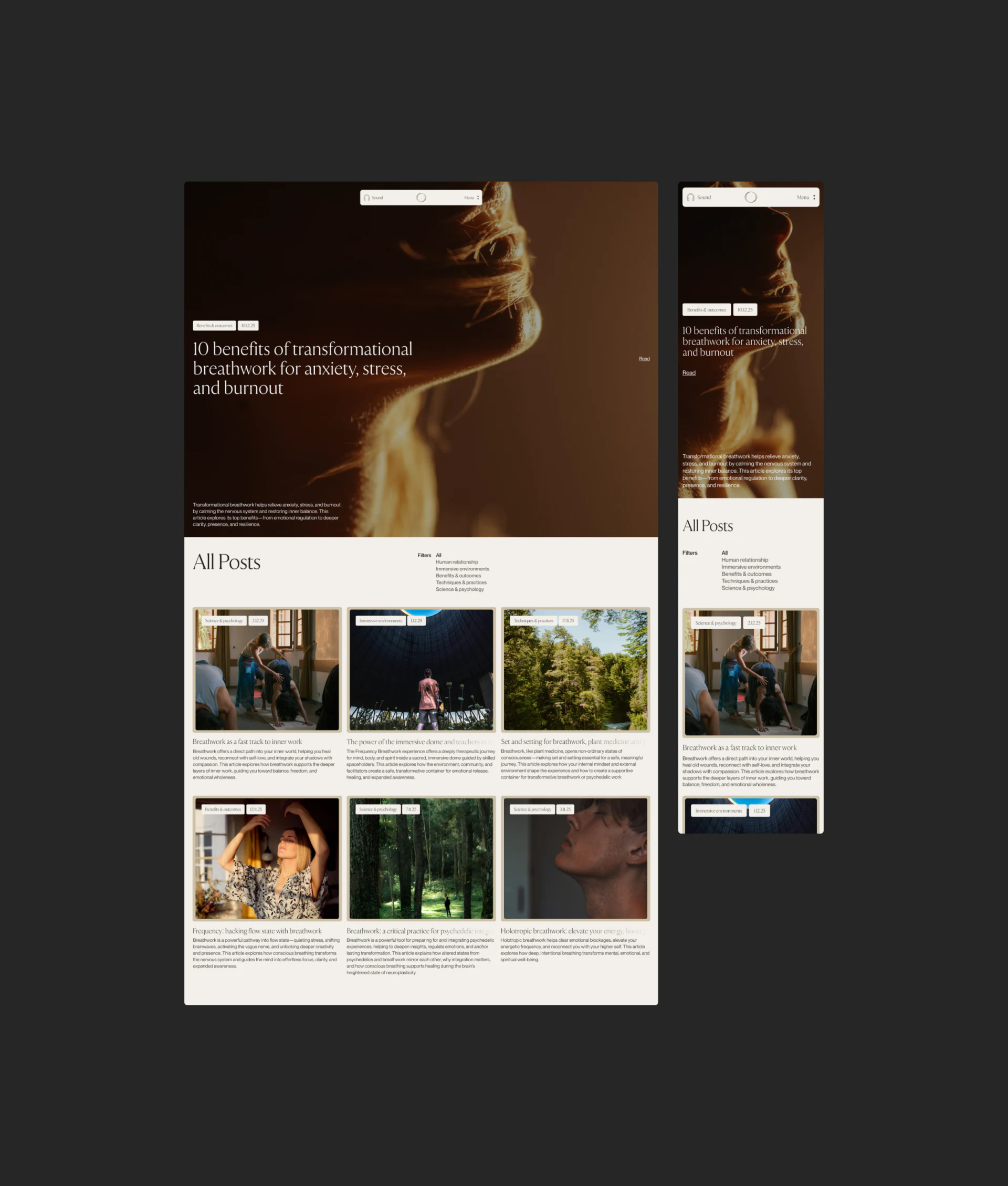
An article page emphasizes one large cover before All Posts. Filters collect relationships, environment, practice, and related themes; cards retain images, dates, topics, and summaries. Mobile arranges them vertically without losing content identity.
Categories let people continue with a question. Articles and courses can connect through related themes rather than every article sharing one enrollment action. Mind-body benefit claims in titles should match their evidence; page design should make topics, author or content identity, and dates checkable.
The useful hierarchy gives philosophy, course conditions, and articles separate places. Calm visuals can remain while levels and arrangements become accurate and reading routes continue by question, supporting fuller understanding before joining.
Let course conditions and reading support choices together
If your course or training website combines philosophy, leveled arrangements, and articles, align participation conditions and fields before designing comparison, reading, and contact entries.
JVDS Design Studio provides UI/UX design, website design, and development services for course sites, level details, and enrollment information.
 Link copied