iPhone Duo UI/UX Adaptation: Foldable Design Is More Than Extra Screen Sizes
The real change introduced by iPhone Duo is not a few extra artboard sizes. It is that the same product can continuously change its available space, orientation, screen divisions and interaction posture while someone is using it.
If a team still works with just two static endpoints—phone and tablet—a layout may look right when fully expanded but lose its information flow when the device is partially folded, rotated, used in split view or rearranged around system controls.
At JVDS, we see foldable adaptation first as the design of a system of states, and only then as the adaptation of pixels and components. Tasks should remain continuous, information hierarchy should stay clear, and layouts should reorganize around space rather than simply scale up.
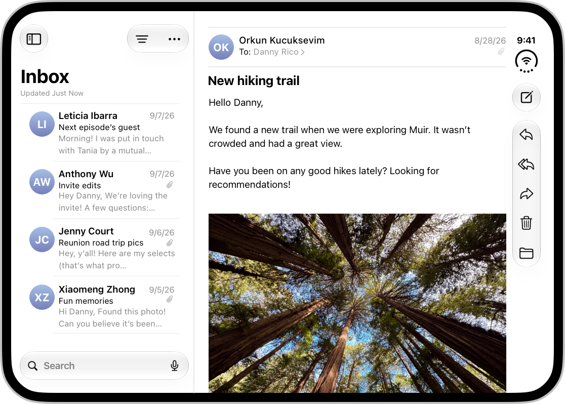
01 Group six device postures into three layout states
A device can be closed, expanded, rotated or partially folded. That does not mean a product team should create a completely separate page for every posture. Doing so quickly produces duplicated logic, repeated components and acceptance criteria that are difficult to maintain.
A more workable approach is to define three layout states: a compact single column, a wide two-column layout and a folded, divided layout. Device posture is a trigger; available width, safe areas and relationships between content should determine the layout itself.
The compact state suits the outer display or a narrow window and focuses on one core task. The wide state can show a main list and its detail together on the expanded inner display. A folded state gives the upper and lower, or left and right, regions distinct roles when the hinge creates a clear boundary.
All three states must share business data and operation progress. Expanding the device should not restart the page, erase entered information or make a previously available feature disappear.

02 Side controls give height back to content
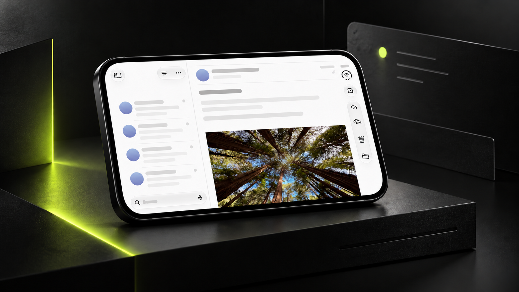
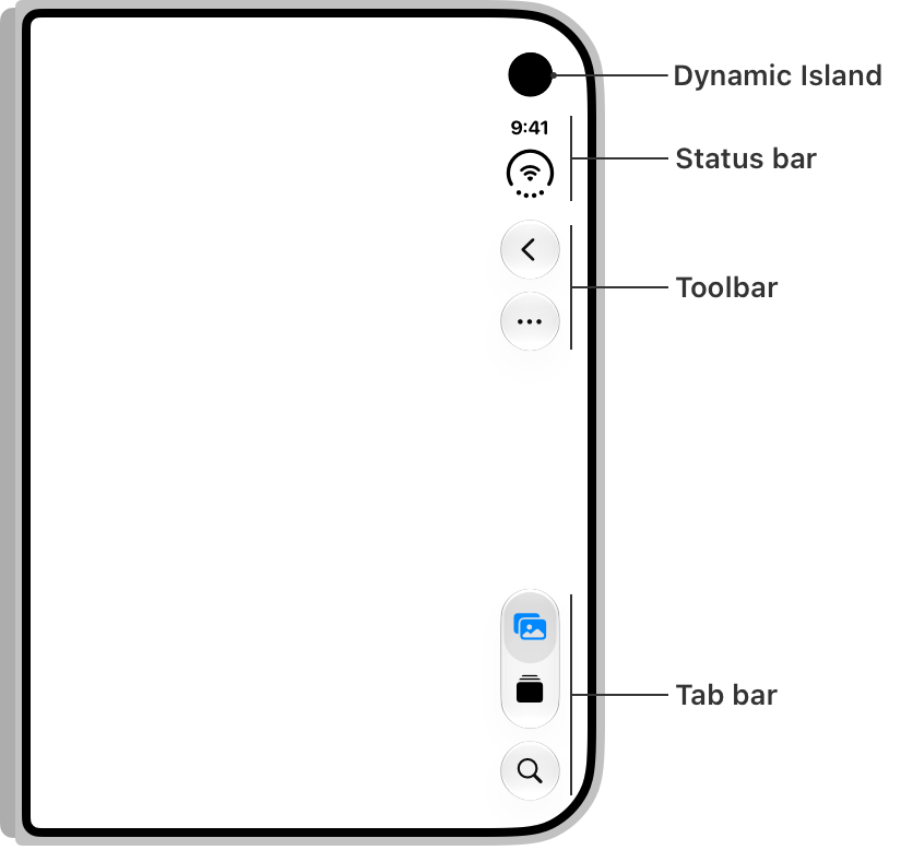
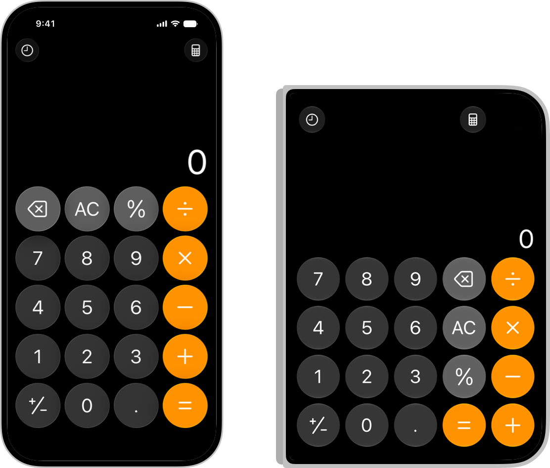
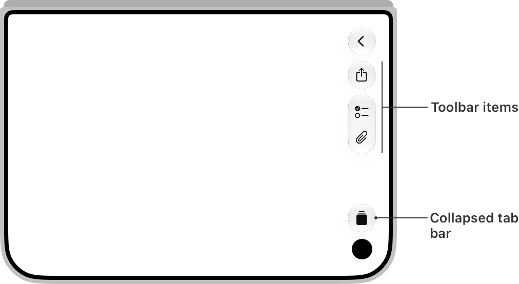
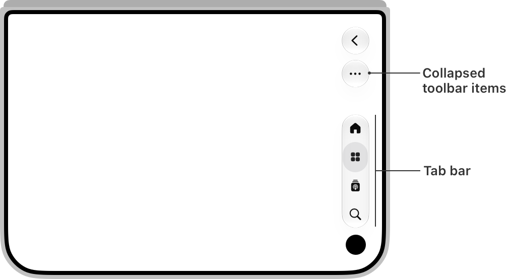
In some landscape situations, iPhone Duo places the status bar, toolbar or tab navigation along the side because the device is wider and shorter. Keeping everything at the top and bottom would leave less room for text, video, tables and task controls.
When using system components, start by accepting the layout changes supplied by the system. These controls can adjust to orientation and space while handling safe areas, accessibility and future system updates more consistently.
Custom controls need to answer three questions: must they always remain visible; do they belong to global navigation or the current content; and should they collapse, move into an overflow menu or take a lower priority when space runs out?
A sidebar is not the answer for every page. Immersive images, maps, videos and some games can extend their backgrounds across more of the screen, but essential controls should still avoid reserved system areas and retain adequate touch targets.
03 Expanding the screen should not just stretch the content
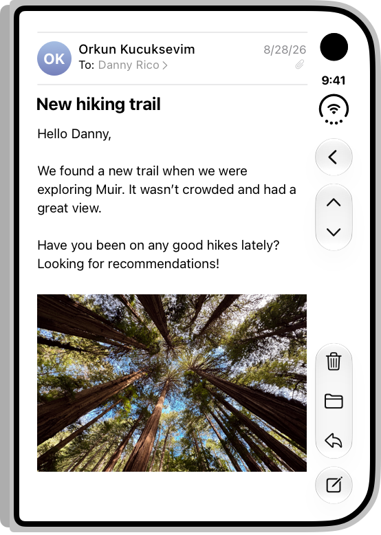
The most common mistake when moving from the outer display to the inner display is to stretch cards, input fields and paragraphs. The screen fills up without providing more useful information, and lines of text can become harder to read.
Wide layouts should reorganize information hierarchy first. Lists and details can sit side by side; filters can move from a drawer into a persistent sidebar; a player can share the screen with its playlist; and product information can form a stable split layout with its action area.
Add a second column only if it reduces back-and-forth navigation. Recommendations, advertisements or decorative modules added merely to fill empty space make the expanded state noisier, not more efficient.
JVDS usually maps information relationships before drawing responsive interfaces. First decide what must be visible together and what can appear later. Then decide the number of columns, proportions, spacing and breakpoints.
04 Keep actions close to the content they affect
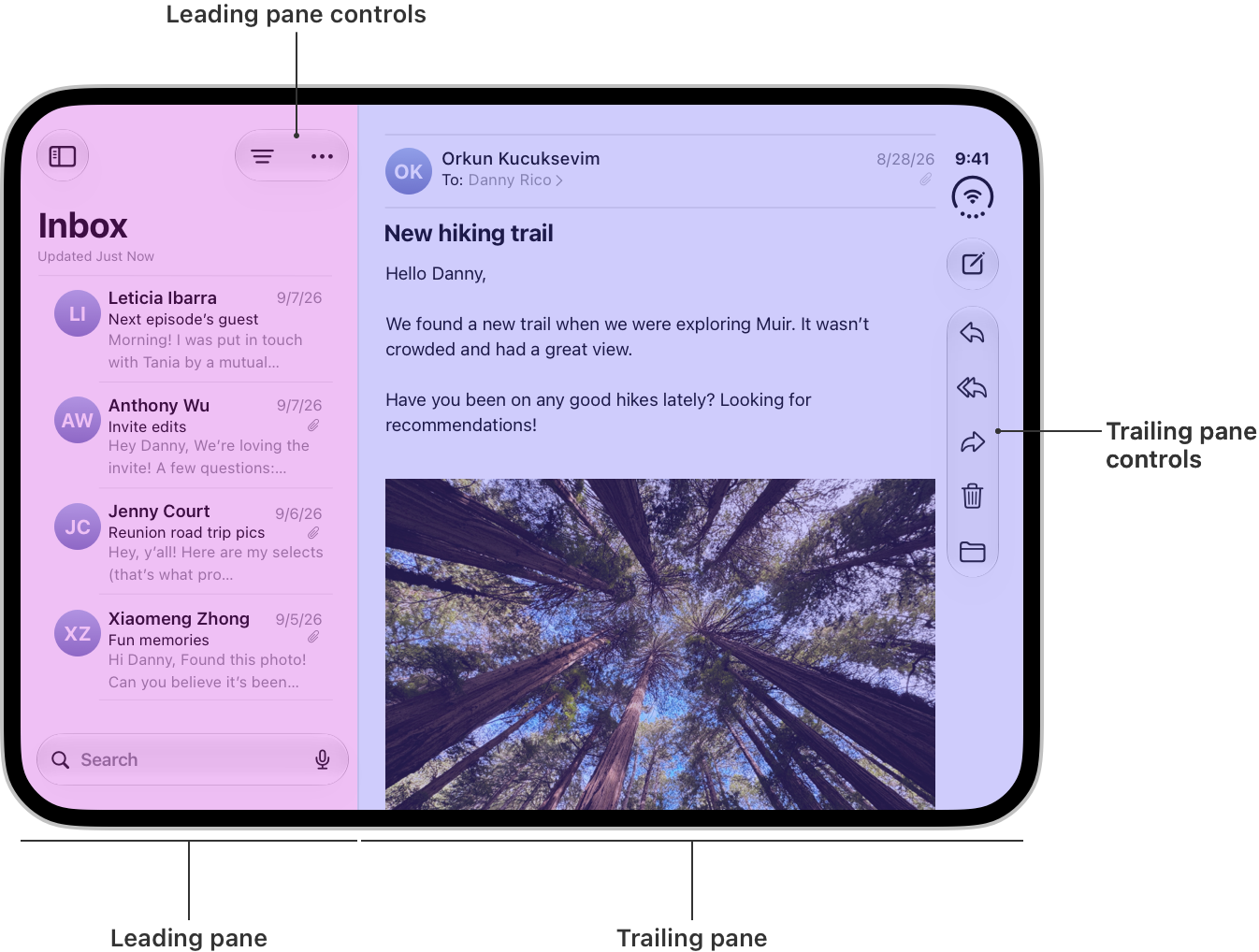
When the inner display shows a list and its detail at the same time, do not move every button to the far right. People need to understand whether an action affects the entire product, the current detail or the selected item in the list.
Local actions should stay near their corresponding content. In Mail, filtering and composing belong to the list region, while replying and forwarding belong to the detail region. Global navigation should remain relatively stable so the product still feels like one coherent place.
When toolbar space runs out, the order of compression should follow the task. Editing, creation and processing screens should preserve frequent task actions first. Browsing and module-switching screens should give greater priority to global navigation.
Do not specify button positions using fixed coordinates alone. A reliable handoff describes action groups, priorities and overflow rules so developers can lay out the controls according to the space actually available.
05 Treat the hinge as a conditional reserved area
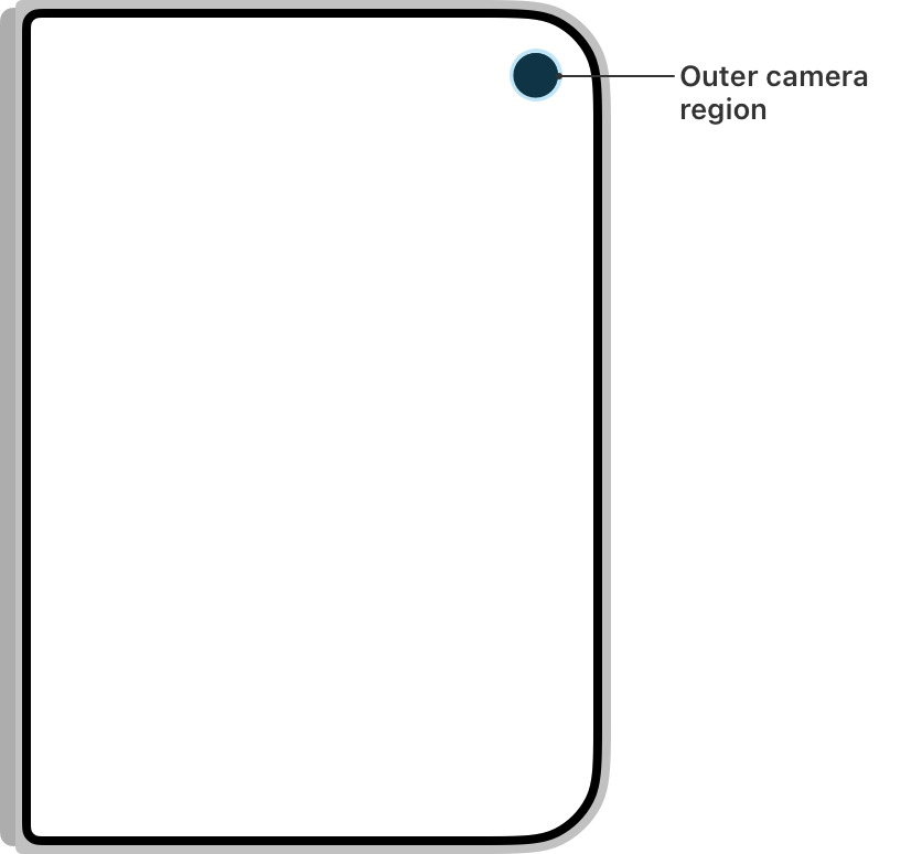
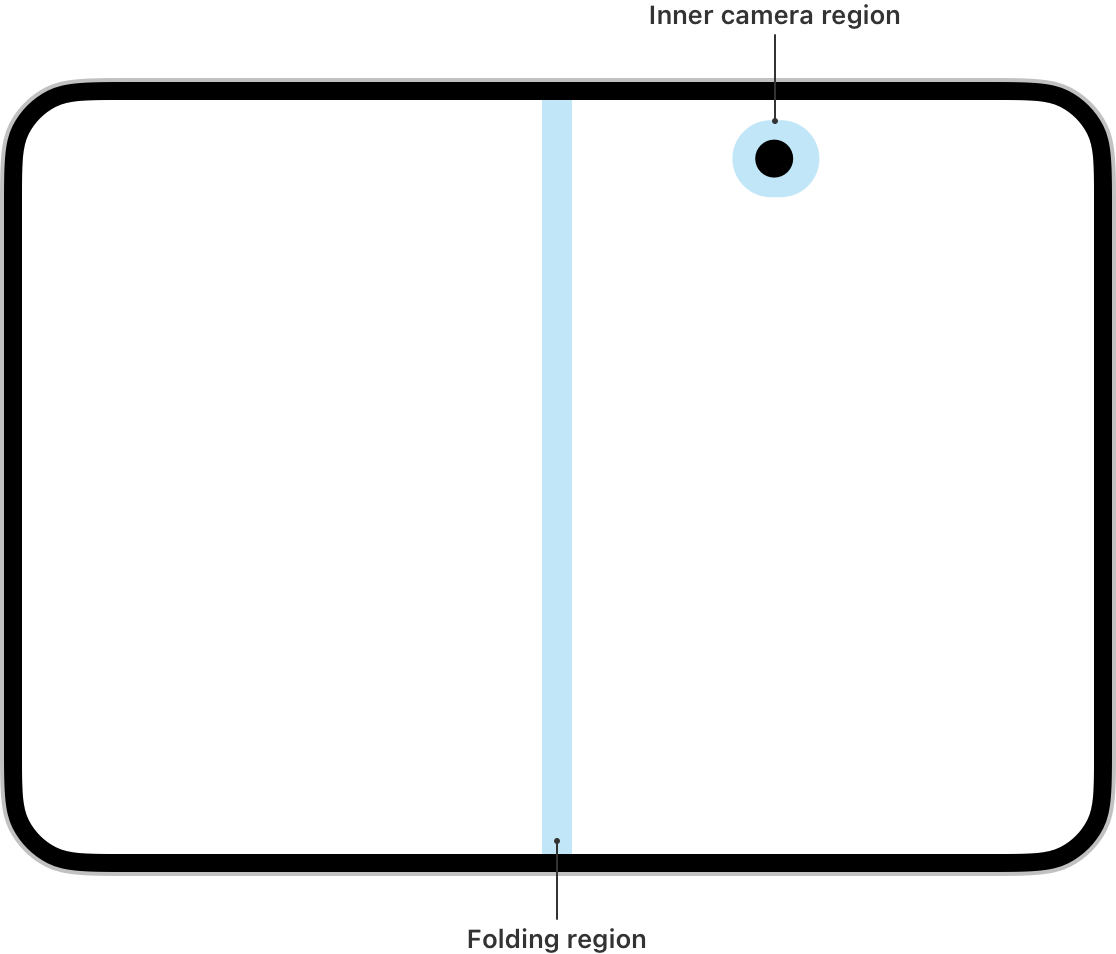
The central region of a foldable display affects content differently as its angle changes. Fully expanded, it may behave like a nearly continuous canvas. Partially folded, it becomes a clear boundary that dialogs, menus and split layouts need to respect.
A design should not simply include a fixed-width line down the middle. Specify safe areas, background layers that may cross the boundary, text and buttons that must not cross it, and the layout strategy as the folding angle changes.
Cameras, dynamic status areas and system controls also change the available space. Components should work with safe areas and layout margins, rather than absolute coordinates copied from a screenshot of one device.
Keep important headings, primary buttons, form inputs and critical data away from the folding boundary. Broad backgrounds, nonessential imagery and visuals that tolerate continuous cropping may span it to preserve a coherent composition.
06 Partially folded layouts are useful, but not every product needs one
The value of a partially folded mode comes from a new way of using the device, not from the device looking unusual. Video calls, photography, live streaming, presentations and remote control can use one region for content and the other for controls.
If the business has no clear division of tasks between the two regions, there is no need to invent a new workflow. Keeping the existing layout usable, content unobscured and controls stable is usually more valuable than adding a rarely used feature.
Assess the case for a dedicated layout using three questions: can the device stand on its own; do the two regions serve different tasks; and does this posture meaningfully reduce the need to hold the device or switch views?
The interface must also handle changes in folding angle. Near the fully expanded or closed thresholds, it should not repeatedly jump between layouts. State changes need stable thresholds, transition feedback and protection for entered information.
07 Upgrade the page inventory into a state matrix
A traditional page inventory lists the pages in a product but does not describe how the same page changes across different spaces. Foldable projects also need a state matrix covering layout, navigation, toolbars, panes and content continuity.
Component specifications should explain responsive behavior. A toolbar action may remain visible, take a lower priority, move into an overflow menu or disappear. Delivering one static arrangement does not explain these possibilities.
During development, base layouts on available space, size classes and reserved system areas. Avoid identifying layouts solely by device name or a fixed width. The same logic can then continue to work as future device dimensions change.
Testing needs more than a few design screenshots. Cover the outer display, inner display, rotation, partial folding, split-screen windows, enlarged text and accessibility features, and verify that people can complete their tasks continuously.
08 iPhone Duo adaptation checklist
Stage | Question to resolve | Completion criterion |
|---|---|---|
Information architecture | Does expansion require a second layer of information to be visible? | Additional content reduces switching instead of merely filling space. |
Layout states | How do compact, wide and folded layouts transition? | States remain continuous; input and task progress are preserved. |
Navigation and controls | Which takes priority: the sidebar, toolbar or tab bar? | Frequent actions stay visible; less frequent actions have a clear overflow path. |
Safe areas | Which elements are affected by the hinge, cameras and system areas? | Text and essential controls are neither obscured nor split. |
Component handoff | How do components compress and reorganize when space runs out? | Design and development follow the same priority rules. |
Testing and acceptance | Are postures, orientation, split view and accessibility covered? | Core tasks can be completed in every state. |
A foldable project does not need a completely separate product for every posture. What matters is defining stable content relationships, action priorities and transition rules so the interface can reorganize naturally across different spaces.
Frequently asked questions
Is adding a few design sizes enough to adapt an app for iPhone Duo?
No. Screen dimensions are only the outcome. Teams also need to define layout states, information hierarchy, control priorities, safe areas and task continuity. Static artboards alone cannot cover real use.
Must every toolbar and navigation control move to the side?
No. System components should follow the system layout first. Position custom controls according to content relationships and task priorities, and keep local actions close to what they affect.
Does the expanded inner display always need two columns?
No. A second column is useful only when it reduces navigation, supports comparison or preserves context. Reading-focused pages should still control line length rather than fill the entire screen.
Is a dedicated partially folded interface mandatory?
No. Invest in one when the upper and lower, or left and right, regions have clearly distinct roles. Otherwise, prioritize the stability and usability of the existing interface.
What is most often missed during project acceptance?
Task continuity during transitions is easily overlooked: entered content can disappear, selections can reset, buttons can jump or dialogs can cross the folding boundary. Validate complete tasks, not just screenshot similarity.
Related services and project enquiries
Related service | Learn more |
|---|---|
App UI/UX design | |
Complex products and design systems | |
Project consultation |
Need design or website development services?
JVDS Design Studio is a professional design studio focused on digital product experiences and brand identity. We work with businesses in China and overseas that want to strengthen their brand image, improve user experience and grow their business, providing clear, usable UI/UX design, high-quality website design and development, app and mini-program development, and cohesive, distinctive brand identity design.
Working on a B2B system or an app? Share your current screens and key user tasks so we can discuss the design scope.
 Link copied