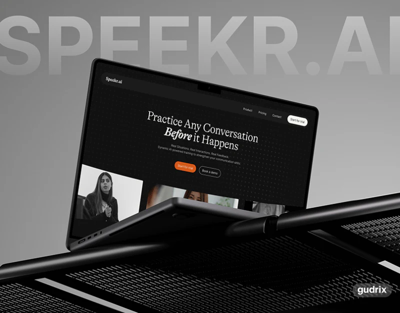
Speekr uses black backgrounds, orange buttons, and light serif headings for a quiet editorial character. Practice Solo, feedback, and custom conversations occupy separate modules, with trial and demo beside each other on mobile. Organizing the introduction around one complete practice session would make this structure easier to understand.
Key takeaways
- Practice capabilities, trial, and demo are grouped, with black and orange making entry hierarchy clear.
- Case figures and plans need separate definitions, and team headings should align with individual labels.
Practice methods have a place after the large heading
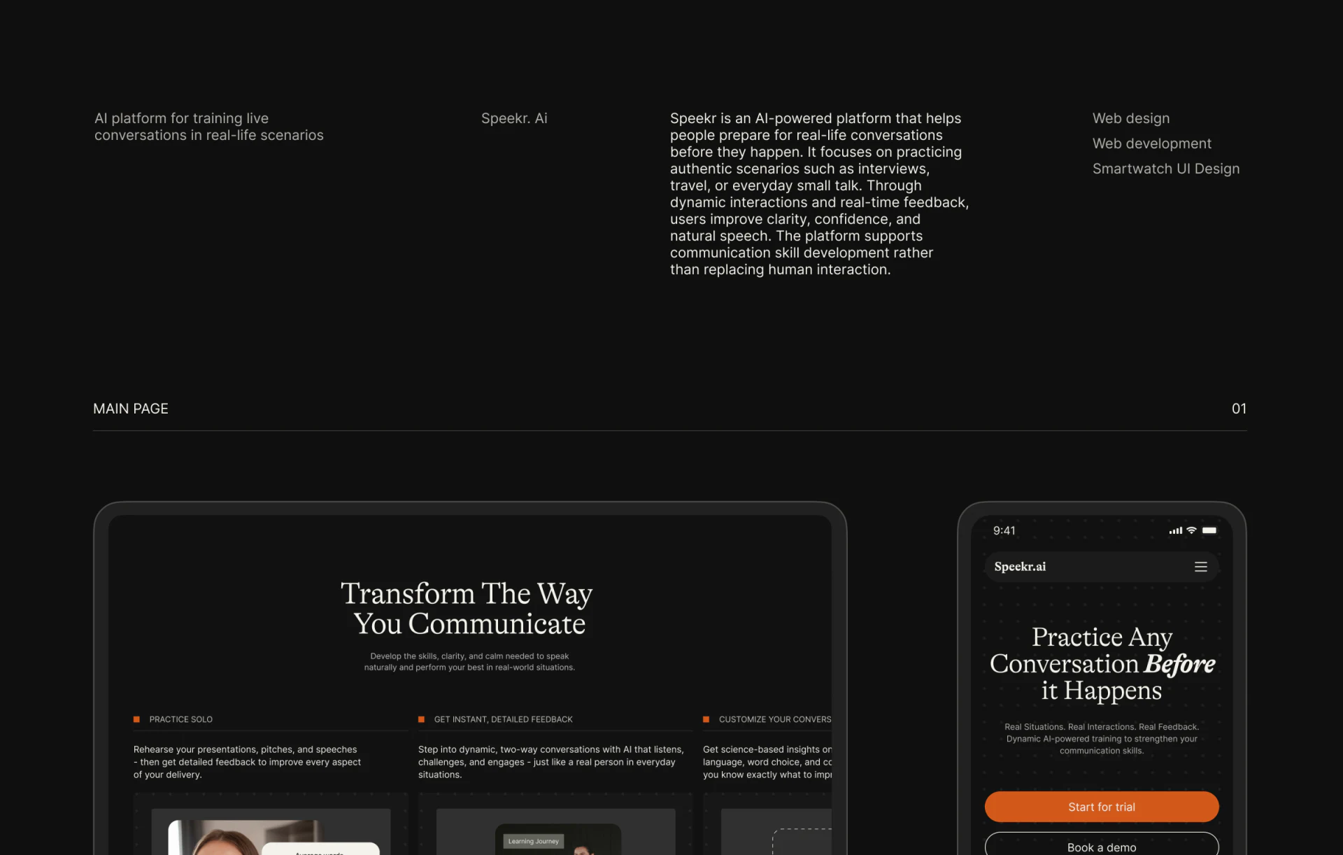
The desktop heading sits centrally with broad black space above and below, followed by three columns on solo practice, feedback, and custom conversations. Small orange dots add limited emphasis without bright cards filling the page. Mobile brings its pre-practice proposition and orange trial button closer together.
JVDS likes the rhythm of topic followed by capability. Capability names still need a coherent process: choose a situation, speak, then view content-specific feedback. Each module has a role; two-way role dialogue and feedback reports should not read as one thing.
Start for trial and Book a demo use solid and outlined mobile buttons for independent experience and further explanation. Destinations should match promises, rather than revealing an unexplained contact form only after clicking trial.
Capability and case cards need different explanations
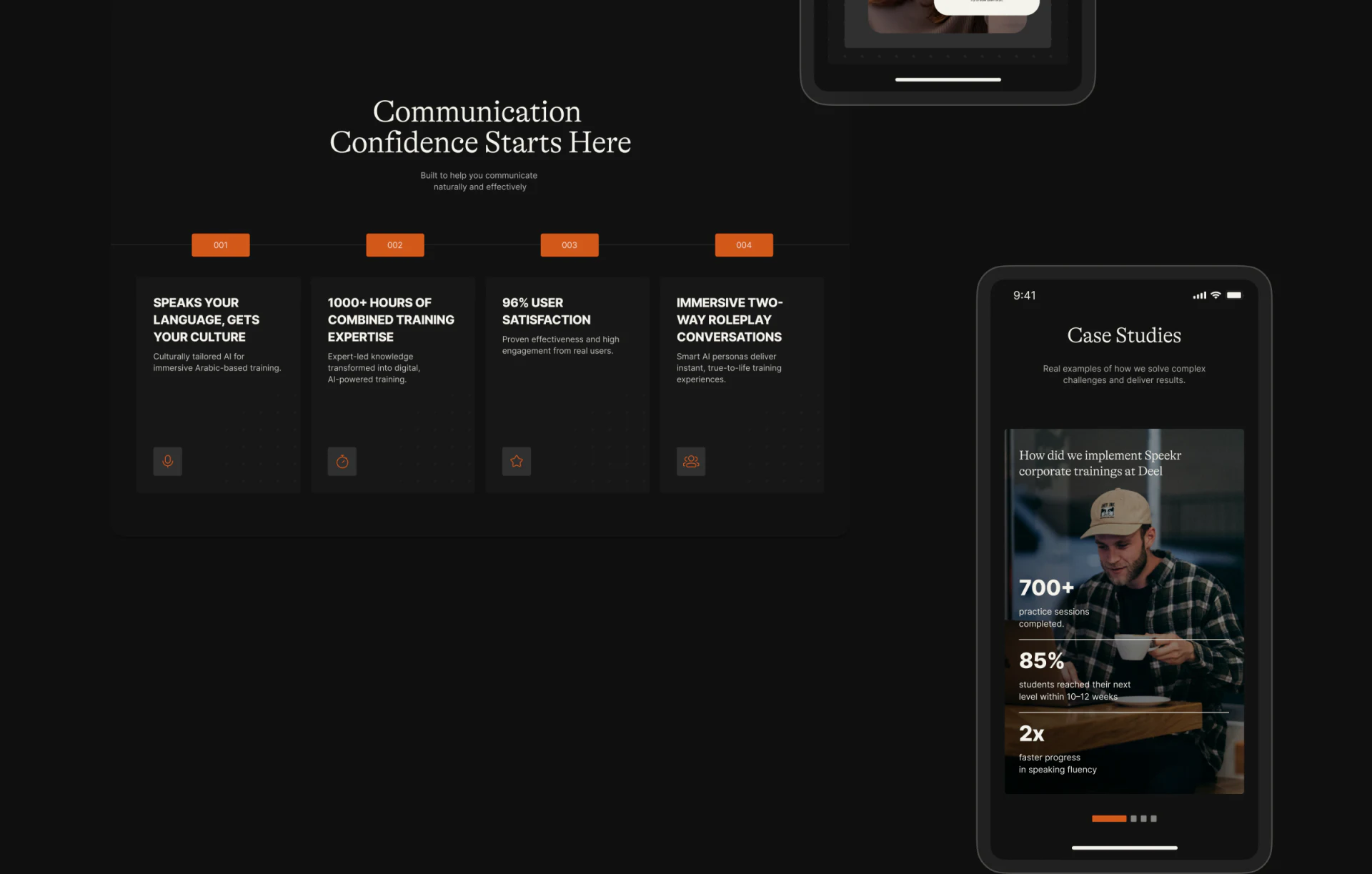
Four capability columns describe language and culture, training experience, satisfaction, and role play, with orange numbers establishing order. A case phone on the right uses a portrait and large figures for stronger visual focus. The two layouts carry different weights.
They answer how the product introduces itself and how a case describes experience, and should not merge into one outcome proof because both contain numbers. Actual figures need objects, time, and definitions nearby rather than asking readers to assemble conditions across cards.
In JVDS’s experience, practice products particularly need a concrete process. Capability numbers can support it, while one expression and its feedback make the exercise understandable instead of asking photographs and percentages to persuade alone.
Plan comparison starts with who the purchase is for
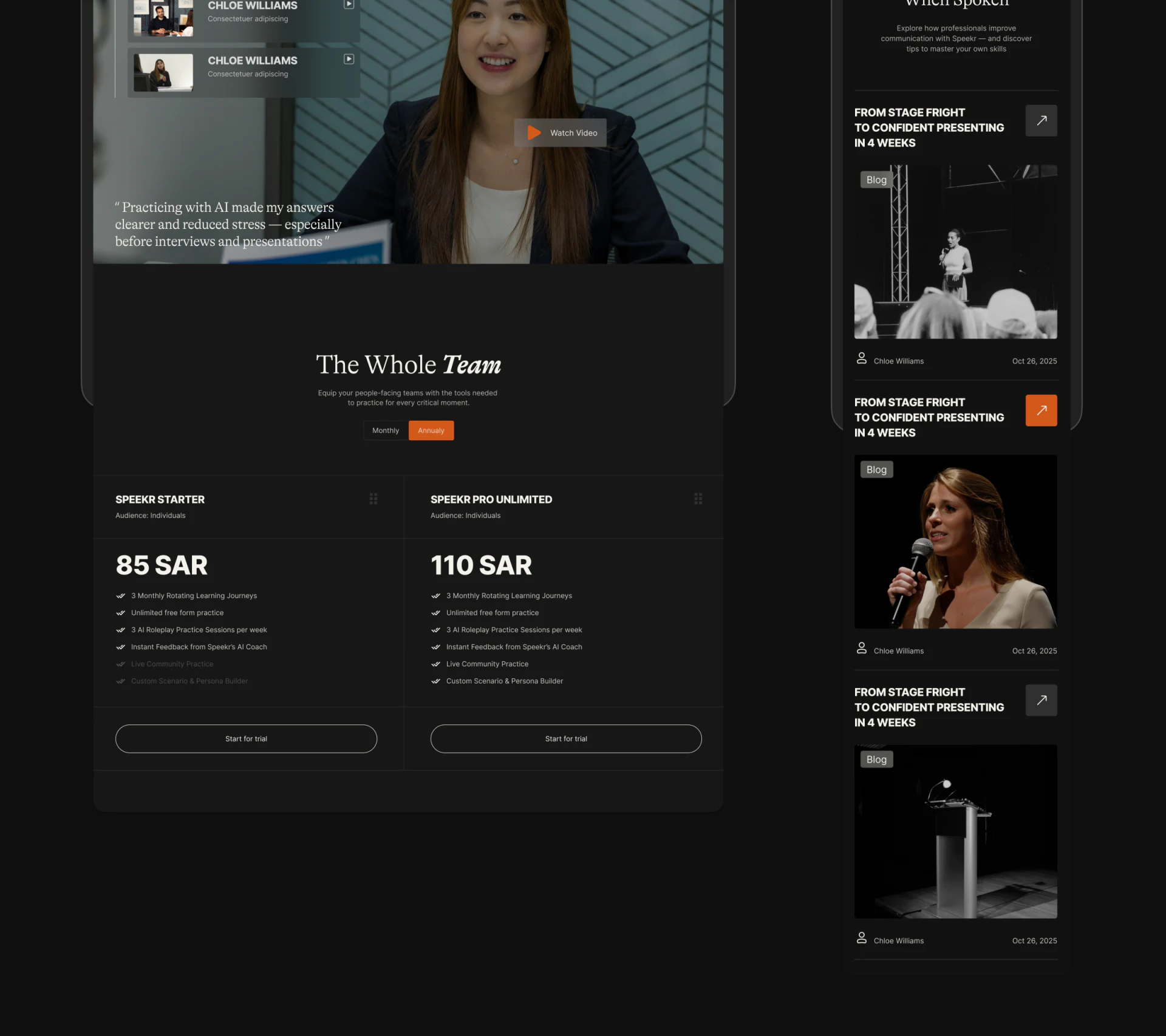
Monthly and Annually switch above two plans, with inclusions in comparable positions and buttons below. Black backgrounds and fine gray lines support comparison; orange indicates the current cycle.
The Whole Team conflicts with Audience: Individuals in both plans. First establish individual, multi-person, or seat scope, then explain billing periods. Amounts also need to distinguish annual totals from monthly equivalents rather than letting the switch carry the full definition.
Article and video lists can add practice situations, with content types and routes back to relevant exercises. JVDS would check objects and promises from a session into plan choice rather than treating pictured prices as current quotes or guarantees of training effects.
Frequently asked questions
Should a training website explain capabilities or practice steps first?
Both can coexist, but one coherent situation explains input, process, and feedback more easily. Capability labels should support that process.
Design review checklist
- Use one situation to check the practice-feedback relationship.
- Align plan audiences, seats, and billing periods.
Make a practice product’s experience promise specific
If your AI, education, or training website needs clearer situations, trials, and plans, bring materials for one experience cycle to discuss.
JVDS Design Studio provides UI/UX design, website design, and development services to help organize page content, interface structure, and implementation needs.
 Link copied