Glassmorphism, Minimalism, or Tech Style? Trends Cannot Replace Product Judgment
A client asks for an “Apple-like” experience, while the product team requests something technological, youthful, and international. The result is often blue-purple gradients, glass cards, and enormous headlines. It may be fashionable, yet unsuitable for a data-dense dashboard, a serious financial process, or a global website that must load quickly. Style is not a filter placed over a product. It is a set of choices that changes reading, interaction, performance, and maintenance.
A client asks for an “Apple-like” experience, while the product team requests something technological, youthful, and international. The result is often blue-purple gradients, glass cards, and enormous headlines. It may be fashionable, yet unsuitable for a data-dense dashboard, a serious financial process, or a global website that must load quickly. Style is not a filter placed over a product. It is a set of choices that changes reading, interaction, performance, and maintenance.
01 Translate Adjectives into Actionable Goals
Words such as “premium,” “technological,” “youthful,” and “international” cannot directly guide design. Ask what should change: greater trust, stronger innovation, easier product learning, differentiation from competitors, or greater appeal to a particular customer group.
The same “tech feel” may mean precision and reliability for a semiconductor manufacturer, energy and experimentation for an AI creation product, or stability and security for financial infrastructure. Style must connect to business and user judgments.
| Vague Request | Possible Real Goal | Verifiable Design Outcome |
|---|---|---|
| More premium | Increase contract value and professional trust | Clear supporting evidence, restrained typography, and consistent details |
| More technological | Express innovation and technical capability | Understandable product mechanisms and credible data and demonstrations |
| More youthful | Reduce distance and encourage participation | Tone, pacing, and interactions suited to the target audience |
| More international | Support multiple markets and English content | Typography, content length, culture, and responsiveness all work |
| More branded | Differentiate from competitors and remain consistent | A visual grammar that extends beyond one hero section |
02 Filter Styles Through Five Dimensions
Every style should be evaluated against brand, task, content, platform, and constraints. Looking only at a mood board overvalues first impressions and underestimates long-term use.
| Dimension | Question to Ask | Consequence of a Mismatch |
|---|---|---|
| Brand | What are its personality, source of credibility, and competitive differences? | Looks like a template or competitor |
| Task | Are users browsing, purchasing, creating, or operating frequently? | Visual treatment obstructs task completion |
| Content | Does the product center on images, long-form text, tables, data, or video? | Layout cannot hold real content |
| Platform | Is it mobile, desktop, web, large display, or cross-platform? | Effects break across devices |
| Constraints | What are the performance, accessibility, development, maintenance, and localization requirements? | Extensive degradation and rework after launch |
03 Understand the Real Boundaries of Common Styles
Style names are labels that simplify communication; a project does not need to belong purely to one. What matters is understanding the problems each style solves and the tradeoffs it introduces.
| Style Direction | Suitable Uses | Main Risks |
|---|---|---|
| Minimal/restrained | Brand websites, tools, and products with clear content | Removing too much information, leaving an empty but difficult page |
| Glass/transparent materials | Media, visual presentations, and lightweight overlays | Low contrast on complex backgrounds and high performance and implementation costs |
| Technological/futuristic | Technology brands, product launches, and immersive demonstrations | Generic blue-purple gradients and poor support for long-term content |
| Editorial/magazine | Brand storytelling, culture, and creative industries | High content maintenance requirements and poor fit for complex operations |
| Data/tool-oriented | B2B products, analytics, and professional software | Can feel crowded and cold when hierarchy is weak |
| Brutalist/experimental | Art, events, and youth culture projects | Significant readability, trust, and sustainability risks |
04 Glassmorphism Is About Background Relationships, Not Higher Transparency
Glass effects depend on backgrounds, blur, hierarchy, and contrast. Long text placed on highly transparent cards becomes difficult to read whenever the background changes. Glass is better suited to short labels, navigation, controls, and lightweight layers over media than to long forms, contracts, and data tables.
If a project uses glass materials, prepare fallback styles for environments without blur support, reduced-transparency settings, and low-performance devices. Check focus, boundaries, and clickability in every context.
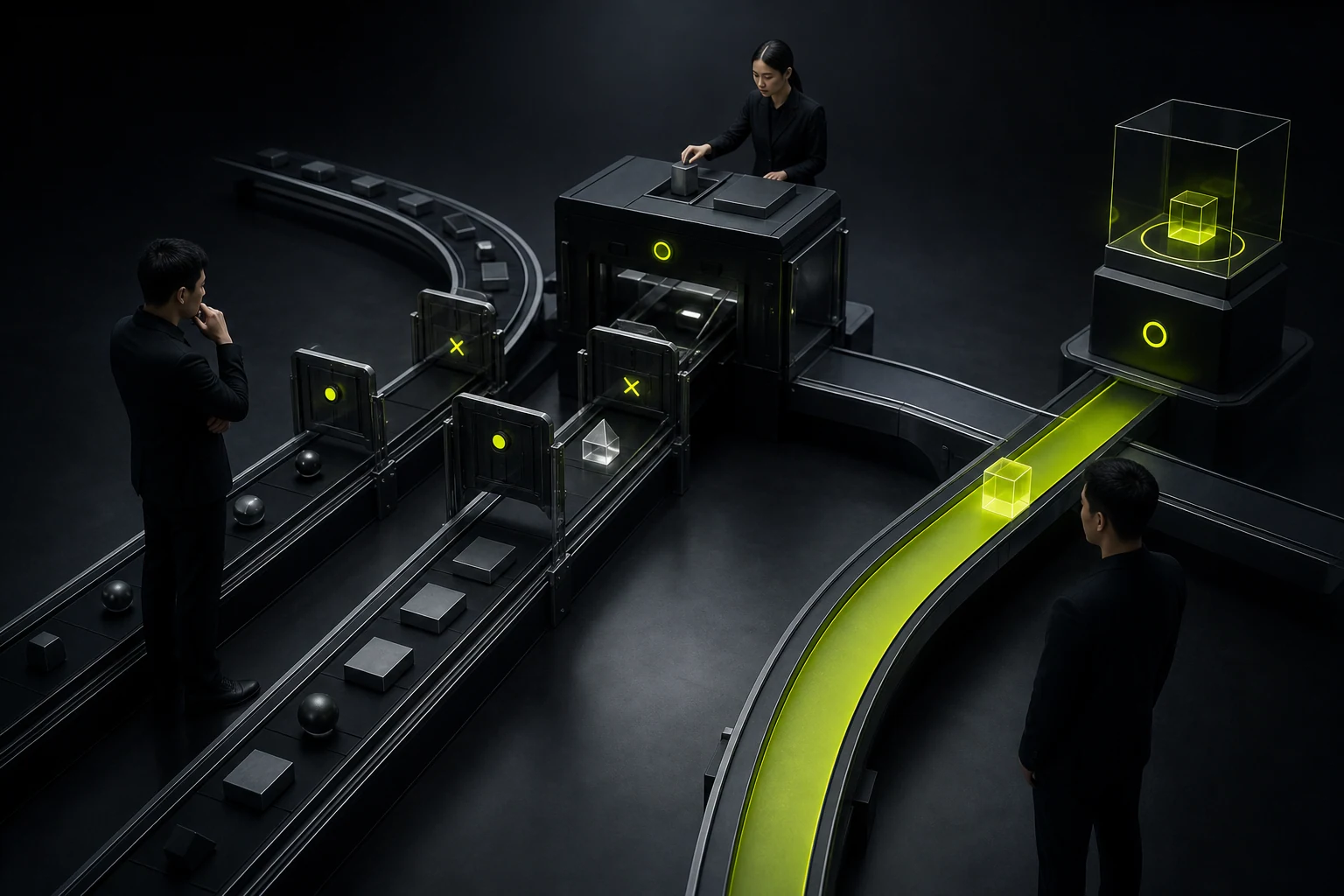
05 Minimalism Is Easily Misused to Say Almost Nothing
Minimalism does not mean a page with one slogan and three large images. It demands more accurate content selection, stable typography, and predictable interactions. On a corporate website, case studies, capability boundaries, delivery processes, and contact details cannot disappear for the sake of visual white space.
Truly restrained design removes repetition and decoration while preserving the facts needed for decisions. When information is extensive, organize it through hierarchy, rhythm, and a component system rather than collapsing everything.
06 Style Must Become a System, Not Stop at Three Mockups
After selecting a direction, define typography, color, spacing, imagery, icons, components, motion, data visualization, and content rules. Otherwise, the home page may look distinctive while internal pages, administration, and marketing materials quickly lose coherence.
Design reviews should stress-test the style with real long headings, real tables, multiple languages, error states, and low-quality assets. A style that works only with ideal imagery has no long-term operational value.
The endpoint of style selection is not “this image looks better.” It is “these rules can keep solving real content and task problems.”
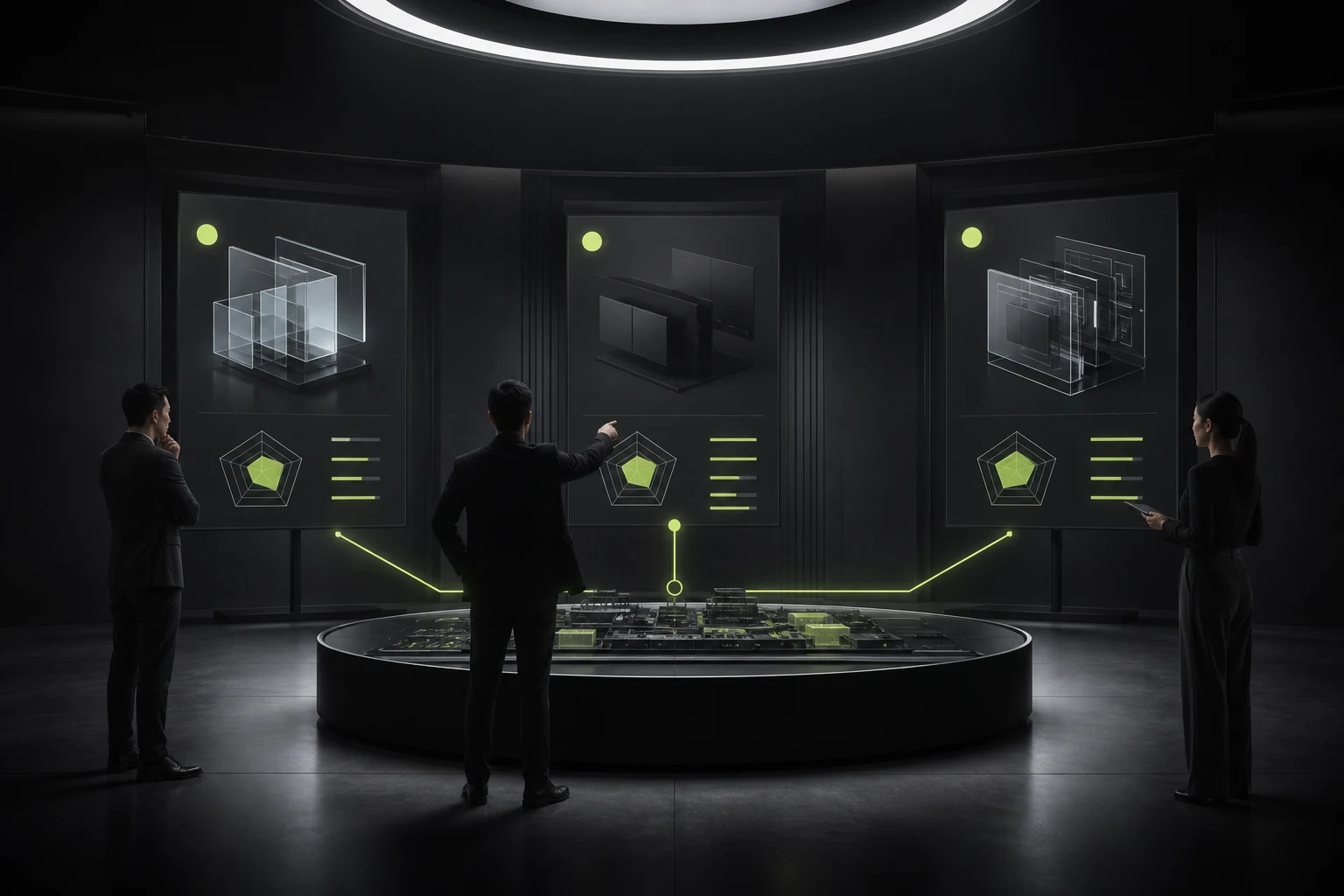
07 Do Not Let Trends Dictate an Expensive Redesign
Popular effects change, but product tasks and brand assets must endure. Use campaign pages, launch pages, and selected components to experiment with more progressive expression while keeping core navigation, forms, content, and design tokens stable.
For an existing product, prototype key pages and run limited tests first. Observe readability, task completion, brand recognition, and development cost. If an effect depends on extensive motion and high-end hardware, reconsider the investment.
08 Use a Style Decision Matrix in Stakeholder Meetings
Ask brand, product, design, and development teams to score candidate directions rather than letting the highest-ranking person decide on first impression. Score each criterion from 1 to 5 and require a written rationale.
| Evaluation Criterion | Suggested Weight | Decision Question |
|---|---|---|
| Brand consistency | 25% | Does it look like us rather than a generic industry template? |
| Task usability | 25% | Does it make core operations clearer and faster? |
| Content fit | 15% | Does it work with real copy, images, tables, and multiple languages? |
| Accessibility | 15% | Can contrast, type size, focus, and motion be controlled? |
| Development and performance | 10% | Can the effect be implemented reliably and load quickly? |
| Operational maintainability | 10% | Can non-designers continue updating content? |
Frequently Asked Questions
Must a UI style be completely different from competitors?
No. Familiar interactions should remain understandable, while brand visuals, content expression, and key experiences can create differentiation. Excessive novelty increases learning costs.
What does “Apple style” actually mean?
It may refer to restrained typography, details, materials, motion, or product photography. Break the vague reference into concrete elements and determine which suit the current brand and platform rather than copying it directly.
Can one product combine several styles?
Yes, but they need shared design tokens, typography, color, components, and motion principles. Different business modules may vary in tone, but they should not become unrelated templates.
How often should design trends be adopted?
A core system should not chase trends annually. Periodically review changes in the brand, content, and platforms, then evolve local expressions. A system-wide redesign is warranted only when the current style obstructs business or maintenance.
| Service | View |
|---|---|
| UI/UX Design Services | View service details |
| Project Consultation | Contact JVDS Design Studio |
| Design and Web Development Articles | Read more articles |
 Link copied