
Too Much or Too Little Interface Content? Do Not Use White Space as a Substitute for Information Architecture
Some interfaces feel overcrowded because ten kinds of information compete at the same visual level. Others feel empty because essential data is buried five layers deep and users must click repeatedly to find it. Information density is not the number of controls on a screen. It is whether the useful information gained during a task justifies the visual, memory, and interaction costs.
Some interfaces feel overcrowded because ten kinds of information compete at the same visual level. Others feel empty because essential data is buried five layers deep and users must click repeatedly to find it. Information density is not the number of controls on a screen. It is whether the useful information gained during a task justifies the visual, memory, and interaction costs.
01 First Determine Whether Users Browse, Compare, or Operate Continuously
Consumer purchase pages usually focus users on a small number of decisions. B2B review, scheduling, and operations require many records to be compared in parallel. The same principle of simplicity cannot evaluate both.
Frequent professional users will learn a stable, dense interface in exchange for fewer clicks and faster scanning. Infrequent users need more explanation and guidance. The task—not the screen size—is the first variable that determines density.
| Task Type | What It Needs More Of | Density Tendency |
|---|---|---|
| Quick browsing | Clear entry points and a few judgments | Low to medium |
| Product/solution comparison | Side-by-side dimensions and highlighted differences | Medium |
| Batch processing | Visible rows, filters, and shortcuts | Medium to high |
| Risk review | Context, evidence, history, and anomalies | High, but must be layered |
| Initial setup | Explanations, examples, and guided completion | Low |
| Continuous monitoring | Trends, thresholds, and anomaly priority | Medium-high with less decoration |
02 A Lot of Information Is Not the Same as Weak Hierarchy
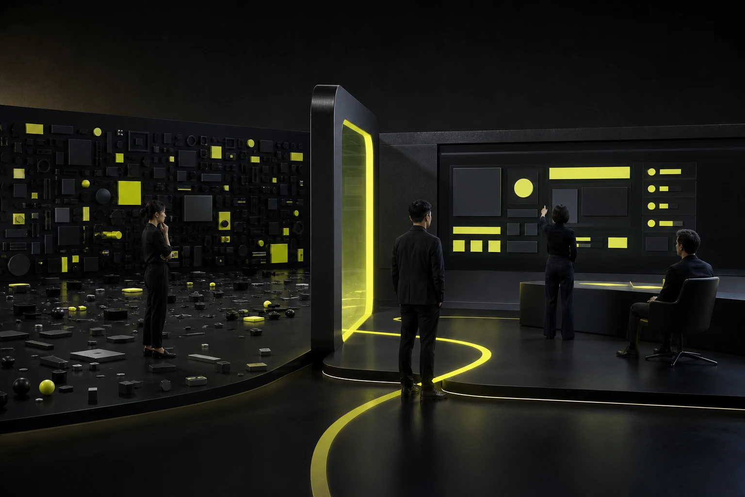
A page can hold substantial information when priorities are clear, alignment is stable, and grouping is predictable. Hard-to-read interfaces often do not have too many elements; their headings, labels, buttons, states, and explanations simply use similar sizes and colors.
Test hierarchy first in grayscale or low fidelity. Can users find the primary object, current status, most important action, and anomalies within three seconds? If structure makes sense only through color and card shadows, the information architecture is still unstable.
White space is not what remains after information is deleted. It is a cost paid to help users understand relationships.
03 Organize Page Information into Four Layers
A complex interface can use four layers: immediate judgment, task completion, explanation when needed, and historical traceability. The first stays visible, the second sits near the action, the third can expand, and the fourth belongs in details or logs.
Progressive disclosure does not mean hiding everything behind “More.” If frequent comparison fields and anomaly evidence require expansion every time, users will compensate with multiple browser tabs, screenshots, or Excel.
| Layer | Content Examples | Presentation |
|---|---|---|
| Immediate judgment | Name, core status, amount/date, and anomaly | Directly visible in the list or initial viewport |
| Task completion | Primary actions, required fields, and critical evidence | In the same context as the object |
| Explanation when needed | Rules, secondary attributes, and calculation methods | Expansion, side panel, or tooltip |
| Historical traceability | Logs, older versions, and full attachments | Detail page, timeline, or dedicated audit view |
04 B2B Tables: Measure What One Screen Can Accomplish, Not Just Its Row Count
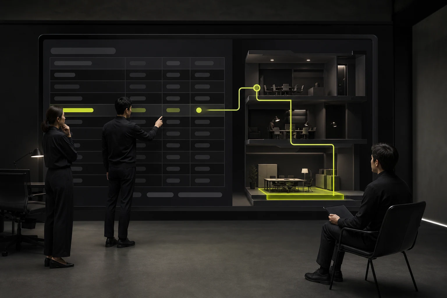
Table density can be evaluated through visible rows, column widths, cell wrapping, fixed columns, horizontal scrolling, and batch operations. More visible rows are not always better. If row states are hard to recognize, headers are unclear, or essential actions are far from the relevant object, compressing row height only accelerates errors.
A product can offer comfortable and compact density settings, but they must not change the meaning of information. Compact mode suits frequent desktop users. Mobile tasks need to be reorganized rather than squeezed into a smaller version of a wide table.
05 Excessive Simplicity Can Also Reduce Consumer Conversion
Hiding pricing conditions, specification differences, delivery, risks, and after-sales terms in pursuit of minimalism makes users discover restrictions only at the final step. The page may have abundant white space while the decision cost rises.
Consumer interfaces can reduce the number of simultaneous actions, but not the facts users need to decide. Important information should appear at the relevant decision point. Secondary content may be collapsed, but its heading must explain what is inside.
06 Use Observable Metrics to Evaluate Density
Information density has no universal score, but task data can guide decisions: completion time, error rate, backtracking, filter usage, horizontal scrolling, detail views opened, repeated switching, and user-created Excel files.
If users repeatedly open details to view the same field, the list lacks essential information. If many columns are never used, tailor them by role or scenario. If users search for information already on the page, hierarchy or naming is likely the problem.
| Signal | Possible Meaning | Next Step |
|---|---|---|
| Frequently opening details and returning | Critical comparison information is missing from the list | Surface frequent fields or provide a side panel |
| Extensive horizontal scrolling | Too many columns or unclear grouping | Fix key columns and create scenario-specific column groups |
| Misclicking adjacent actions | Actions are too dense and hierarchy is weak | Add spacing and separate high-risk actions |
| Page looks empty but tasks are slow | Information is excessively fragmented | Combine context and reduce layers |
| Users export to Excel for processing | In-system comparison or batch capabilities are inadequate | Add filtering, calculations, batch actions, and saved views |
| New users cannot find the entry point | Terminology and density are too advanced | Add explanations, default views, and progressive guidance |
07 Begin a Density Optimization with a Task Walkthrough
Select a frequent task and record the information users inspect, layers they open, data they copy, and moments of hesitation from entry to completion. Then label every element as required, conditionally needed, traceable, or unnecessary.
Adjust hierarchy and placement before changing type size, spacing, and color. Finally, fill the page with real data and test edge cases, including long names, multiple states, missing values, and errors. Any density approach looks attractive with ideal placeholder data.
Frequently Asked Questions
Does more information make a B2B interface more professional?
No. Professional interfaces provide sufficient context and efficiency, but irrelevant fields, duplicated states, and unexplained data increase risk. High density requires stable structure and clearly defined tasks.
Should design standards prescribe one page density?
They can define default row heights, spacing, and component specifications, but different tasks require different densities. A design system should provide comfortable and compact modes plus scenario rules rather than making every page identical.
How should mobile devices handle dense B2B pages?
Do not simply scale down desktop tables. Retain the tasks that matter in the mobile context, use cards, grouping, progressive expansion, or horizontal comparison, and leave complex batch operations on desktop.
Does more white space always look more premium?
No. White space supports grouping and focus. If it forces users to scroll and click more to find essential facts, it is merely inefficient empty space.
| Service | View |
|---|---|
| UI/UX Design Services | View service details |
| Project Consultation | Contact JVDS Design Studio |
| Design and Web Development Articles | Read more articles |
 Link copied








