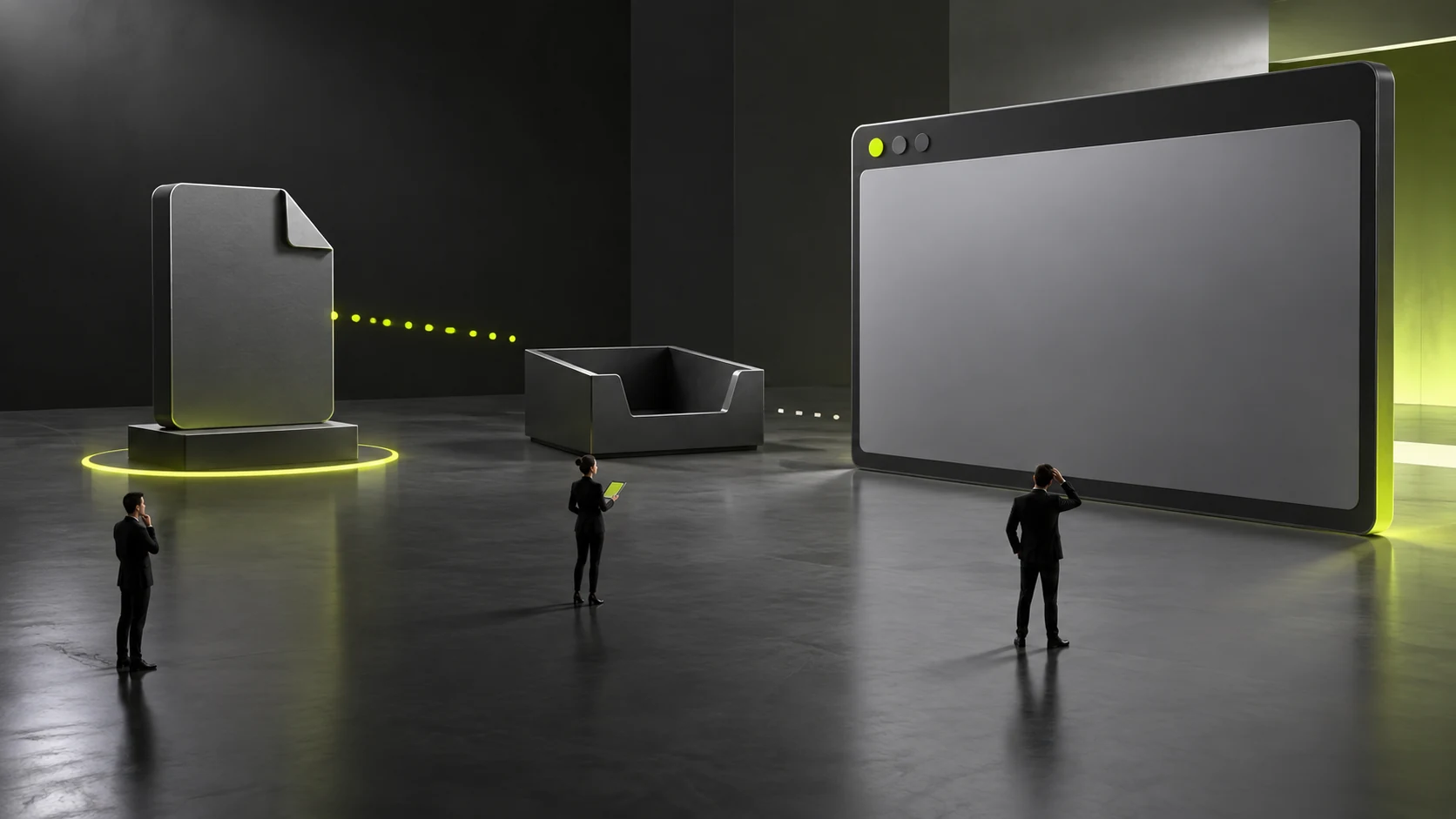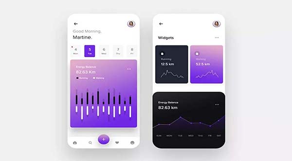
We live in an age of visual information overload. People expect the web, as a primary source of visual information, to be clean and bright so information can be delivered more efficiently. This is a central challenge for an interface design firm.
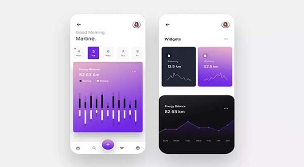
Minimalism, as the name suggests, reduces expression to the most essential elements. It is a design approach that rejects unnecessary colors, structures, graphics, and other decoration. Its purpose is to make the central content stand out from supporting elements, placing the core message in focus. In this approach, the idea itself becomes the most fundamental design element.
First, interface design guided by minimalism can clarify the central idea we want to convey to users. It can appropriately hide or remove unnecessary information and organize content into a meaningful hierarchy so users can find information quickly. Second, minimalism helps reduce visual interference. One of its core principles is to hide or remove unnecessary information with care, and whitespace is an effective way to achieve that goal.
The central goal of minimalist design is to eliminate redundant elements and colors in pursuit of clarity. It communicates useful information effectively, directs users' attention toward key content, and helps them focus on the most important points on the screen. A balanced approach does not mean deleting everything or simplifying as much as possible. It means making appropriate choices in interface design, prioritizing important information in the user's field of view, and hiding or removing less important content. This reduces users' cognitive burden, improves the user experience, and can make browsing or finding information more enjoyable, encouraging users to spend more time with the interface.
When making these choices, pay attention to color, design elements, concise copy, and the treatment of whitespace in the layout. For example, an interface with no whitespace and densely packed typography can leave users unsure where to begin. If a page needs to emphasize the information users should understand on the home page, place that information prominently against an open background and give it clear focus. Then guide users gradually toward the important content below.
Under the guidance of minimalism, interface design should also organize visual elements simply and clearly. Classify, group, and remove interface information appropriately. Categorizing content helps users understand the interface structure quickly and find key information while browsing. Reducing categories, grouping content, and removing clutter do not mean reducing the amount of valuable information. Instead, they arrange essential information within a relatively simple layout. When organizing visual elements, begin with a concise, clear home page. Keep the color palette restrained, bright, and simple except where brand requirements call for additional colors.
Interfaces often contain many levels, so the overall visual style should remain consistent. A unified interface style strengthens users' memory and recognition and helps them find information more efficiently. To maintain consistency, keep element placement and sizing, the overall color scheme, and the style of elements within the same category as consistent as possible.
During interface design, it is easy to overstate or misrepresent ideas by focusing on form while neglecting function. The following points briefly explain common misunderstandings about interface design under a minimalist approach.
First, minimalism can easily be taken to an extreme. Simplifying purely for the sake of simplicity can overlook interface functionality, producing a bright appearance but a poorer user experience. Pursuing a simplified layout without considering how users understand an interface and find information inevitably leads to a misunderstanding of minimalism and results in an inefficient, ineffective interface.
Second, minimalism has gained broad recognition, making it easy for designers to assume that anything non-minimalist is not design. A merely literal understanding of minimalism, blind adherence to the style, and disregard for the fundamental principles of interface design can reduce the work to an empty concept.
Applying minimalism in interface design is not simply a matter of reducing elements; it requires thoughtful planning and tradeoffs among interface components. Designers should recognize that minimalism can improve the visual experience and application usability when it remains user-centered. By combining practice and theory, designers can form their own design philosophy while continuing to develop and refine practical methods and principles for minimalist interface design.
Need design or website development services?
JVDS Design Studio is a professional design studio focused on digital product experiences and brand identity. We work with businesses in China and overseas that want to strengthen their brand image, improve user experience and grow their business, providing clear, usable UI/UX design, high-quality website design and development, app and mini-program development, and cohesive, distinctive brand identity design.
Working on a B2B system or an app? Share your current screens and key user tasks so we can discuss the design scope.
 Link copied