Should Your Product Support Dark Mode? Evaluate Use Cases and the Cost of Two Themes
Dark mode may look like a visual feature, but it is actually a system of colors, hierarchy, assets, states, and testing. When poorly executed, body text fades into gray, status colors glare, charts become indistinguishable, and white-background images look like flashlights. The real question is not whether users like black, but whether the product has a strong enough use case to justify maintaining two appearances over time.
Dark mode may look like a visual feature, but it is actually a system of colors, hierarchy, assets, states, and testing. When poorly executed, body text fades into gray, status colors glare, charts become indistinguishable, and white-background images look like flashlights. The real question is not whether users like black, but whether the product has a strong enough use case to justify maintaining two appearances over time.
01 Which Products Should Prioritize Dark Mode?
Dark mode often offers clearer value for long sessions, low-light environments, media viewing, development tools, monitoring displays, and nighttime operations. Benefits may be limited for infrequently used corporate forms, marketing pages with little content, or tools used primarily in bright offices.
Platform expectations also matter. Mobile and desktop users are accustomed to system-level appearance settings, and a product that ignores system preferences can feel inconsistent. For internal enterprise systems, investigate the real working environment first instead of adding dark mode merely because competitors have it.
| Use Case | Value of Dark Mode | Suggested Priority |
|---|---|---|
| Frequent nighttime use | Reduces contrast between a bright interface and the environment | High |
| Video, images, 3D, and creative tools | Brings content forward and lets the interface recede | High |
| Monitoring, trading, and operations displays | Supports extended viewing and focus on status | Medium-high; test status colors rigorously |
| Daytime enterprise office systems | User preferences and fatigue vary widely | Medium; research first |
| Low-frequency marketing websites | Primarily a brand choice; may not improve tasks | Low to medium |
| Print/document-centered products | Final output is usually on a white background | Usually not a priority |
02 Build Semantic Color Mappings Instead of Inverting Colors
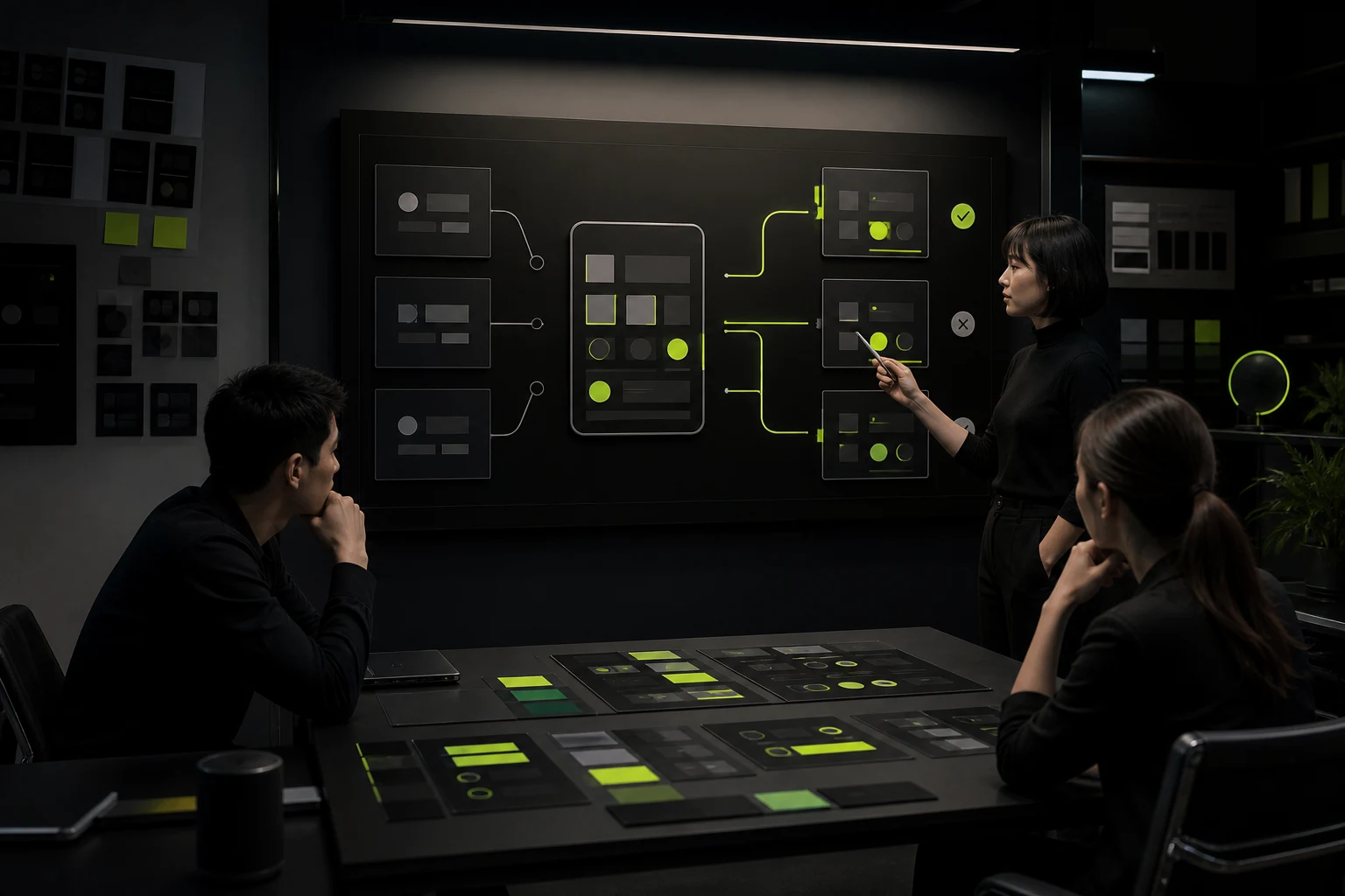
White backgrounds, black text, and brand blue from a light theme cannot simply be inverted. Dark mode requires new definitions for background levels, text hierarchy, borders, fills, hover, selection, disabled states, and status colors.
A more robust approach uses semantic tokens such as background/base, background/elevated, text/primary, border/subtle, and status/danger instead of hard-coded component colors. Light and dark themes map values to the same semantics while component logic remains consistent.
| Semantic Role | Light Mode Example | Dark Mode Consideration |
|---|---|---|
| Base background | Near white | Not necessarily pure black; avoid excessive contrast |
| Elevated layer/card | Light gray or shadow | Slightly lighter than the base to establish hierarchy |
| Primary text | Dark, high contrast | Bright but not harsh pure white |
| Secondary text | Medium gray | Maintain readability; do not let gray disappear |
| Border | Light gray | Visible on dark backgrounds without competing for attention |
| Status colors | Brand/semantic colors | Reduce excessive saturation while preserving meaning and contrast |
03 Component States Create Most of the Work
Buttons, inputs, dropdowns, tables, dialogs, tooltips, code blocks, and charts all include at least default, hover, pressed, focus, disabled, error, and selected states. Designing only a few dark page mockups leaves many combinations undefined during development.
The design system must validate both themes and high-contrast settings for every component. Focus outlines cannot disappear against dark backgrounds, disabled states cannot be confused with active controls, and errors cannot rely on red alone.
04 Charts, Maps, and Images Do Not Adapt Automatically
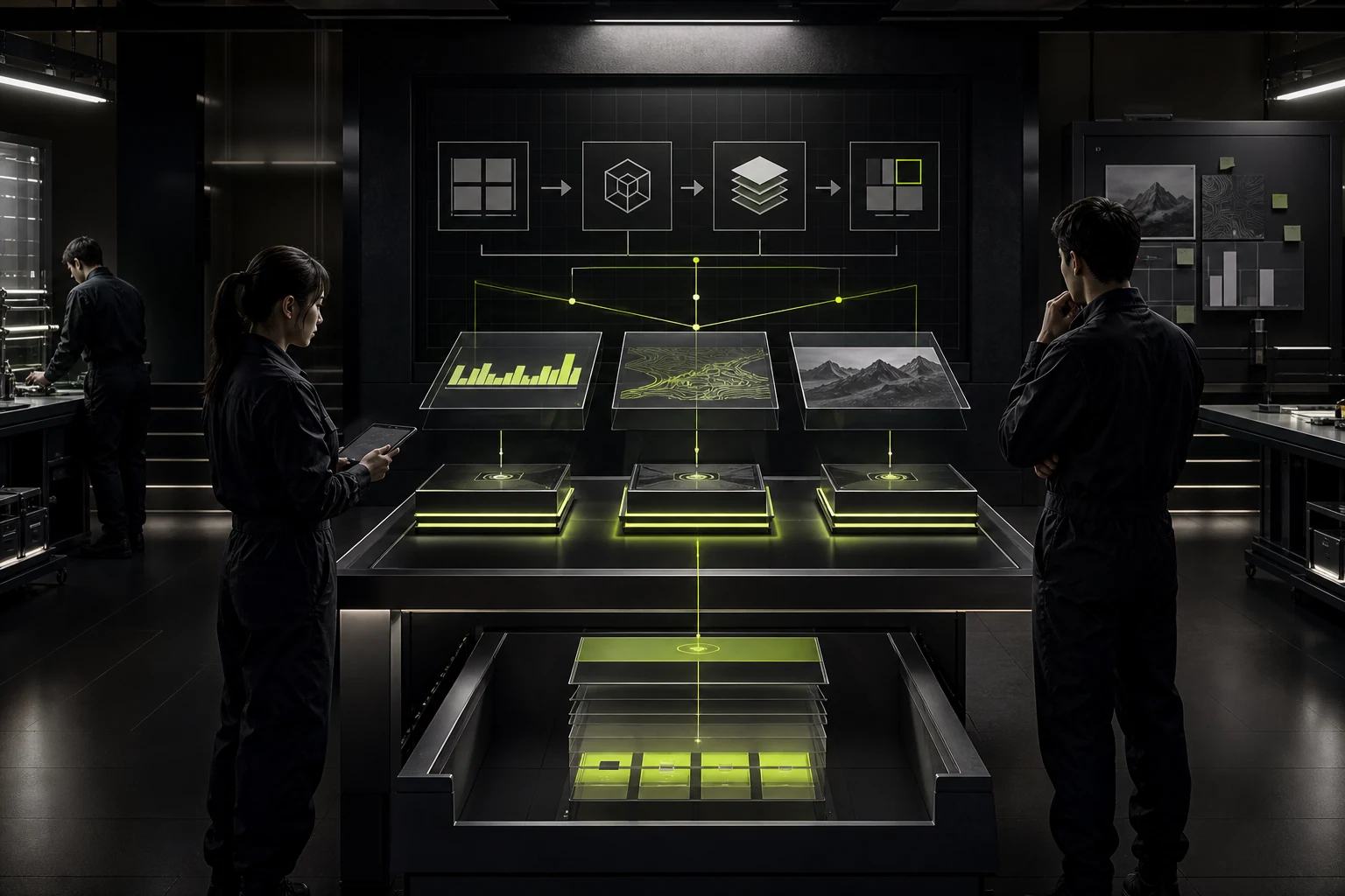
Data visualization is especially vulnerable on dark backgrounds. Colors that are too bright cause fatigue, while colors that are too dark become indistinguishable. Gridlines, tooltips, selections, and anomaly states all require separate testing.
Logos, screenshots, and product images with white backgrounds become bright blocks in a dark interface. Prepare transparent assets, dark variants, or muted containers where appropriate, but do not arbitrarily alter brand or product imagery.
- Do not distinguish chart series by color alone; add line styles, shapes, or labels.
- Test map basemaps and overlays together so roads and markers remain visible.
- If screenshot content cannot adapt, use a clear border and neutral container.
- Prepare full-color, reversed, and monochrome brand logo variants.
- Let media content command attention while keeping controls visible.
05 Validate Accessibility Separately in Both Themes
Foreground and background colors for common body text generally need a contrast ratio of at least 4.5:1, while large text and non-text elements have different requirements. Do not assume dark mode is inherently easier on the eyes, and do not use low-contrast gray text to manufacture a premium appearance.
In addition to the standard theme, test increased contrast, reduced transparency, enlarged text, and color-vision differences. Transparent glass, blur, and gradients can lose readability against different wallpapers or content backgrounds.
Dark mode is not a skin. It is another interface that must pass the same quality bar.
06 Three Implementation Options Have Very Different Costs
A product can follow the system, offer a user-controlled switch, or remain permanently dark. Following the system best matches platform expectations. A manual switch gives users more control but requires saved preferences and cross-device behavior. Permanent dark mode suits only a limited set of immersive or professional environments.
| Option | Suitable Situation | Additional Work |
|---|---|---|
| Follow system | General mobile and desktop products | Dynamic switching, system tokens, and testing both themes |
| System + manual switch | Long sessions and significant differences in user preference | Preference storage, account synchronization, and control placement |
| Always dark | Media, cinema, and selected monitoring or creative environments | Daylight conditions and accessibility still require validation |
| Not supported yet | Unclear benefits or an unstable design system | At minimum, keep tokens extensible for the future |
07 Use a Simple Test to Decide Whether to Build It Now
Answer four questions: do users work in low light or for extended periods; is theme support generally expected on the platform; is the existing design system tokenized; and can the team sustain ongoing testing and asset maintenance?
If the use-case value is high but the system foundation is weak, first establish semantic colors and pilot critical journeys rather than covering every legacy page at once. If the only goal is a screenshot for a product launch, invest the budget in core tasks, performance, and accessibility instead.
Frequently Asked Questions
Can dark mode save battery?
On some devices with self-emissive displays such as OLED, darker pixels may reduce energy use. Actual savings depend on the display, brightness, colors, and usage. Battery savings alone should not determine whether a product supports dark mode.
Should dark mode use a pure black background?
Not necessarily. Pure black can create excessive contrast and make hierarchy harder to express. Many products use a near-black neutral and slightly lighter backgrounds for cards and elevated layers.
How long does it take to add a single dark mode switch?
If the design system already has semantic tokens and complete components, the cost can be manageable. If colors are hard-coded, images are numerous, charts are complex, or pages carry substantial legacy debt, the work resembles a system-wide redesign.
Does a corporate website need dark mode?
It depends on the brand and use case. Dark mode is rarely essential for a corporate website unless content, media, or the brand experience provides a clear reason. Supporting system preferences must not compromise SEO, performance, or accessibility.
| Service | View |
|---|---|
| UI/UX Design Services | View service details |
| Project Consultation | Contact JVDS Design Studio |
| Design and Web Development Articles | Read more articles |
 Link copied