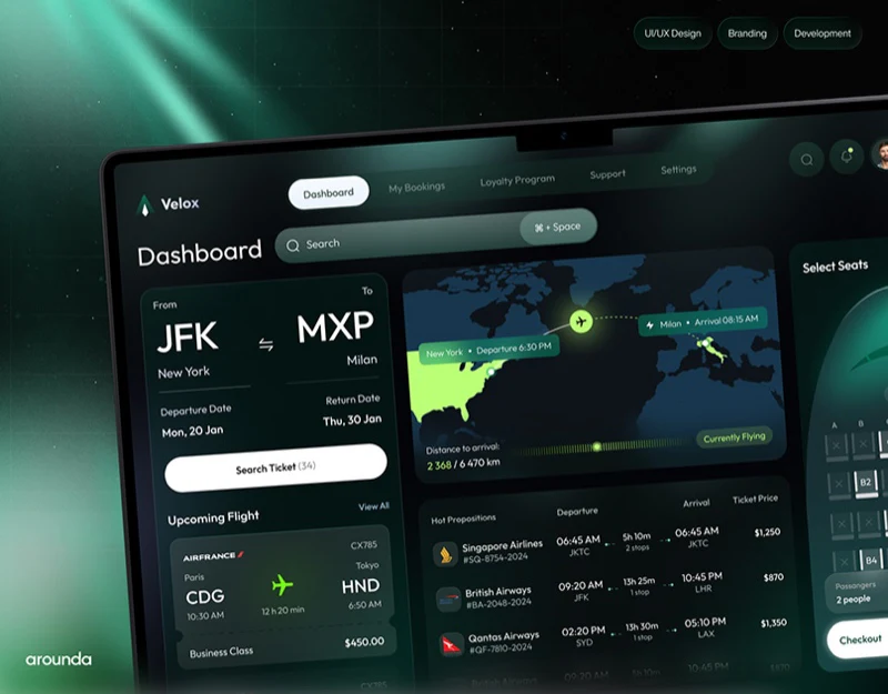
Velox places search, routes, candidate flights, and seat selection in a dark dashboard. Left-to-right organization makes the direction of action understandable, while green and orange highlight key choices. The main question is whether panels describe the same itinerary and clearly distinguish current status from an unbooked selection.
Key takeaways
- Panels support checking search conditions and selection results together.
- Existing itineraries, flight status, and new bookings need explicit relationships.
Panels keep search conditions visible
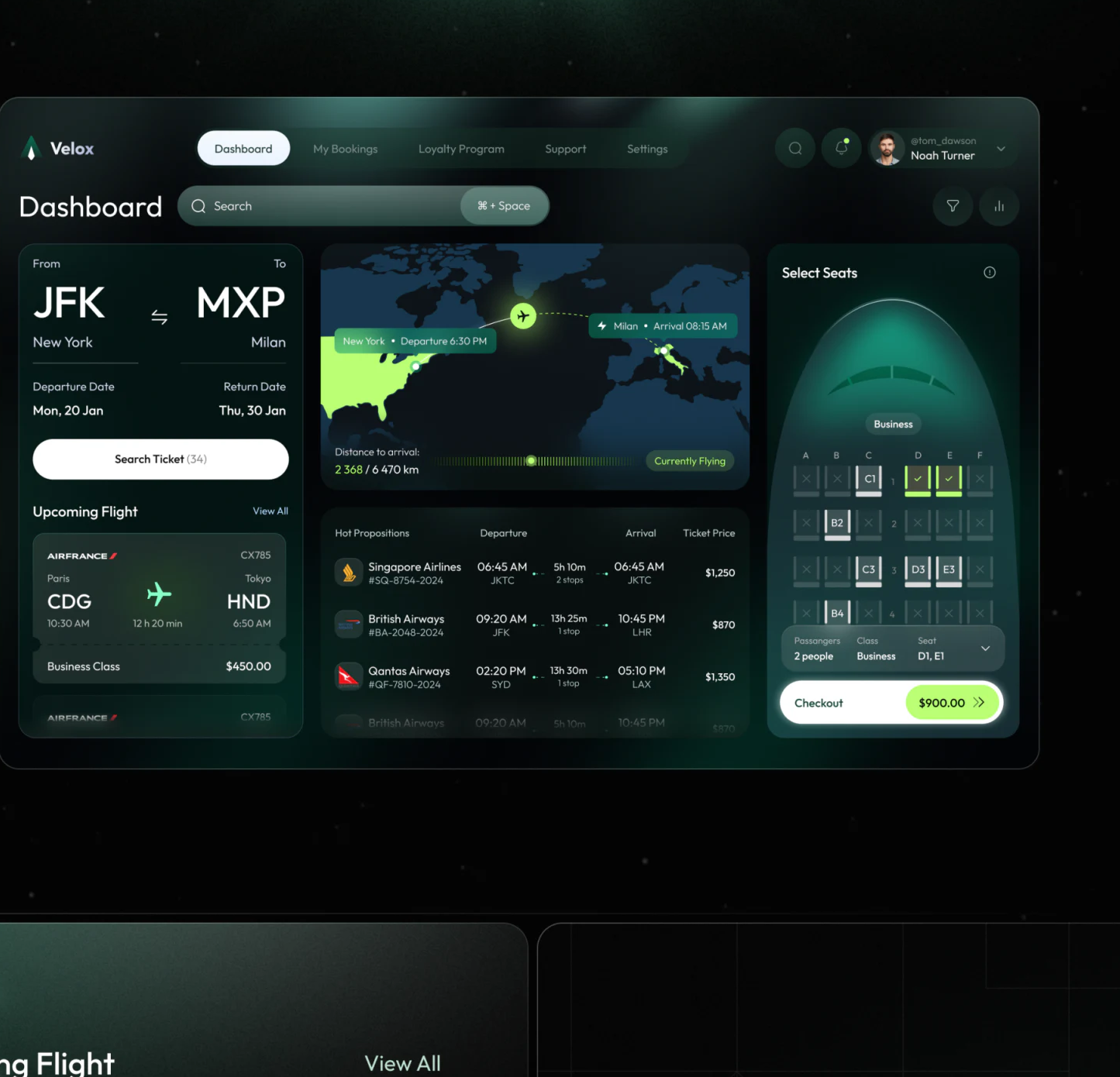
The left panel shows JFK, MXP, cities, and dates; the middle has a map and flight list; the right has seats and checkout. Keeping search conditions visible while comparing fares is a strength of this simultaneous booking interface. White search and checkout areas also stand apart from dark information regions.
Multiple objects coexist on one screen. Upcoming Flight on the left, Currently Flying in the middle, and the candidate list have different purposes, but need to identify existing trips, ongoing flights, and new searches explicitly. Region headings and a selected-flight summary can explain these relationships.
Changing a date or airport should explain whether earlier seats and prices remain valid. A visual checkmark cannot automatically carry into a new flight. Valid conditions such as passenger count can remain while the interface identifies selections that need updating.
Routes need time fields as well as a map
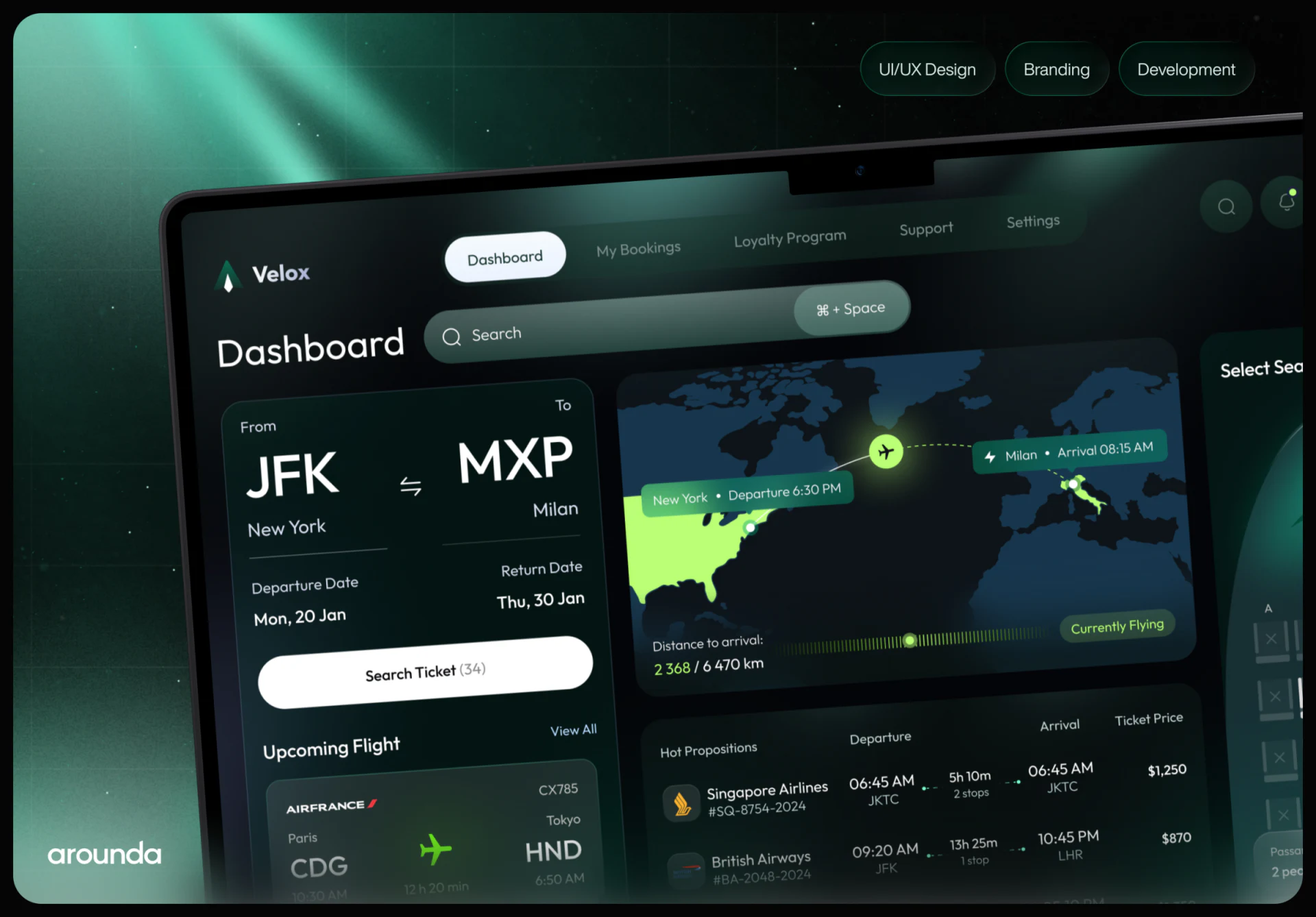
The central map uses a bright green region, aircraft, and path to connect New York and Milan, with distance progress below. It quickly establishes geographic scale and suits route explanation. It depicts a current flight state, not necessarily the result for any candidate in the list.
Candidates still need airline, departure and arrival airports, local dates and times, duration, and price. Cross-time-zone conditions cannot be inferred from maps; fields should explain date changes and time bases. Bright routes and white key fields can establish emphasis together.
The angled monitor presentation strengthens the product mood but reduces some data. Implementation review should return to a front-facing interface to check comparable prices and dates before deciding map area. A polished mockup does not establish a clear comparison task.
A seat summary supports checking
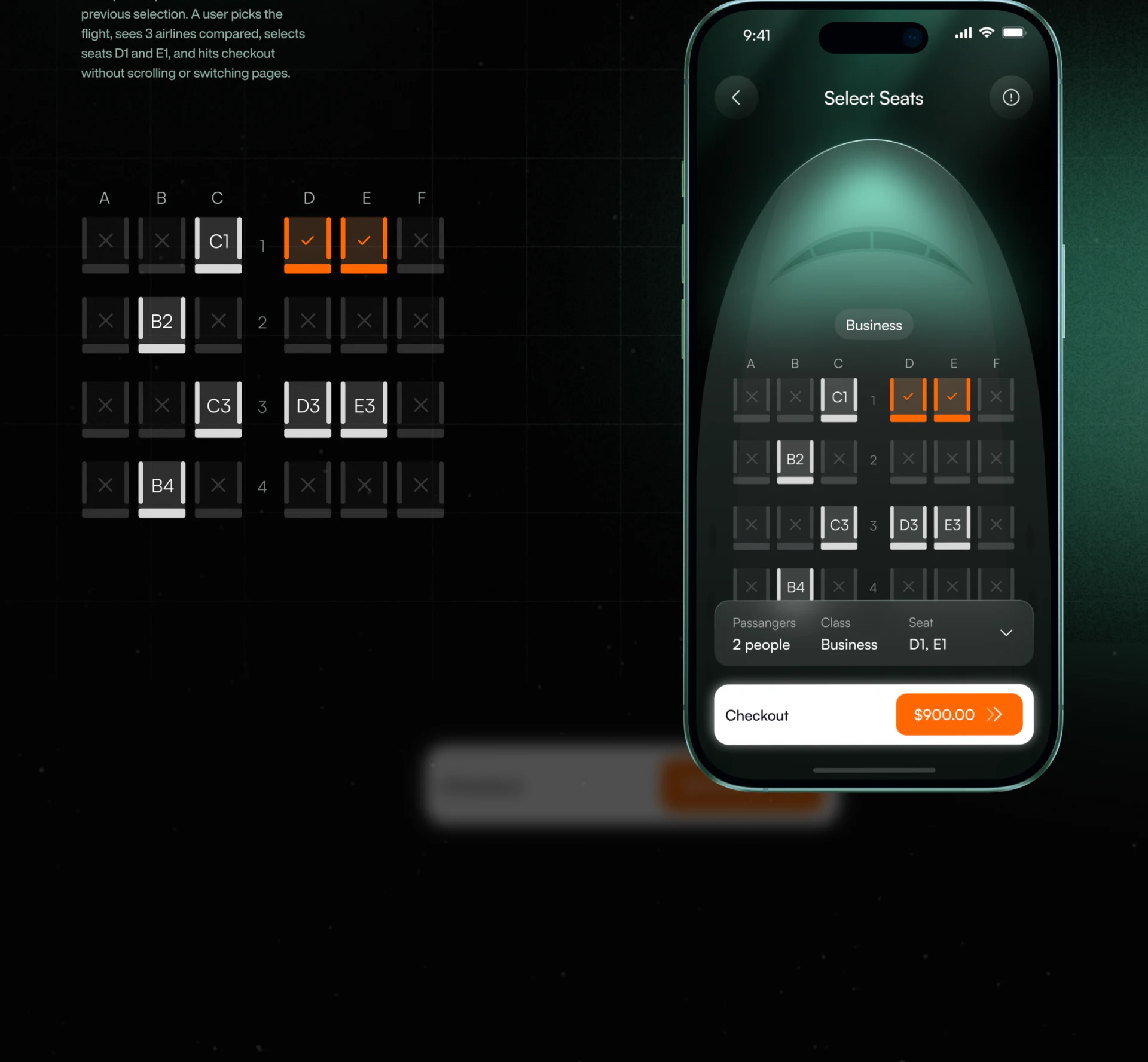
Mobile seats use orange underlines and checks for two positions, while other cells use numbers or crosses. Passengers, Class, and Seat below translate graphic choices into a textual summary—a useful checking method.
D1 and E1 appear in the summary, with an amount beside Checkout. Selection results and proceeding sit together. Passenger count, class, and seats are easy to locate, but group bookings should also map seats to passenger names and explain whether the amount includes seat selection and other fees.
Desktop green and mobile orange can suit different visual treatments while state meanings stay consistent. Unavailability reasons, feedback when removing a seat, and price changes need words and state rules, rather than interpretation from color alone.
Frequently asked questions
Does a flight page always need a map?
Keep it when route explanation or itinerary tracking has a clear purpose. Candidate comparison still depends on readable airports, times, duration, and prices.
What should a group seat summary include?
At least identify each passenger’s seat, class, and related fees. After changing flights or dates, explain which seats need confirmation again.
Design review checklist
- Give each panel a clear itinerary identity.
- Explain local time and date changes in time fields.
- Make seats, passengers, and fees cross-checkable.
Organize the objects in a simultaneous booking view
A booking product can first align search conditions, candidates, and the final summary, then check how maps, seats, and checkout update together.
JVDS Design Studio provides UI/UX design, website design, and development services, helping organize page content, interface structure, and implementation needs.
 Link copied