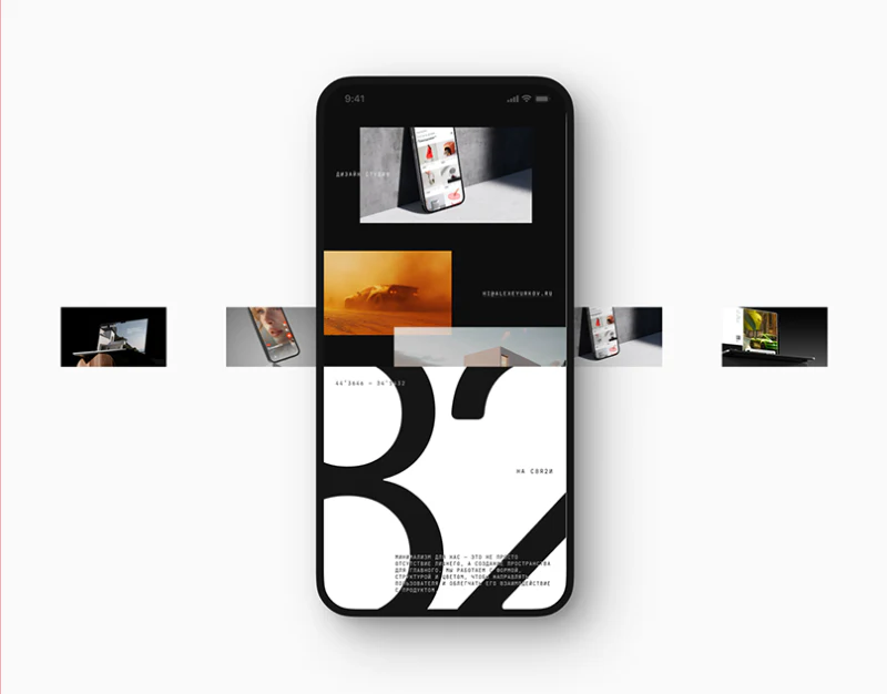
КРЕМ makes its mark and project names very large, but the three page groups do not maintain one density. The home establishes an impression, projects explain scope, and the blog gives text a white reading area. Creative studio website structure can learn from these shifts: brand expression has room while content retains its own way of being read.
The home introduces the studio’s character
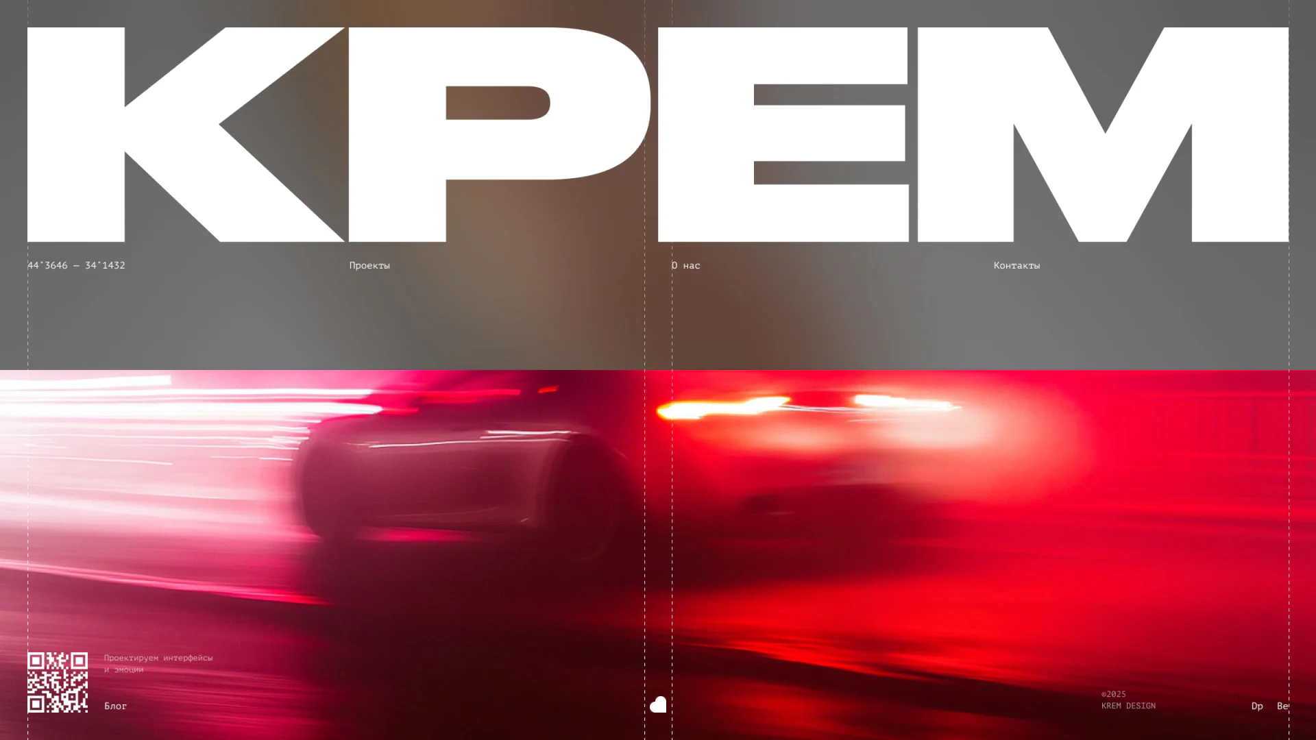
White КРЕМ spans the upper half, above a car photograph with red motion trails. Heavy, steady type balances speed and light in the image. Vertical fine lines run through the page, placing small dispersed entries on common axes rather than making the composition arbitrary.
Work, about, and contact run beneath the mark; the blog sits lower left beside a QR code and short explanation. Navigation supports continuing after viewing the type. This suits studios where expressive character informs collaboration decisions, especially with enough work to sustain browsing.
Small menus and coordinate-like text have similar sizes, though menus act and coordinates mainly set atmosphere. Position, contrast, or state should distinguish them. Navigation must stay clear if the background changes, rather than happen to be readable in this gray area.
Projects move from identity to work scope
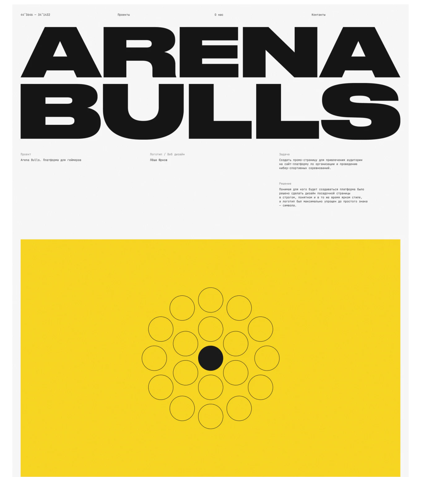
ARENA BULLS occupies the top in two large lines. Three columns below explain the project, identity and web design, and task and solution, before yellow graphics. Large type continues, but focus shifts from studio name to project, making the content level recognizable.
The summary appears before display images, giving yellow graphics and marks context. Portfolio quality and actual work scope are different information: a complete product image cannot establish that a team handled all development. Summaries should name involvement before images demonstrate quality.
JVDS Design Studio considers large headings a possible portfolio recognition system, while explanations need a size comfortable enough to continue reading. Three columns give stable positions, but narrow screens suit sequential stacking that preserves project, scope, and task relationships.
The blog gives long writing another space
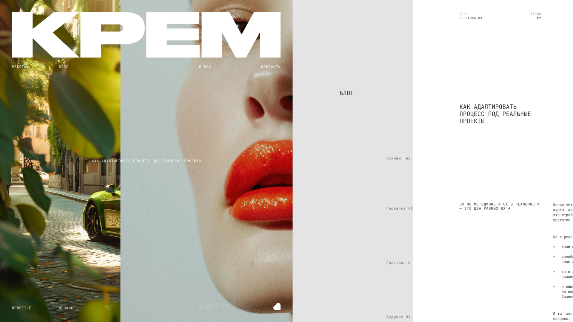
The blog collage places brand photographs, gray section areas, and white body text together. Close portraits and streets retain a distinct character, while article numbers, headings, and regular text serve reading. Photographs identify the brand, sections orient readers, and white areas support prose.
The presentation does not prove that all three areas stay fixed in an actual browser; they visibly serve different tasks. If arranged side by side, body width should prioritize reading and section selection remain clear. On mobile, large brand images should not continually occupy the space long text needs.
From home to work to articles, КРЕМ does not reduce everything to one card. Large type maintains a family relationship while space and density adapt. That allocation is the useful lesson: each page identifies the studio and answers the visitor’s main question.
Give brand expression a path forward
Creative studio and professional service websites can let the home establish character, projects explain scope, and articles carry viewpoints, connected by clear navigation.
JVDS Design Studio provides UI/UX design, website design, and development services, helping plan portfolios, project presentations, and professional content pages.
 Link copied