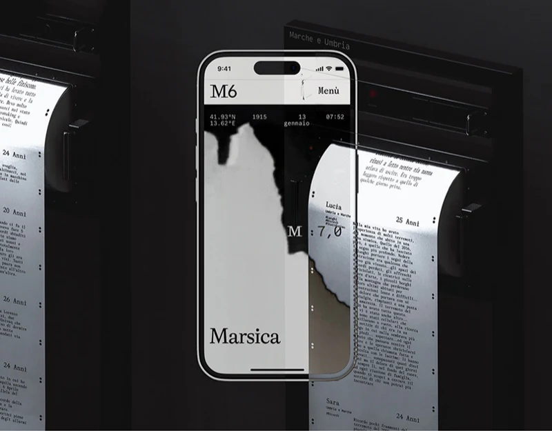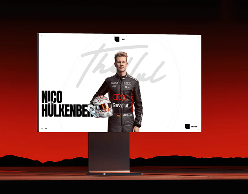
This Audi F1 concept uses red, black and white, condensed large type and people photography to suggest speed. Team, profiles and technology have their own rhythms: portraits identify people, text supports biographies, and full-car and detail images explain parts. Visual intensity needs to suit different lookup tasks.
Key takeaways
- People, prose and technology use suitable visual densities.
- Clear objects and destinations help different visitors search directly.
People cards provide specific profile entries
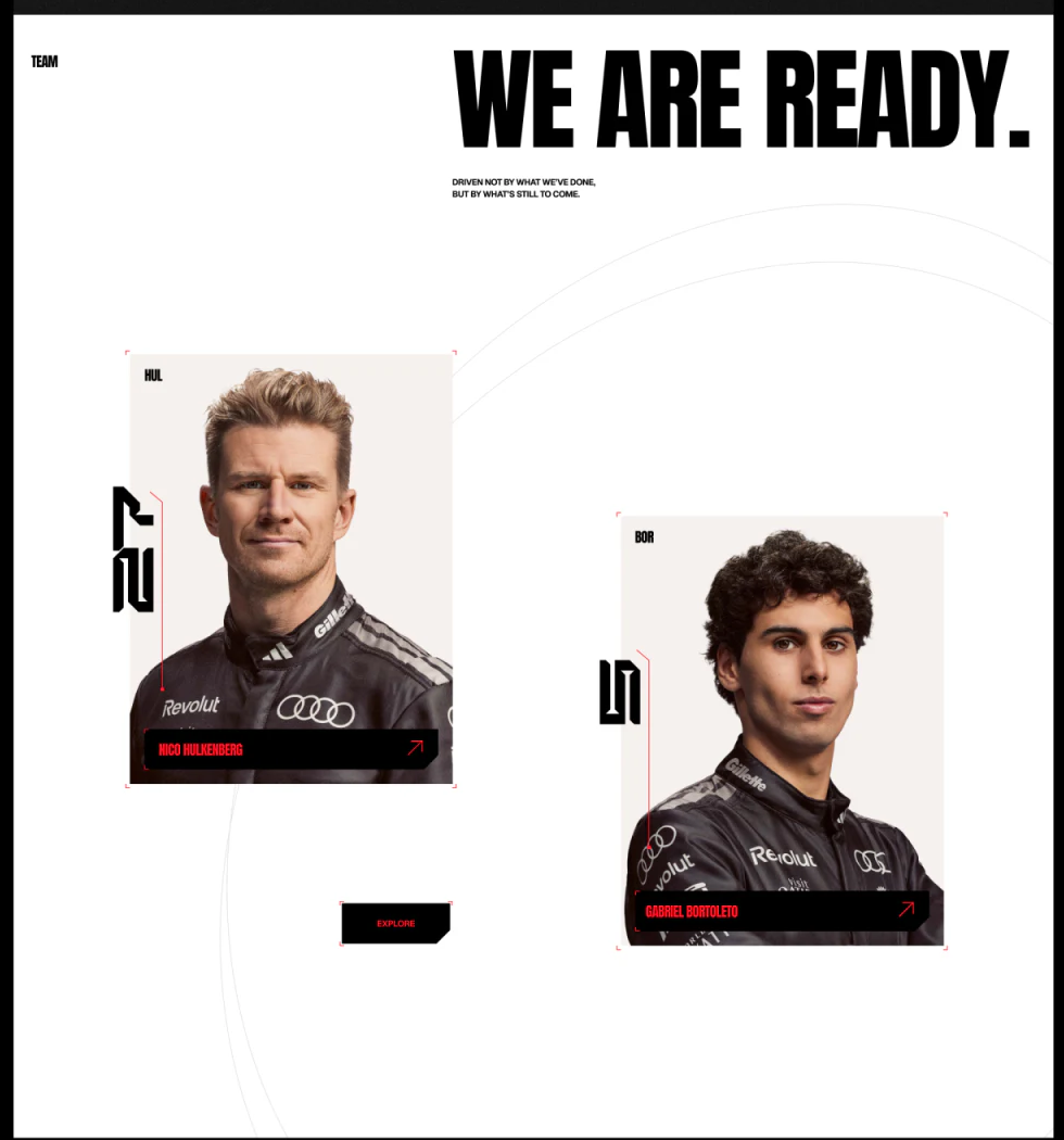
We Are Ready establishes the Team theme above two offset portraits. Black name strips and red arrows sit at their bottoms. Portraits establish recognition, while names and arrows connect attention to specific people.
Offset layout adds rhythm; mobile order should retain the same fields. Card size should not imply status, and names and entry scopes should agree. A separate Explore needs to explain whether it opens the team or more people.
JVDS favors action names tied to specific objects, such as viewing a profile or team introduction. Brand arrows can remain without requiring repeated attempts to understand destinations.
Poster headings and long text use different backgrounds
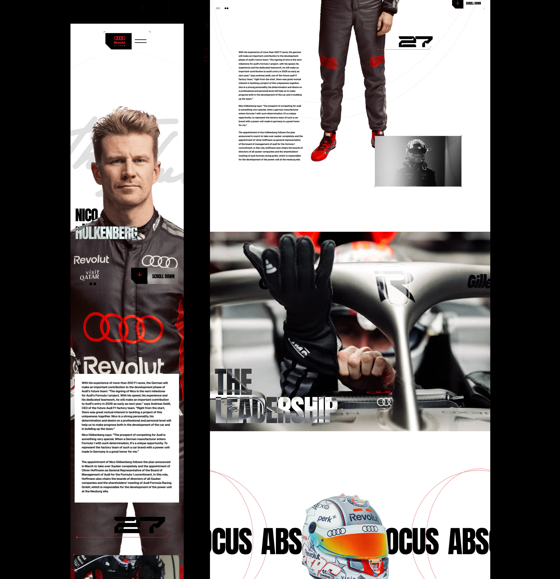
Names overlay portraits, with equipment, signatures and detail photographs extending the profile character. Mobile moves long introductions into white text areas to reduce background interference. Short headings join image composition while body text gets a quiet position—a useful division.
Large names cross clothing and marks with changing contrast, so key words need completeness checks. Long text needs suitable type size, measure and paragraphs, with the person’s name retained near the reading area.
Returning to the team should preserve the original position so deep reading does not require searching again. Photographs express personality; biographical facts need separate content checks, while layout makes them findable and readable.
Technology expands through components
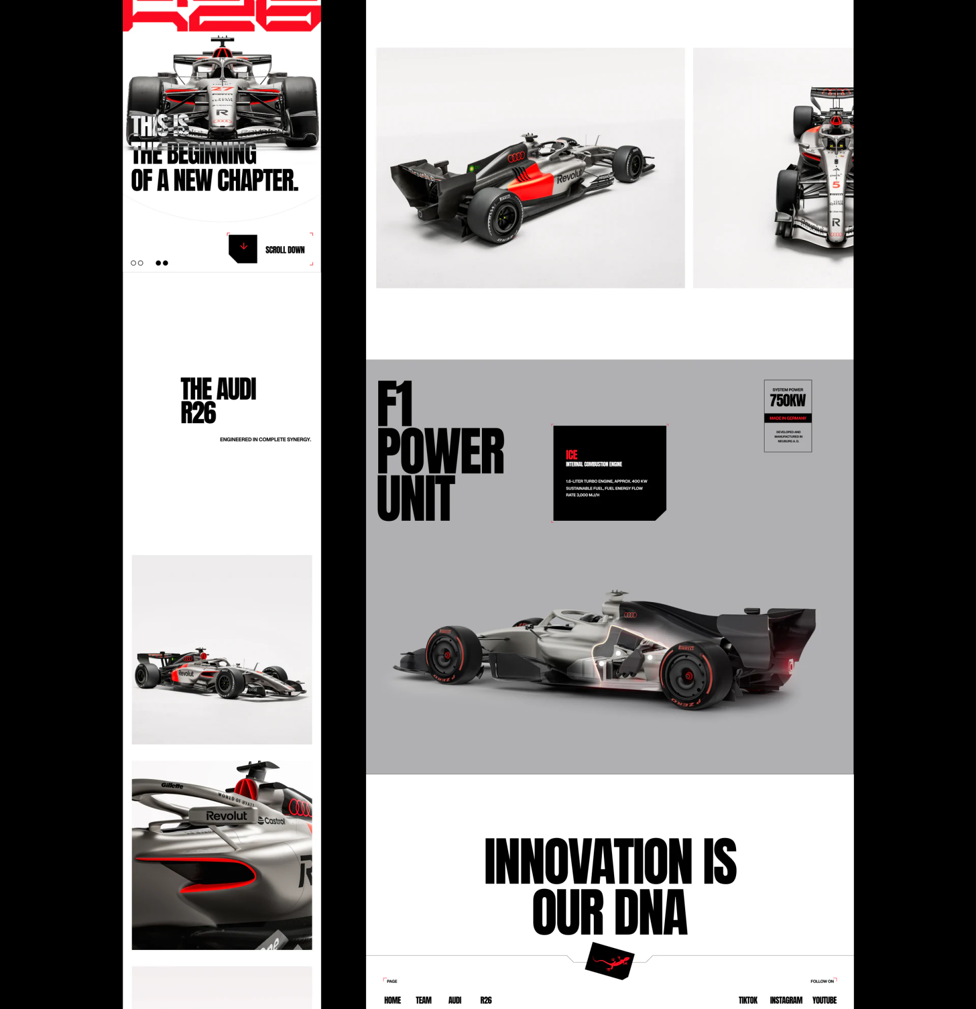
The car page shows several full-car angles before F1 Power Unit, where a small black explanation card and local highlight identify the component. Whole-car images convey form; details narrow the discussion for layered technical reading.
After selecting a part, highlight, heading and fields should update together and retain a whole-car return. Technical visitors can enter through navigation without reading every biography; related entries can connect people and machinery.
Parameter fields need subjects and sources, since perspective effects cannot establish real performance. Large type and red retain the theme, while key explanations should remain independently readable on small screens.
Frequently asked questions
Must a racing website put people and technology in one long page?
Related entries can connect them while retaining independent navigation. Looking up a part and reading a biography do not require the same full route.
Is poster-style naming suitable for long text?
Titles can join images; long text benefits from stable backgrounds, readable sizes, short paragraphs and current person identity.
Design review checklist
- Clarify separate destinations for person cards and Explore.
- Keep names over images completely readable.
- Synchronize technical highlights and component titles.
Organize people stories and technical lookup
Racing or sports websites can plan person, team and technology entries before arranging poster-style heroes and body reading areas.
JVDS provides UI/UX design and website design and development. We can work through page content, interface structure and implementation needs together.
 Link copied