Brand projects often stall at one sentence: “We already have our positioning; we want the design to feel more premium.” Given four words—innovative, credible, youthful, and international—the design team still cannot tell whether to be restrained or expressive, rational or human. Those words lack business context and do not define tradeoffs.
Translating positioning into visuals is not about assigning a color to every adjective. It means identifying whom the brand must win, where it must be chosen, and how it differs from competitors, then turning those answers into actionable visual principles and validating them as a system.
01 Start with Business Choices, Not a Mood Board
Brand positioning should at minimum define target customers, core scenarios, value promise, competitive alternatives, and reasons to believe. If these remain vague, a visual proposal easily becomes an aesthetic vote in which people choose by personal preference rather than brand objectives.
For example, both “a digital tool for small and midsize businesses” and “a mission-critical platform for large groups” can call themselves professional and reliable. The first may need to reduce comprehension barriers and distance, while the second prioritizes structure, stability, and governance. Their visual expressions will differ.
02 Rewrite Abstract Positioning as Visual Principles with Tradeoffs
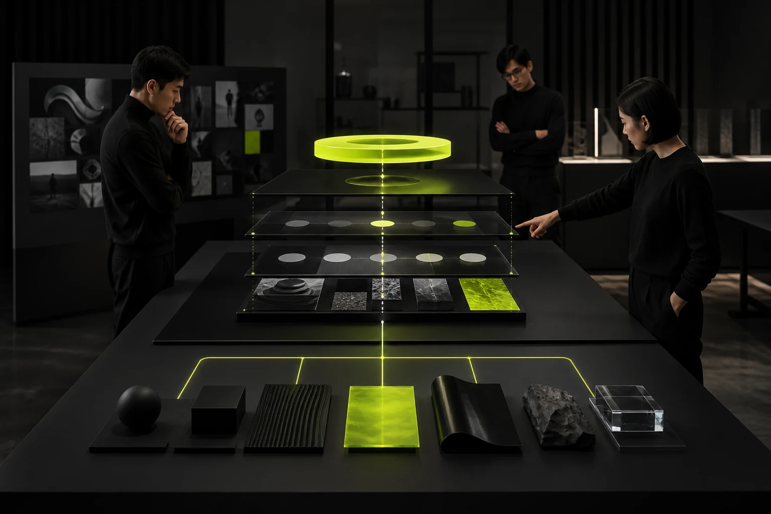
A strong principle is not “simple and modern,” but a sentence that guides choices: “Information clarity takes priority over decorative impact,” “Use engineering precision to build trust while retaining human stories to avoid coldness,” or “Remain highly recognizable in digital channels without becoming overly energetic in formal materials.”
Principles are most useful when boundaries are expressed in pairs: rational but not cold, international but not stripped of local culture, youthful but not driven by short-lived trends. Boundaries show the team which attractive directions do not fit the brand.
Positioning Insight | Actionable Visual Principle | Potential Design Impact |
|---|---|---|
Complex technology must be understood by nontechnical buyers | Prioritize clarity and reduce decorative metaphors | Information hierarchy, diagrams, typography, and layout |
High-risk decisions require long-term trust | Stable but not conservative | Color ratios, whitespace, imagery, and motion pacing |
The brand challenges established industry conventions | Create a clear contrast at critical touchpoints | Primary color, graphic language, and heading system |
Expansion across markets and languages | Build an extensible system that does not depend on one language-specific pun | Typography, lockups, components, and localization rules |
03 A Visual Concept Must Explain Why, Not Just Show What It Resembles
A concept proposal should explain how it responds to positioning, target audiences, and use cases instead of creating atmosphere with a page of keywords and reference images. The Logo form, colors, typography, and graphic language should also share a common logic.
If a direction works only in a poster Mockup but fails in a product interface, contract, trade show, or small icon, it is closer to a style exercise than a brand system.
04 Break Positioning Down Across Visual Elements
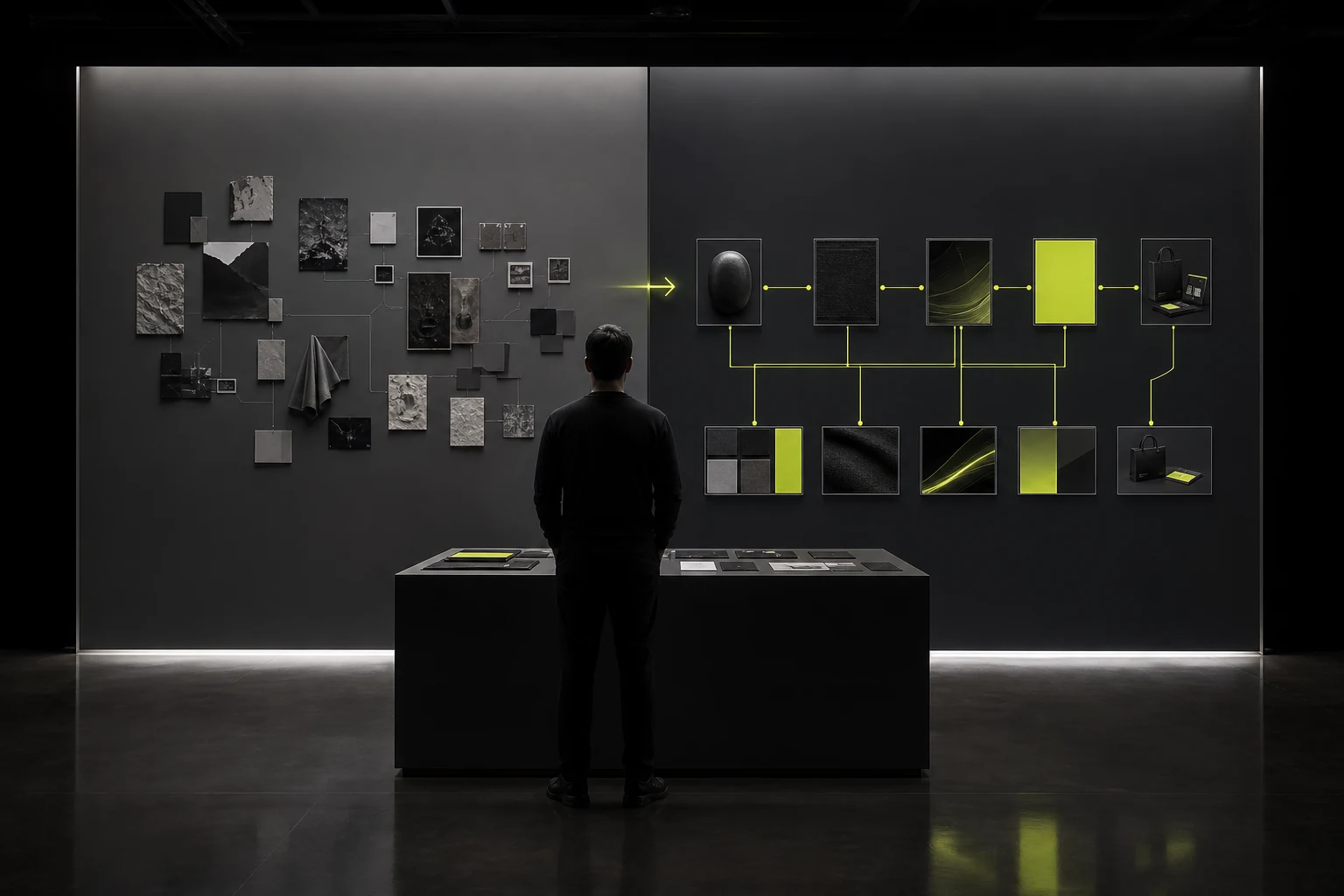
Color creates recognition and emotion, but must also address readability and usage ratios. Typography carries tone and multilingual adaptation. Layout establishes information order. Graphic systems enable expansion. Imagery defines how the brand depicts people, products, and contexts. Motion sets the pace of digital touchpoints.
Do not expect the Logo alone to express the full positioning. A mature visual system coordinates several elements so the brand remains consistent across touchpoints without becoming an exact copy everywhere.
Element | Question to Answer |
|---|---|
Logo | Does it work at small sizes, in one color, on complex backgrounds, and across languages? |
Color | How will primary and secondary proportions, functional colors, accessibility, and print differences be handled? |
Typography | Are Chinese, English, numbers, and multiple weights coordinated and licensable? |
Layout | How do information density, whitespace, headings, and data create order? |
Graphics / illustration | Are there generative rules rather than only a few fixed decorative images? |
Imagery | What should and should not be photographed, and how should people and products appear? |
Motion | How are speed, easing, transitions, and static fallbacks kept consistent? |
05 Test at Real Touchpoints, Not Only on a Brand Board
Test at least three high-frequency touchpoint types: a brand entry point such as the corporate website home page; a high-information-density context such as a product page or PPT; and a small format such as an avatar, icon, or mobile navigation. For offline brands, also test packaging, trade shows, signage, or print.
The goal is not to produce more mockups, but to find system boundaries. A typeface that looks strong in a large heading may be hard to read in Chinese body copy. A brand color that stands out on a poster may conflict with buttons and data visualizations. The earlier these issues appear, the more valuable the guidelines become.
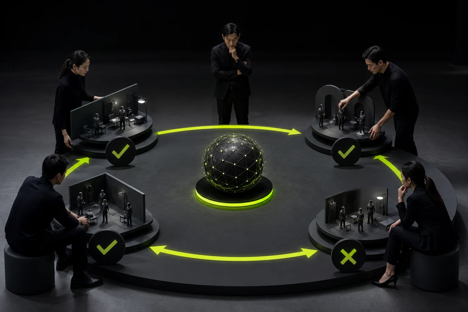
06 Use a Representative Scenario to Test Whether Tradeoffs Are Real
A manufacturer wanted to express “technology leadership” and initially favored extensive dark blue, grids, and technology particles. Research showed that nearly every competitor used the same visual language, while buyers cared more about reliable delivery and engineering capability. The direction shifted toward a clear specification system, authentic production imagery, and graphics that explain technical processes instead of adding more technology decoration.
This scenario shows that translating positioning is not about drawing “technology,” but about determining what evidence helps target customers understand technical capability.
07 Brand Guidelines Should Preserve Principles, Not Only Record Values
In addition to Logo sizes, color values, and typography, brand guidelines should explain visual principles, combination logic, graphic generation, imagery selection, and common contexts. Recording only “red is #FF0000” still leaves future teams unsure when to use it, how much to use, and what to pair it with.
When positioning changes, product lines expand, or the brand enters a new market, principles help the system evolve. Without them, teams can only copy old pages, and the brand quickly becomes rigid.
Frequently Asked Questions
Must brand positioning be completed before visual design begins?
At minimum, define target customers, value proposition, differentiation, and core scenarios. When positioning is still being explored, research and visual prototypes can validate it in parallel, but judgment cannot be skipped.
Why are “premium, youthful, and international” insufficient?
These words are too generic and lack business context and tradeoffs. They cannot guide typography, color, layout, or application decisions.
Can a Logo express the entire brand positioning?
No. A Logo is one part of the identity system. Full positioning is expressed through typography, color, graphics, imagery, layout, content, and experience together.
How can a team judge whether a visual direction fits the brand?
Return to the positioning principles and test at real, high-frequency touchpoints instead of voting only on proposal-page aesthetics.
If brand positioning changes, must the entire VI be redesigned?
Not necessarily. First identify which existing assets remain effective, then decide whether to refine, extend, or rebuild so existing recognition is not lost merely for a “refresh.”
Service | View |
|---|---|
Brand Visual Design Services | |
Corporate Website Design and Development | |
Brand Project Consultation |
 Link copied