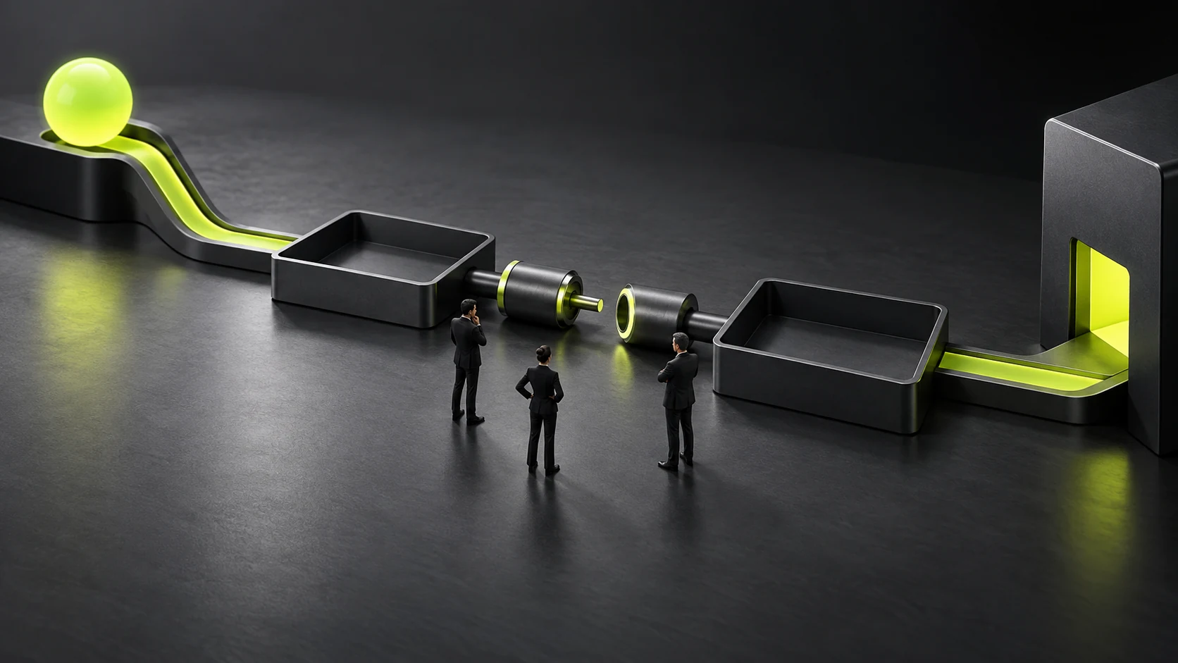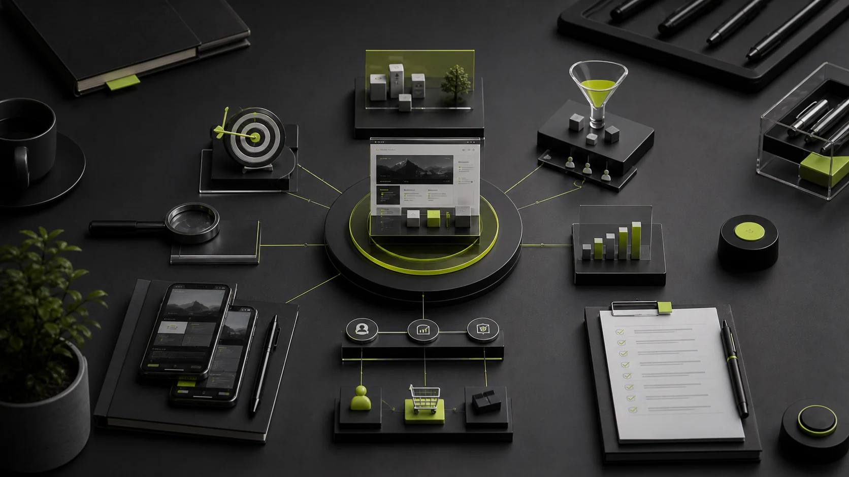
Many brand websites swing between two extremes. One emphasizes atmosphere, motion, and concepts but leaves users unsure what the product is. The other fills every page with buttons, selling points, and promotions until any brand distinction collapses into a standard e-commerce template. A mature brand website uses brand expression to help users understand, trust, and act.
Brand character does not come from more animation or larger type, but from consistent choices: what to say and omit; how to shape rhythm; which voice, imagery, colors, and interactions to use; and where to be direct or leave space. Commercial conversion requires those choices ultimately to serve the product and users.
01 Define the Brand Website's Narrative First
A brand website is not a brand manual placed online. Positioning must become a narrative users can understand: whom we exist for, which problem we recognize, how we solve it differently, which products or services we provide, what evidence supports us, and how users can participate. The sequence should reflect audience familiarity rather than follow one fixed template.
Narrative Stage | User Question | Common Content |
|---|---|---|
Identity | Who are you, and is this relevant to me? | Positioning, target audience, and core proposition |
Tension | Which problem do you see as worth solving? | Industry conditions, user frustration, and cultural perspective |
Approach | What is different about your product or method? | Product logic, design philosophy, technology, or craft |
Evidence | Why should I believe you? | Product details, materials, cases, customers, team, and process |
Action | What can I do next? | Purchase, experience, appointment, inquiry, subscription, or store visit |
02 A Brand Home Page Is Not a Commercial Timeline
A home page can use emotion and rhythm, but the hero section should help target users quickly identify the brand category and value. If brand awareness is low, one abstract slogan and a video force visitors to guess. Use a clear subheading, product category, scenario, or action button as an anchor, then expand the brand character visually.
03 The Visual System Must Support Content, Not Cover It
Visual Element | Brand Role | Experience Requirement |
|---|---|---|
Typography and Layout | Establish voice, order, and recognition | Readable body copy, clear hierarchy, and multilingual scalability |
Color | Create emotion and brand memory | Sufficient contrast and recognizable states without sacrificing accessibility |
Imagery | Communicate products, scenarios, and values | Authentic, licensed, performance-controlled, and appropriately cropped on mobile |
Graphics and Motion | Establish a distinctive rhythm and sense of interaction | Purposeful, skippable, performance-controlled, and compatible with reduced-motion preferences |
Grid and Whitespace | Create brand order and emphasis | Stable in responsive layouts without hiding critical information behind oversized visuals |
04 Product Evidence Is Part of the Brand Narrative
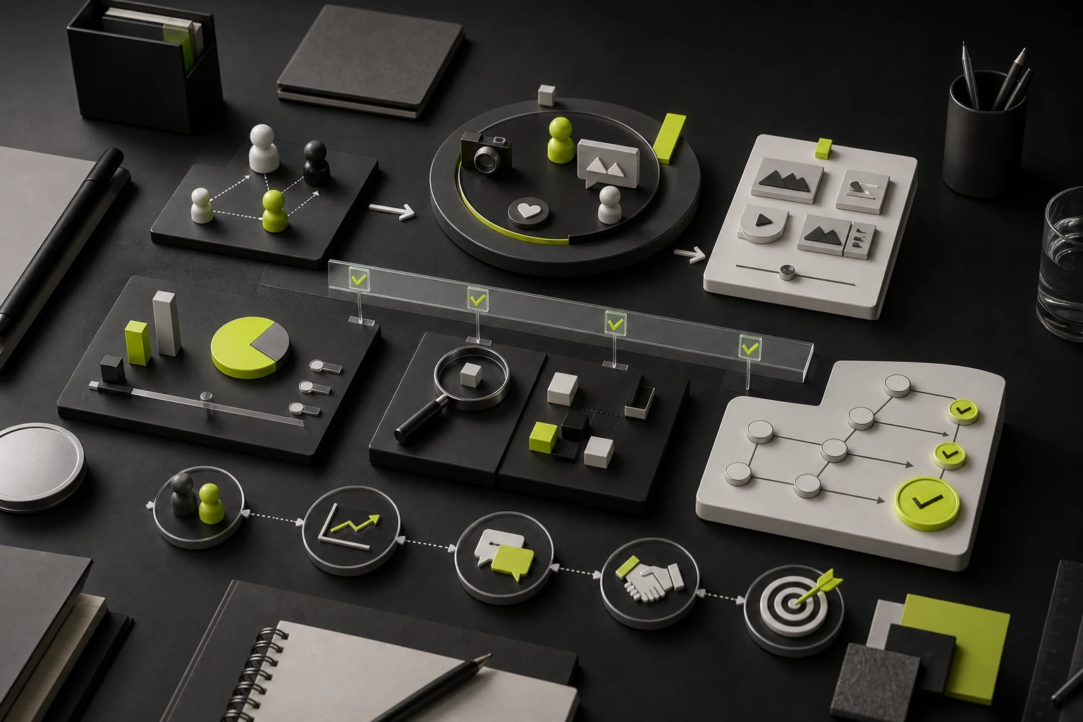
A brand cannot rely only on attitude and storytelling. Users eventually need to see products, services, materials, functions, process, price, or outcomes. A premium feel does not require less information; it presents information with greater order. Product pages should explain differences, details, use cases, and limitations so brand claims connect to verifiable facts.
- Product images should show dimensions, materials, usage, and details as well as appearance;
- Service pages should explain process, delivery, fit, and poor fit as well as service names;
- Technology brands should show mechanisms, performance, and integrations, not only innovation;
- Sustainable brands should provide evidence about materials, supply chains, and standards, not only principles;
- Professional-service brands should provide case context, process, and tradeoffs, not only customer Logos.
05 Conversion Buttons Do Not Have to Damage Brand Character
Conversion does not require a neon "Buy Now" button. Use language, placement, hierarchy, and commitment level to fit the brand. "Explore the Collection," "View Materials," "Book an Experience," and "Get a Brand Proposal" are more specific than a universal "Learn More." A page may use primary and secondary CTAs, but not every button should be equally prominent.
User Stage | Appropriate Action | Brand-Led Expression |
|---|---|---|
First Encounter | Continue exploring the brand and products | Explore the collection, understand the approach, or watch the story |
Interested | Review details and evidence | View materials, try the feature, or read a case |
Comparing | Obtain pricing, solutions, and service information | Review service scope, download a guide, or book an experience |
Ready to Act | Purchase, inquire, apply, or visit | Shop now, submit a project, book a store visit, or start a trial |
06 Motion Should Perform an Information Task
Motion can establish entry, explain product structure, guide attention, and provide feedback, but it should not make users wait, become disoriented, or lose control. Autoplay hero video must consider size, muted playback, loading, and mobile. Scroll narratives need a normal reading path. Important information cannot appear only briefly inside animation.
07 Mobile Is Not a Smaller Desktop Site
Brand websites often use large typography and horizontal narratives on desktop, but mobile requires reorganizing reading order, image cropping, button placement, and motion. Critical brand statements, product differences, and actions cannot disappear because of visual cropping. Mobile also needs to address weak networks, one-handed use, and inbound social traffic.
08 Performance Is Part of the Brand Experience
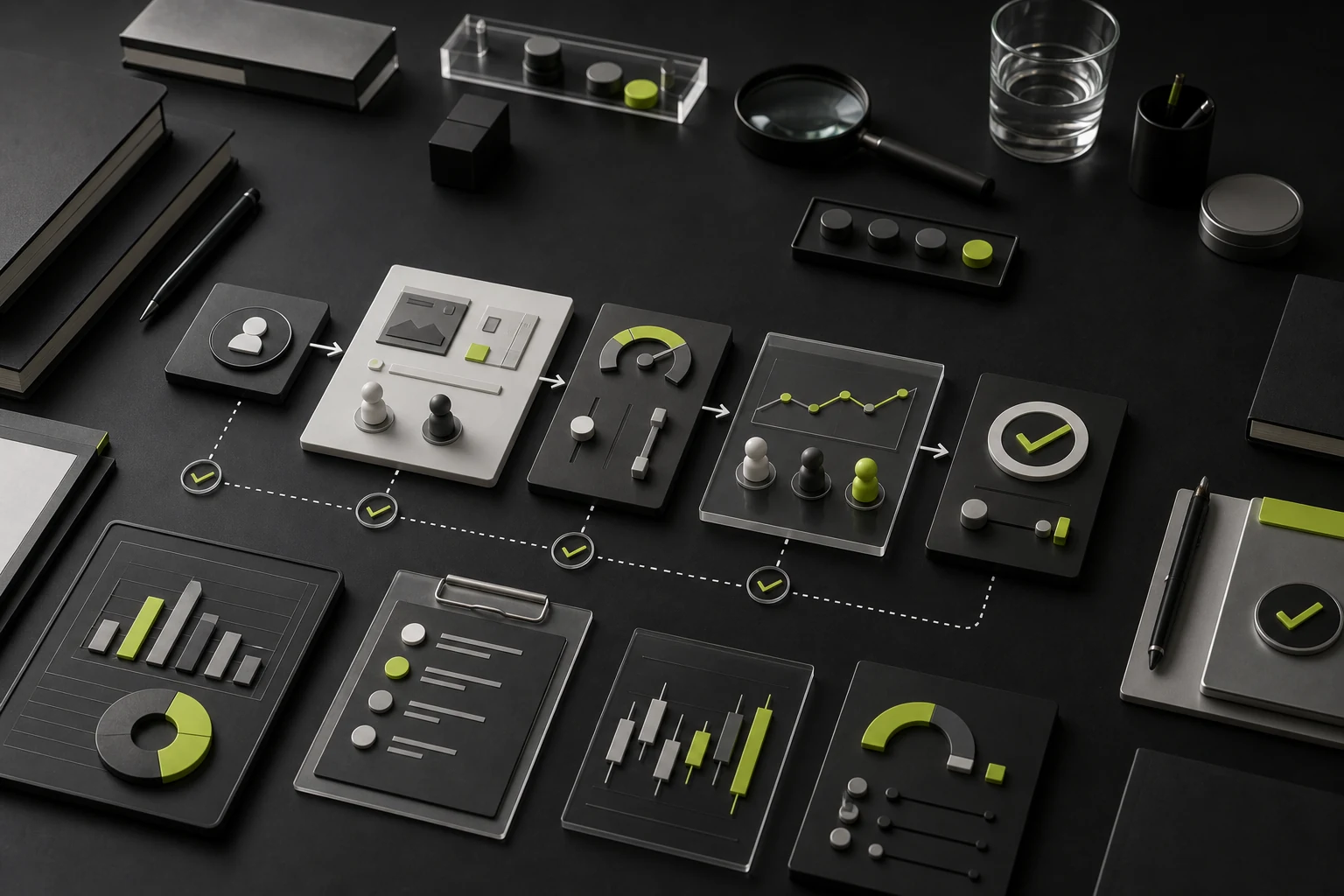
Users do not interpret waiting as premium. Large videos, uncompressed images, complex WebGL, and too many fonts slow loading and increase exits. Resolution strategies, modern image formats, on-demand loading, static fallbacks, and less hero-section JavaScript can preserve visual expression while controlling performance.
09 Brand Websites and SEO Are Compatible
Search engines need crawlable text, clear structure, stable URLs, and useful content. A brand site can use real text for primary headings and product information, semantic tags for structure, alternative text for images, and internal links among brand, product, case, and article pages. Turning all text into images or displaying it only inside animated canvases harms both accessibility and search understanding.
10 Five Dimensions for Evaluating a Brand Website
Dimension | Review Question |
|---|---|
Recognition | Without the Logo, do typography, imagery, language, and interaction still feel distinctive? |
Understanding | Can target users quickly explain what the brand offers and how it differs? |
Trust | Is evidence about products, services, team, process, and third parties specific? |
Action | Is there a natural next step for users at every maturity level? |
Continuity | Can the system expand as content, products, and languages change? |
11 Common Failure Modes
- The brand story is long, but product and service entry points are buried;
- Tiny gray type, low contrast, and difficult navigation are used to create a premium feel;
- Motion becomes the project focus while content, performance, and mobile are deferred;
- Every page pursues visual novelty without stable components or content order;
- Abstract slogans replace product facts and real evidence;
- One "Contact Us" button serves every user without an action ladder.
Frequently Asked Questions
Does a brand website need extensive motion?
No. Motion should serve the brand and understanding. Many brands establish strong recognition through typography, imagery, language, and detail alone; complex animation is not required.
Can a premium website contain a lot of copy?
Yes. Premium character comes from content order and quality of expression, not from minimizing words. High-value products and services often require more complete evidence.
Can a brand website include e-commerce?
Brand content can connect directly to purchasing, or an independent store can handle transactions. The key is a natural transition from product understanding to the buying path.
How can we tell whether visuals hurt conversion?
Review whether critical content is seen, product-page depth, CTA clicks, mobile exits, loading, and user testing—not just one overall conversion number.
How often should a brand website be redesigned?
There is no fixed interval. Reassess when positioning, product structure, technology, content, or user needs change materially. Ongoing content and targeted optimization can maintain it between redesigns.
Service | View |
|---|---|
Corporate Website Design and Website Development | |
Brand Visual Design | |
UI/UX Design Services | |
Project Inquiry |
Need design or website development services?
JVDS Design Studio is a professional design studio focused on digital product experiences and brand identity. We work with businesses in China and overseas that want to strengthen their brand image, improve user experience and grow their business, providing clear, usable UI/UX design, high-quality website design and development, app and mini-program development, and cohesive, distinctive brand identity design.
Updating your brand identity or website? Tell us where the design will be used and which materials you need.
 Link copied