
Some VI manuals run to hundreds of pages but no one opens them. Others have only a dozen pages and are used every day. The difference is not page count, but whether the manual covers real situations, its rules are actionable, and its assets are ready to use.
A corporate VI manual is typically divided into a foundational system and an application system. The foundational system defines identity rules, while the application system explains how those rules apply to offices, marketing, spaces, digital products, and other contexts. As corporate websites, APPs, and social media have become primary touchpoints, a traditional manual covering only business cards, letterhead, and storefront signage is no longer sufficient.
01 The Foundational System Defines What the Brand Looks Like
The foundational system should establish a shared language for the Logo, colors, typography, graphics, and imagery. Each rule should provide not only standard values but also the rationale for choices and common mistakes. Listing only Pantone and CMYK values without explaining how the team should use brand colors for website buttons remains difficult to implement.
Foundation Module | Recommended Content |
|---|---|
Logo system | Primary version, lockups, minimum size, clear space, monochrome, and reversed versions |
Color system | Primary, secondary, and neutral colors; print and screen values; and contrast principles |
Typography system | Chinese and English typefaces, weights, hierarchy, alternatives, and licensing notices |
Supporting graphics | Construction logic, proportions, cropping, combinations, and prohibited uses |
Icons / illustrations | Style, stroke width, corner radius, color, and application examples |
Image language | Subject, composition, lighting, people, and post-production principles |

02 Logo Guidelines Must Cover Real Boundary Conditions
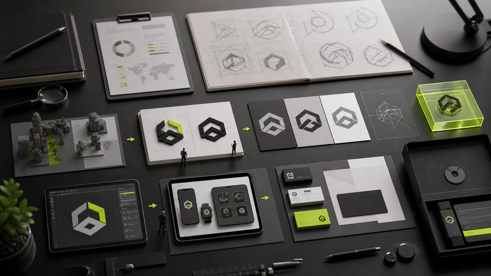
A Logo should not be tested only at a large size on a white background. The manual should demonstrate dark backgrounds, complex images, one-color printing, embroidery, foil stamping, laser engraving, social-media avatars, and 16-pixel icons.
Minimum size should not be an arbitrary number; legibility should be determined through actual output. If the full version fails at small sizes, provide a simplified mark or icon version instead of forcing every channel to use the same lockup.
03 Color and Typography Must Balance Brand Character and Readability
A primary brand color may not suit long-form body copy, notices, or button states. The VI manual should distinguish identity colors from functional colors and account for contrast, states, dark mode, and accessibility across websites and product interfaces.
Typography guidelines should cover Chinese, English, numbers, and special characters. Global brands also need fallback logic for other languages. When commercial fonts are used, the licensing scope should be stated to prevent unauthorized installation after templates are distributed to the team.
Context | Typography Rules Needed |
|---|---|
Brand headings | Typeface family, weight, letter spacing, and size ratios |
Body copy and long-form text | Readable weight, line height, and paragraph spacing |
Data and specifications | Monospaced or numeric features and alignment |
PPT / office documents | Alternative fonts available to employees |
Website / APP | Webfont or system font, loading, and licensing |
Multiple languages | Character coverage, stylistic compatibility, and fallback order |

04 Prioritize the Application System by Frequency and Risk
Traditional VI projects often produce many application mockups at once, even though the company may actually use only PPTs, social-media covers, its corporate website, and trade-show materials. The application system should be driven by business contexts; it need not add unused envelopes, badges, and vehicles merely to make the manual longer.
Prioritize content that is frequent, highly visible, or produced by many people. Provide editable templates for high-frequency contexts, strict rules for high-risk contexts, and principles for low-frequency contexts.
- Office: business cards, letterhead, email signatures, PPTs, and document templates;
- Marketing: posters, brochures, social media, advertising, and event materials;
- Sales: proposals, quotations, case studies, and product materials;
- Digital: corporate website, APP, mini programs, favicon, and social-sharing cards;
- Spatial: storefront signage, wayfinding, booths, conference backdrops, and environmental graphics;
- Product: packaging, labels, manuals, and hardware surfaces;
- Employer brand: recruiting pages, employee handbooks, and internal events.
05 Digital Guidelines Should Be a Dedicated Section
Corporate websites and product interfaces use more than the Logo and brand colors. They also involve grids, components, motion, image ratios, interaction feedback, and tone of voice. The VI manual can define brand-level principles, while specific components belong in the web or product design system.
The two systems should be connected: how brand colors map to buttons, backgrounds, and state colors; how brand typography falls back under performance or language constraints; and whether motion is restrained, precise, or energetic. This prevents the corporate website from looking like a generic template with brand colors applied.

06 For a Digital Manual, Findability Matters More Than a Static PDF
Brand assets should be stored in a company-controlled cloud drive or digital asset management system and classified by version, language, and use. The team should be able to download the correct files quickly instead of asking in group chats, “Who has the latest Logo?”
A one-page quick guide can list commonly used Logos, color values, fonts, and template links, while the complete manual supports complex decisions. Every brand update should record the version and effective date, and outdated templates should be withdrawn.
Asset Layer | Recommended Format |
|---|---|
Quick use | One- to three-page reference sheet and common download links |
Complete guidelines | Searchable PDF or online brand portal |
Editable templates | PPT, social media, sales materials, and office documents |
Source assets | AI, SVG, and PNG files; font information; icons; and image library |
Governance records | Versions, owners, approvals, and update log |
07 Companies of Different Sizes Need Different Levels of Detail
A startup can begin with the core identity, digital rules, and frequently used templates rather than producing many low-frequency applications at once. An established company with more channels needs a complete application system. Groups and multinational brands also need brand architecture, regional governance, and approval mechanisms.
The manual is not the endpoint of the project. Three to six months after rollout, add rules based on real usage problems. Simplify guidelines no one uses, and add examples or templates for scenarios where mistakes occur frequently.
Frequently Asked Questions
How many pages does a VI manual usually have?
There is no standard page count. A small set of core guidelines may be 20–40 pages, while a complex brand can exceed 100. The criteria should be coverage and actionability, not thickness.
What is the difference between a VI manual and a brand manual?
A VI manual focuses more on visual identity and applications. A brand manual may also include positioning, architecture, tone of voice, content, and brand governance. Project terminology is not fully standardized.
Is a design system still needed when a VI manual exists?
Digital products usually need one. VI defines brand visual principles, while a design system governs components, interactions, code, and product operations. The two should map to one another.
Must the manual include every application design?
No. Prioritize high-frequency, high-risk, and collaborative contexts. Low-frequency content can use principles without producing designs merely to add pages.
How often should a VI manual be updated?
The brand core should not change frequently, but applications, templates, digital guidelines, and channels do change. Document issues continuously and update the manual when major business or touchpoint changes occur.
Service | View |
|---|---|
Brand Visual Design Services | |
Corporate Website Design | |
Project Consultation |